|
| Group |
Round |
C/R |
Comment |
Date |
Image |
| 86 |
Mar 22 |
Reply |
Thanks, Pat. I hope you do try this. It's fun. I happened to have a journal covered with handmade paper, and it was a quick "try". Fabric is a good idea! Endless possibilities! |
Mar 27th |
| 86 |
Mar 22 |
Comment |
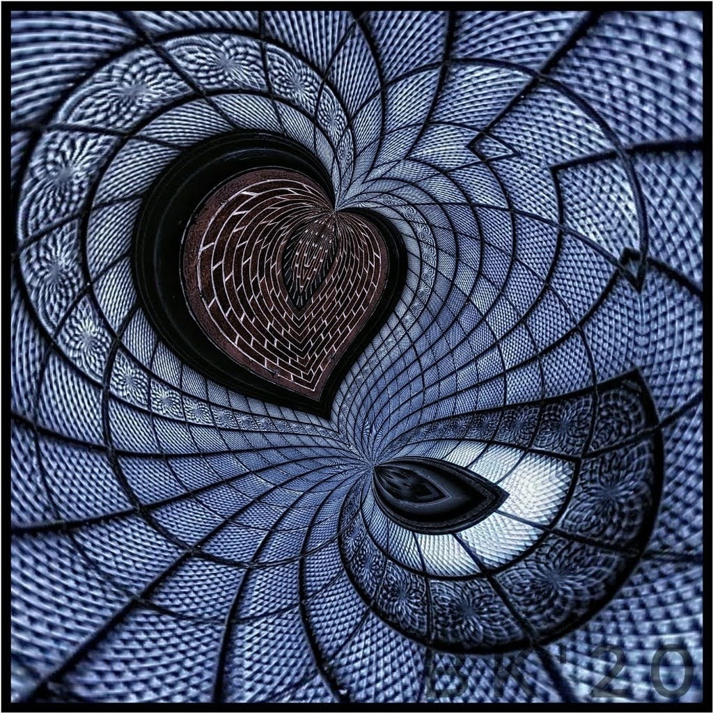
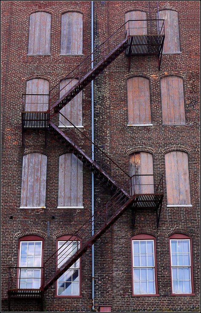
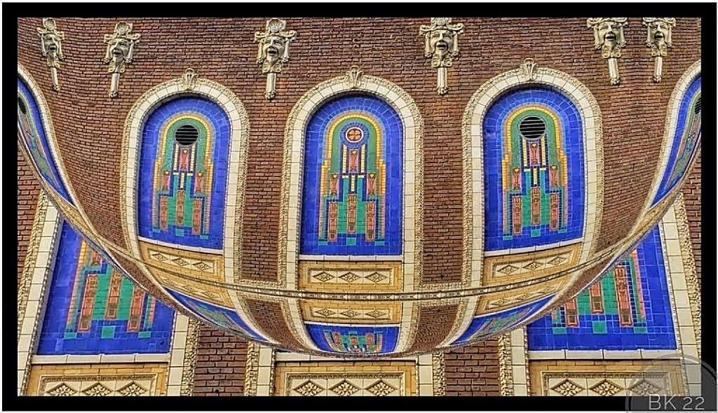
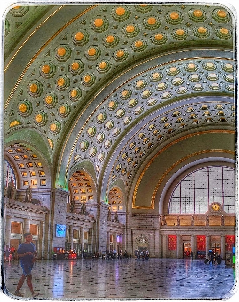
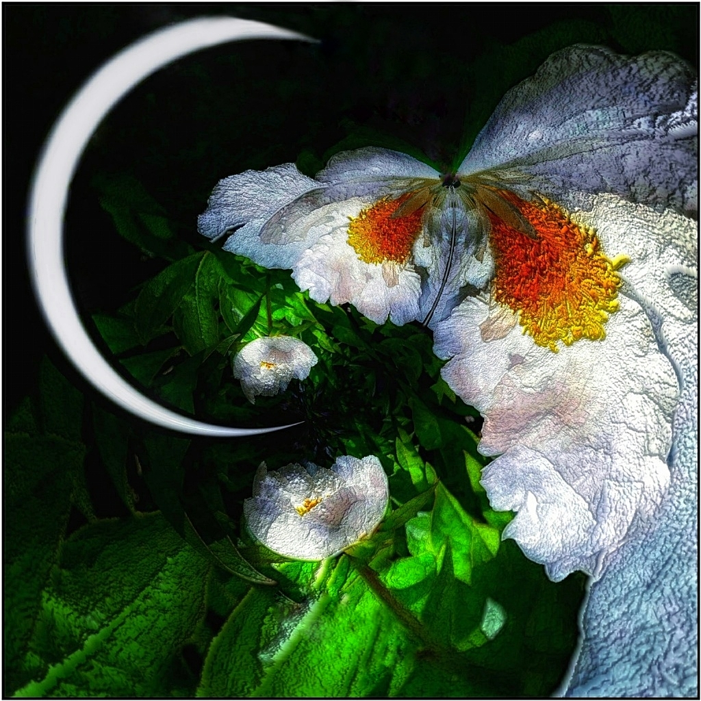
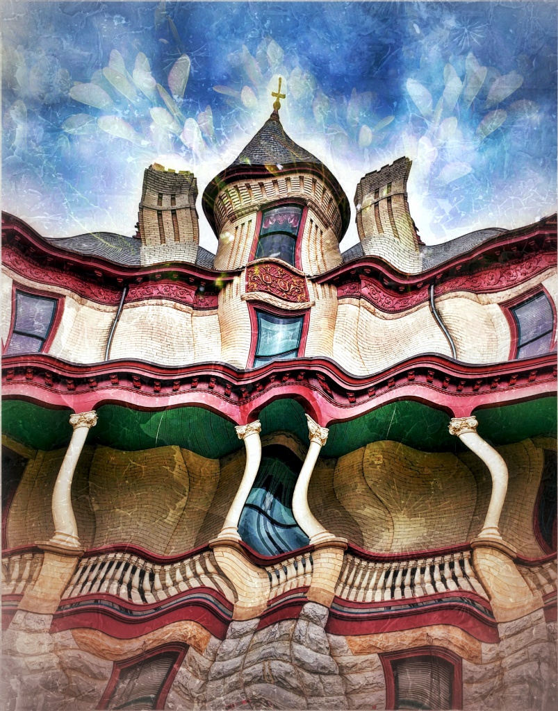
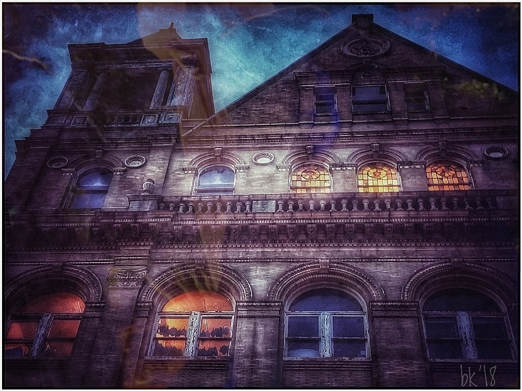
Your efforts certainly paid off! The building is a very interesting piece of architecture in and of itself, but the results of all those edits is very creative and you had alot of fun in the process. The final result reminds me of magazine illustrations from the 60s, and at first glance it looks like a scene from the Jetsons. A very colorful creation and totally transformed from the original. |
Mar 27th |
| 86 |
Mar 22 |
Reply |
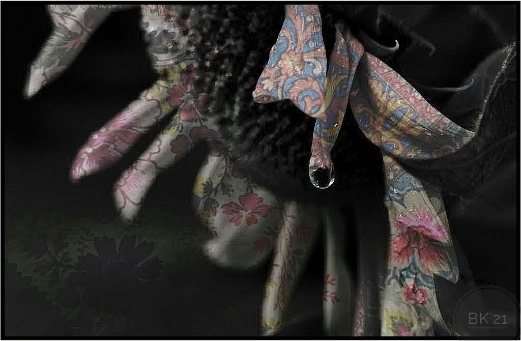
Thank you Kieu-Hanh! I started out trying the yellow with the overlay, but the colors came out strange, muddied up by the yellow and not clear. I got more clear and real colors from the book cover once I converted to the black/white. |
Mar 15th |
| 86 |
Mar 22 |
Reply |
Thanks, Gene! I'm going to test lightening up some areas and also try a different crop. |
Mar 15th |
| 86 |
Mar 22 |
Comment |
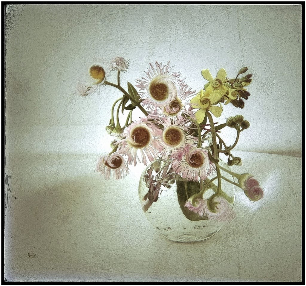
It's such a neat tea/coffee pot with the tiny, colorful tiles. I like your idea of replacing the busy shop background, and your choice is very creative. The designs and colors are pretty and unique. You were greatly successful using the new app. If you want the focus directed to the coffee pot, I believe I would change the background so it doesn't compete so strongly. Darkening the background might work, but I personally would prefer a darker gray/black background, like a "color splash" image (only one item in the scene in color). I especially like the swirls directly behind the pot and would try and carry that throughout the background. I've never used Superimpose, but it might not be available for Android. I will look into it because it seems to be a very useful tool. |
Mar 9th |
| 86 |
Mar 22 |
Reply |
Thanks, Ruth! I think your ideas to lighten those areas will help. I'll give it a go! |
Mar 9th |
| 86 |
Mar 22 |
Comment |
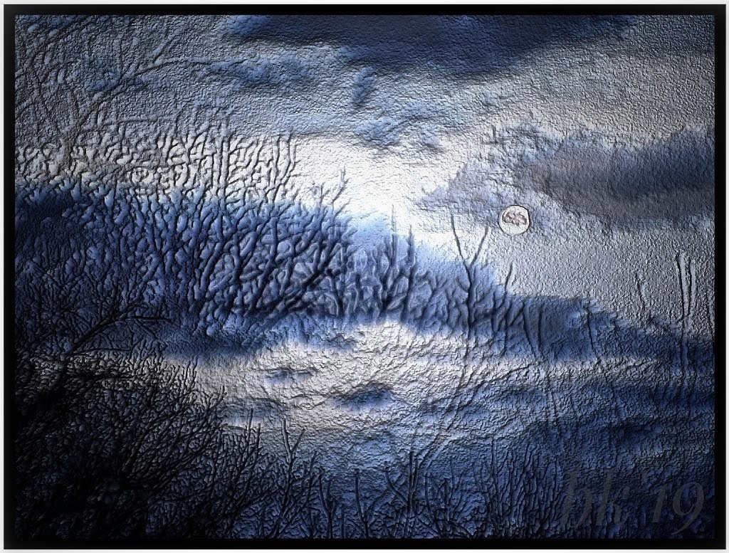
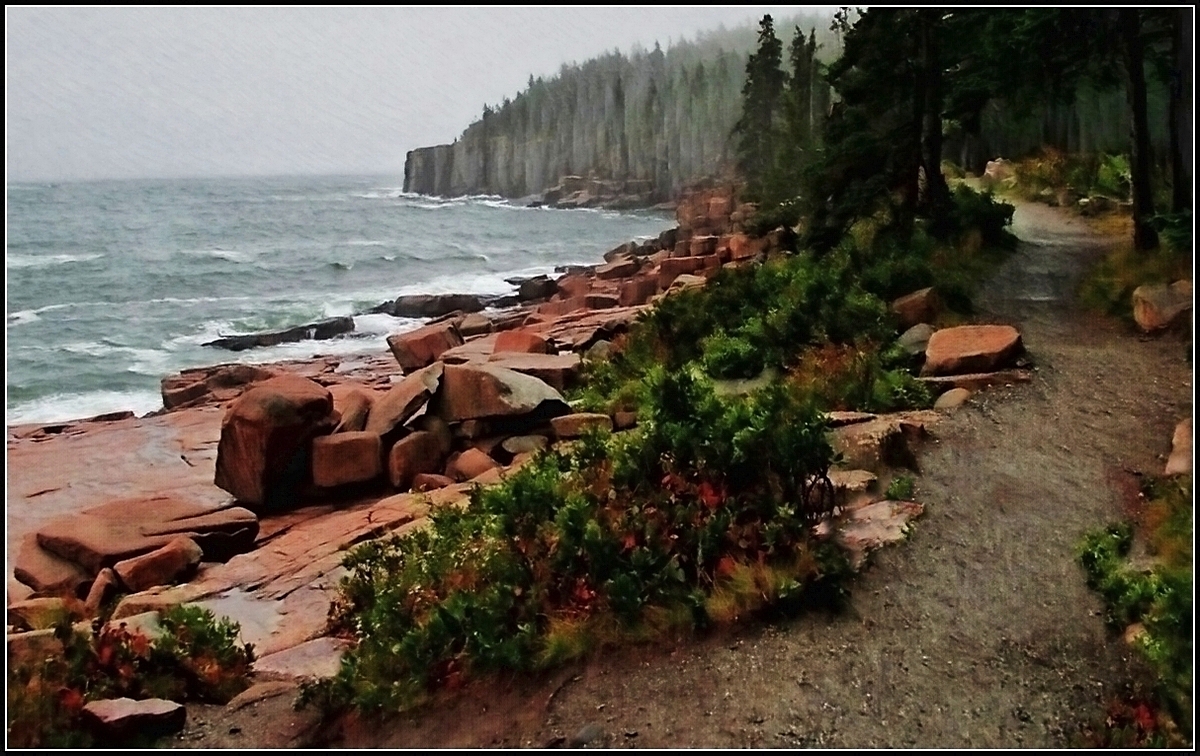
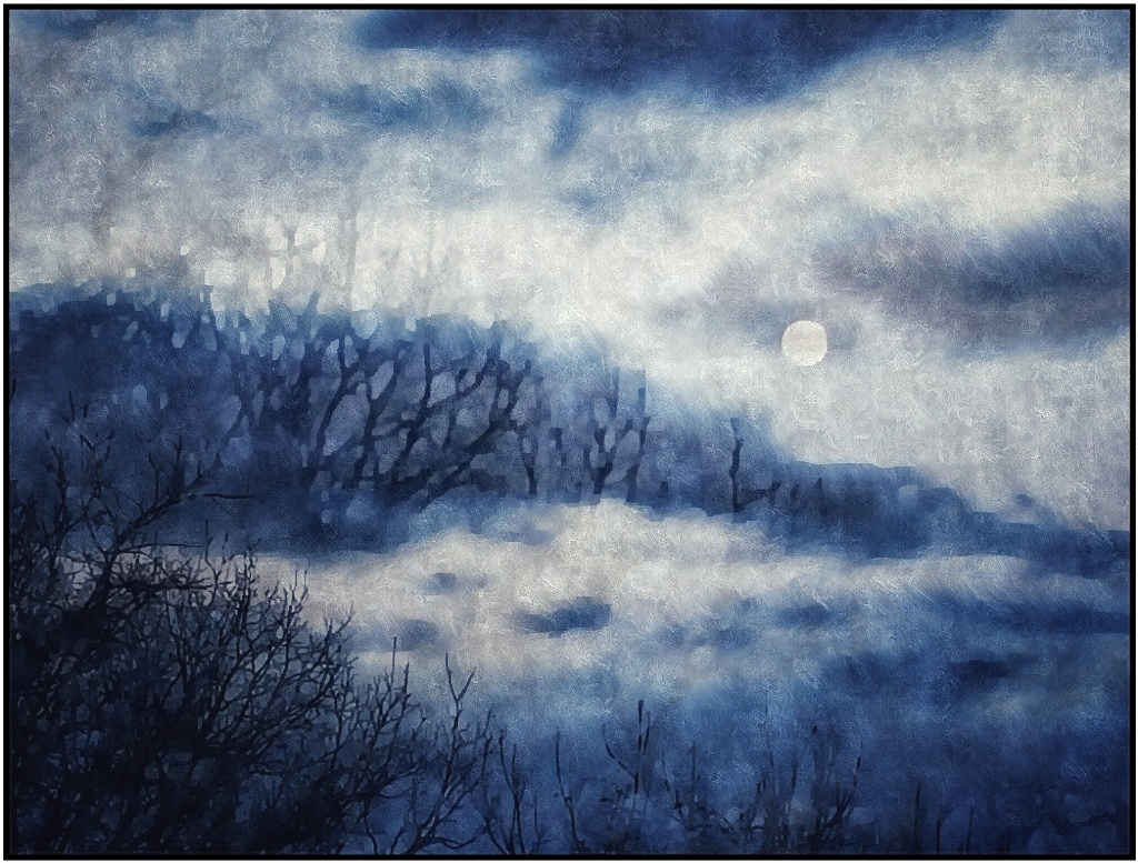
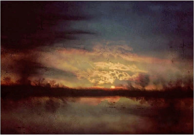
Glad you're back, Ruth! I completely understand your preference for open spaces. It's freeing! The vastness of the sky and clouds help us "float away". I really like your choices for this. Your trees give a nice lead in and frame for the clouds, and I like the resemblance of the tree line slightly repeated in the clouds. Nice colors too! |
Mar 6th |
| 86 |
Mar 22 |
Comment |
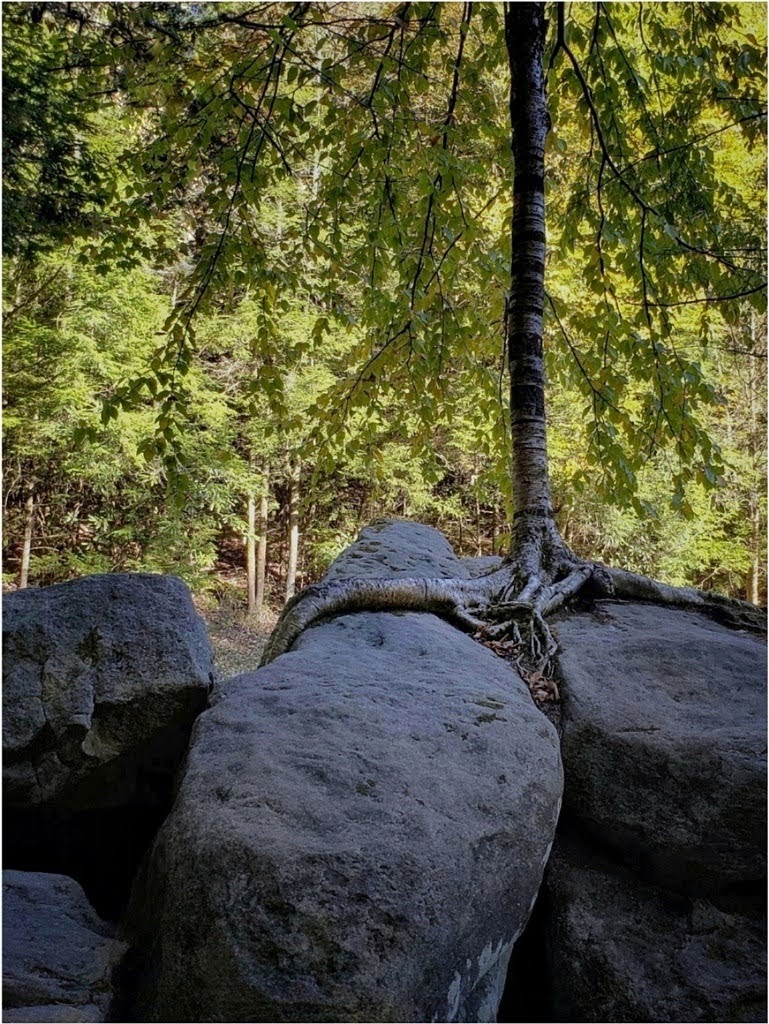
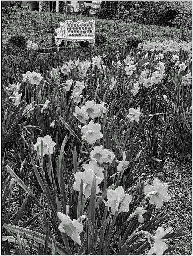
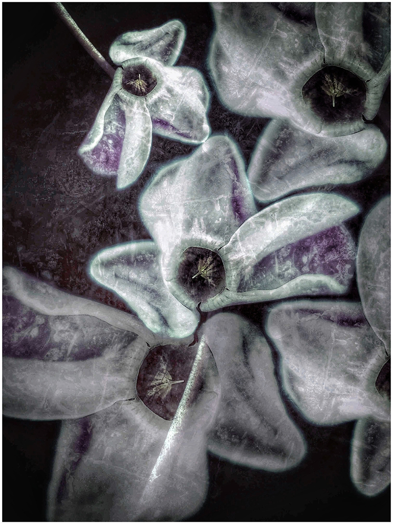
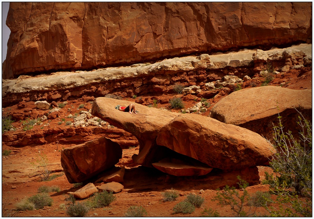
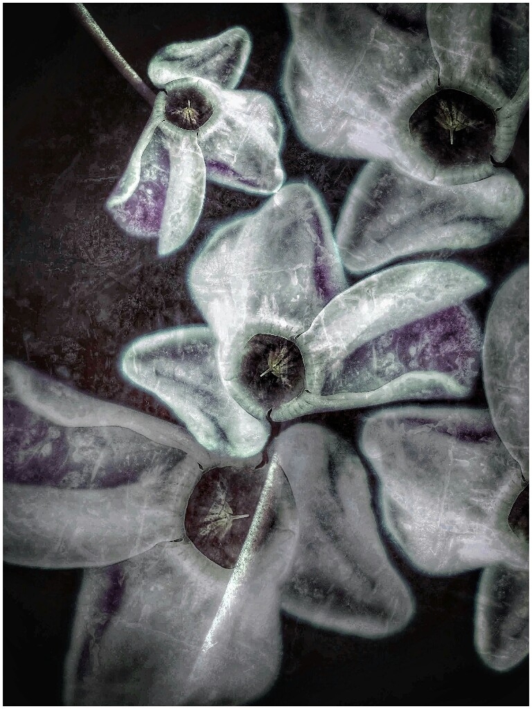
Those are amazing, Jack. They are so old and perfectly shaped, like hands reaching to the sky. I like your edits, especially for a warmer look, and it gives a strong silhouette look. I think I would try one more step and remove the plants around the image. It would look great blown up poster size! |
Mar 6th |
| 86 |
Mar 22 |
Comment |
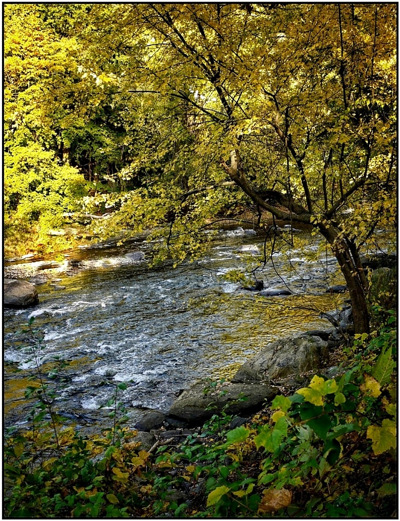
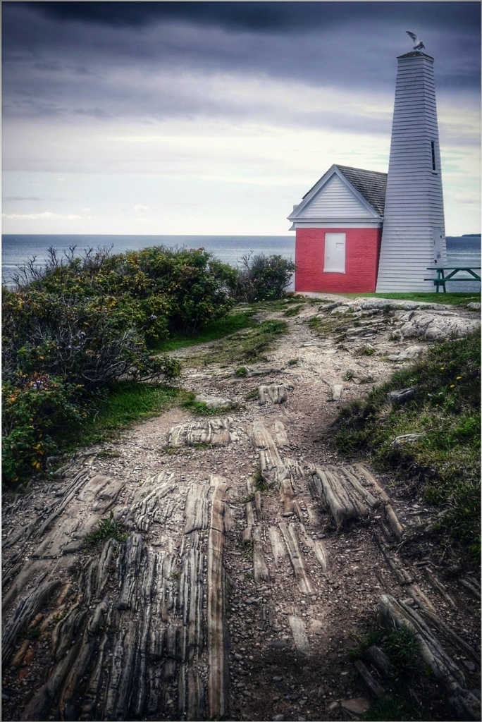
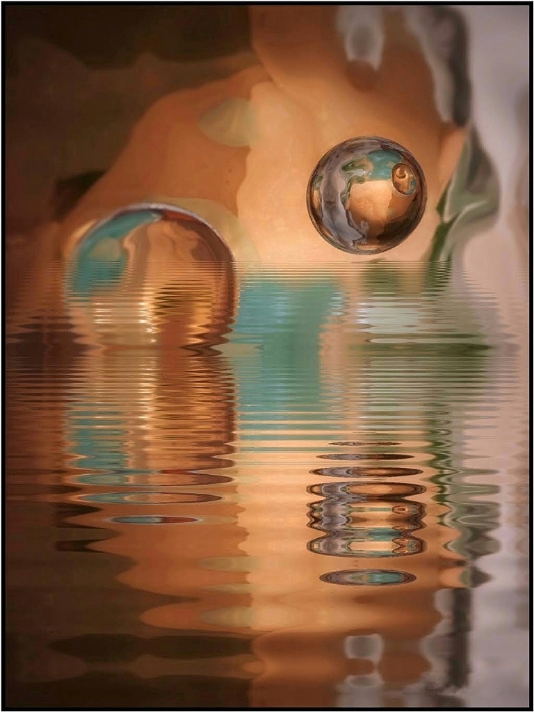
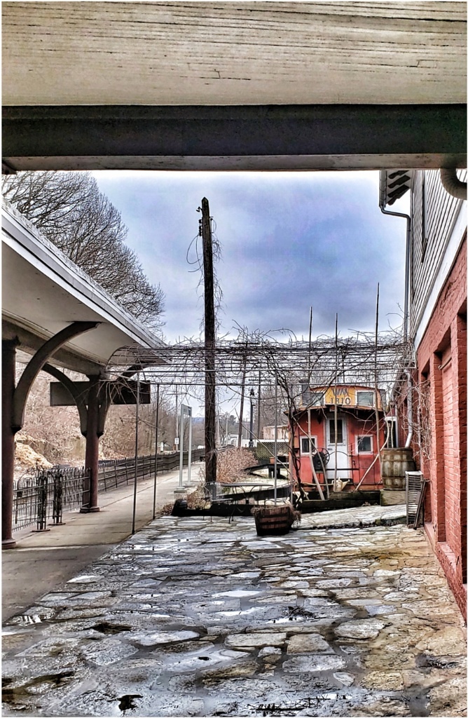
It's fantastic, especially because of the real and natural colors. While, at first glance it seems like it might be an abstract, it impresses because it's real. The mirror image of the sky in the water is wonderful. The land falls in the middle but cropping loses some reflections. The only thing I'd test is replacing the container with, maybe, a boat or two. |
Mar 6th |
| 86 |
Mar 22 |
Reply |
Thanks, Jack! Yes, it looks like it might be a reflection from something, then not, and then you wonder. Just a unique take Lol |
Mar 6th |
5 comments - 5 replies for Group 86
|
5 comments - 5 replies Total
|