|
| Group |
Round |
C/R |
Comment |
Date |
Image |
| 86 |
Feb 22 |
Comment |
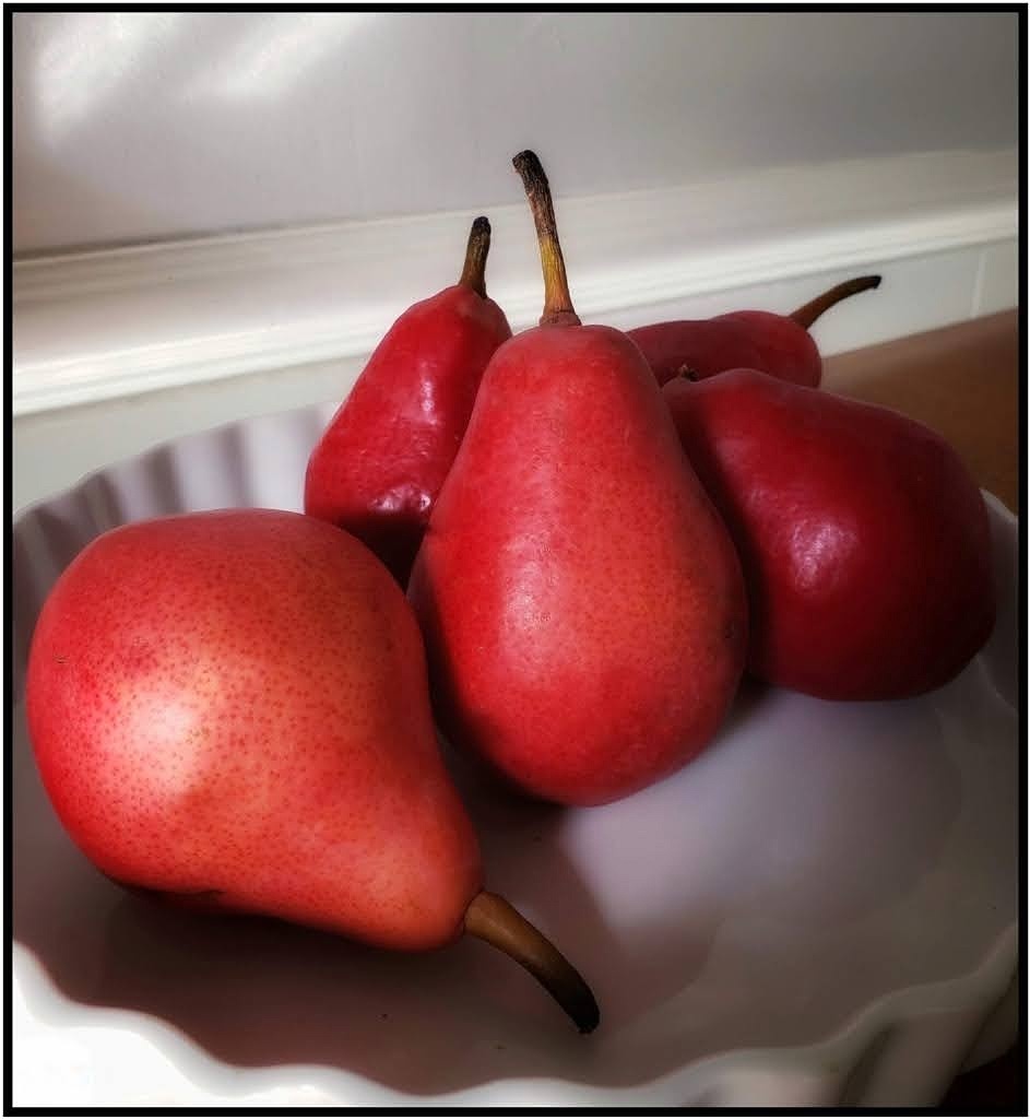
This is a good snapshot of spring which we are anxiously awaiting. Your goal was accomplished with edits, removing distractions. The unfocused nature and the overly sharp foreground cause the shot to appear somewhat painterly to me. I don't know if that was your intention but I think you could achieve more of that look with minimal edits. |
Feb 23rd |
| 86 |
Feb 22 |
Reply |
Thanks, Gene! My eye sits in that same place too. I need to tone it down, and I don't like the spots at the bottom of the back pear. I think I'll remove those. I believe I over-sharpened and the hotspots resulted, as well as the minute spots on the skin of the pears. I will share the results if it makes it into the kitchen!
|
Feb 10th |
| 86 |
Feb 22 |
Reply |
Thanks, Jack! I agree with Gene that the hotspot on left needs toning down. I think I over-sharpened and caused it. I'm not fond of the lower spots on the back pear either.
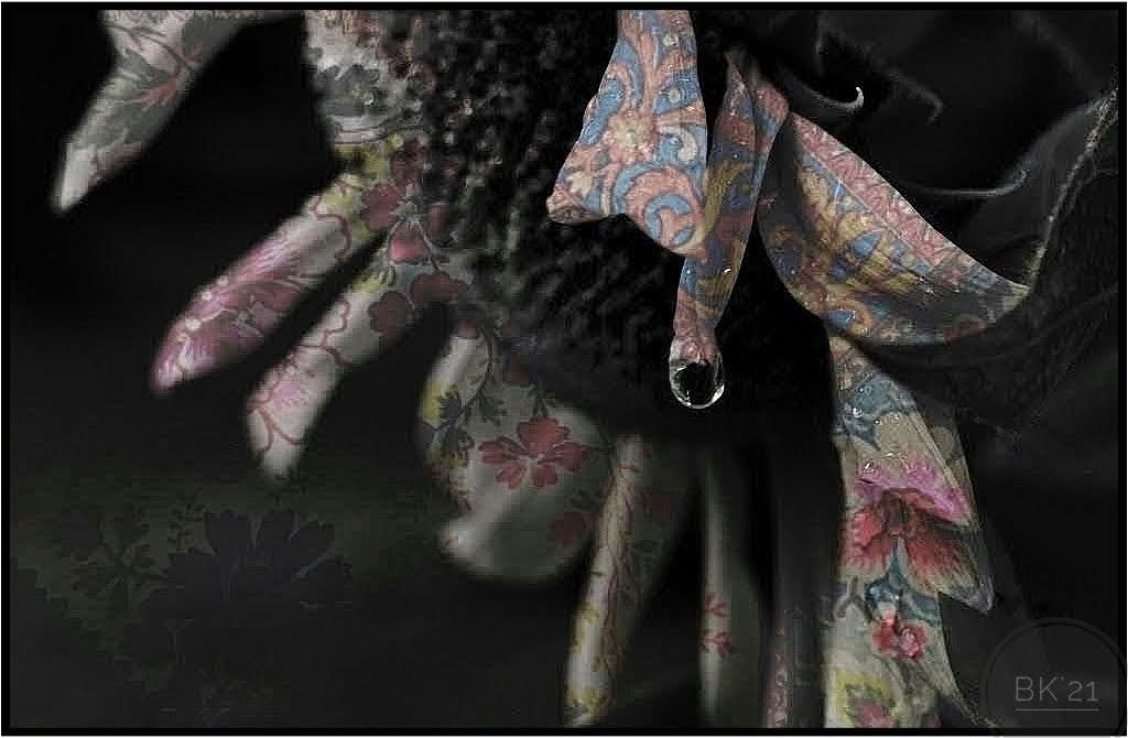
About painting, I love digital paintings but have not tried it. I'll use an acrylic wash (watered-down acrylics like watercolors), although my husband says 'why not just print' Lol He may be right! I began painting last year. I wasn't sure I could do it but as long as I can color-outside-the-lines it's great! This one will be a big test. |
Feb 10th |
| 86 |
Feb 22 |
Comment |
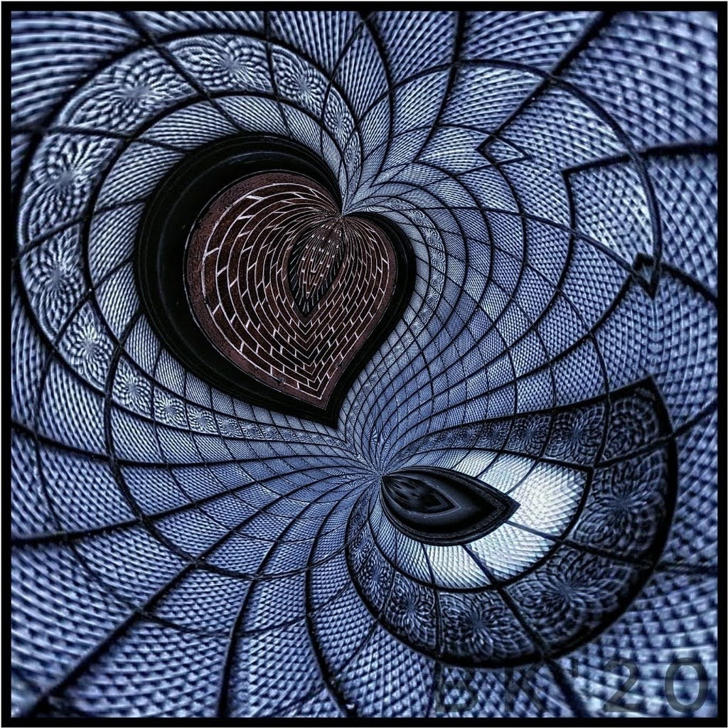
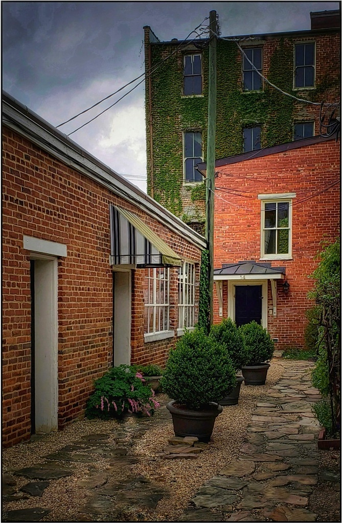
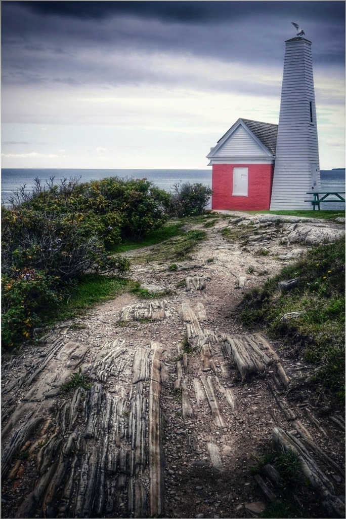
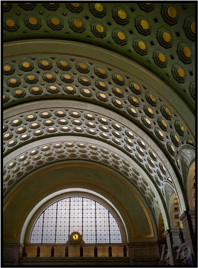
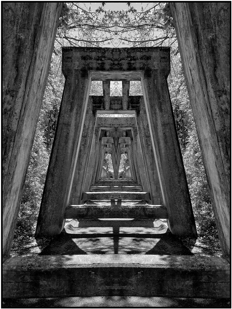
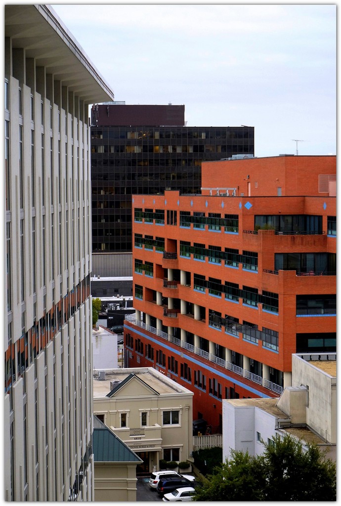
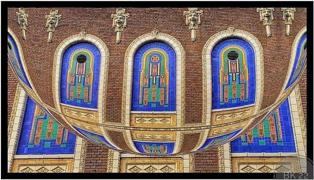
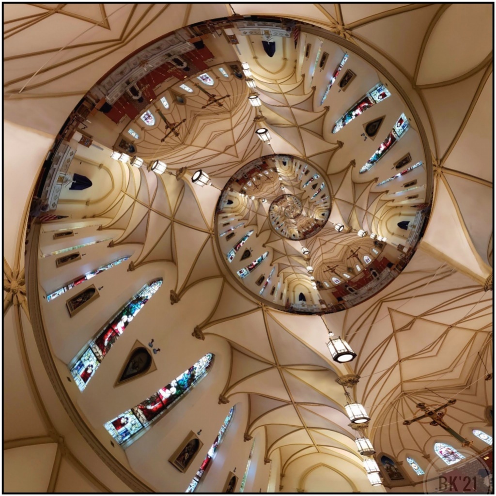
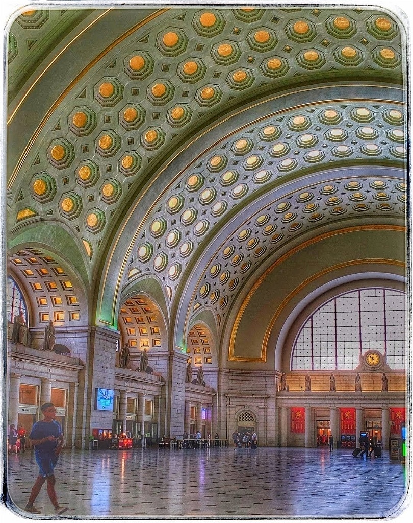
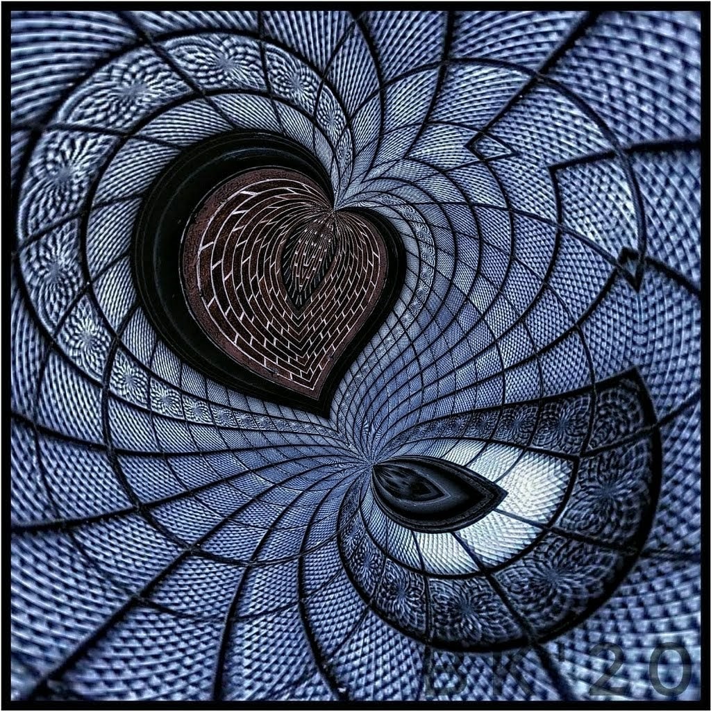
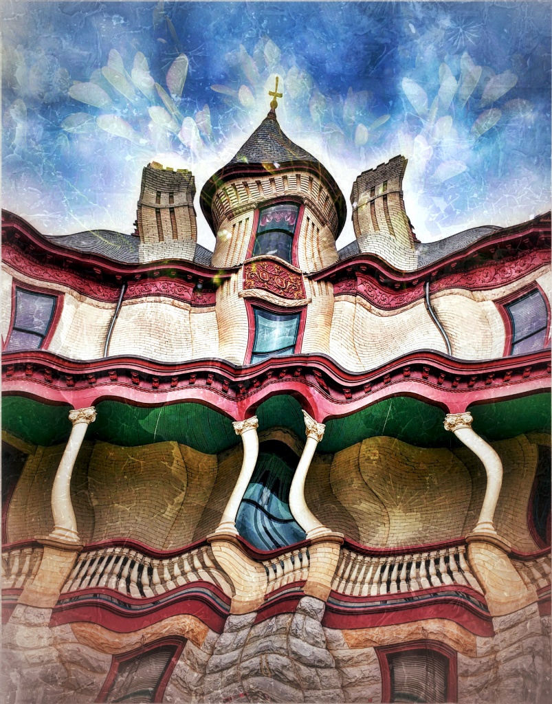
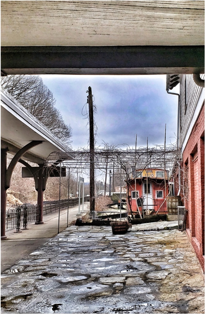
I'll be the odd man out on this one. I love the architectural structure and brilliant colors, and I think it's a very good shot.
I prefer the original. It needs barely any edits. The poles on the right are perfectly straight and, to me, you can see the artistic nature of the structure without altering any perspective.
You could leave the small bit of blue at top right, or remove it, or crop to remove it. I don't think it's really needed. You might try a closer crop removing the first set of beams and circle of blue which leaves a fan shape without it. Lots of options, and only my thoughts.
I tend to agree with Gene that perspective isn't too hard to fix, but it can be fiddly. If you use Snapseed, I find that the Perspective "free" selection works best for me because it allows you to move every bit of the image around until you're satisfied. It is a lovely photo! |
Feb 10th |
| 86 |
Feb 22 |
Comment |
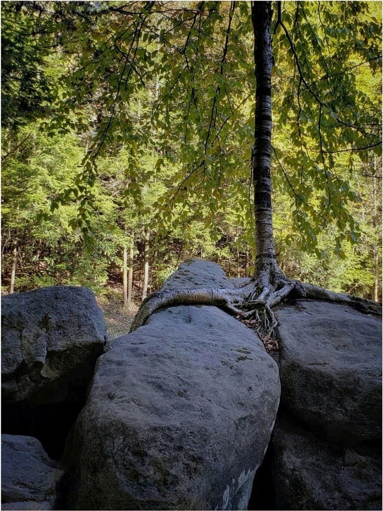
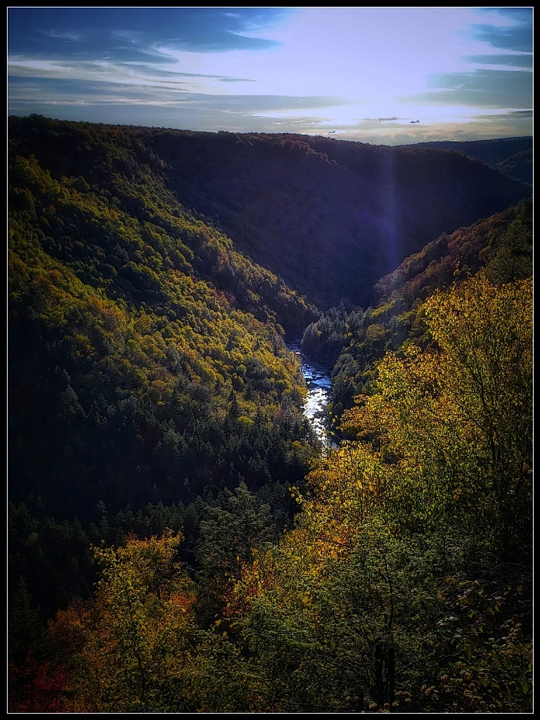
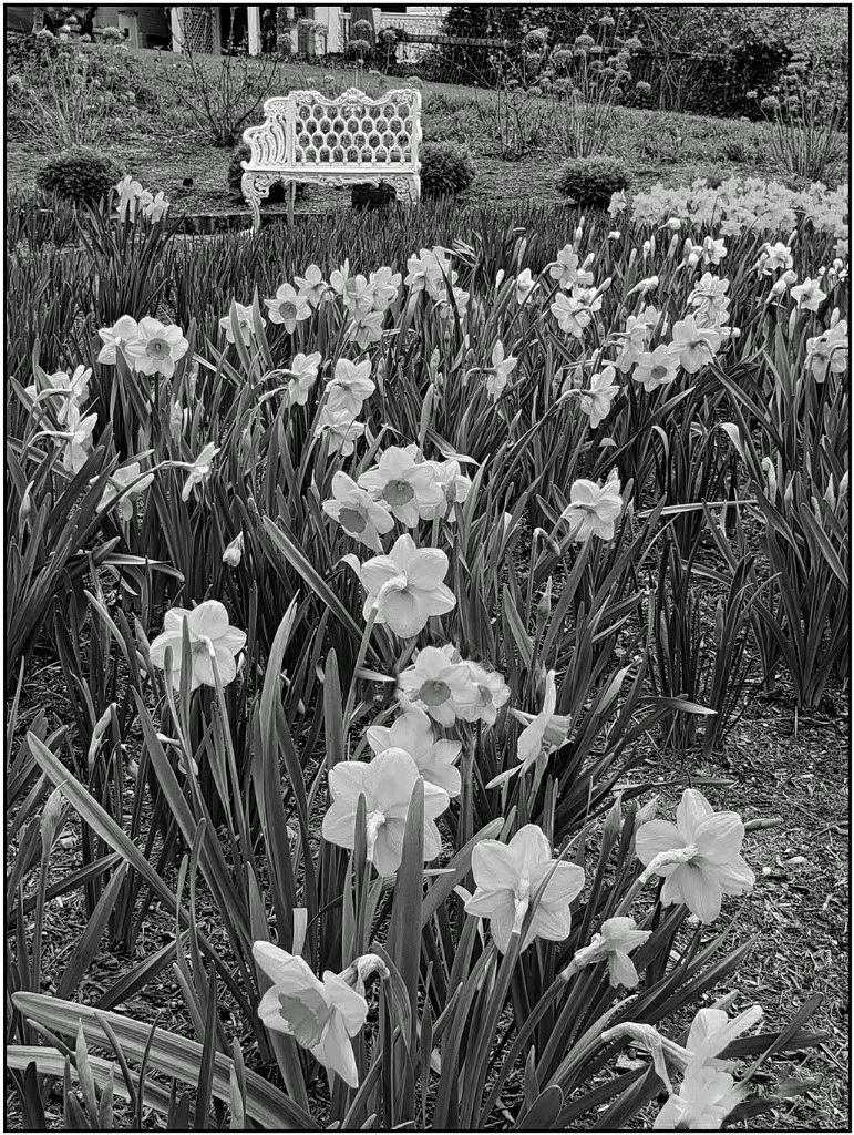
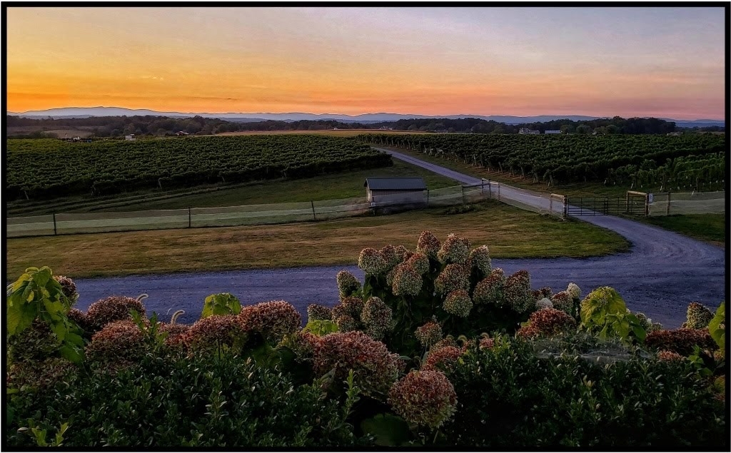
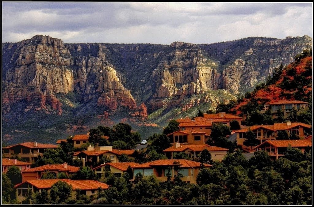
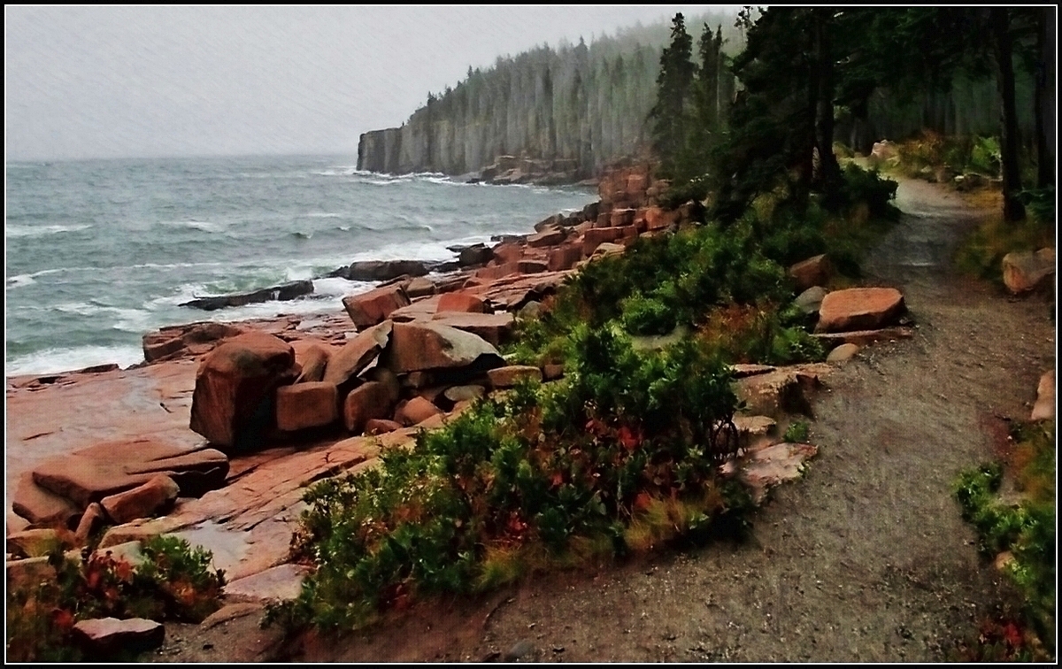
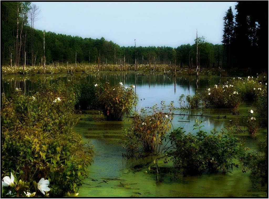
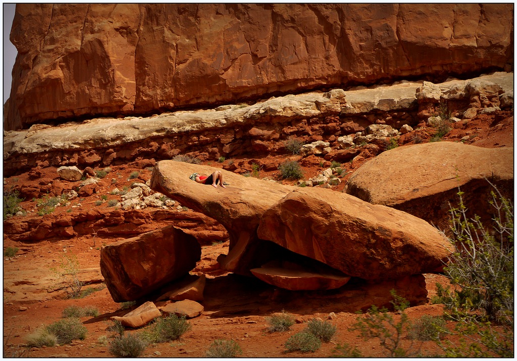
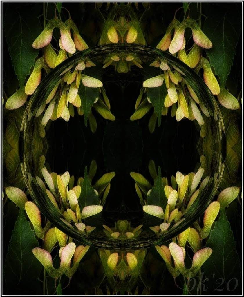
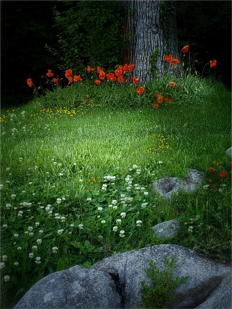
From the perspective chosen, the small flower against the log immediately shows the differences you want to share. You must have been close to the ground or on the ground?! I love the bit of the blue and the rolling hills. You achieved your goal in my opinion. The shot offers a good sense of scale and range of distance beyond. It's a very peaceful scene. |
Feb 10th |
| 86 |
Feb 22 |
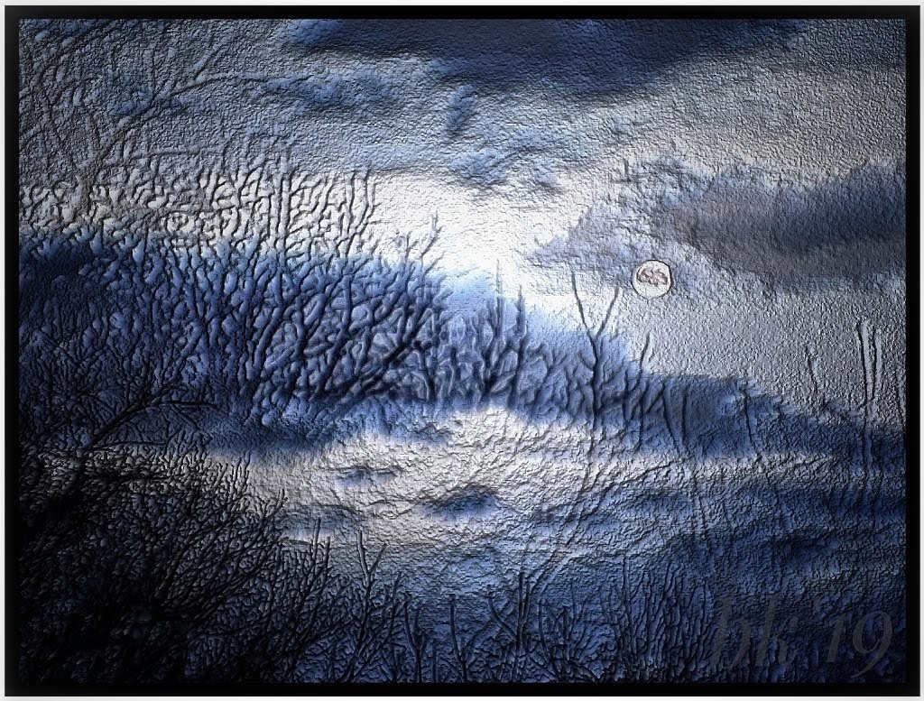
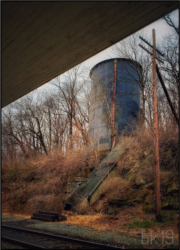
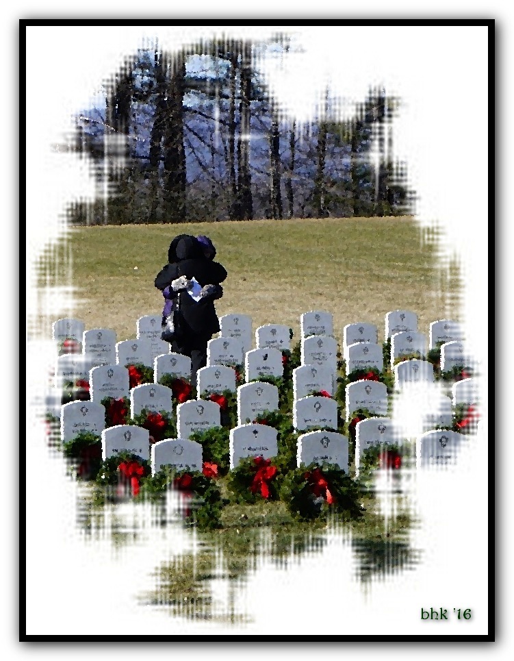
Comment |
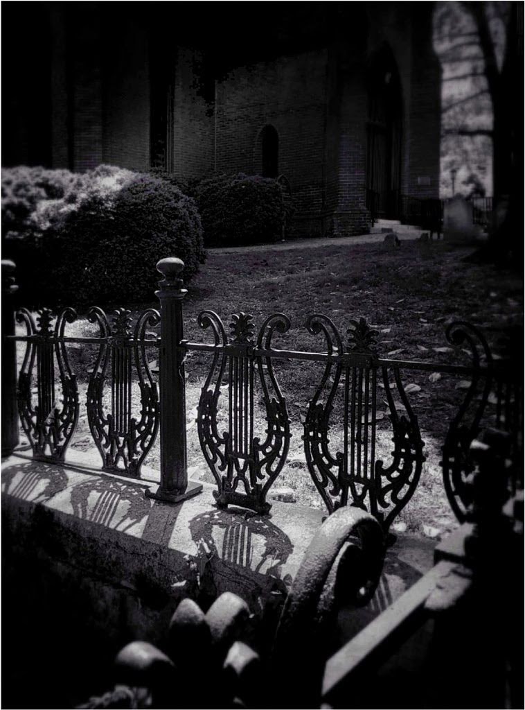
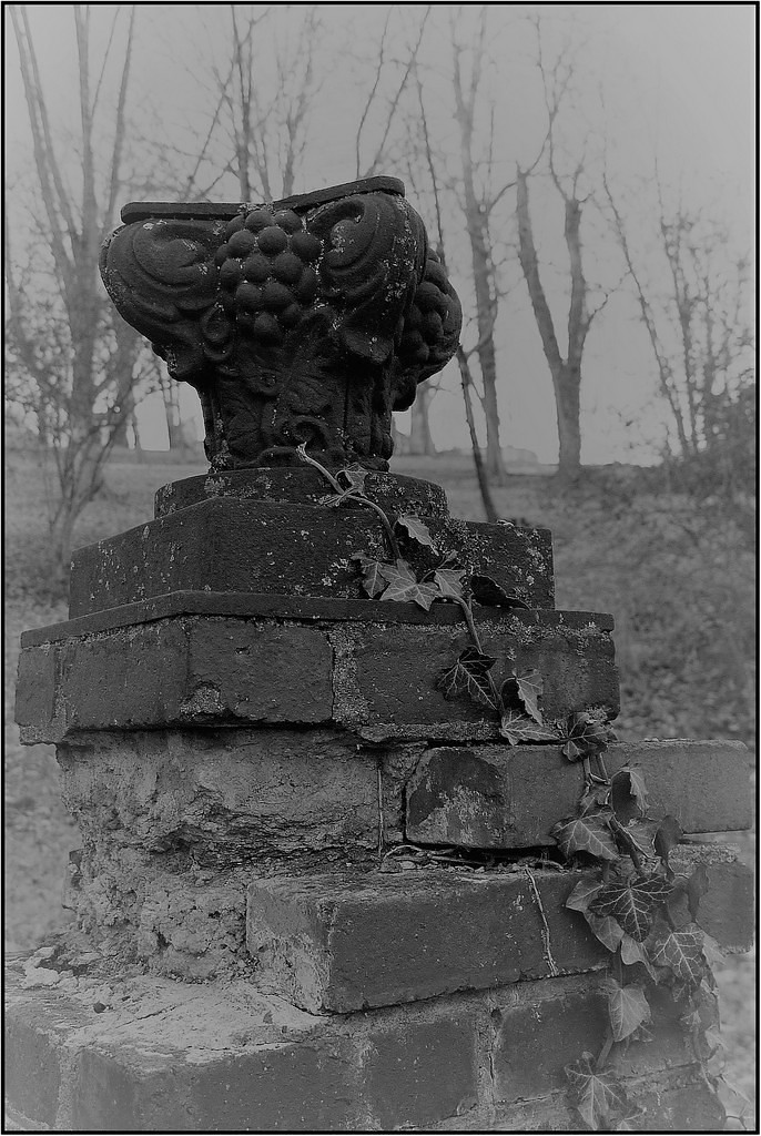
What a super image! It works well in BW. You have nice, crisp contrasts of the black iron against the soft snow. Snow is tricky, but if it's the foreground area Bob is talking about, it doesn't really bother me. My eye moves on. I especially like the angles throughout, and chairs nearest left help lead the eye. Have you thought about trying a night shot? The variety of lights might look really neat. |
Feb 10th |
| 86 |
Feb 22 |
Comment |
My goodness, Bob, to me it looks perfectly natural. One would never dream that it was edited at all. You got the catch light and fantastic details in the feathers. I love it and believe you were fortunate to be as close as you were without it flapping away. It's turning makes one wonder which way it's going to go. Impressive shot! |
Feb 10th |
5 comments - 2 replies for Group 86
|
5 comments - 2 replies Total
|