|
| Group |
Round |
C/R |
Comment |
Date |
Image |
| 26 |
Oct 21 |
Comment |
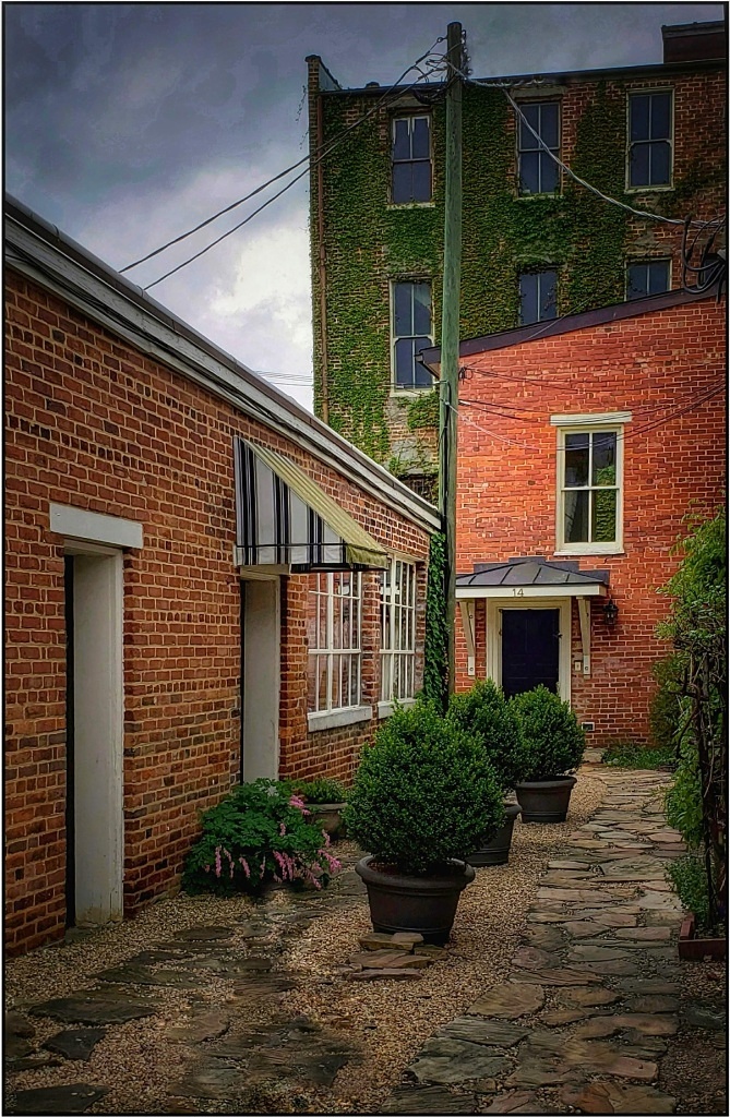
It's a wonderful image of these unusual birds. I like that brightening opened up the shadows to draw out details in the feathers. I don't see any improvements needed. If you want, you might give a little more space at the top and darken the background all around. But as it is, it's very nice.
On an aside, the old saying "hen-pecked" came to mind when you identified the female. It made me smile looking at the bill 'pecking' and the male looking a bit annoyed. |
Oct 13th |
| 26 |
Oct 21 |
Comment |
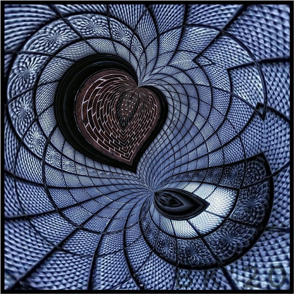
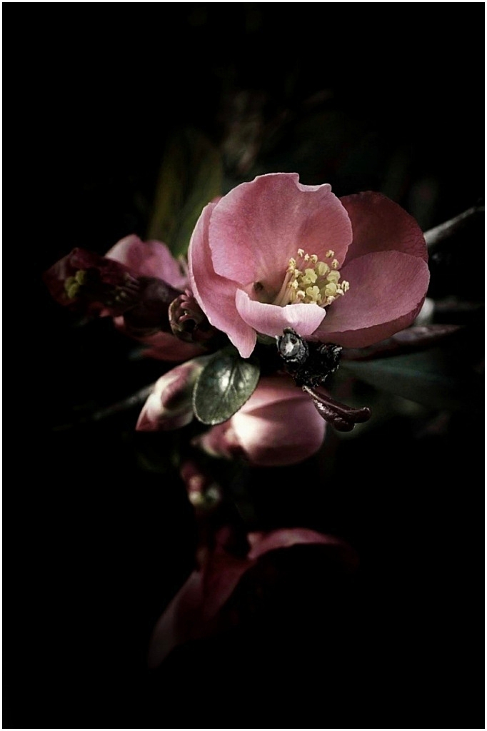
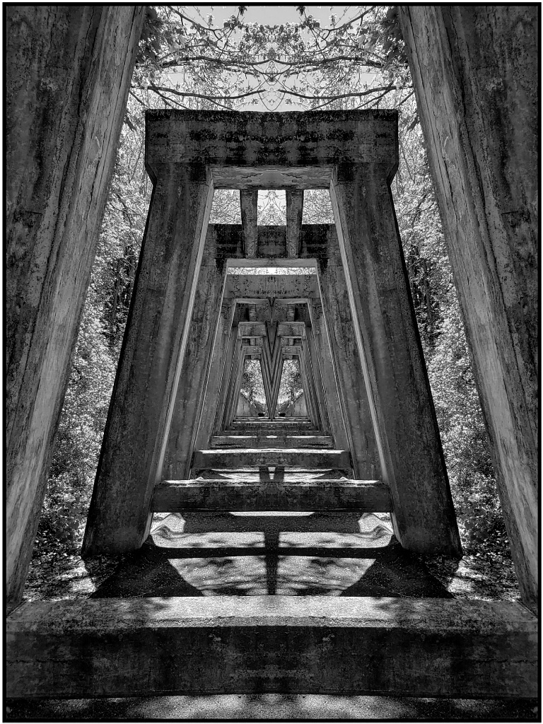
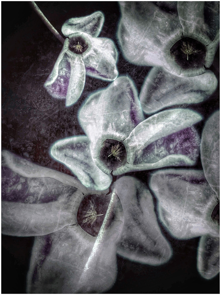
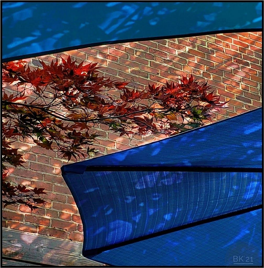
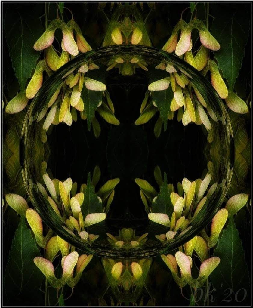
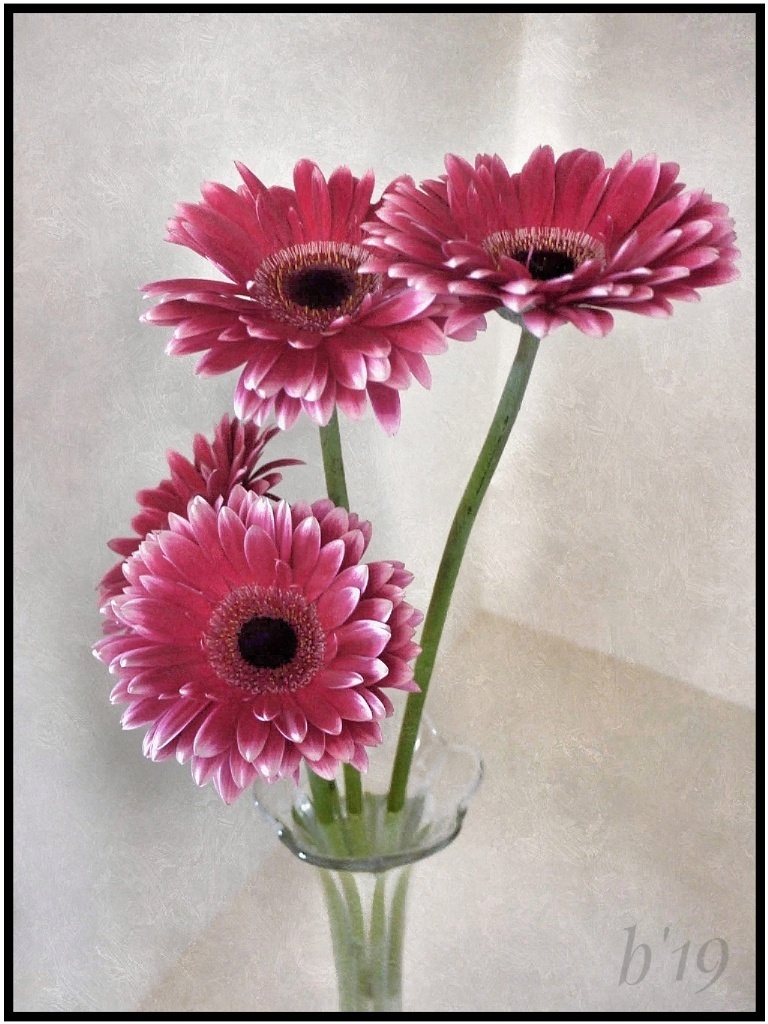
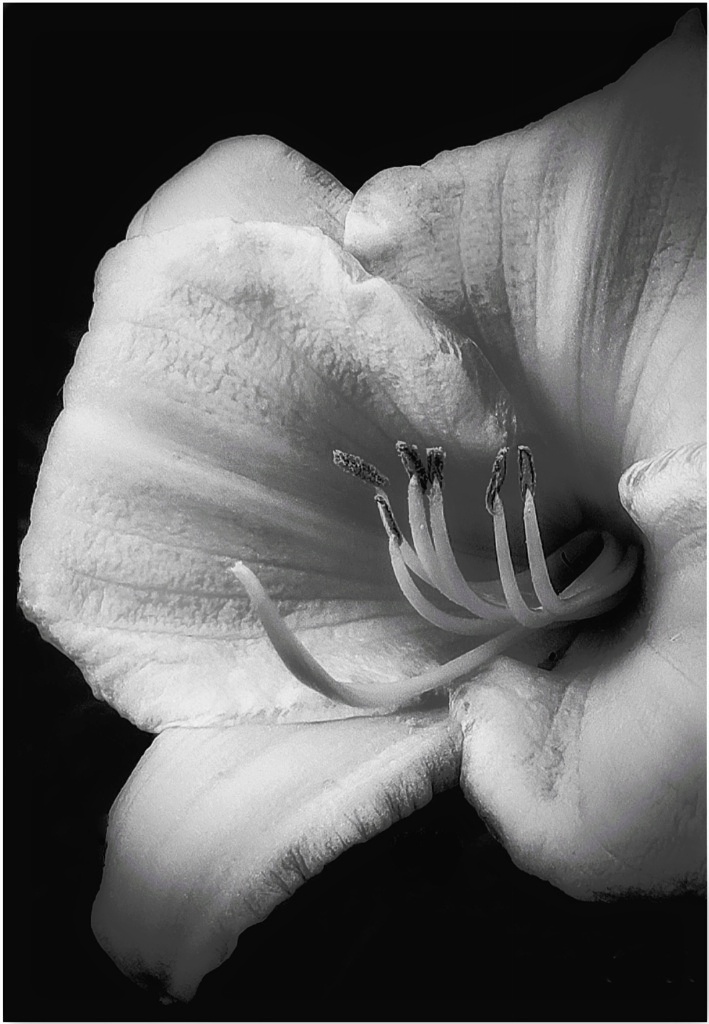
I love it! You might not be a fan of the post-processing (I am, of course) but your edits are great and really highlight the details and textures. The lighting is special, too. I would not change anything unless you crop to fill the frame which would also be nice. |
Oct 13th |
| 26 |
Oct 21 |
Comment |
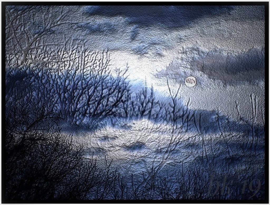
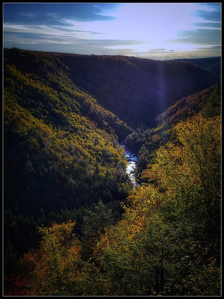
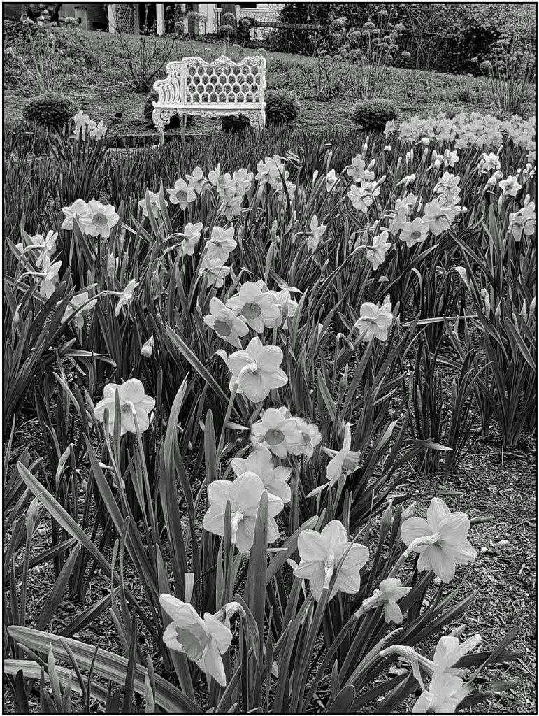
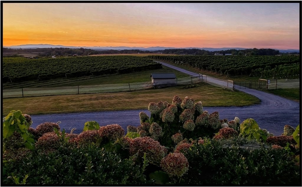
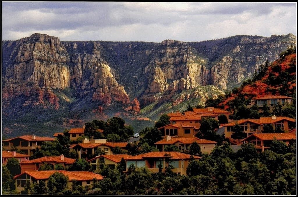
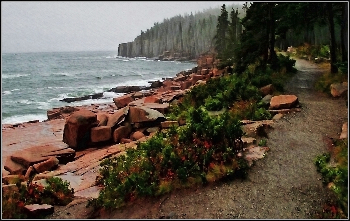
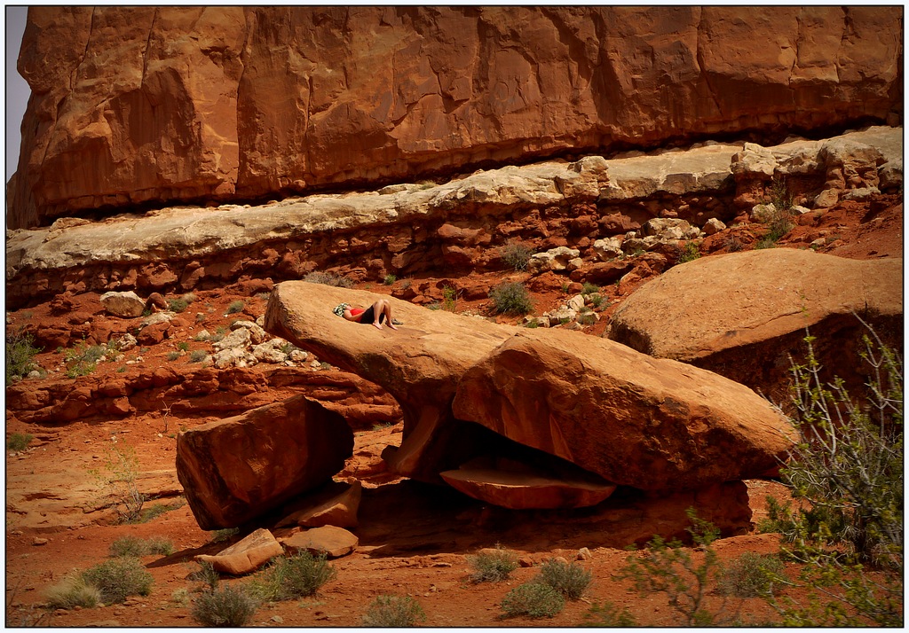
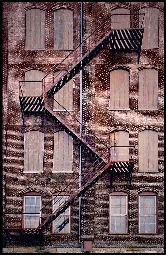
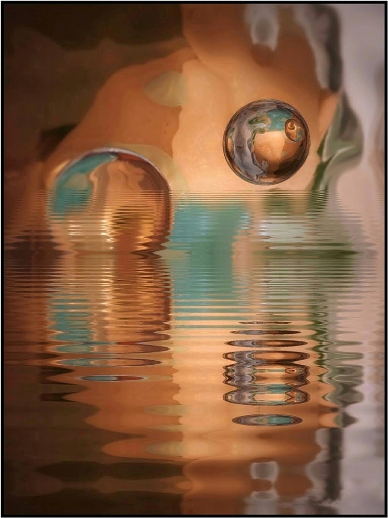
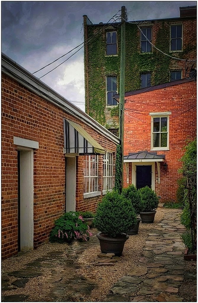
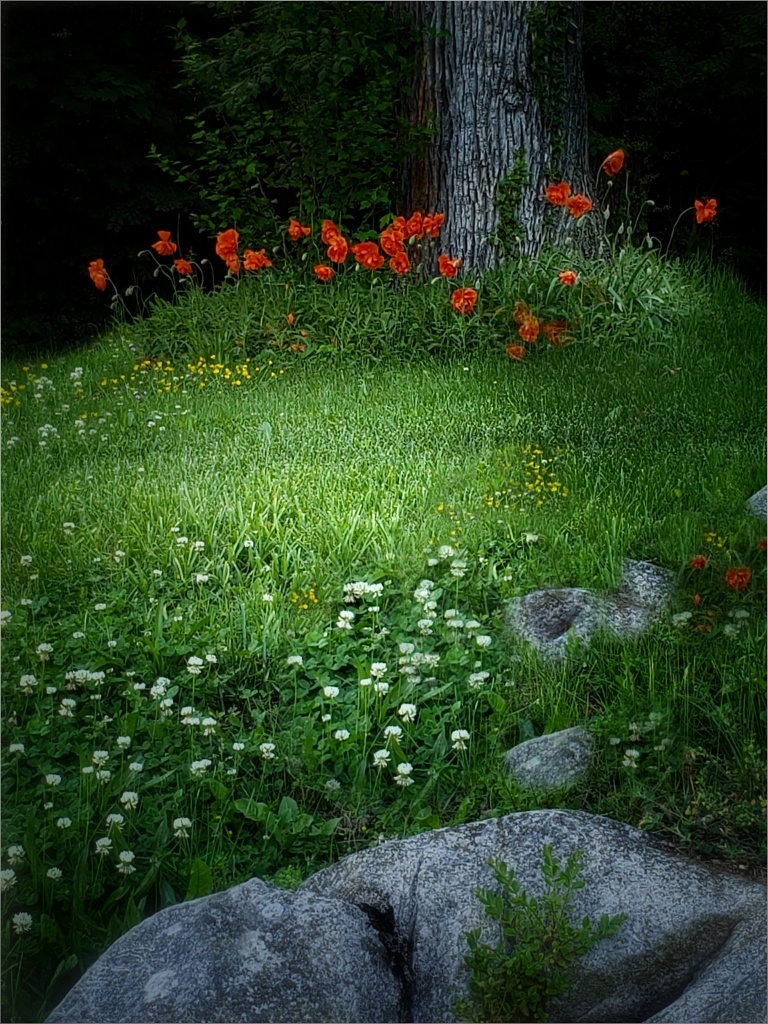
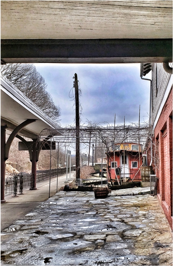
I do not see how any changes can be made. It's a lovely scene. Fantastic sky and sun! The only tiny thing that might be done is remove whatever that is half-way up on the left-- a lighter, vertical structure (?) near what looks like water. Beautiful image! |
Oct 10th |
| 26 |
Oct 21 |
Comment |
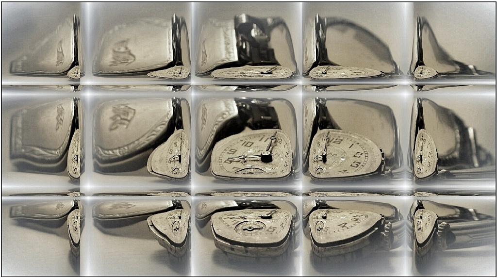
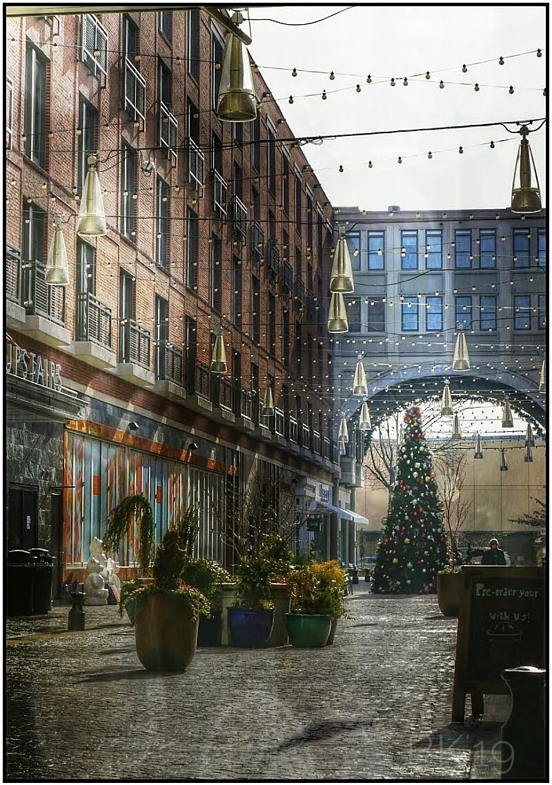
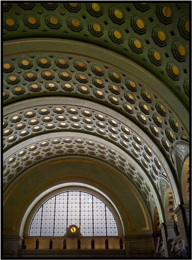
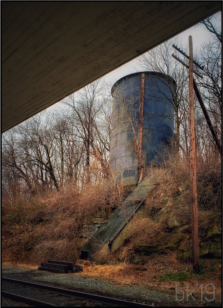
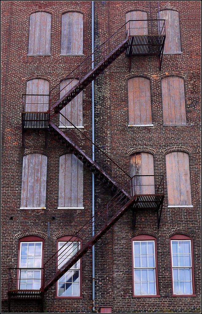
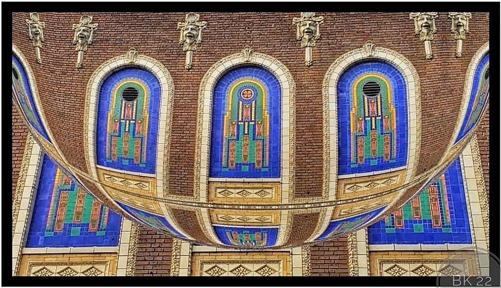
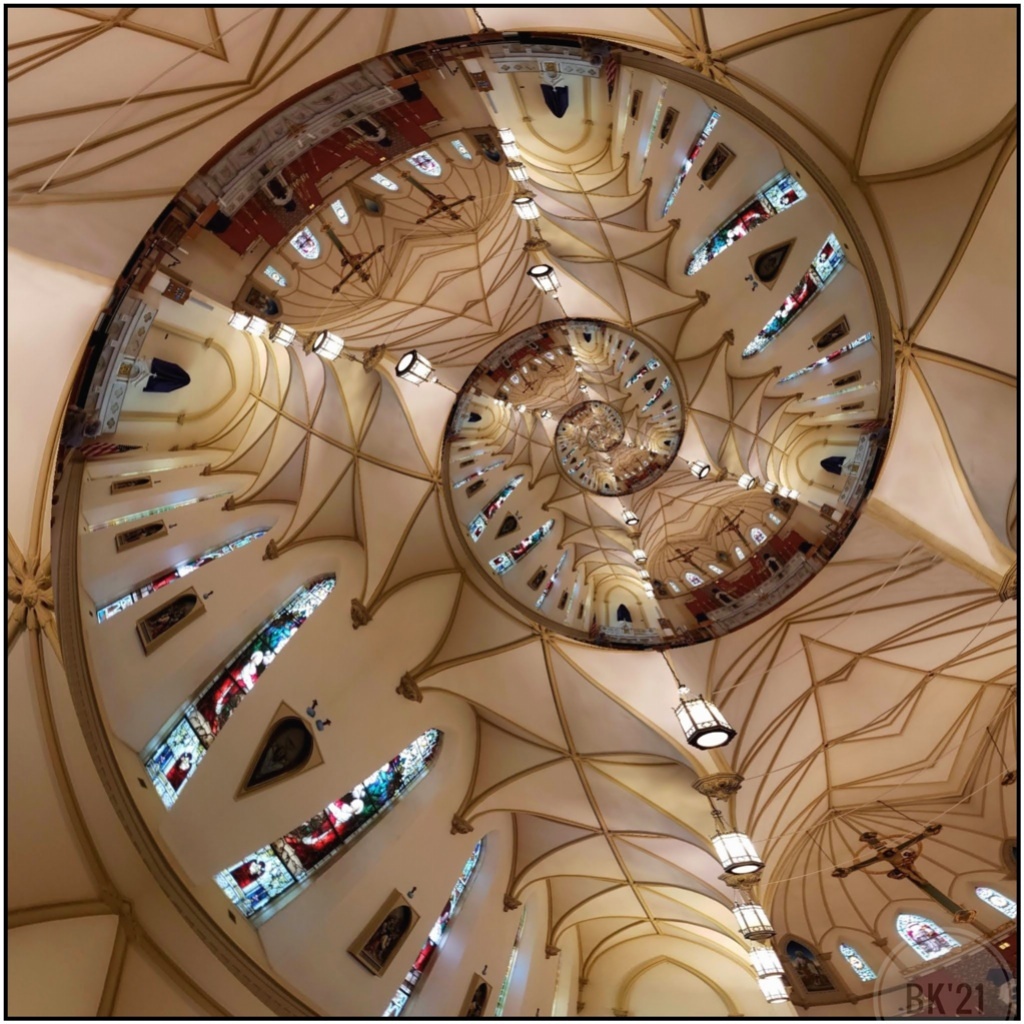
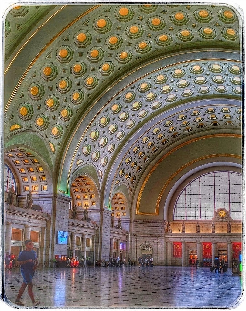
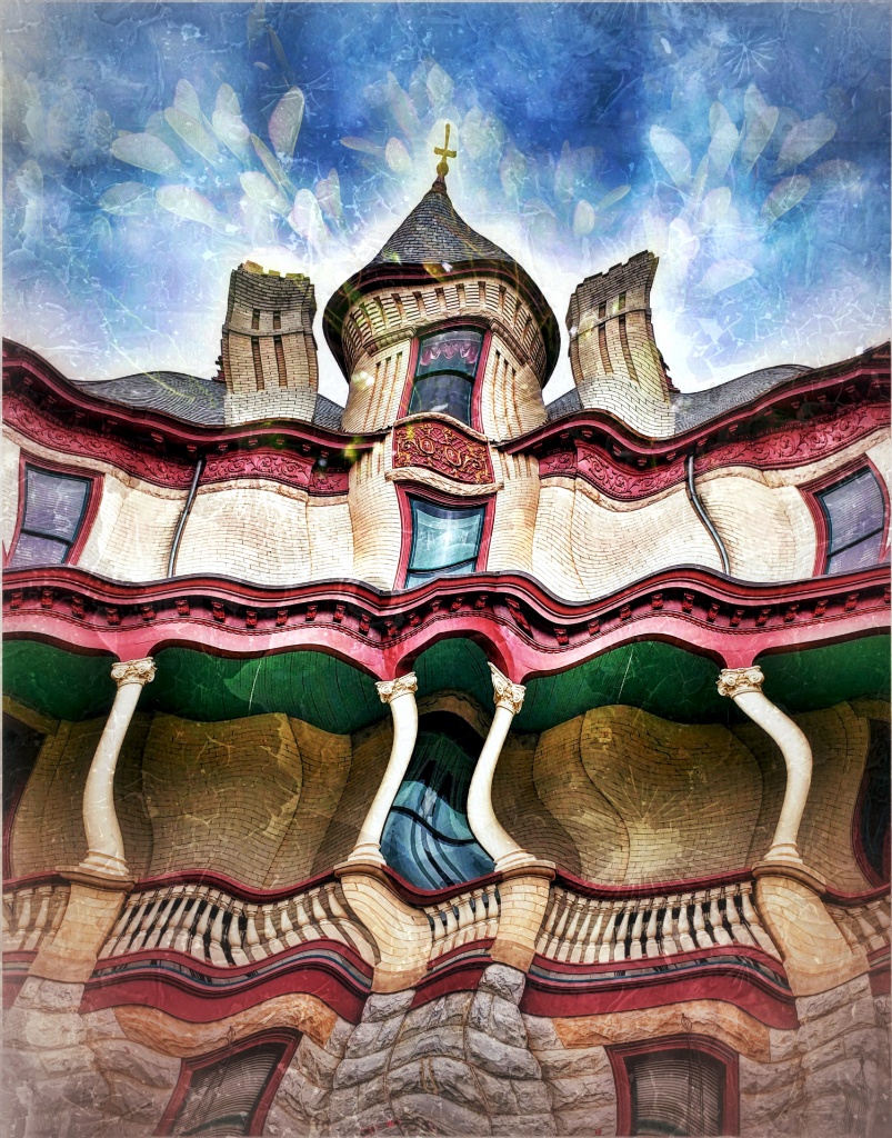
Tony, it is a fabulous shot. I like both images very much. There is nothing I would change but very tiny things in the color version: try removing the small lamps in the curved light, and the shadow of a window (?) In the upper right corner. All nitpicks, but they do not seem to stand out in the BW the same way as in the color. The person at the bottom is very neat! |
Oct 10th |
| 26 |
Oct 21 |
Comment |
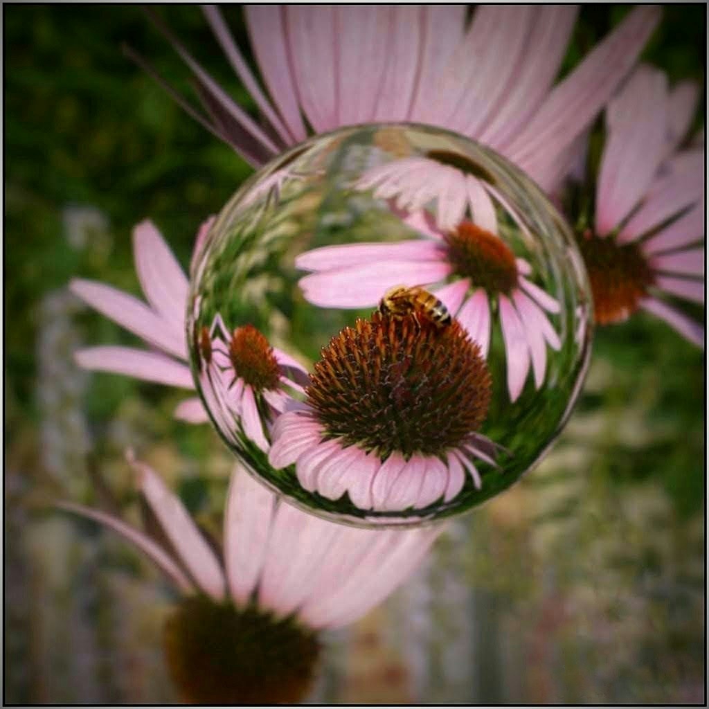
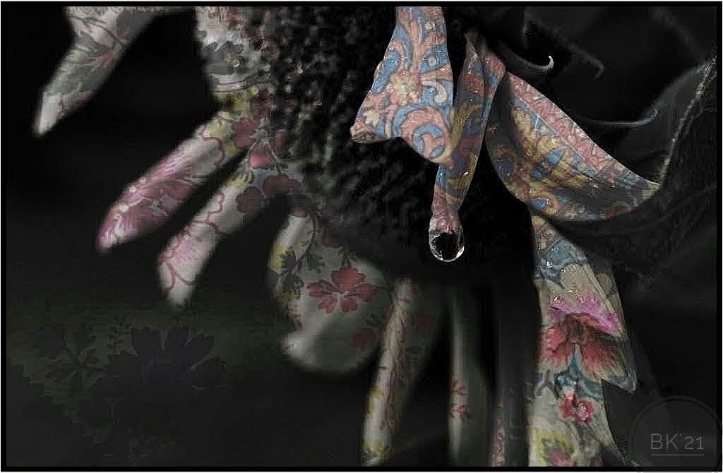
I just sent you email, but then realized you are probably busy with PSA events.
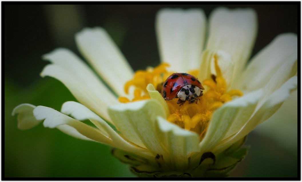
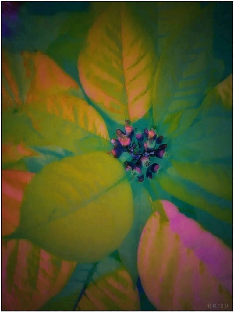
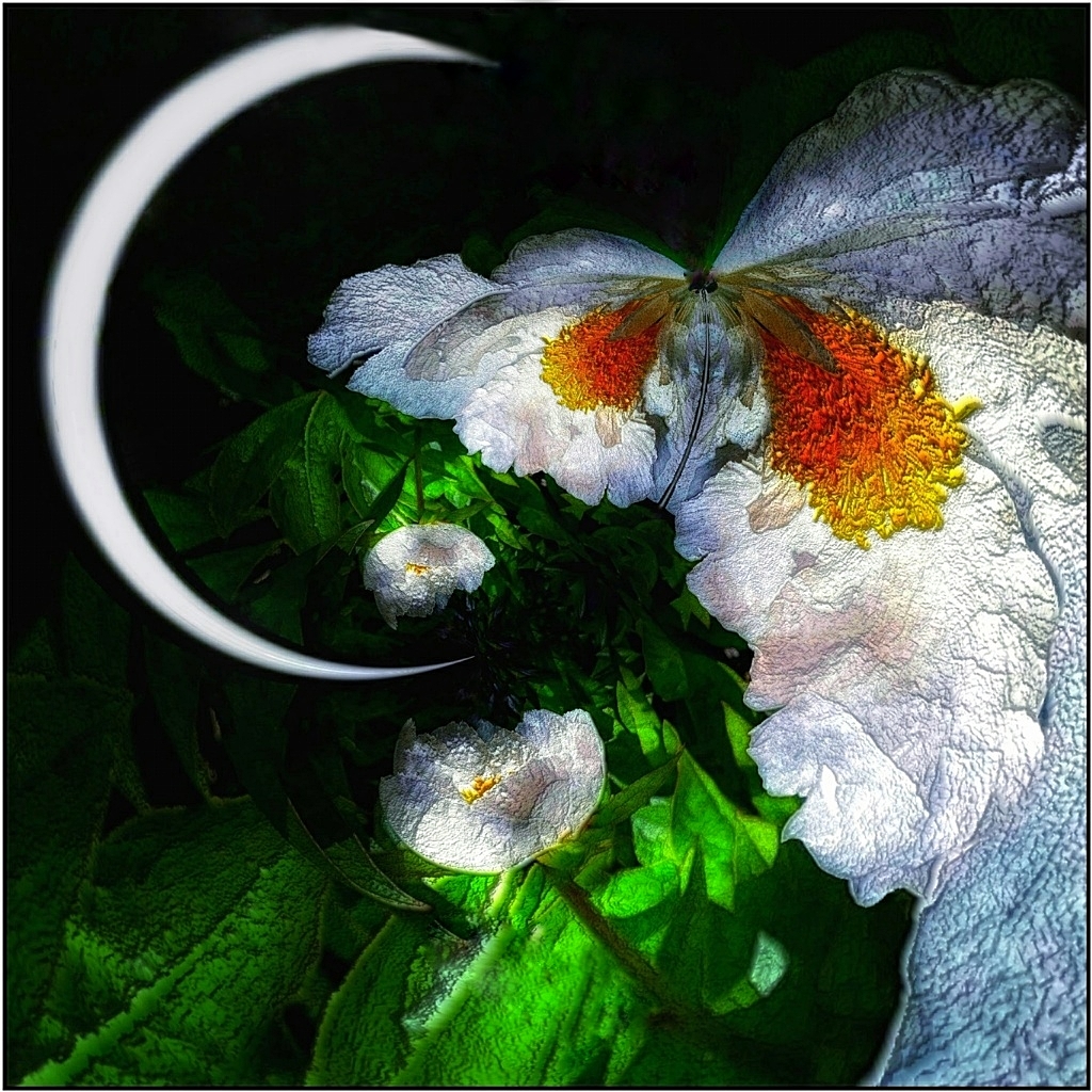
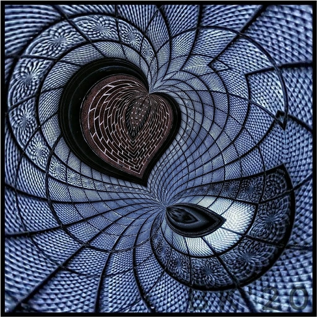
The edits you made to the butterfly are very nice and expose even more detail in the wings. I'm not sure I would have changed the flower colors because now they are very similar to the butterfly. I personally like the contrast in colors. I wonder if reducing the highlights or a selective tool would work to reduce the brightness of the yellows and prevent competing elements. It's a beautiful butterfly and I agree with Tony to extend the left for more space. We are in the Monarch's south migration flyway amd I've watched them daily travel in line over the house. Too high for any decent shots, but still phenomenal. |
Oct 10th |
5 comments - 0 replies for Group 26
|
| 86 |
Oct 21 |
Reply |
That's funny, Pat! I had the strangest feeling I posted this previously, and I checked ahead of posting it but couldn't find it. I guess I just didn't go back far enough! |
Oct 23rd |
| 86 |
Oct 21 |
Reply |
Thank you Ruth! Happy Boooo to you! |
Oct 18th |
| 86 |
Oct 21 |
Reply |
Thanks, Gene! I don't have a process, but I think my curiosity gets carried away! |
Oct 18th |
| 86 |
Oct 21 |
Reply |
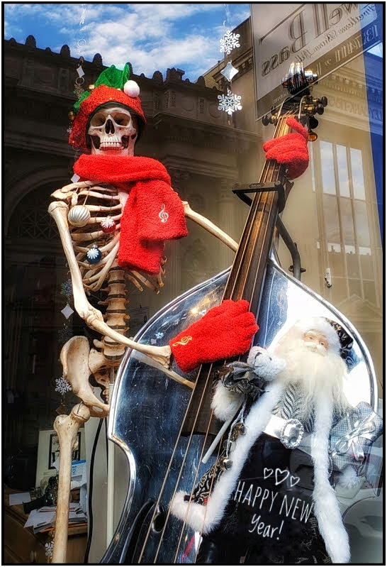
Thank you, Kieu-Hahn! About the 2nd image used over the building, it was not the skeleton face that showed through. It was the lighter ghost and sticks in the upper left that formed light rays and 'screaming' face. Strangely, that is a hand of the lighter ghost that turned into the face in the final. With the opacity of the 2nd image reduced substantially the blue skeleton became invisible -- a good thing. |
Oct 18th |
| 86 |
Oct 21 |
Comment |
This is alot of fun. Strangely, I was going to submit a similar image (no horses) but remembered it wasn't a phone image! I like the creative racing merry-go-round, especially the 3D effect around the middle. I would only reduce the reflections from windows that go across the horses. The editing programs and choices are great fun, and as in your image offer many different and neat things to observe. |
Oct 18th |
| 86 |
Oct 21 |
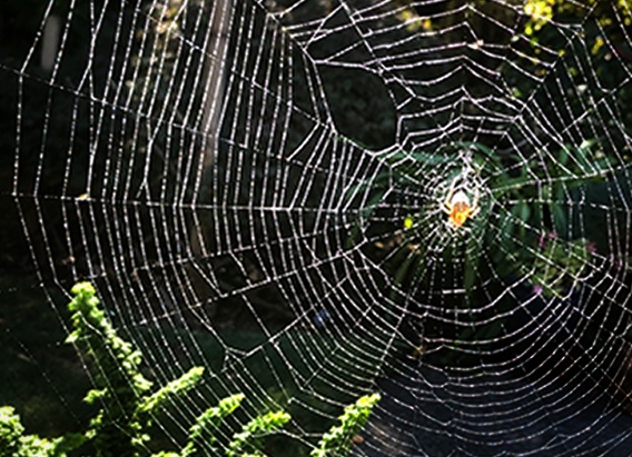
Comment |
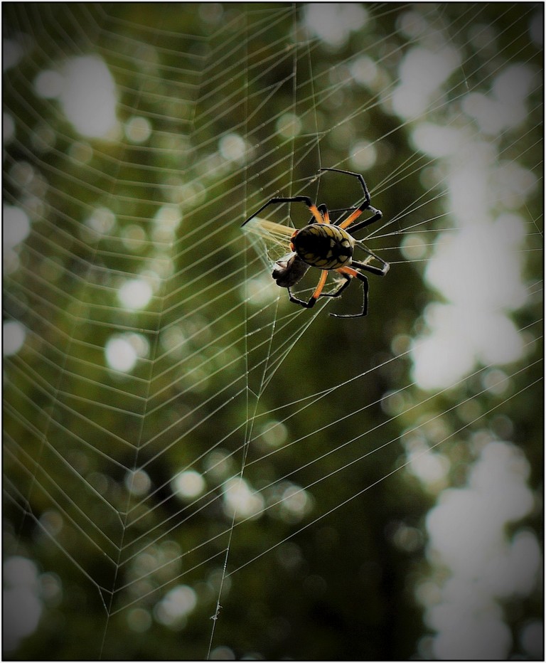
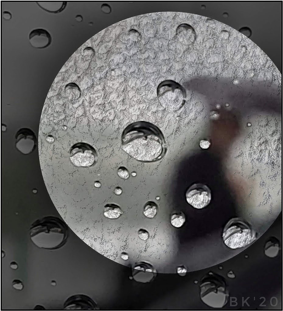
Gene, I should place your web over my house! What a find. I love whole webs with dew, and your spider is smack in the center! As far as resolution, resizing is always a guessing game for me. I wonder if you can crop for a closeup. It might work but you lose alot of the web. One idea is below but it's a drastic change with Snapseed: cropped, added a vignette and used the brush tool on the lower right.
|
Oct 18th |
 |
| 86 |
Oct 21 |
Comment |
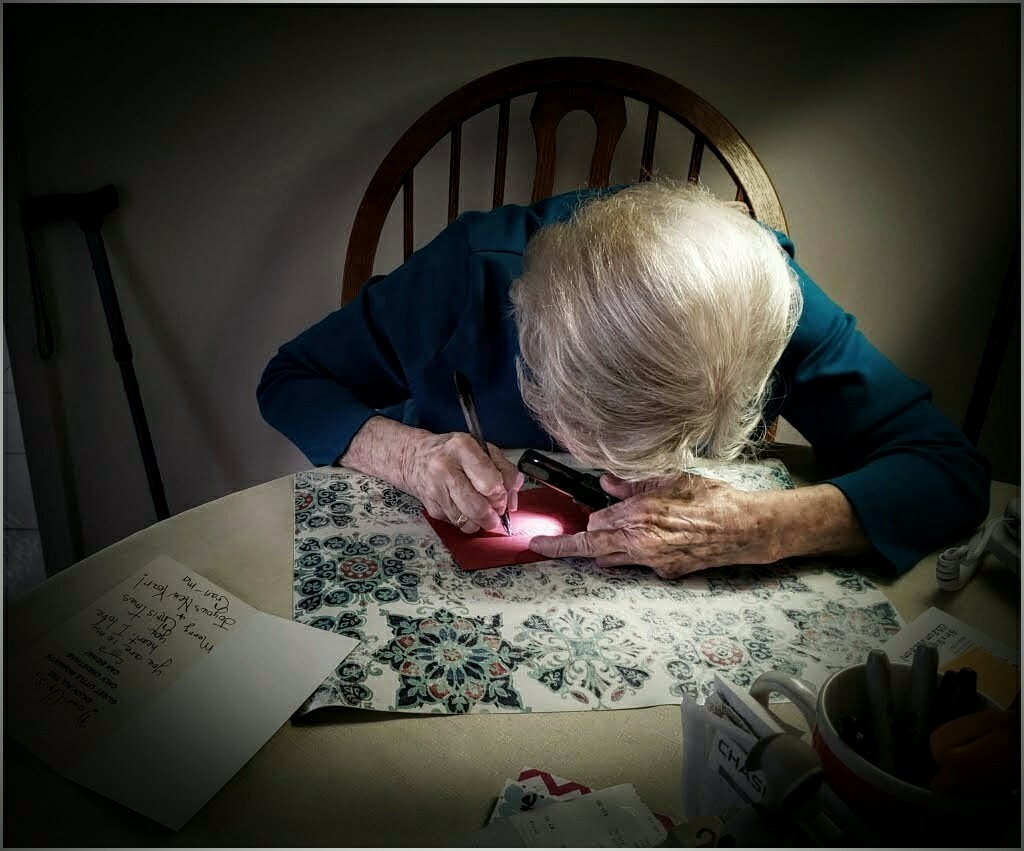
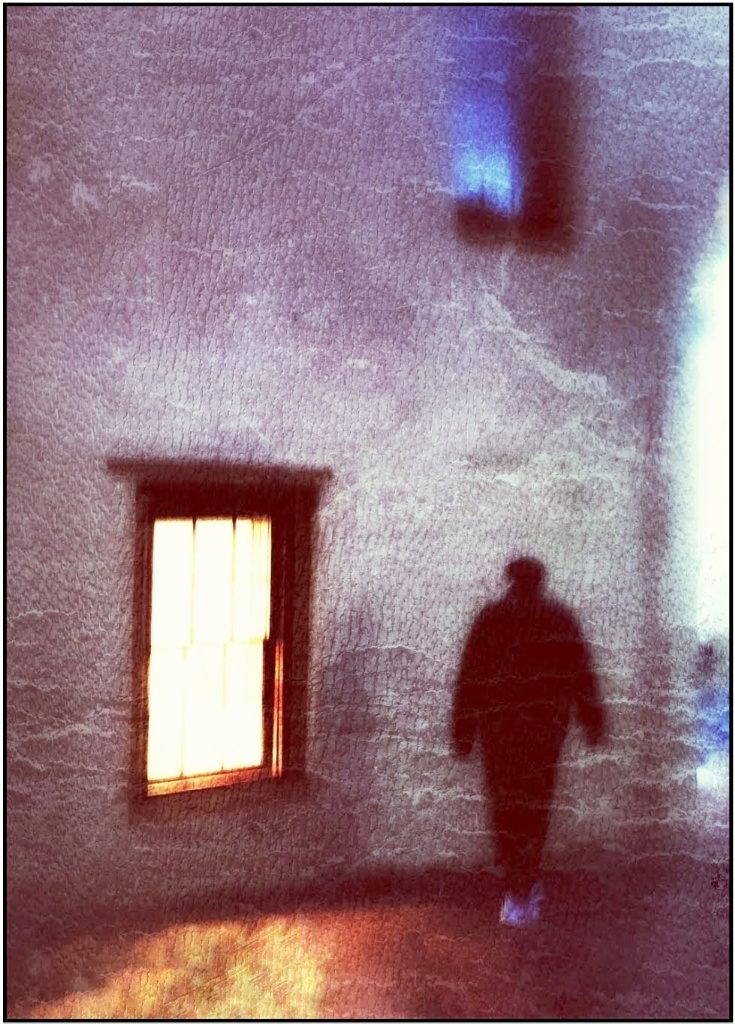
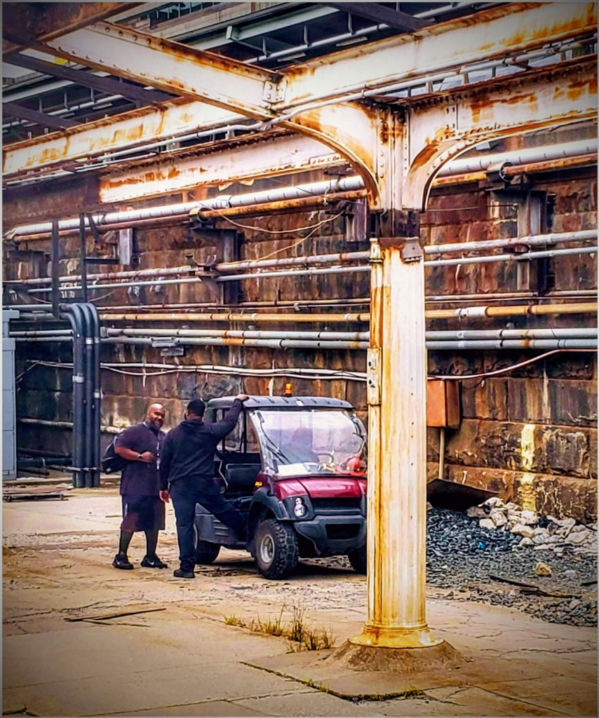
This is such a special image. I love the colors and starkness of the image. I don't think you need to do too much. The story speaks for itself and is endearing. I like how the fellow has made sure he and the guitars are sitting on plastic or paper, too! As far as any changes, you might not need so much wall at the top. It might lend itself to a panorama. Nicely seen and a warm memory forever. |
Oct 10th |
| 86 |
Oct 21 |
Comment |
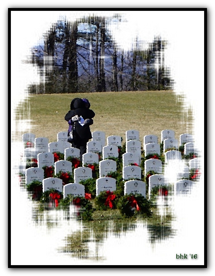
I saw the exhibit advertised. It had to be impressive. Your image certainly is impressive and shares an incredible story. Three miles of flags is so sad. At first I saw the flags as spiked, metal cones of some kind. Then realized it was the shadows cast across the flags. Still, the virus has spikes, and the shadows cause an interesting reminder of that, too. Nice job! |
Oct 10th |
| 86 |
Oct 21 |
Comment |
Your edits really make them look like they are truly wearing spikey coats of armor! I would only try and reduce the highlights in the grass. I'm not sure, but a vignette adjusted might work for that. Nice job! |
Oct 10th |
| 86 |
Oct 21 |
Reply |
Thank you! I've never used PS for anything, believe it or not! In Snapseed, you use the Double Exposure tool and it allows for alot of adjustments. I think it may be the same as your blended modes. They just don't use the same terminology. It's alot of fun! I'm not sure why the image I chose worked. Sure doesn't look like it should! I tried a few. Somehow it did what I needed. |
Oct 10th |
5 comments - 5 replies for Group 86
|
10 comments - 5 replies Total
|