|
| Group |
Round |
C/R |
Comment |
Date |
Image |
| 26 |
Jul 21 |
Comment |
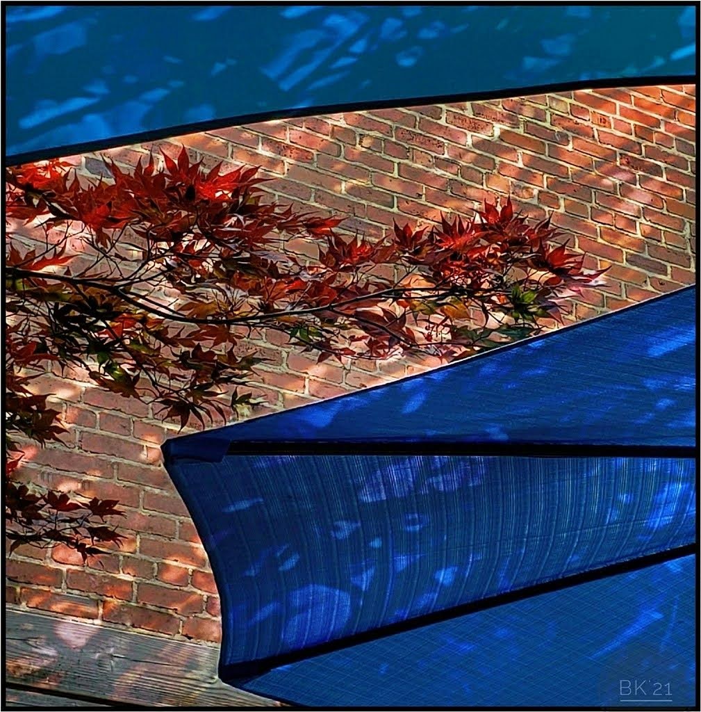
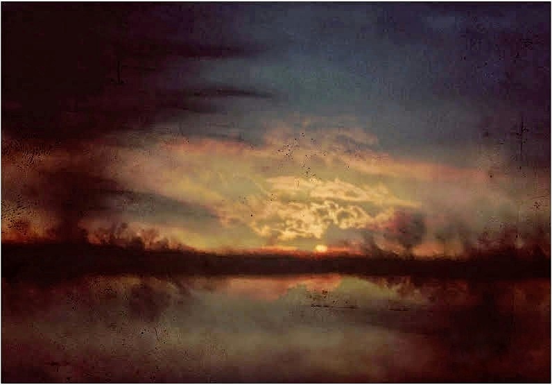
Lovely! I love the textures and overall effect. I agree with Bob that darkening the brick would help, but the overall results are wonderful. |
Jul 11th |
| 26 |
Jul 21 |
Comment |
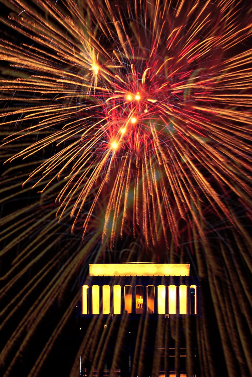
The fireworks at the Capitol are always spectacular! The coloring is very interesting, especially reflected up through the image. I'd prefer more of the fireworks reflected in the pool which would mean using a different image of the pool leading up to the monument. I like this as it is, but to punch it up so that it's not so perfect, I would overlay the fireworks, adjust them to encompass the entire image and then reduce the overall opacity. My version is not good, but just a rough idea. |
Jul 11th |
 |
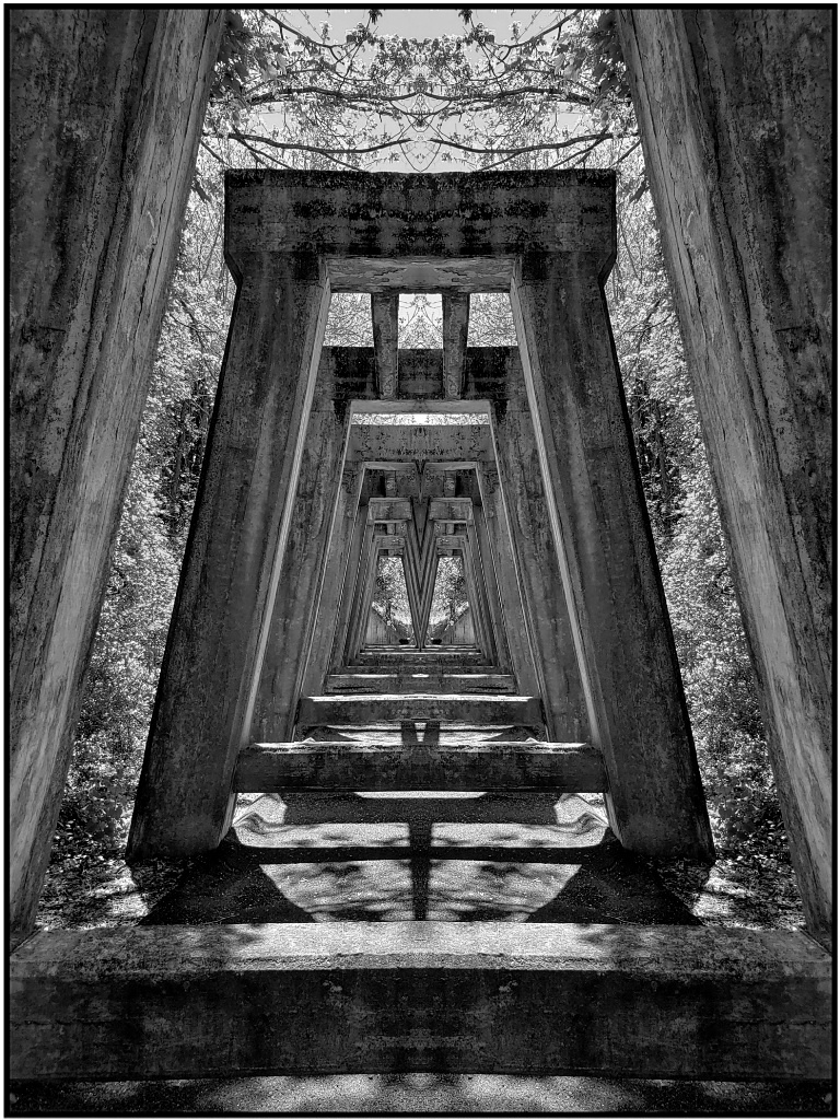
| 26 |
Jul 21 |
Comment |
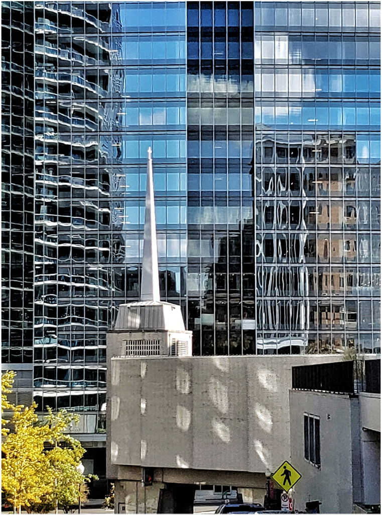
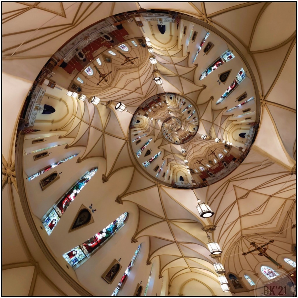
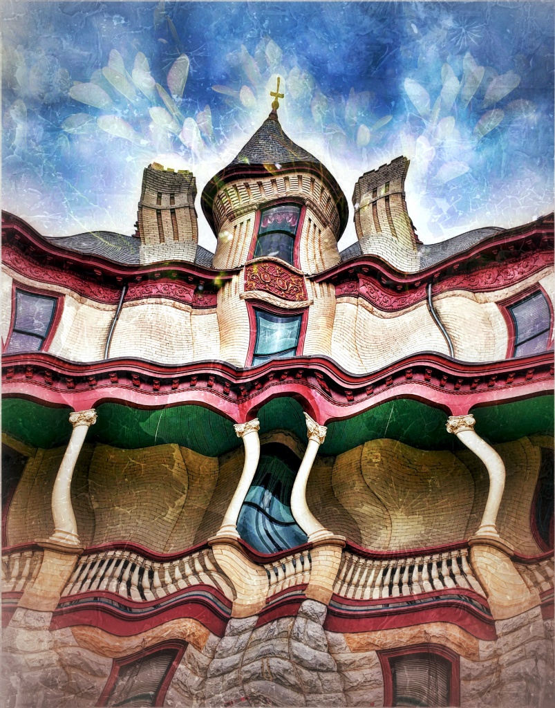
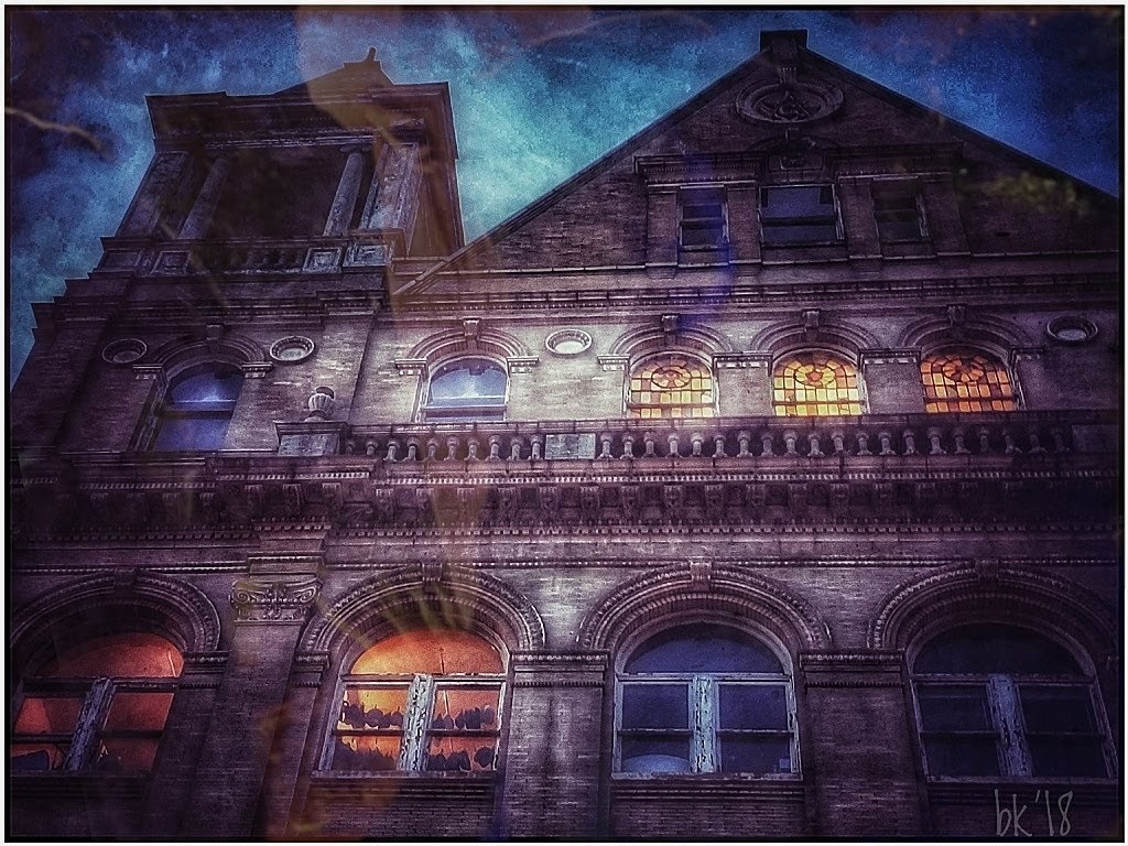
I think the distortion adds great interest to the image and the building becomes its name, Grace. It's great in BW. The piece of building, branch: maybe get creative-- consider cloning and adding even more branch to go across the building at left and into the area across the other building, instead of tediously removing...just an idea. |
Jul 11th |
| 26 |
Jul 21 |
Comment |
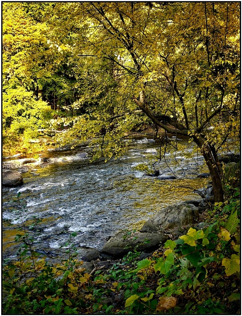
A beautiful version of the falls. Good idea to change the image to BW. I am undecided about leaving the tourists in the scene. They are so tiny I did not notice them immediately so I might remove them; yet, they offer a perspective showing size of the falls. Artist's choice! |
Jul 11th |
| 26 |
Jul 21 |
Comment |
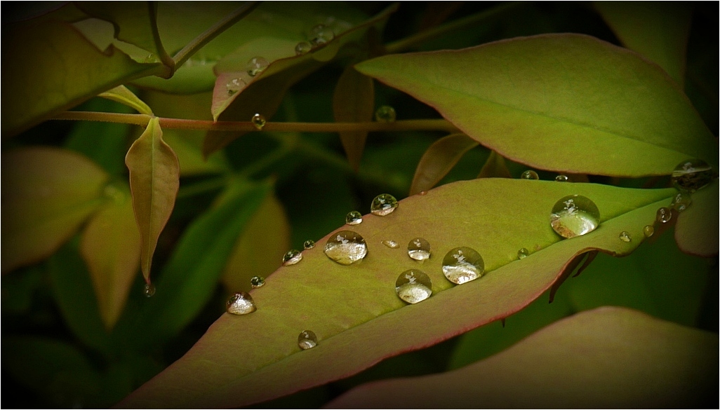
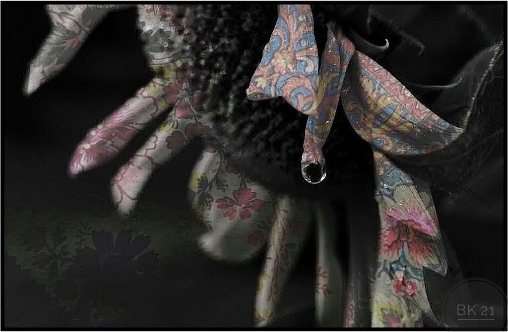
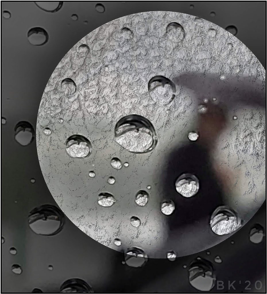
This had to be a fun creation. I love the waterdrops and think you might even add a few more to those below on right. Great lighting and bold, bright colors. No one would guess anything has been cloned. It's very natural but in an electrified way. |
Jul 11th |
| 26 |
Jul 21 |
Reply |
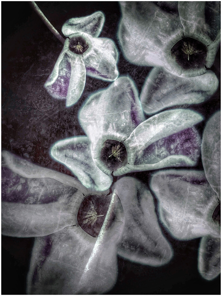
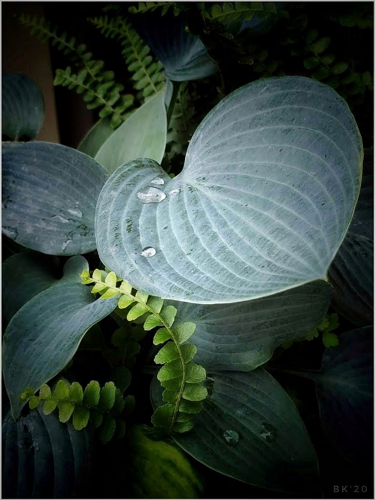
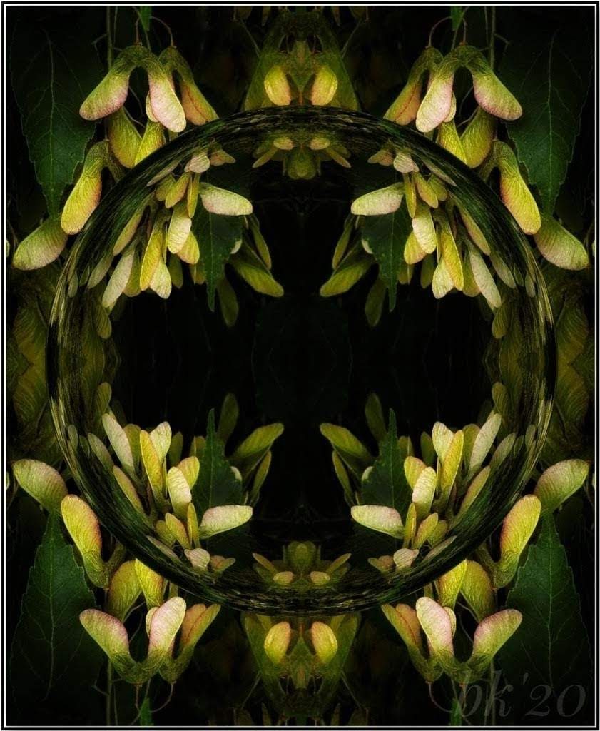
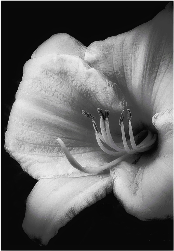
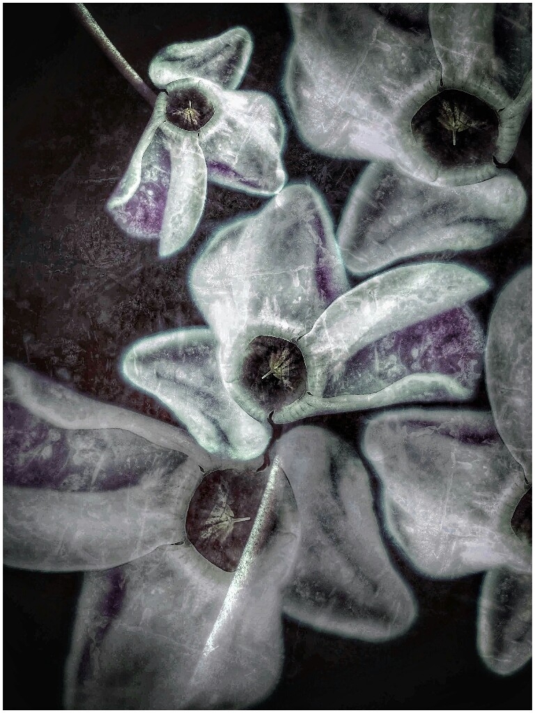
Thank you, I think I lost detail (lines) when I resized. I tried to restore them but couldn't. It was a "blue" hosta, but, still, the colors are too strong. I'm liking the BW more. |
Jul 11th |
| 26 |
Jul 21 |
Reply |
Thanks, I lost details when I resized. I tried to get them back but it didn't work. I'm leaning more toward liking the BW. |
Jul 11th |
| 26 |
Jul 21 |
Reply |
Thank you. I like your version and suggestions. When I resized, I noticed I lost detail (lines) in the bottom leaf and top one to right. Tried to get it back by but couldn't. The color is too blue, but it was a "blue" hosta. I might be able to correct that. I'm never sure of my BW images, but I lean toward liking this one better than the color. |
Jul 11th |
5 comments - 3 replies for Group 26
|
| 86 |
Jul 21 |
Reply |
Gene, I agree with Jack about the approaches used by some who critique phone images. Thank you for your suggestions and analysis. |
Jul 24th |
| 86 |
Jul 21 |
Reply |
Two separate images, Pat. The snail is not in the thumbnail. It was only for reference to explain the blue co!or that showed up in the final. |
Jul 24th |
| 86 |
Jul 21 |
Reply |
Thumbs up on it! I like it. You were in the right place at the right time to get the strange, stormy sky. |
Jul 24th |
| 86 |
Jul 21 |
Reply |
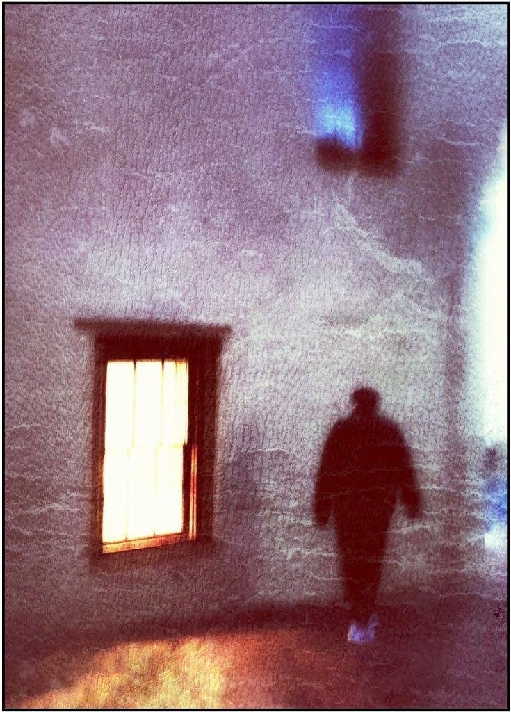
My 2cents...Gene is right to suggest flipping because the eye leads left to right. I often see and photograph things right to left and have to check myself frequently. Sometimes things are fine left alone, and it's always the artist's preference due to their intention. I, personally, see more strength in the image flipped (slightly cropped for less wall and more beautiful window) but then it becomes artsy. If you prefer a record image of a place you enjoy, it's your choice and fine as presented. |
Jul 24th |
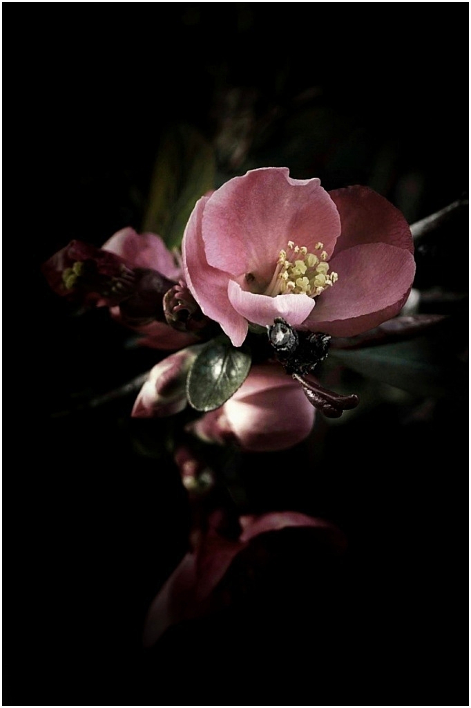
| 86 |
Jul 21 |
Comment |
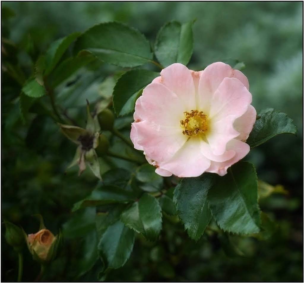
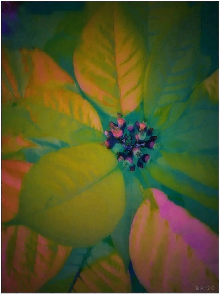
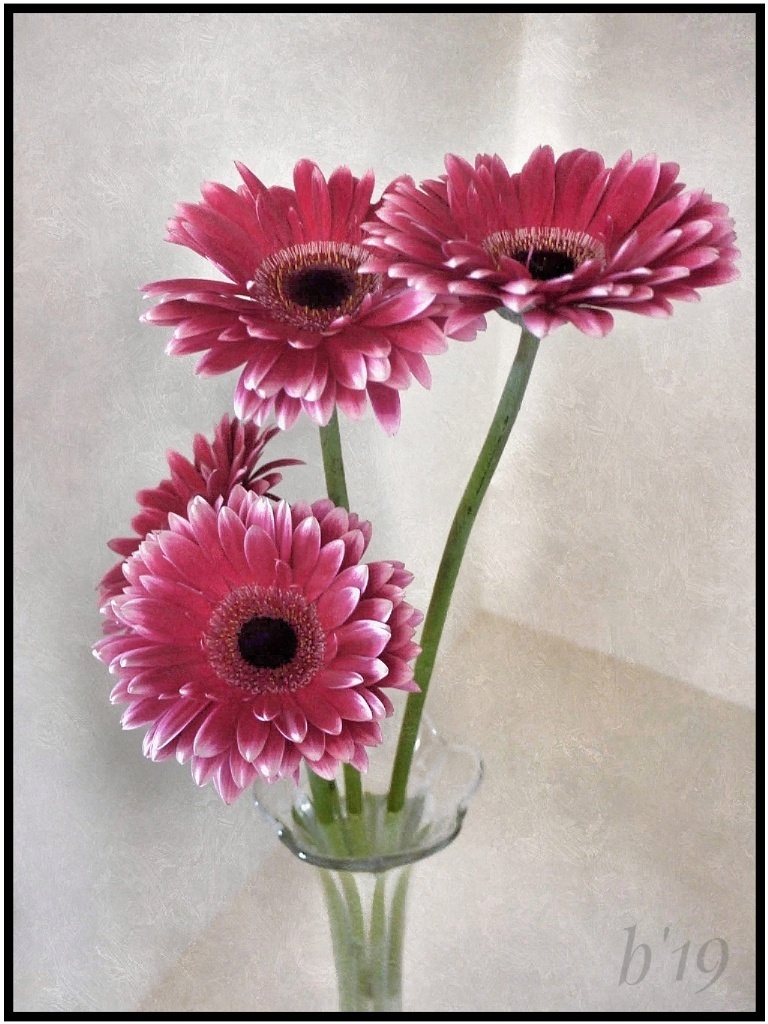
Very pretty! I like all the edits which greatly enhanced the creation. I've found that sometimes it's necessay to use each, or several, of the choices under the selective tool in Snapseed to get good results in reducing highlights. You might also try using the brush tool on the petal. |
Jul 11th |
| 86 |
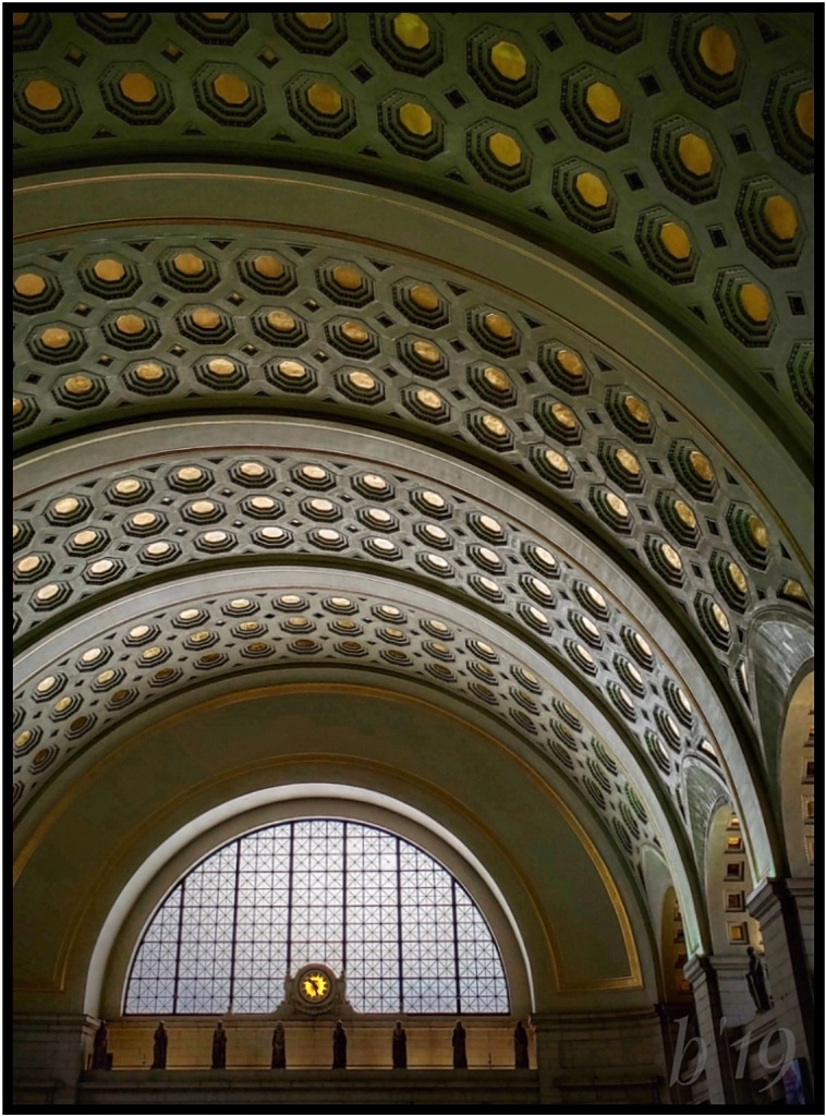
Jul 21 |
Comment |
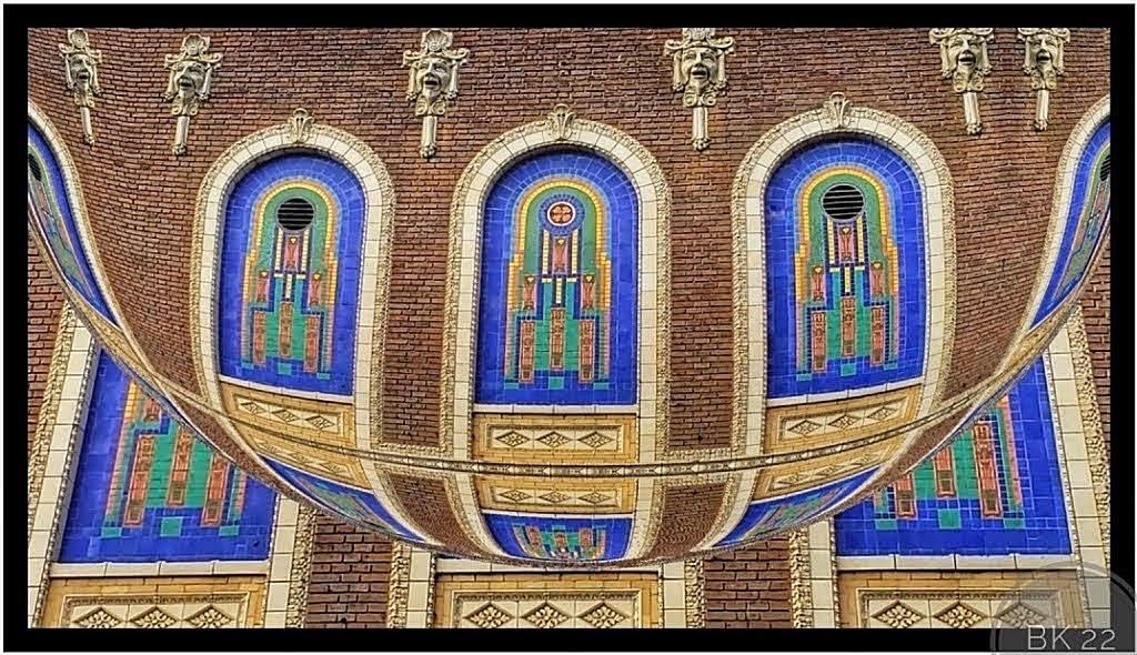
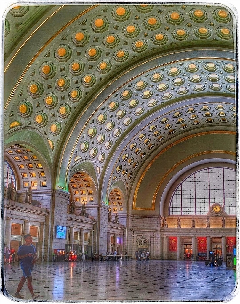
I have not yet been to this lovely museum. The architectural design is very impressive. You captured a beautiful piece of the architecture, and the edits added nice textures and colors without overdoing it. |
Jul 11th |
| 86 |
Jul 21 |
Reply |
Thanks! It didn't obey when I told it to stop moving LOL I have another image of the body perfectly sharp, but then the shell was being pulled so it was not in focus! I gave up... |
Jul 11th |
| 86 |
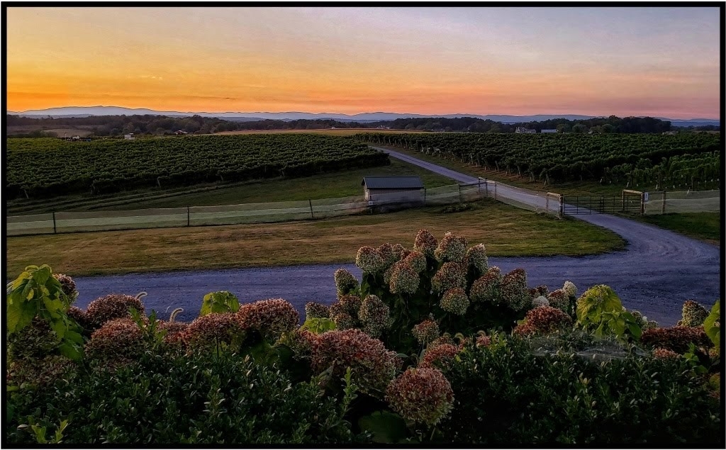
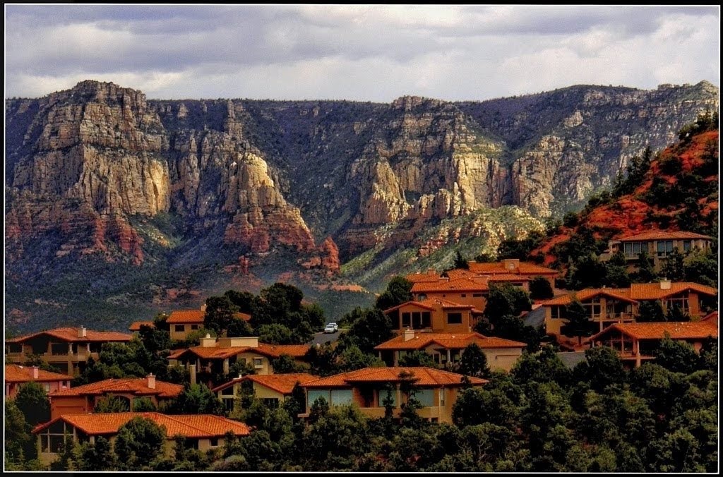
Jul 21 |
Comment |
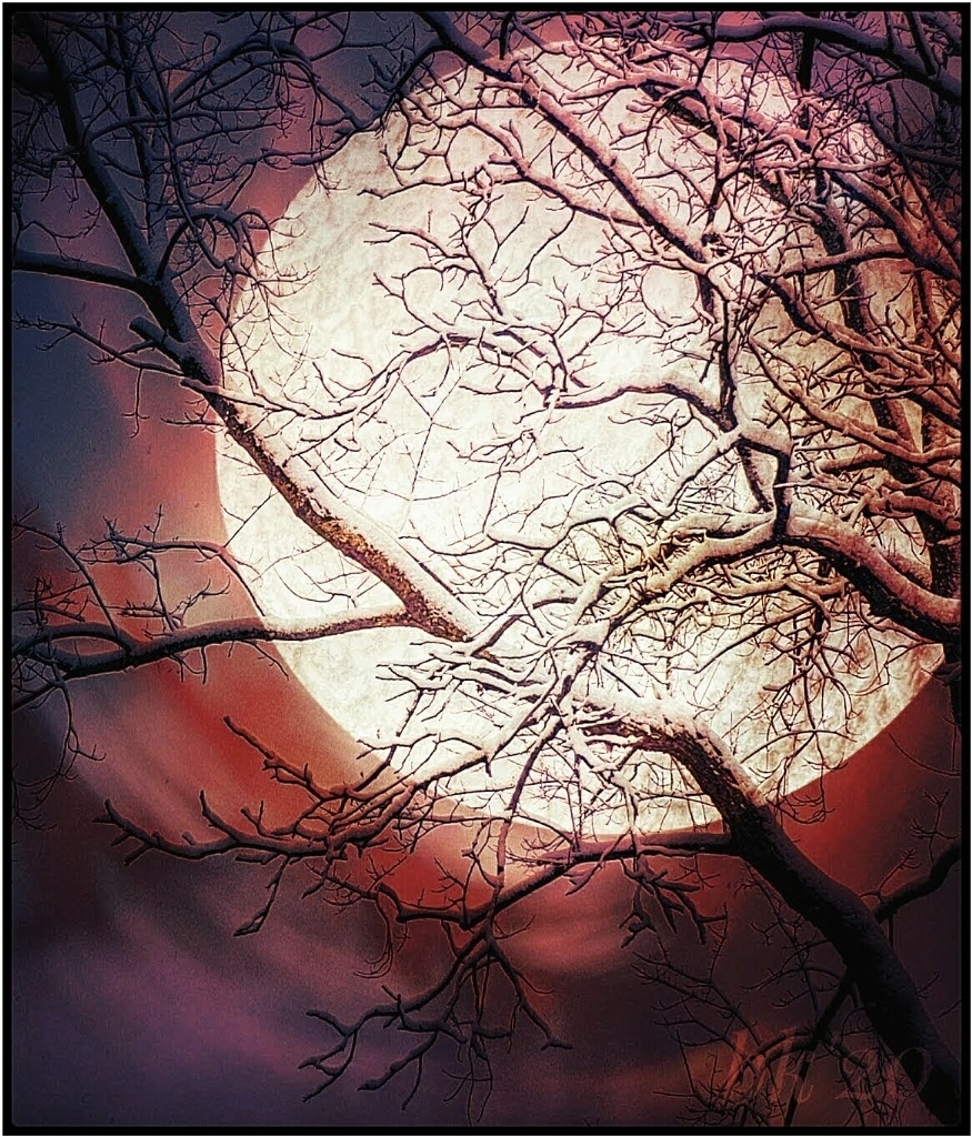
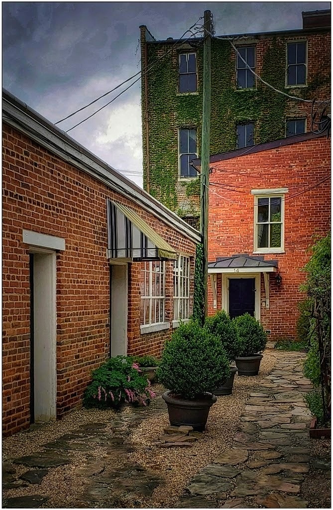
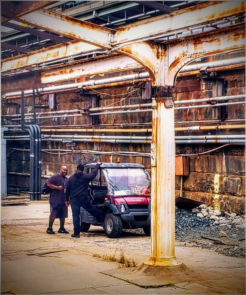
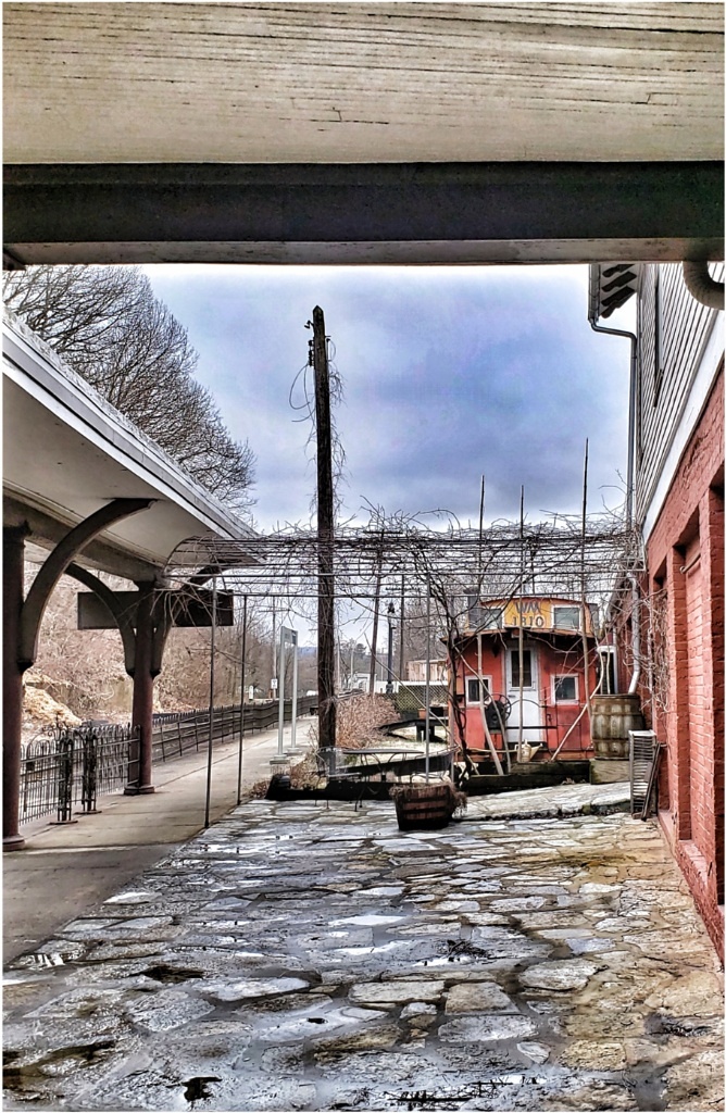
What a beautiful evening scene! less is more idea might apply here. I would crop the left up to near the phone/electric pole, unless there is something in that area that is special to you. I like the soft lighting, and the red rooftops and blues scattered in the distance, but I might punch up those colors just a bit more. Nice memories! |
Jul 11th |
| 86 |
Jul 21 |
Comment |
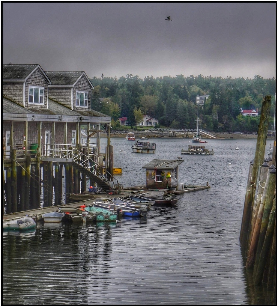
Welcome to the group, Gene! Very impressive image. The ominous sky over the boats catches immediate attention. My suggestion is to crop closer bringing the harbor close. It turns your image into more of a panorama making the forboding sky the focus which, for me, is the strength in your scene. Nicely seen! |
Jul 11th |
4 comments - 5 replies for Group 86
|
9 comments - 8 replies Total
|