|
| Group |
Round |
C/R |
Comment |
Date |
Image |
| 26 |
Apr 21 |
Reply |
I'll try it. Thanks. |
Apr 8th |
| 26 |
Apr 21 |
Reply |
You can just remove the spots. Cloning should work. |
Apr 8th |
| 26 |
Apr 21 |
Reply |
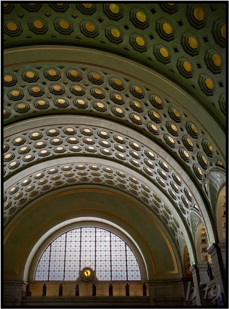
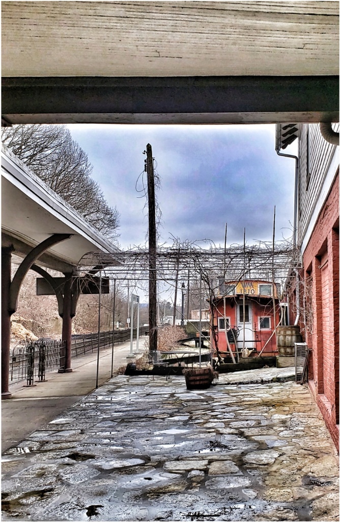
That's all interesting, especially that they rerouted and dug tunnels! No need to go on, but I wonder why they don't take it down if it's such a problem. Glad they haven't so you can have the benefit of photos! |
Apr 8th |
| 26 |
Apr 21 |
Reply |
Thanks, Jose! At what point do you suggest cutting the tree? Where the first set of branches start drooping down? |
Apr 8th |
| 26 |
Apr 21 |
Comment |
Really like the bold, colorful graffiti. I think a closer crop from almost any angle would make interesting images. One side looks like an animal to me. It must look like that to others, too, because they drew an ear on it!
Your title mentions a slide, but I'm not seeing it. If it's the path in the foreground going up the right and under the building, I'd keep more of it in the frame to emphasize it. I'm guessing the name is given by those frequenting the spot and practicing E-biking (?)
These appear along the Atlantic, too, and at a Delaware beach we visit. Ours are rounded towers formerly used in WWII to scout for enemy ships and submarines. |
Apr 7th |
| 26 |
Apr 21 |
Comment |
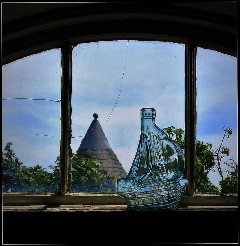
The boat was secondary to the original scene but became serendipitous! It adds extra interest. Placed as it is, I think the boat is a little too far ahead and would be better pulled back slightly as if heading toward the pot of gold. I like the nice blues, and the bolder colors in the rainbow. |
Apr 7th |
| 26 |
Apr 21 |
Comment |
I hadn't seen Bob's crop! I think it's a good suggestion. |
Apr 7th |
| 26 |
Apr 21 |
Comment |
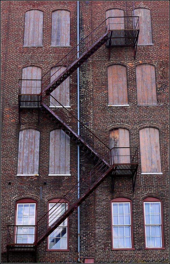
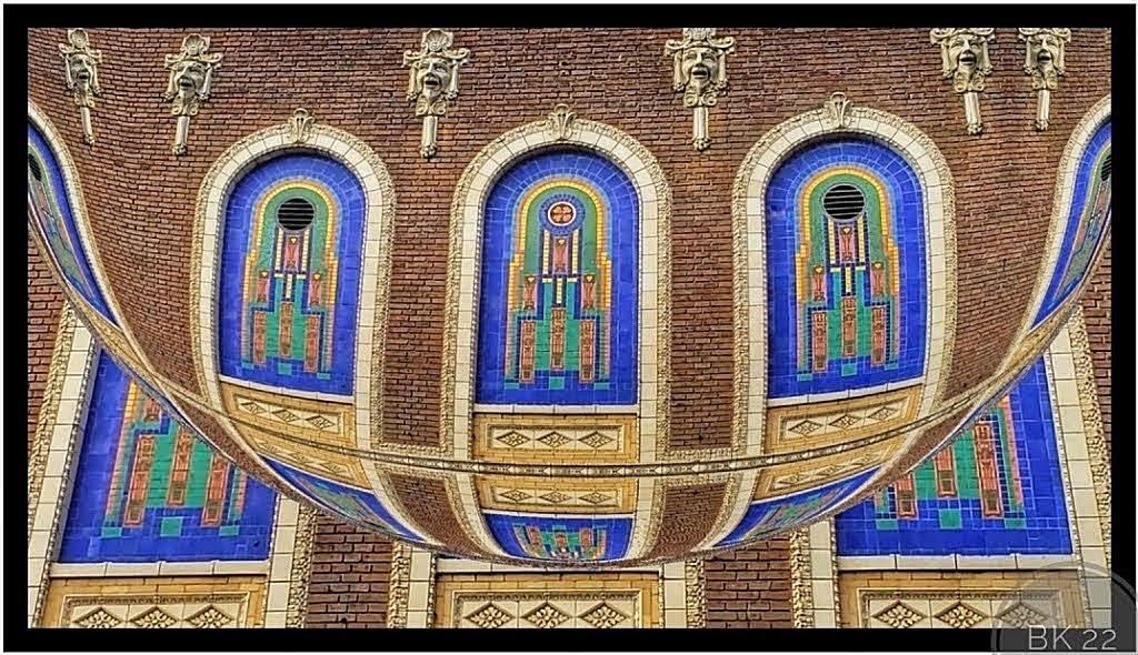
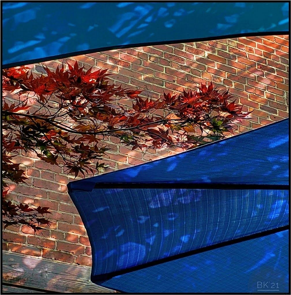
I think a slightly closer crop would work better to focus more on the design. Maybe a little taken from both sides, on the right to the first line in the building, and on left to the shadow. The blues and silver-grays are very nice, but I also wonder about converting to B/W. |
Apr 7th |
| 26 |
Apr 21 |
Comment |
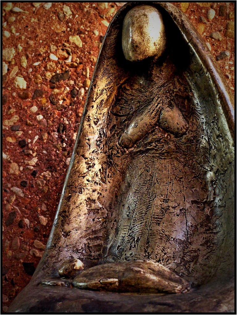
It is very nice to see this presented in B/W. I prefer it to the color. My reason is the face. My eye goes straight to the perfectly captured features in the face and head, but the background in the color image distracts me. I agree the leaf and stick should be removed, and perhaps the small, dark shadow near the top its head. |
Apr 7th |
| 26 |
Apr 21 |
Comment |
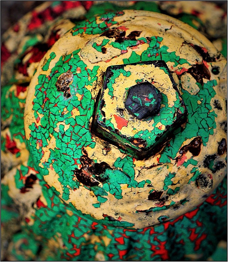
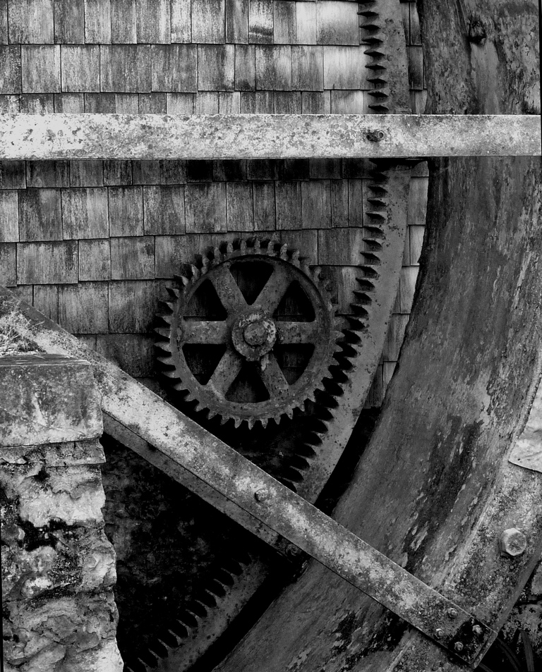
This is great! But, I'm partial to abstracts especially with rust and decay. I first saw long-legged bird shapes in water, then wondered if it was hieroglyphics or graffiti. Looking closely, I realized it was glorious rust! It offers alot to imagine. The colors and textures really pop, especially the peeling bits that actually appear slightly 3D. Wonderful. |
Apr 7th |
| 26 |
Apr 21 |
Reply |
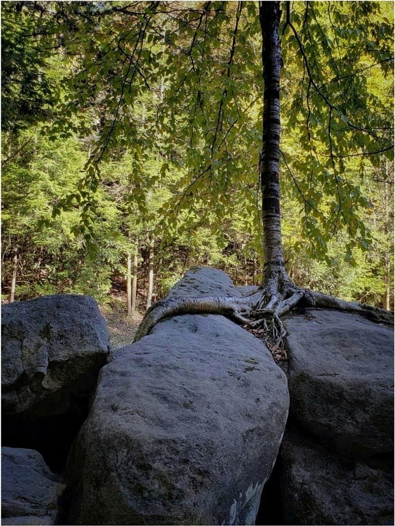
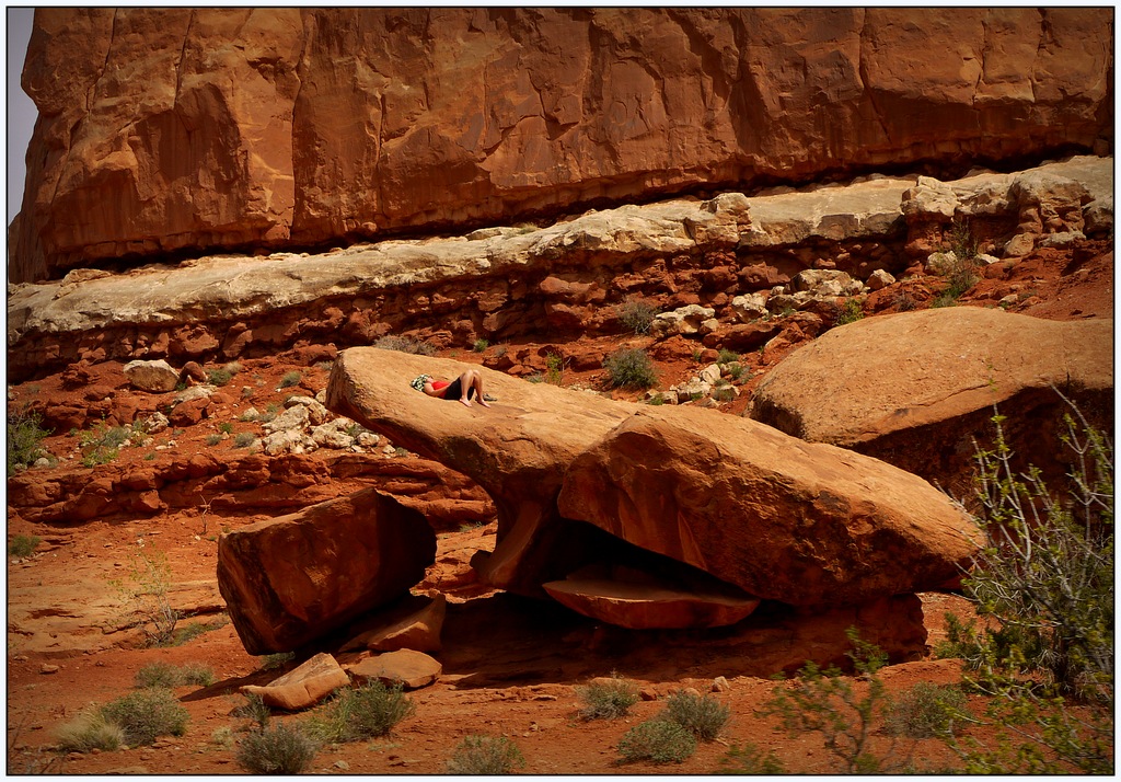
Yes, yes and yes! Thanks, Mervyn. I made the mistake of 2nd guessing and should have cropped close for the roots. |
Apr 7th |
| 26 |
Apr 21 |
Reply |
Thanks, Bob, I like the color adjustments. Let's see if I can do that! As I said to Tony, I 2nd guessed myself. My first preference was a closeup of the roots which originally drew my attention, and leaving the rock really distracts. I'll try various angles and crops, but I think the close crop works.
|
Apr 7th |
| 26 |
Apr 21 |
Reply |
Thank you, Tony. Yes, I was drawn to the roots first. I made the mistake of 2nd guessing and included the rocks. They distract. |
Apr 7th |
| 26 |
Apr 21 |
Reply |
Thanks, Bob. I got maybe 20 quick shots, and "working the scene" is always helpful. |
Apr 7th |
6 comments - 8 replies for Group 26
|
| 86 |
Apr 21 |
Reply |
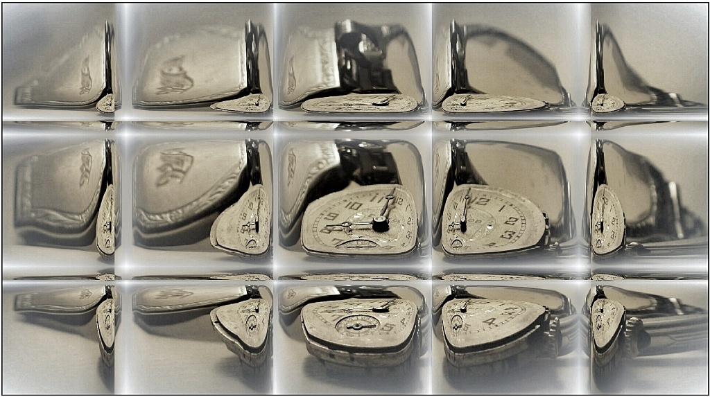
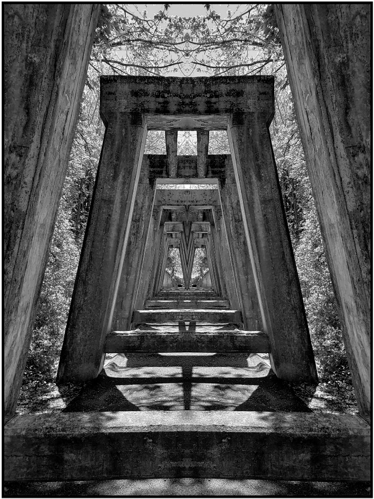
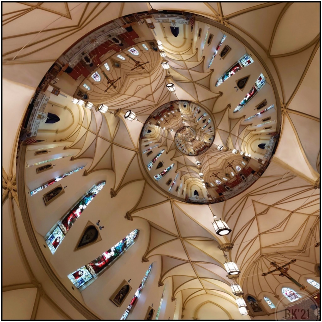
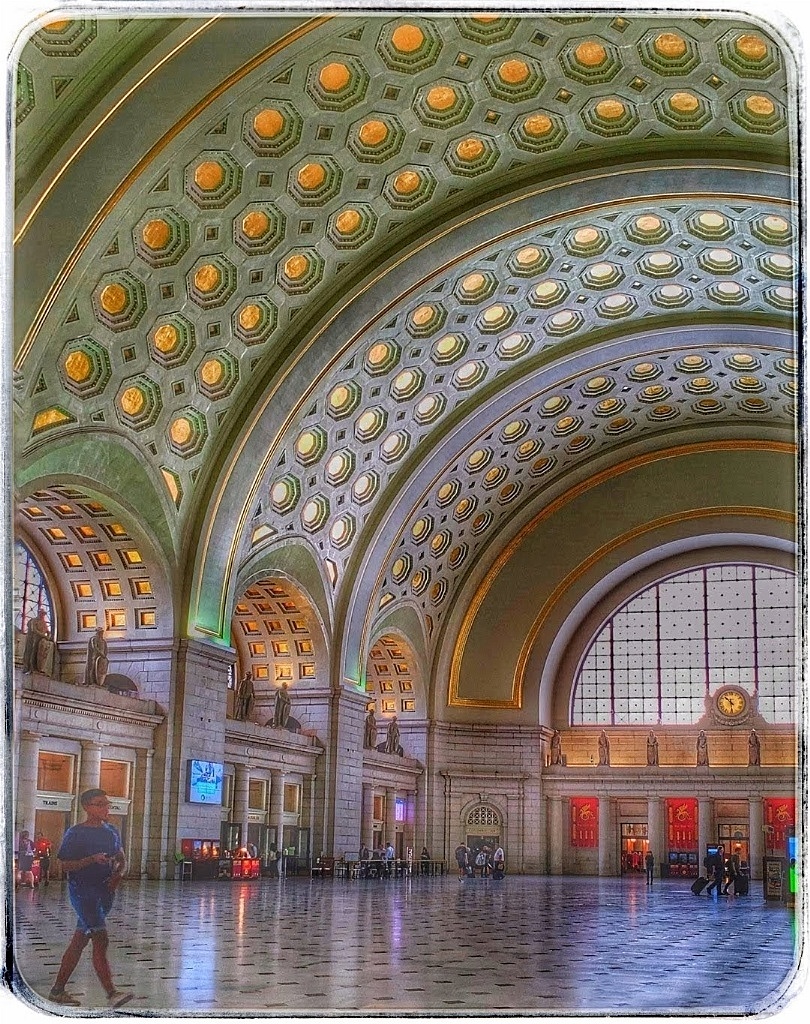
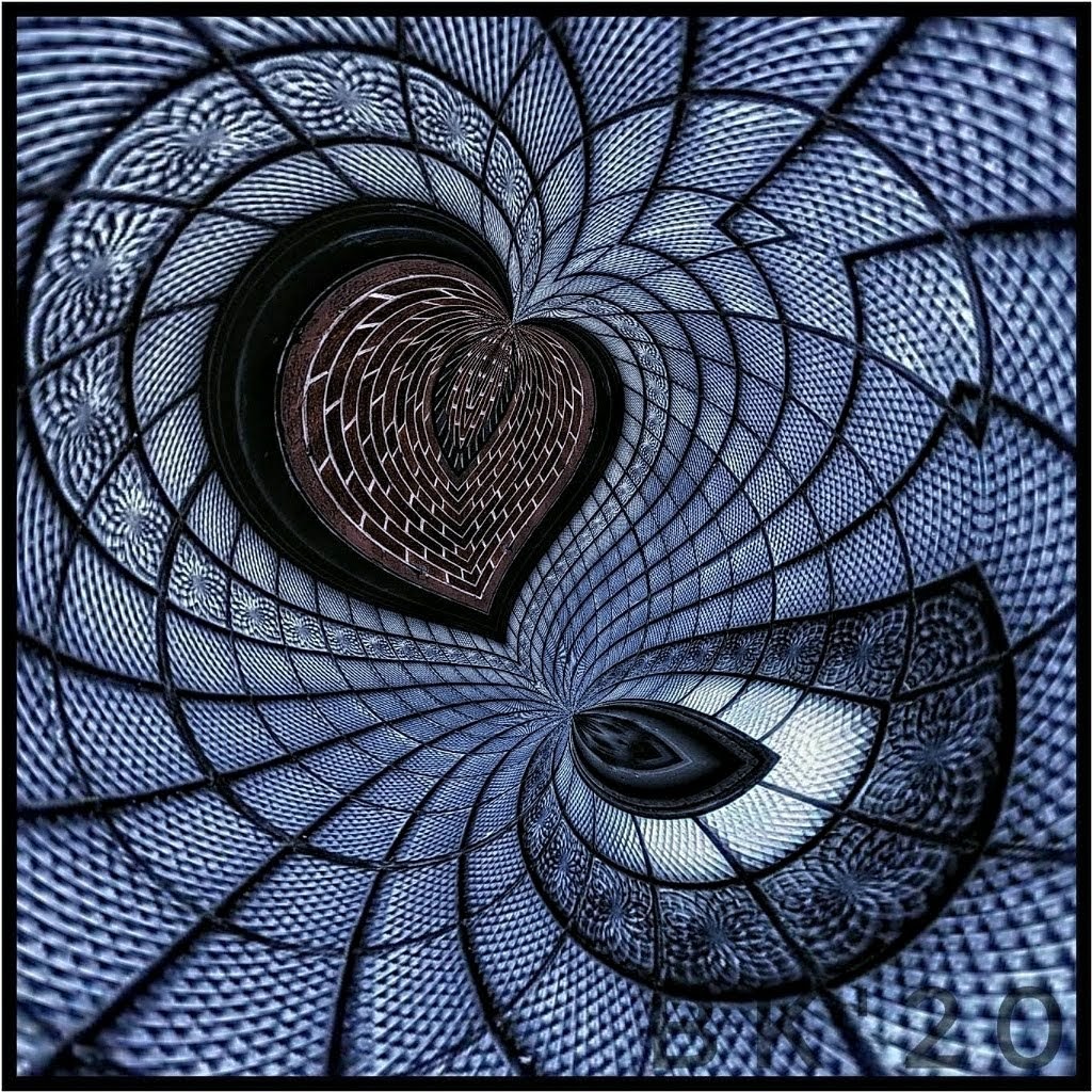
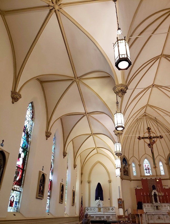
Thanks, Pat. Because of the ceiling's design, I had an idea Mirror Lab might hold some neat options. It really can do some amazing things. |
Apr 21st |
| 86 |
Apr 21 |
Reply |
Thank you, Marilyn! |
Apr 21st |
| 86 |
Apr 21 |
Reply |
Thanks, Ruth! I never know what the end results of my fiddling will be! |
Apr 21st |
| 86 |
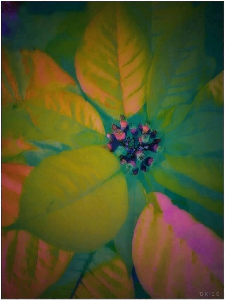
Apr 21 |
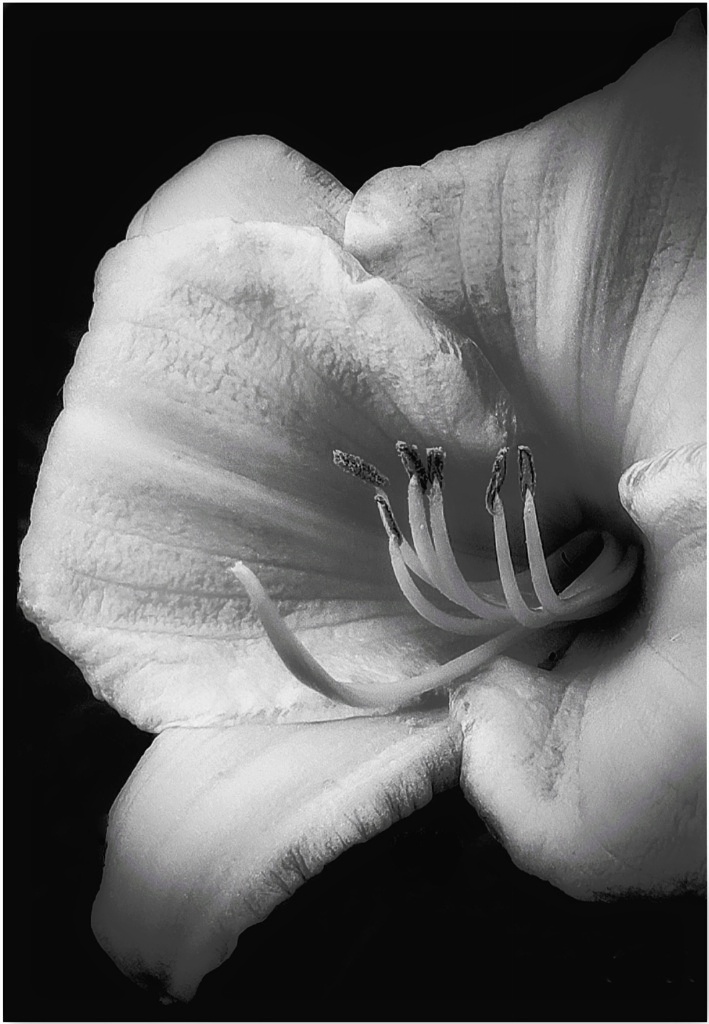
Comment |
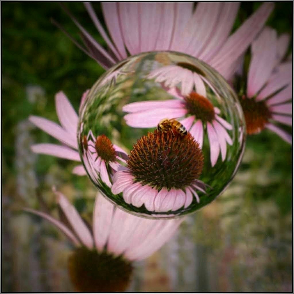
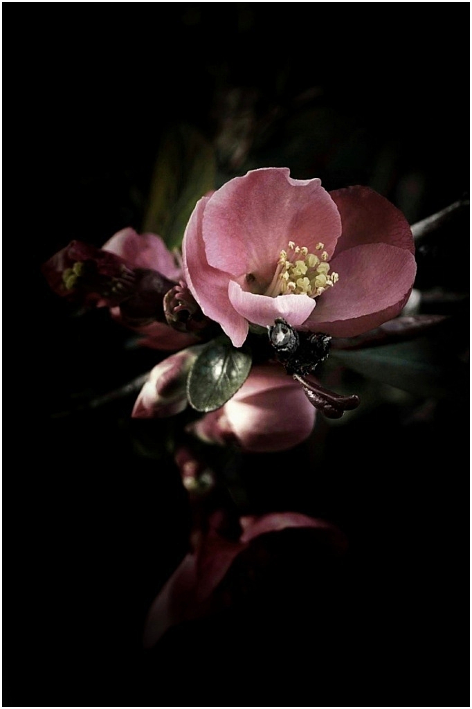
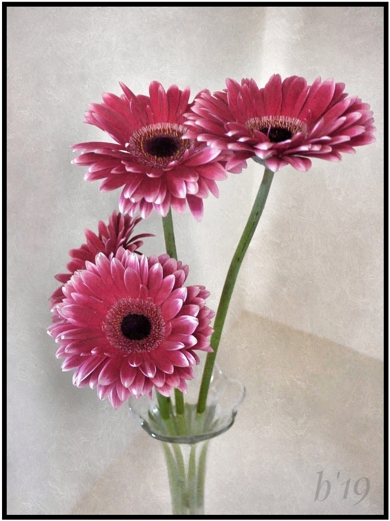
Beautiful colors and fantastic details in the main flower. I like the background but if you want to make the flower really pop, try the brush tool in Snapseed and darken the background or try a darker vignette. Very nice. |
Apr 21st |
| 86 |
Apr 21 |
Reply |
Yes, exactly. |
Apr 13th |
| 86 |
Apr 21 |
Comment |
Love the new version! Great improvements. Up to you, but I would match the previous yellow spot with the black wall. You might clone it. |
Apr 13th |
| 86 |
Apr 21 |
Reply |
Thank you, Jack! Sorry-- Here's thumbnail of the orig. I should have included. I could have tried correcting perspectives, but I think it would have taken alot of effort. |
Apr 13th |
 |
| 86 |
Apr 21 |
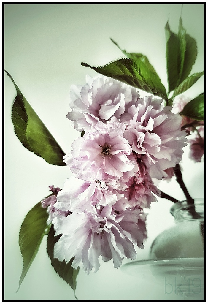
Comment |
The diagonal of your creation is lovely, and the lighting falls across the blossoms nicely. I'd like to see the one bright blossom in your Orig.1. At that area of your creation it is a little busy and I wonder if reversing the order might work better, redbuds behind cherry. I can't use the app so I am unfamiliar. A clever composition with lots of possibilities. |
Apr 11th |
| 86 |
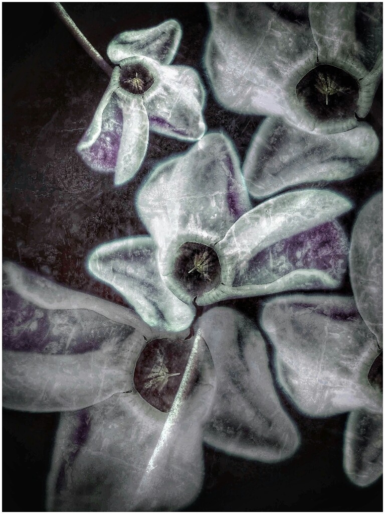
Apr 21 |
Comment |
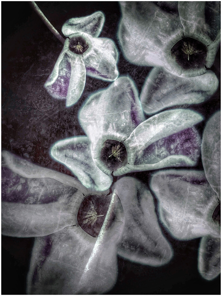
Pretty in purple, and your edits are spot-on! These are small, and getting a crisp shot of the stamens isn't that easy. Stamens are perfect, and you even got the tiny hairs on the unopened buds. Good job using the tools and emphasizing so many details. Spiderwort maybe?? |
Apr 11th |
| 86 |
Apr 21 |
Reply |
Thanks for those suggestions, Phillipa. I will try both! |
Apr 8th |
| 86 |
Apr 21 |
Comment |
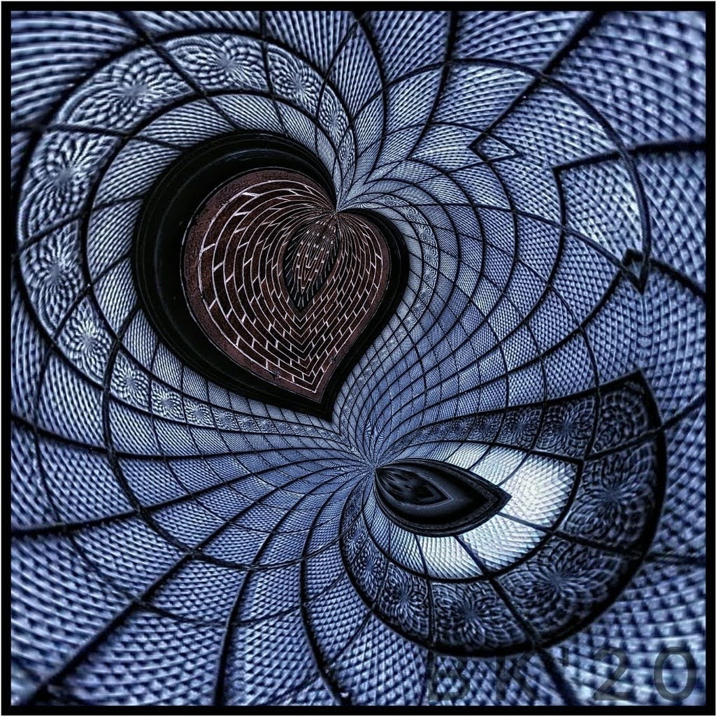
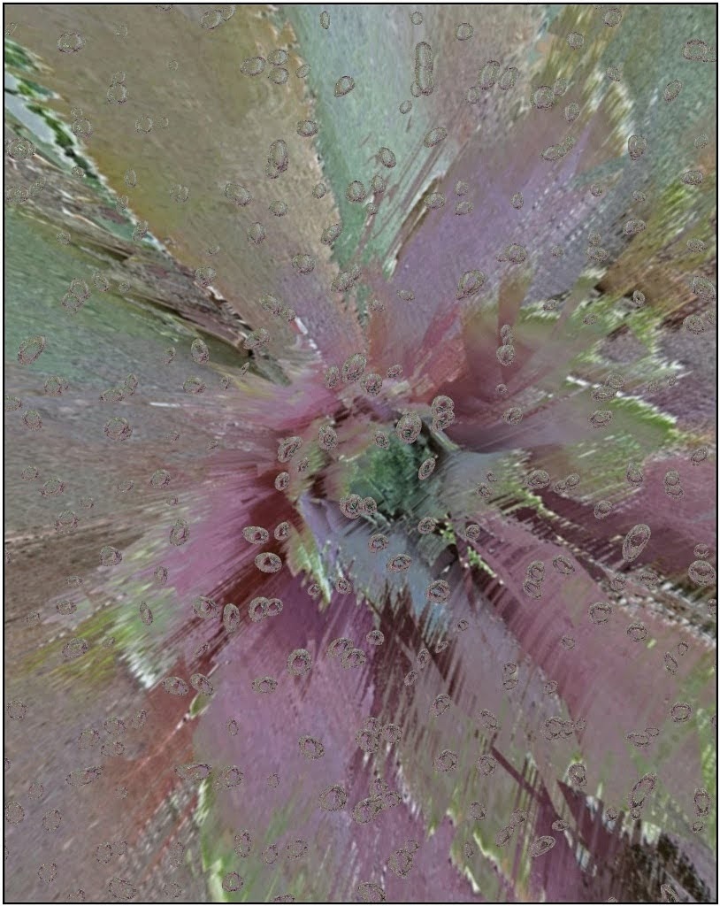
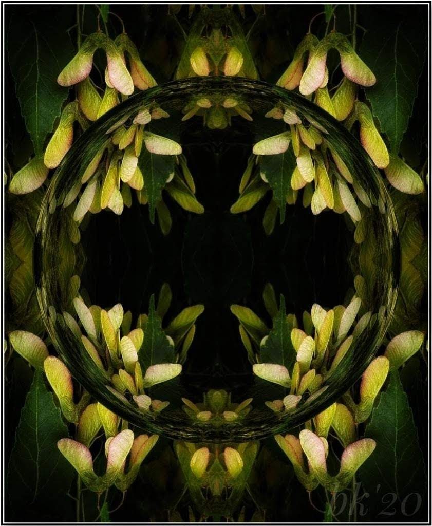
I see a mistake I made. I didn't use the Penta-Spiral. I used "Spiral C" under Polar. Sorry about that! |
Apr 8th |
| 86 |
Apr 21 |
Reply |
Thank you very much, Kieu-Hanh! |
Apr 8th |
| 86 |
Apr 21 |
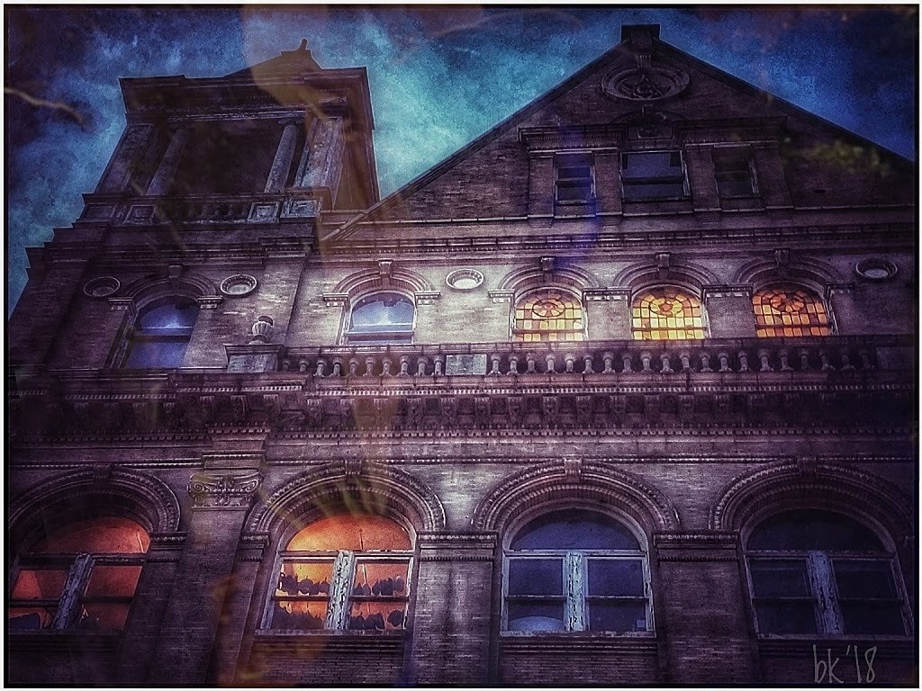
Comment |
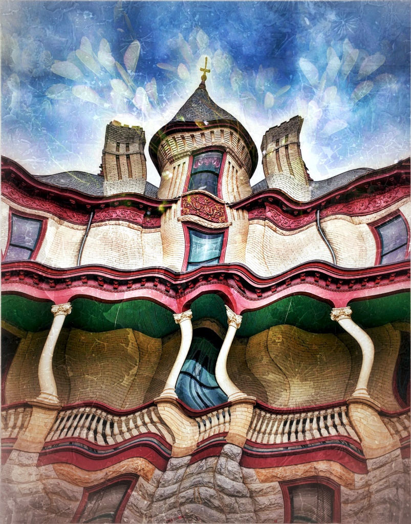
What a remarkable composite! I love the brilliant colors and your results, especially with the buildings in the back. However you came up with the idea, it all fits. The only small spot I go back-and-forth on is the area around the top of the head. I, personally, would reduce the strength of the shadow there. |
Apr 8th |
| 86 |
Apr 21 |
Comment |
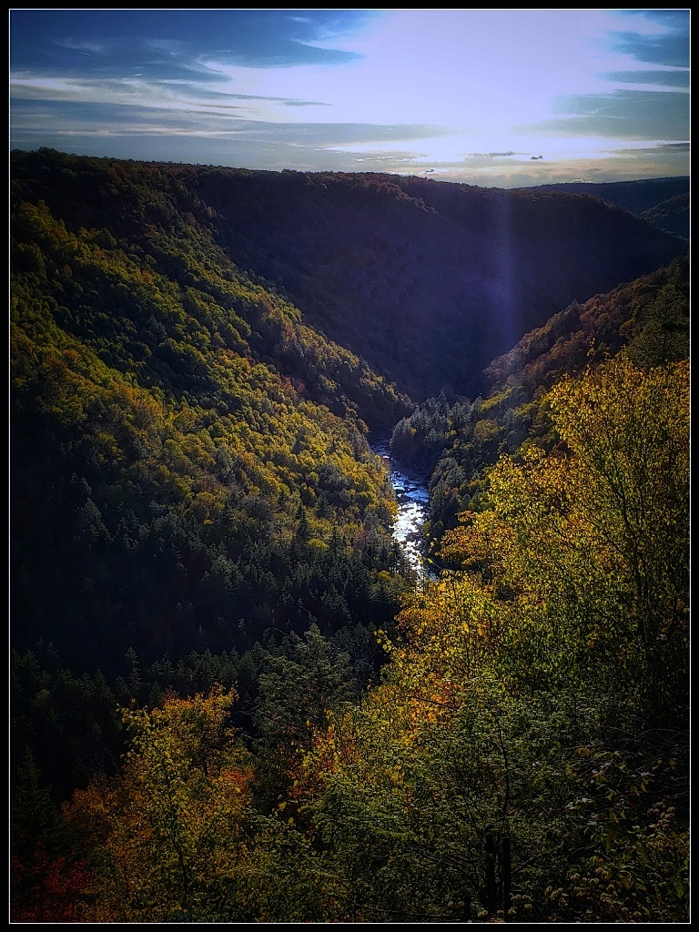
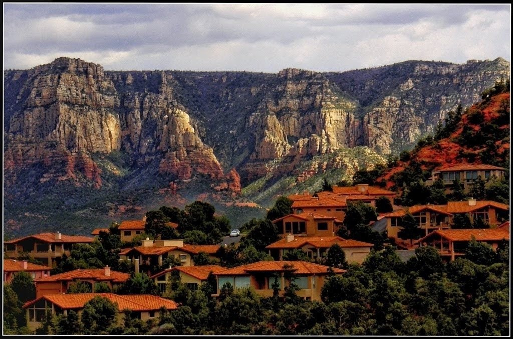
I can certainly see why you like this place! What an abundance of opportunities. It must change constantly (and I would hate that sand in the lens). I love the overall scene, but I also see many images in this one. The patterns made by the wind are beautiful, and I can only suggest trying some selected closeups. That said, you may prefer wide vista's, and it does give a good sense of the area. As is, I would use a bit if dodge/burn in the distant mountains to define them more through the haze. |
Apr 7th |
| 86 |
Apr 21 |
Comment |
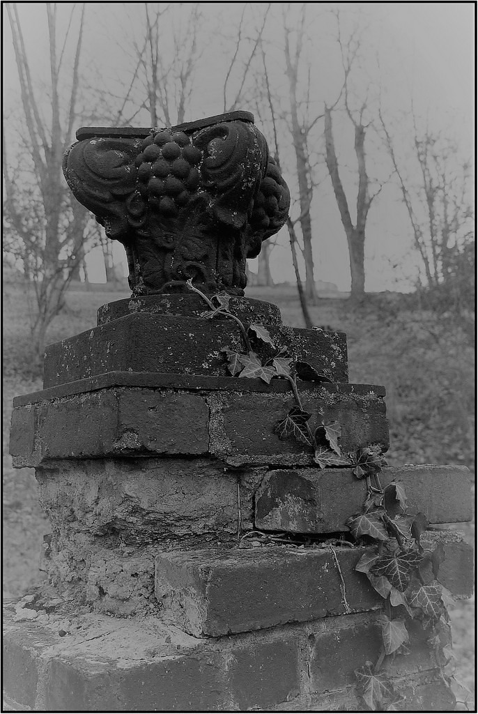
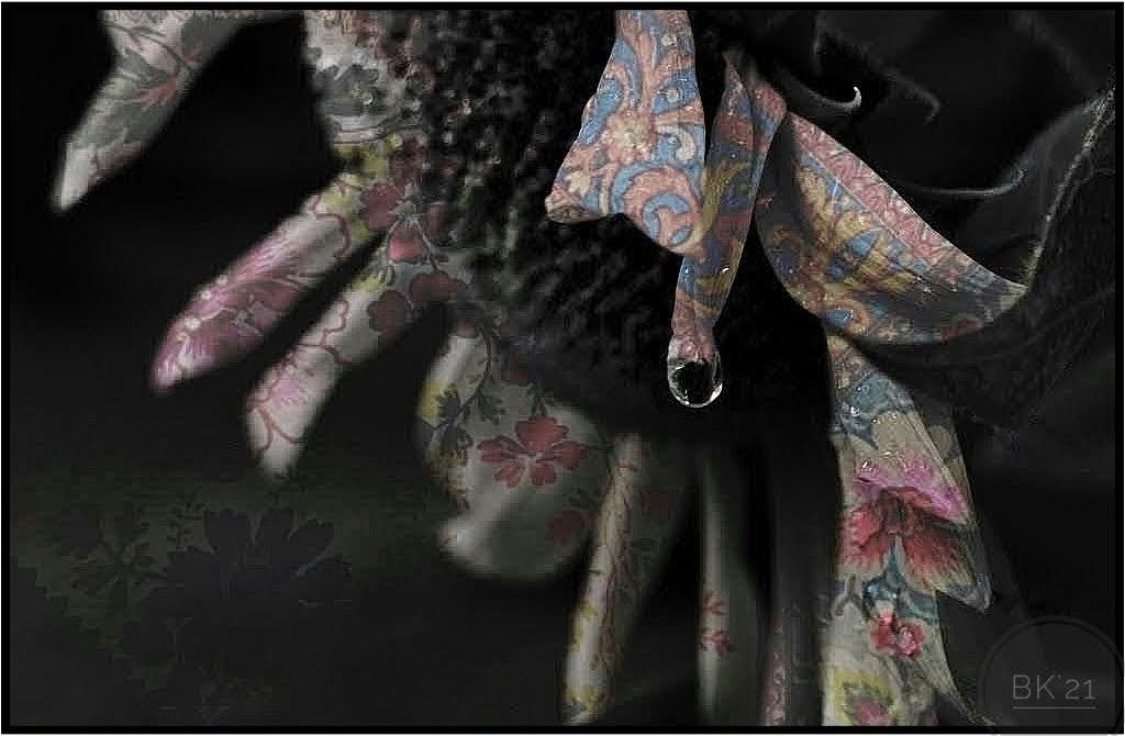
This is a fantastic antique hood ornament, maybe the Goddess of Speed ? As is, it's pretty perfect. I like the varied tones of silver-grays. They stand out nicely against the black. You might punch up the tones slightly unless you prefer a softer look, or in Snapseed try Smooth under Looks to darken the background and make the item pop. I would remove the yellow and keep consistent with the background. Flying in the other direction would be better to me, but flipping won't work because of the printing. You had only one choice for composing because it was against the wall and it's well done. |
Apr 7th |
8 comments - 7 replies for Group 86
|
14 comments - 15 replies Total
|