|
| Group |
Round |
C/R |
Comment |
Date |
Image |
| 26 |
Jul 19 |
Reply |
Thank you! |
Jul 11th |
| 26 |
Jul 19 |
Reply |
I like yours, Bob. I see what you did. Snapseed has a brush tool that might work. I tested alot of ideas, couldn't decide. I usually lean toward colors but liked a BW version too! |
Jul 11th |
| 26 |
Jul 19 |
Comment |
What a beautiful sweet face. You are lucky to get any puppy at rest! He must have worn himself out. It's a lovely portrait, nice and sharp, and your edits handled the coloring perfectly. I do like Bob's suggestion for blurring the carpet. It maximizes the focus on his face. |
Jul 11th |
| 26 |
Jul 19 |
Comment |
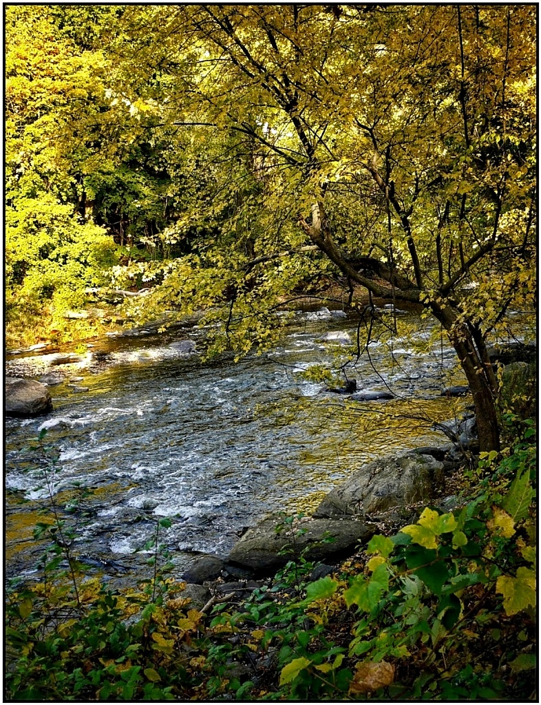
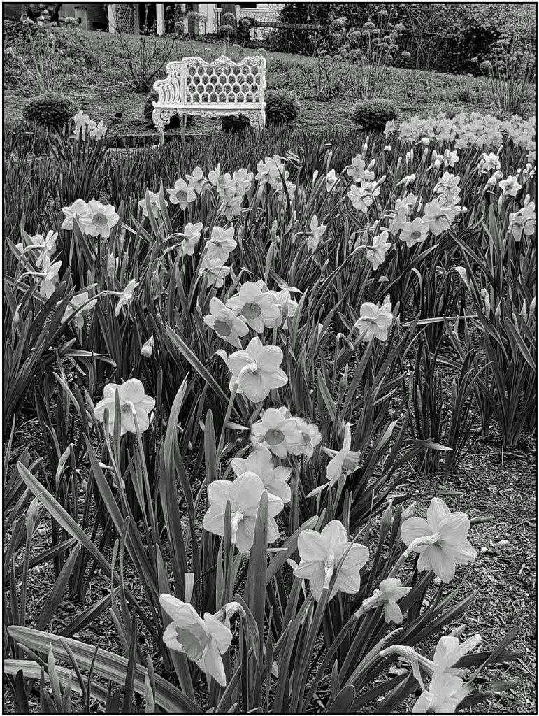
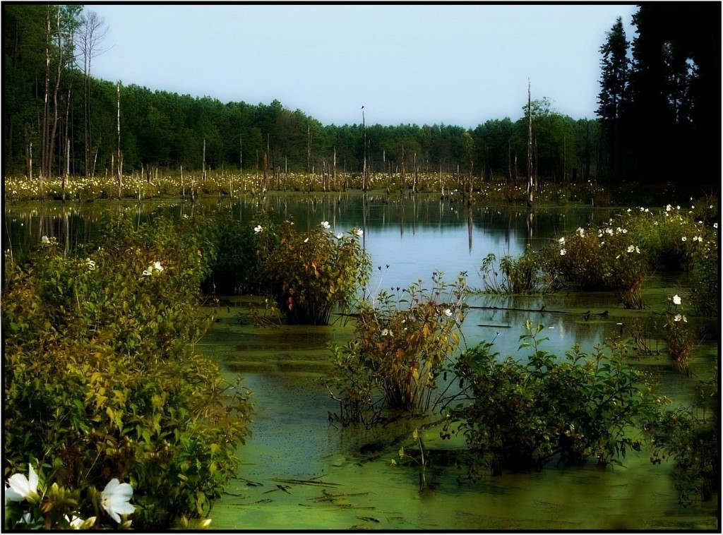
Very pretty pond in early morning light, and the fence is a nice lead in. Overall, things look a little bright to me. I think reducing the brightness and increasing the shadows will emphasize the nice light you were drawn to in this. My quick fix might be too dark, but just an idea. I agree with Bob that including the right side of the pond would benefit the image. |
Jul 11th |
 |
| 26 |
Jul 19 |
Comment |
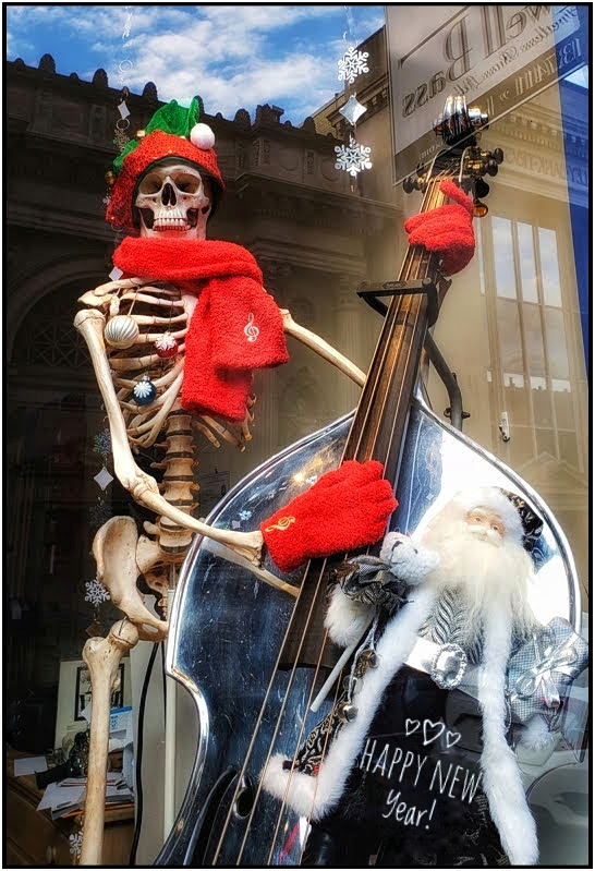
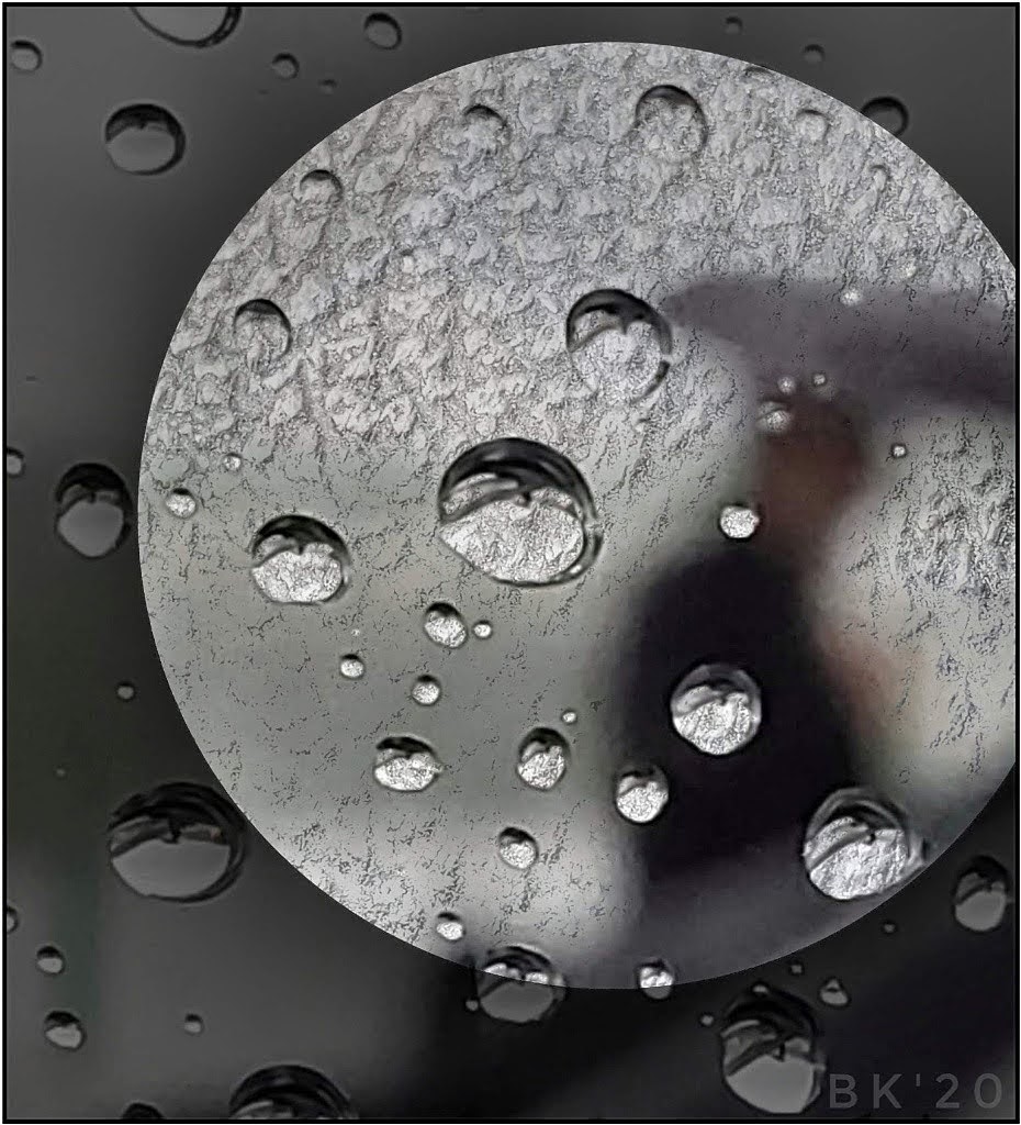
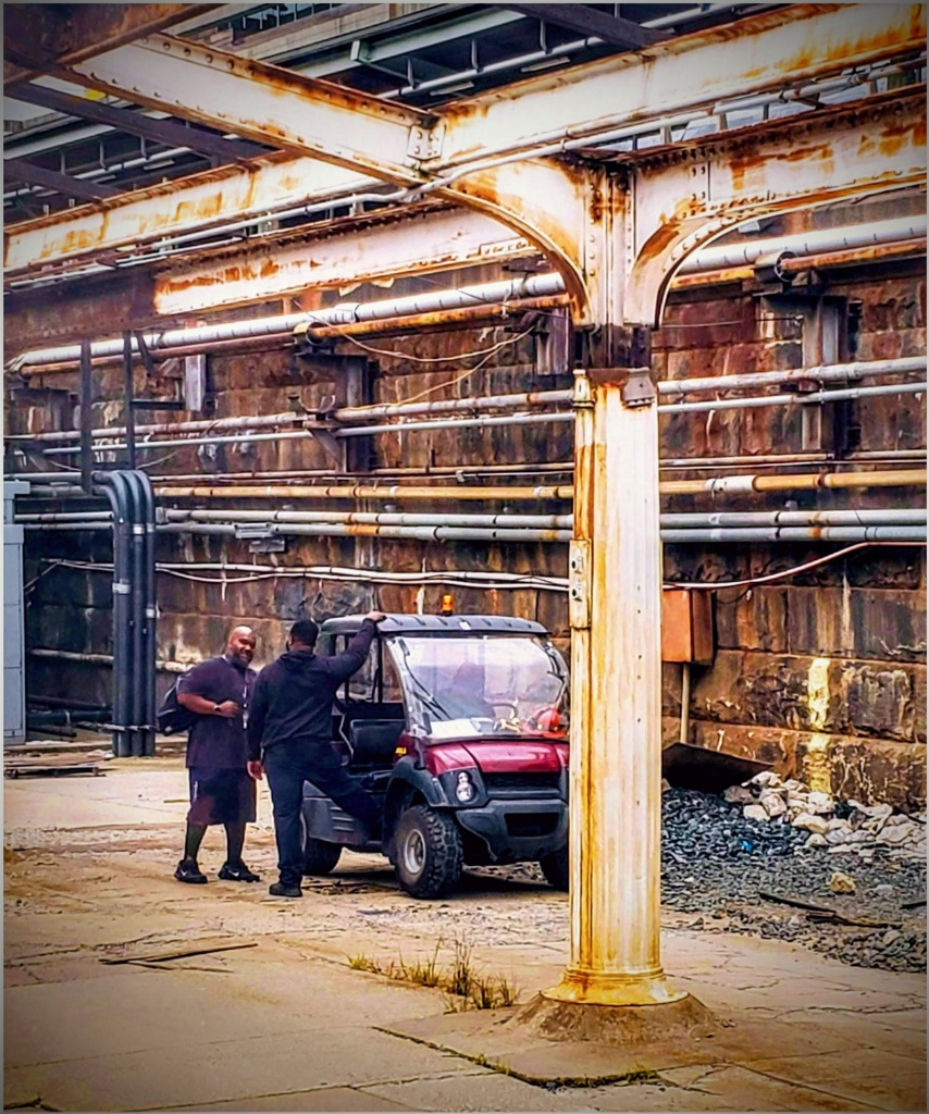
Nice find! Love the neon colors, especially the smooth, shimmer of reflections in the wetness. I go back-and-forth on cropping. Bob is right that cropping forces the eye to the machines. I personally think the reflections make the scene special. They are metallic, and I wouldn't want to lose much of that. |
Jul 8th |
| 26 |
Jul 19 |
Comment |
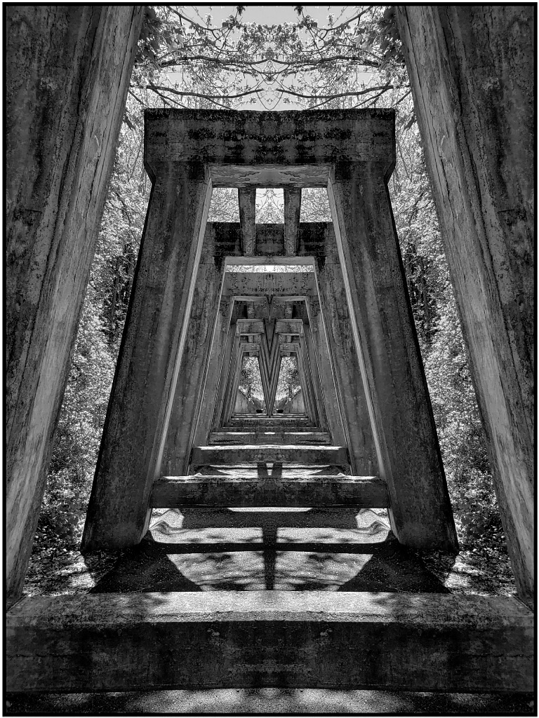
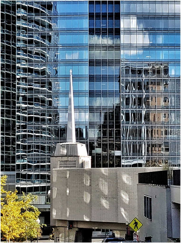
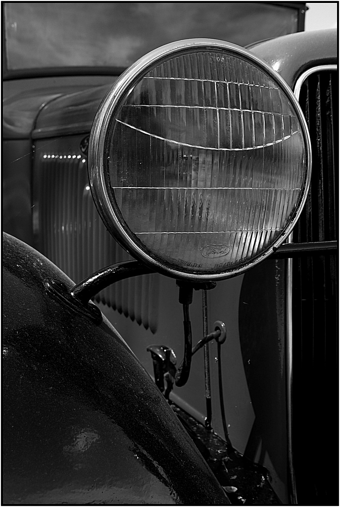
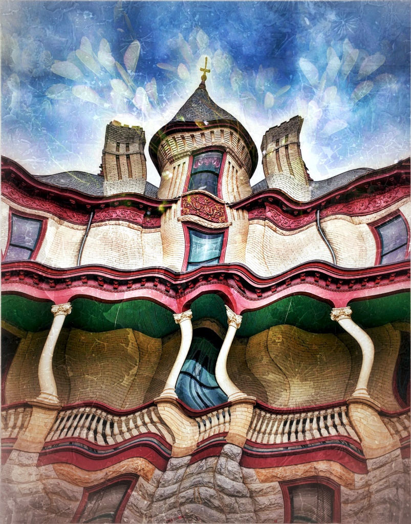
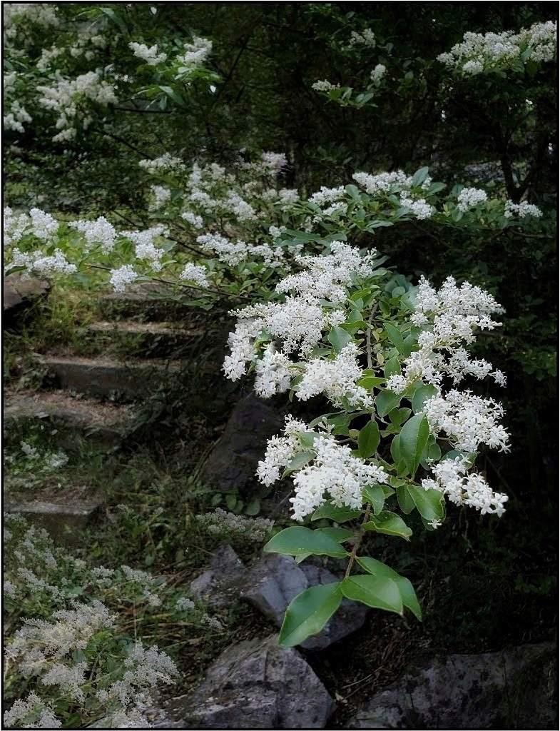
Nicely seen. There's a juxtaposition. Rounded edges against sharply squared buildings. Bob's idea for BW could be impressive. If you prefer the color and stark trees, I'd punch up the trees even more. The golden sheen across them is beautiful, and I'd try for more of it. If possible, I'd recrop, or expand, to keep the edge of the shell inside the frame. Nice edits removing the posts! |
Jul 8th |
| 26 |
Jul 19 |
Comment |
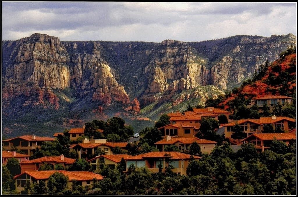
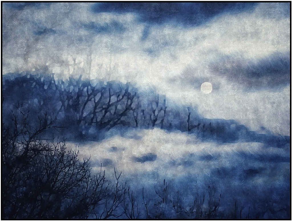
Very beautiful, and iconic. Your edits greatly reduced the fog and improved the sky. I love the natural S formed by the flowers leading to the house. Overall, I lean toward keeping the softer colors in the field that are in the original. The mound isn't distracting to me, but I'd prefer to have the surrounding houses removed or obscured.
(Just got a reminder to submit my image. Sent 3 days ago. Pls. let me know if you didn't receive it. Thanks!) |
Jul 8th |
| 26 |
Jul 19 |
Comment |
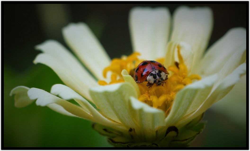
So cute! Fantastic shot, perfectly crisp and bright. Love the expression and catchlight in the eye. Probably listening to the shutter! The only minor change I'd make is add a bit of space above its head. |
Jul 8th |
6 comments - 2 replies for Group 26
|
| 86 |
Jul 19 |
Comment |
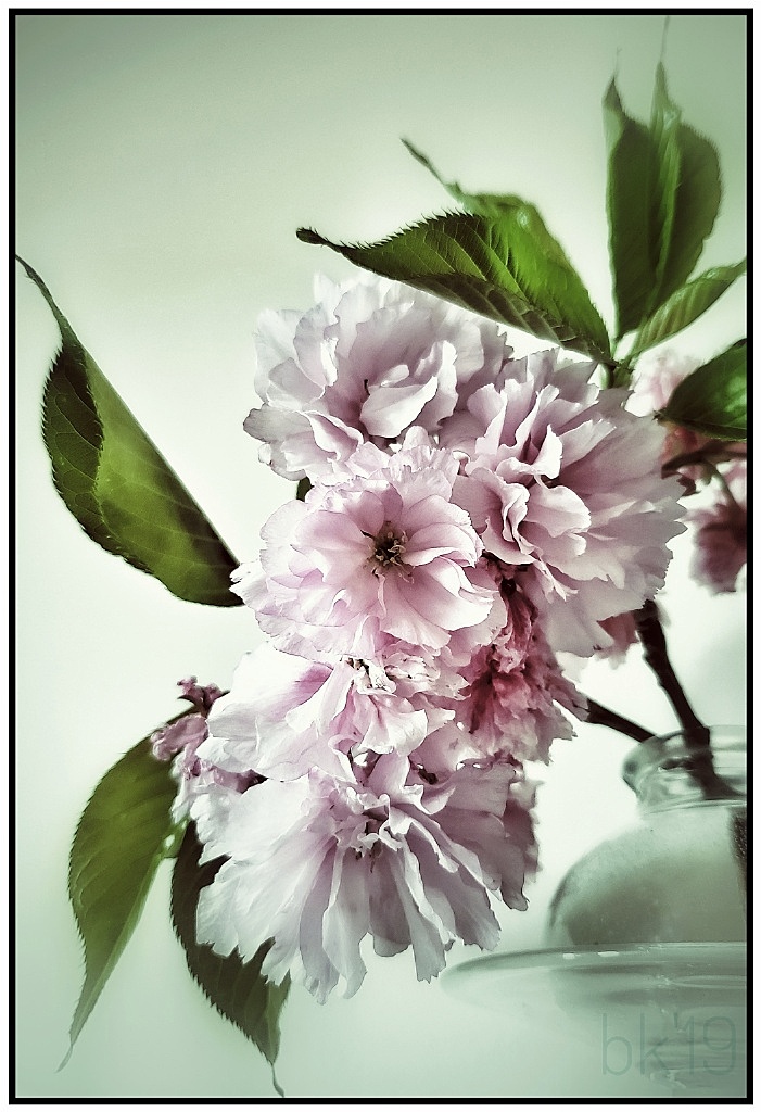
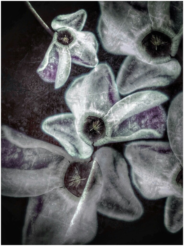
Oh, I really like the waterlogged/icolorama version! Very artistic and painterly. I will look into the apps. Thanks for sharing the info! |
Jul 12th |
| 86 |
Jul 19 |
Reply |
Thanks, Carl! I kept a version without the glow (softness), so I'll revisit it. If I get a chance I'll share a thumbnail of it. |
Jul 11th |
| 86 |
Jul 19 |
Reply |
Yes, Laurie, I do it before saving. Once it's saved you can't go back to my knowledge-- at least I haven't figured out how. I practiced on photos I wasn't interested in keeping. |
Jul 10th |
| 86 |
Jul 19 |
Reply |
Thank you. I The blur is from Snapseed's Glamour Glow tool. It can be removed. It was a last edit (attempt) to smooth the image. |
Jul 10th |
| 86 |
Jul 19 |
Reply |
Thank you, Ruth! |
Jul 9th |
| 86 |
Jul 19 |
Reply |
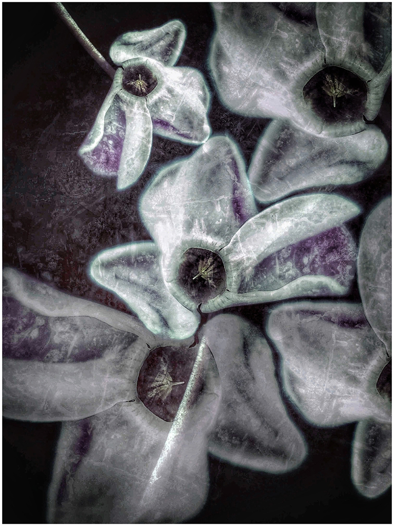
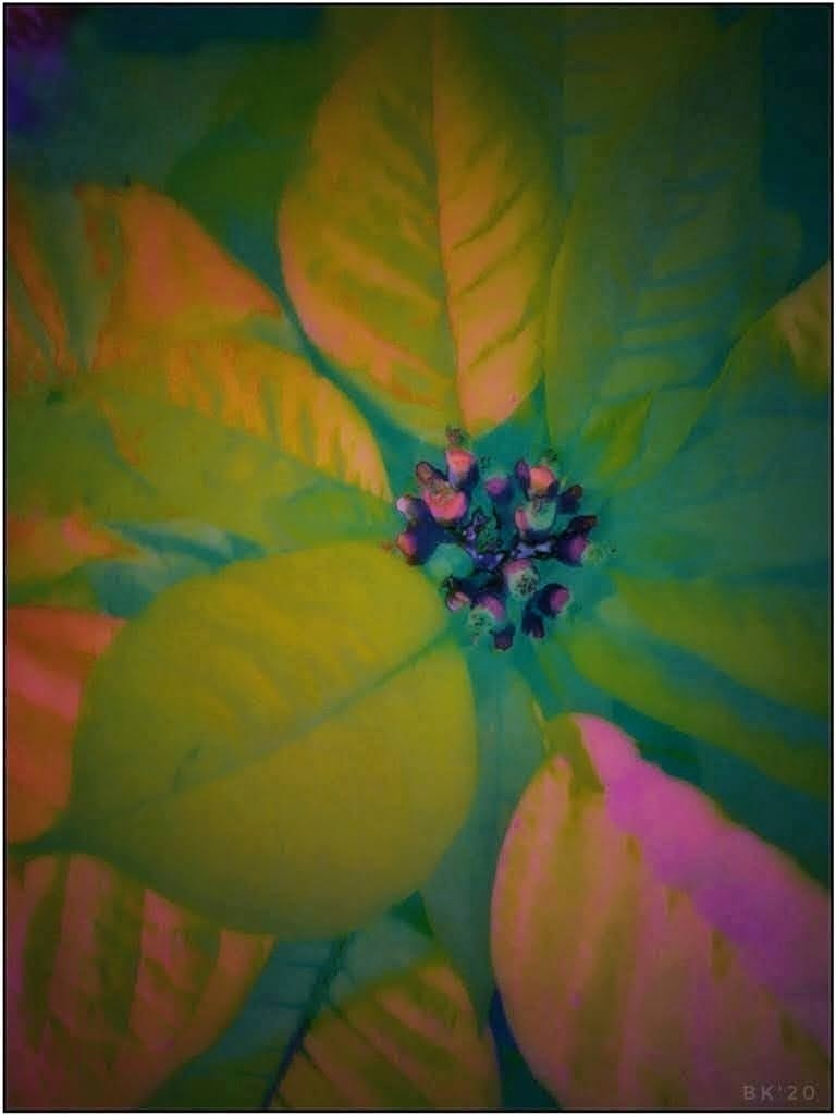
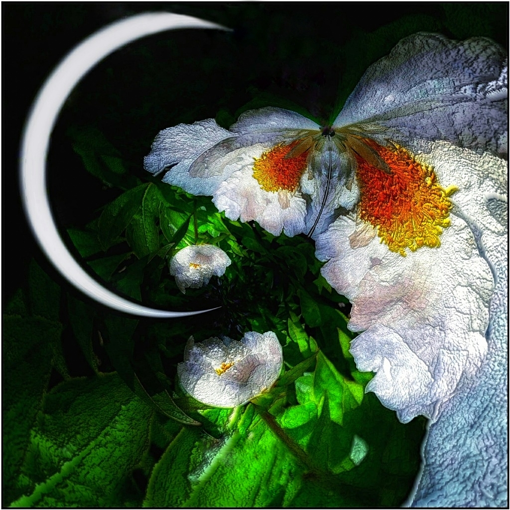
Thank you, Margaret. The area directly above the stamens at the edge of the petal. It looks too thick and fleshy (if that's a word). It bothers me, but sometimes I need to 'move on'! |
Jul 9th |
| 86 |
Jul 19 |
Comment |
Fascinating juxtaposition. I questioned the blur at first, but the women were not the immediate focus (though they contribute immensely to the scene). Also, everyone in the image is moving, and you can't do much about that. One can imagine winds might be blowing sand and the grasses. It certainly gives pause for wonder and alot of great conversation. You were lucky to capture it -- quick to even think to do so!
|
Jul 9th |
| 86 |
Jul 19 |
Comment |
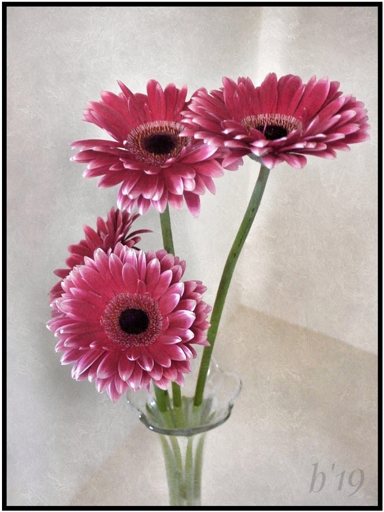
You fooled me :-) I thought I was seeing double of something, and I was! It all looks so perfectly natural. Great job fixing the perspective, and very pretty flowers. I agree with Janet. I think the strength of the image is the iconic Temple. I'd remove the building on left and try cloning another section of the Temple for that space, or maybe darkened clouds. Very minor thing: I would straighten the right a tiny bit so that the frame cuts straight through the middle of the back spire. Very interesting and creative! |
Jul 9th |
| 86 |
Jul 19 |
Comment |
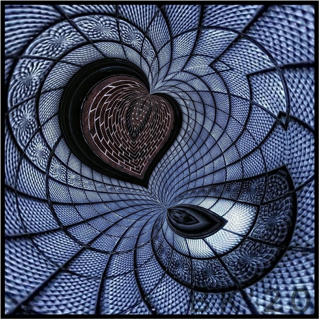
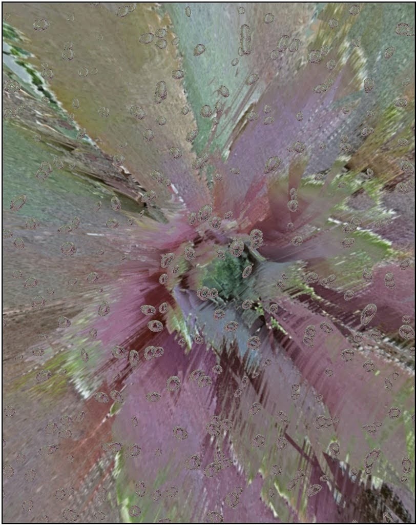
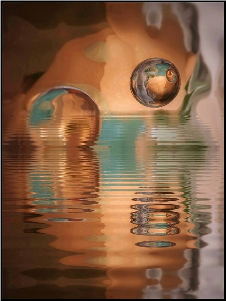
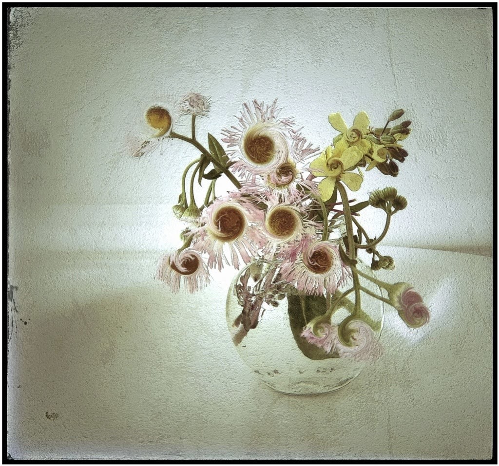
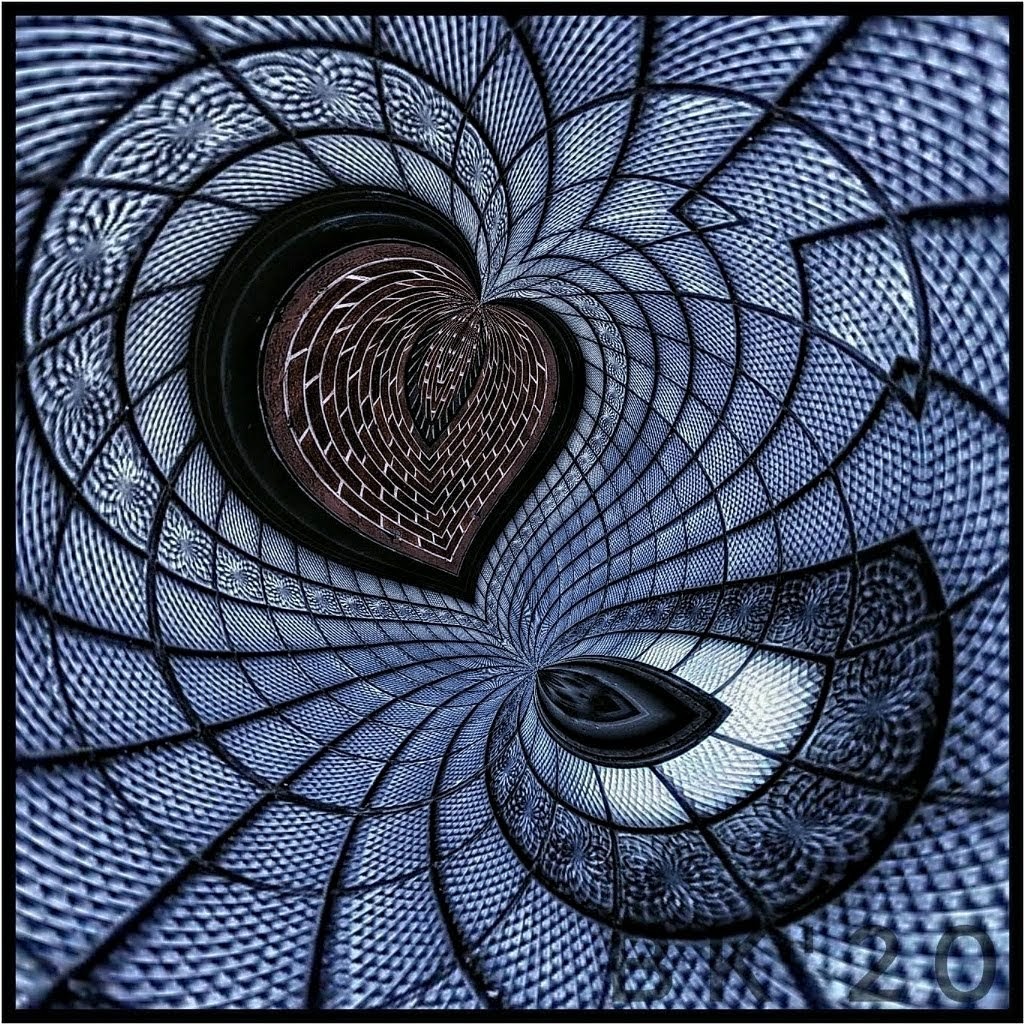
Fantastic! Who would ever guess what this is, especially from a distance. To me it resembles a blue 'eye' with lashes. You created a wonderful abstract, and can see it on my wall! Nice edits and lovely colors. It's mesmerizing. |
Jul 9th |
| 86 |
Jul 19 |
Comment |
Oh my goodness! They were in your yard. Wow! I think your edits are great, especially flipping the direction. It made all the difference. The armour is nice and sharp, very detailed. I'm not familiar with their habits, but I'm surprised they didn't scurry away. Aren't they fearful? You had to be pretty close to get such a nice shot. I hope you keep taking more photos of them and get to catch one with its nose off the ground :-) nice job! |
Jul 9th |
| 86 |
Jul 19 |
Comment |
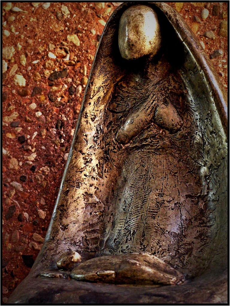
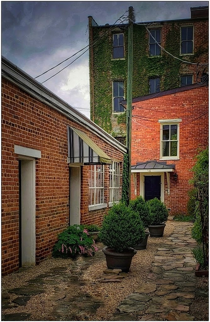
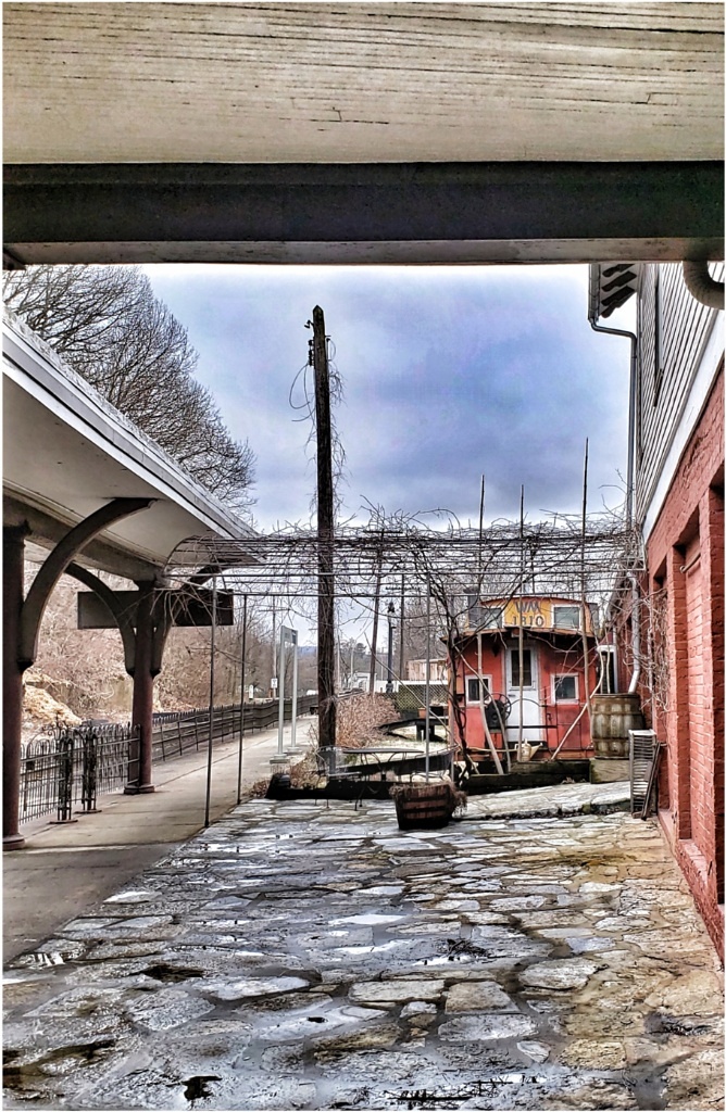
What a beautiful shell! Your edits really made it pop. It is much improved from the original, and the crushed stones in the pavement are very colorful and better exposed. Nicely done! About edits, I sometimes get lost in editing, saving, and then forget. I do like having the ability to see the list of edits in Snapseed as they were made (little arrow at top leads to list). Taking a screenshot of that list saves me time-- when I remember to do it! |
Jul 9th |
| 86 |
Jul 19 |
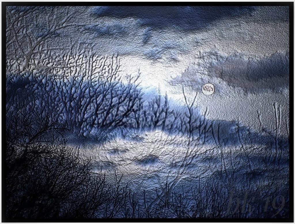
Comment |
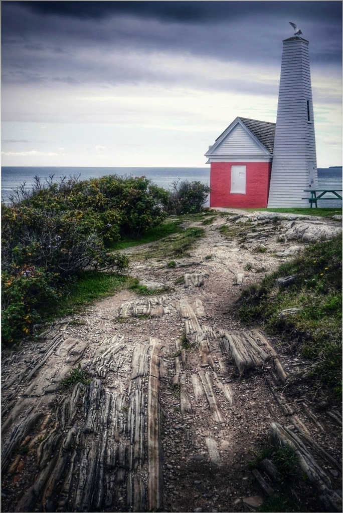
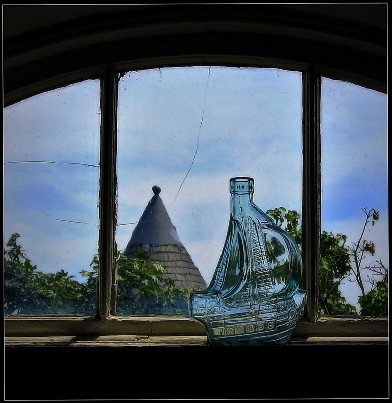
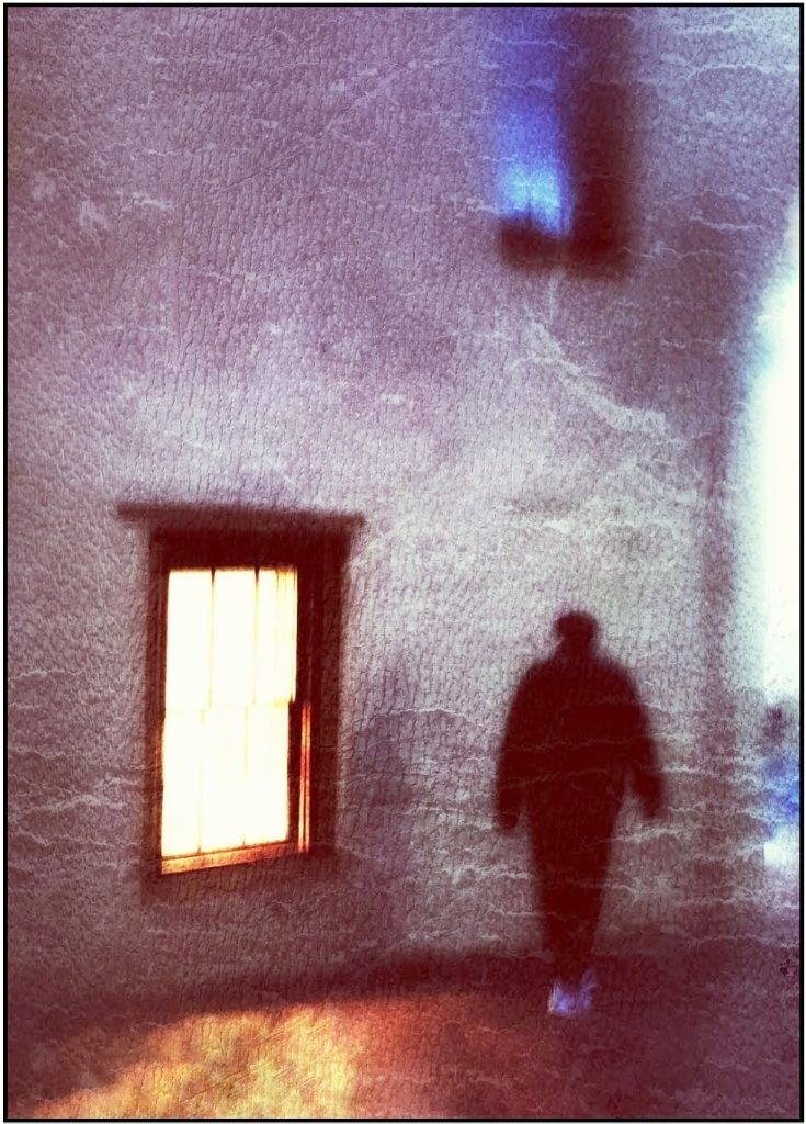
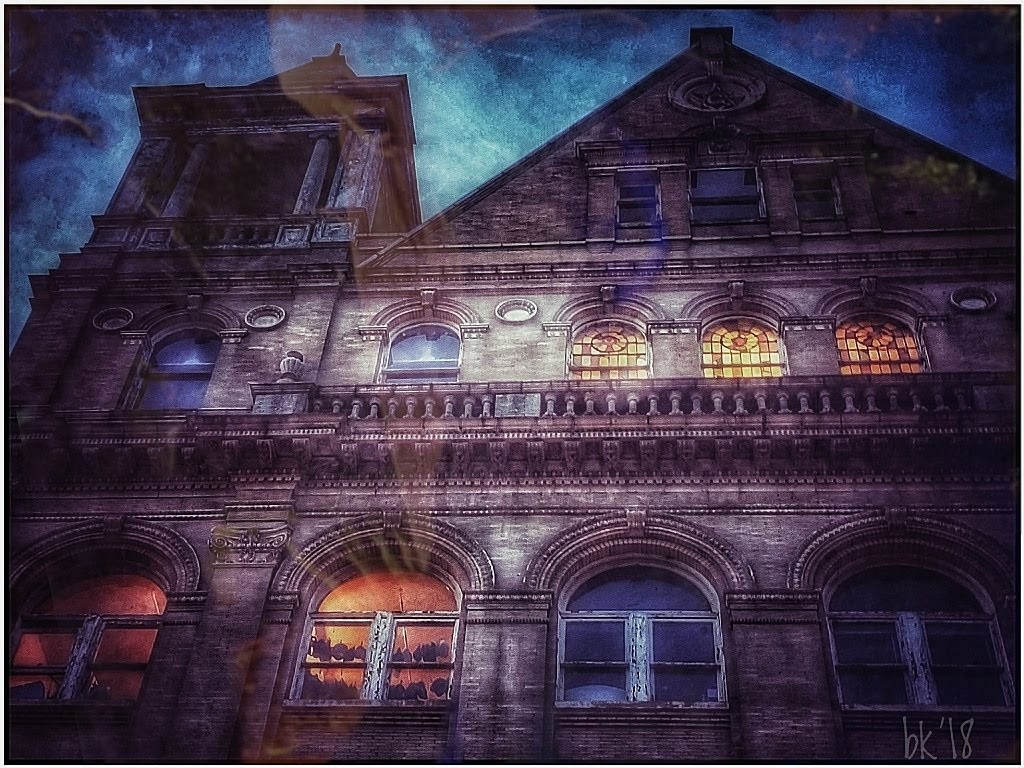
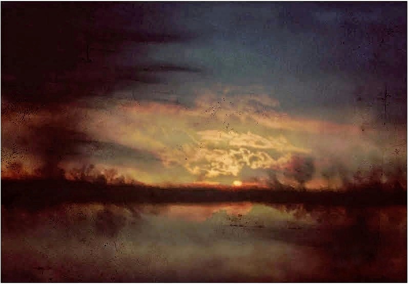
I think all sunrises and sunsets are beautiful. You took this to a greater artistic level, and the framing is neat. I like the HDR in Snapseed, too, and always test it out. I actually like the dirt and speckles on the glass! To me, it adds to the overall atmosphere, and one imagines looking out from an old, maybe abandoned building. As far as which pane to look through, the tower leads the eye right to left (something I do very, very often). But, if you flip it, the tower leads more easily through the image-- to the sun and then the brighter area to left and back (the triangle). Only problem is, then it becomes a sunset, not sunrise. Not your intention, so I wouldn't change anything. I really like the ambience you created. |
Jul 9th |
7 comments - 5 replies for Group 86
|
13 comments - 7 replies Total
|