|
| Group |
Round |
C/R |
Comment |
Date |
Image |
| 26 |
Jan 18 |
Reply |
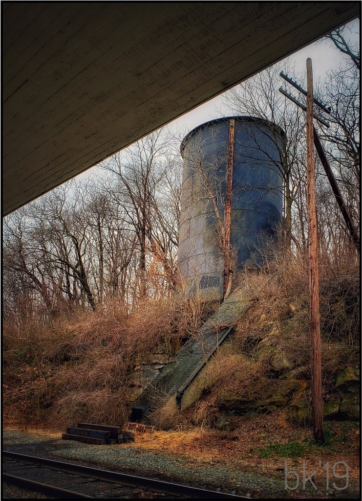
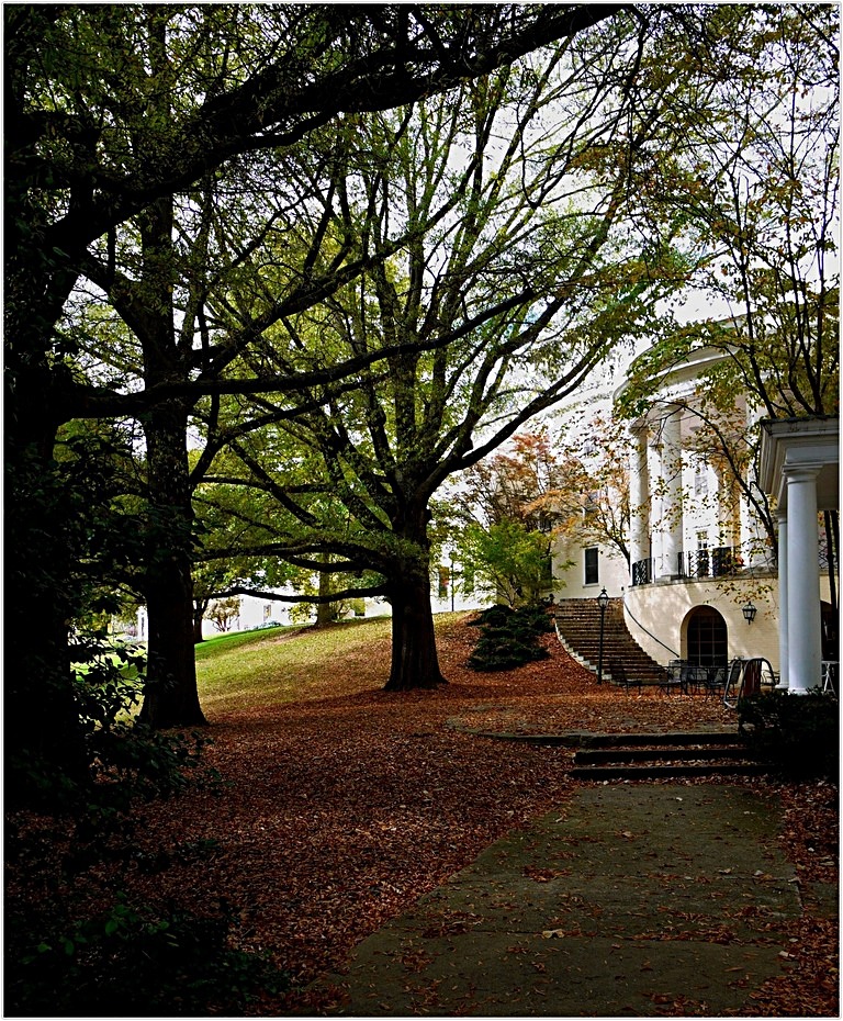
Thanks! I'll go back in spring. I won't get the leaves, but it should be nice. Sun was harsh, and I stood in shade. Wasn't possible to reduce the highlights anymore to pull more of the building out. In RAW maybe, and later in the day would have been best. |
Jan 15th |
| 26 |
Jan 18 |
Comment |
Albert, I happened to take another look from my desktop computer. I am wrong about revealing more. I think the monitor on my tablet is way off. Sorry! |
Jan 15th |
| 26 |
Jan 18 |
Comment |
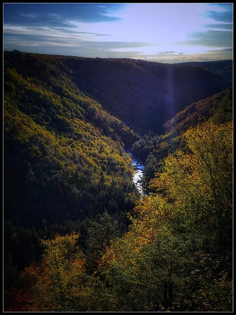
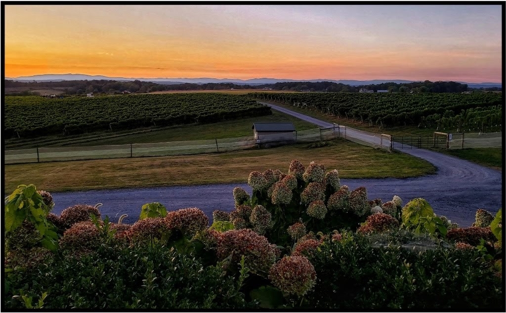
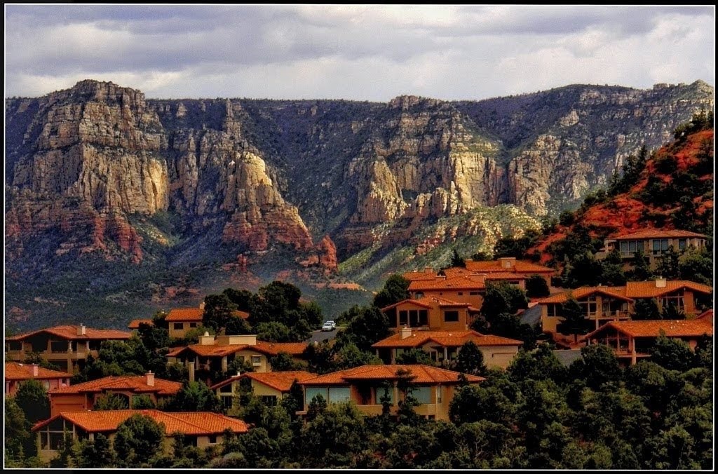
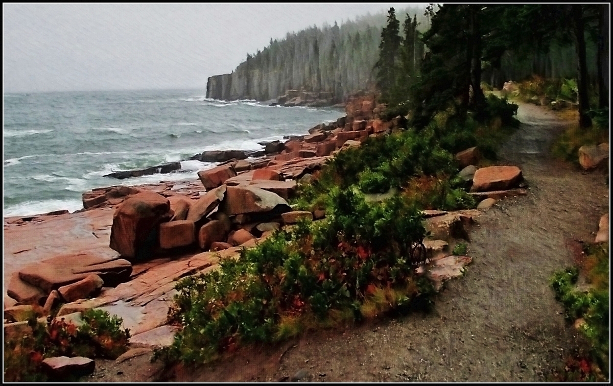
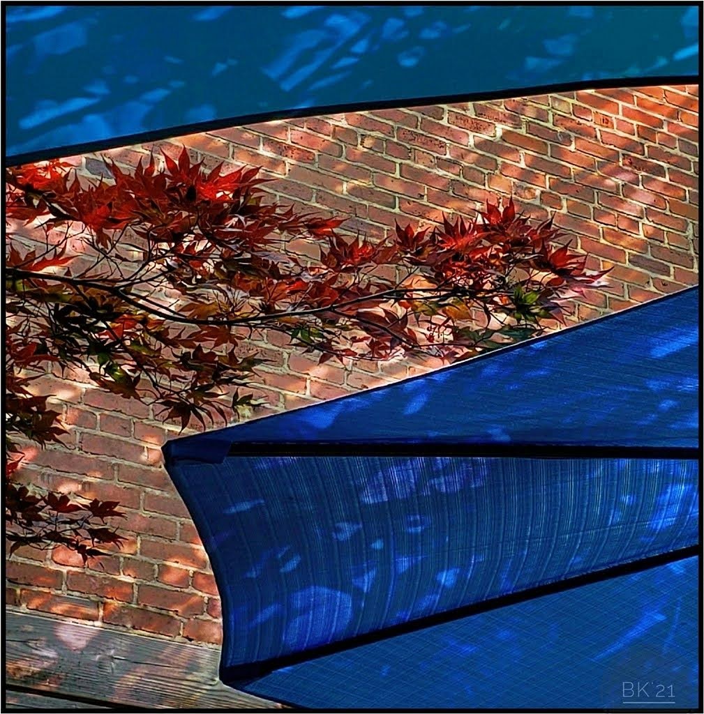
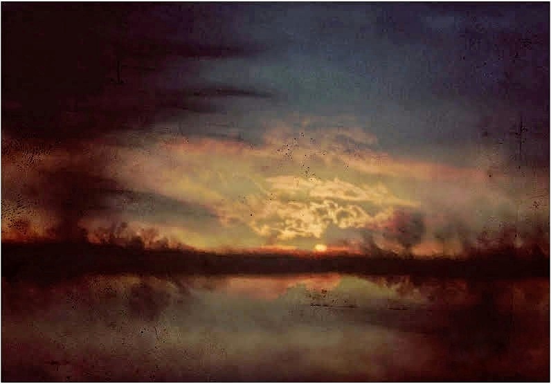
Beautiful light and colors. I like the capture of the sun setting at this point making the far mountains glow. I think you might adjust only to reveal a little more of the village, if possible. |
Jan 13th |
| 26 |
Jan 18 |
Comment |
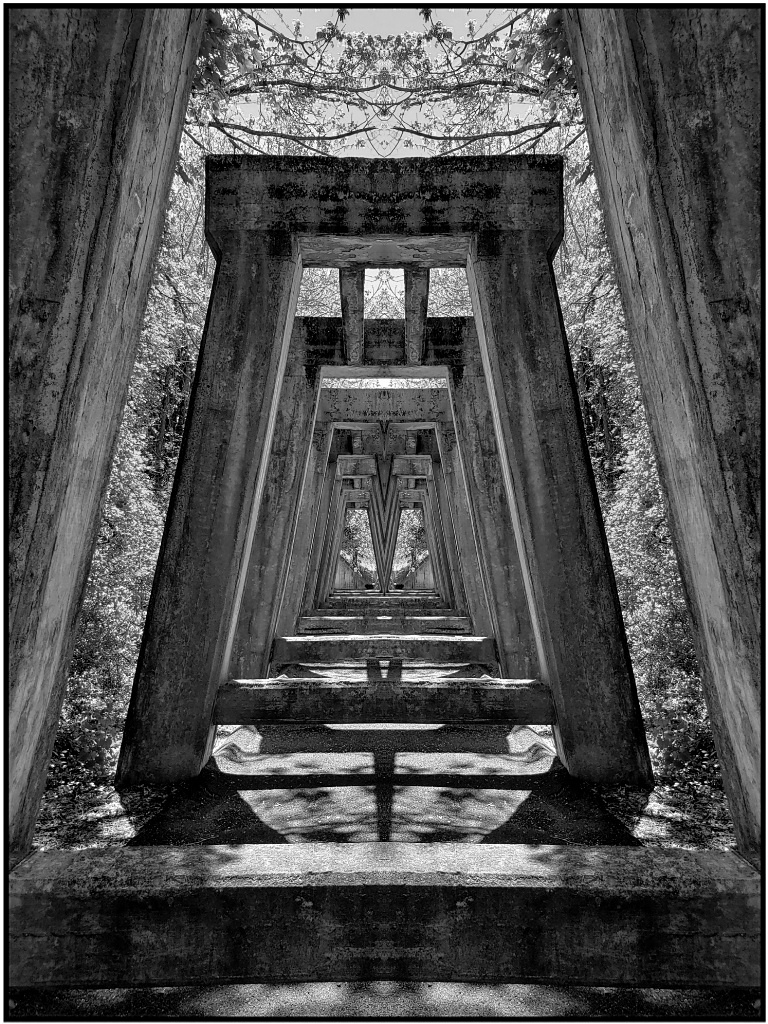
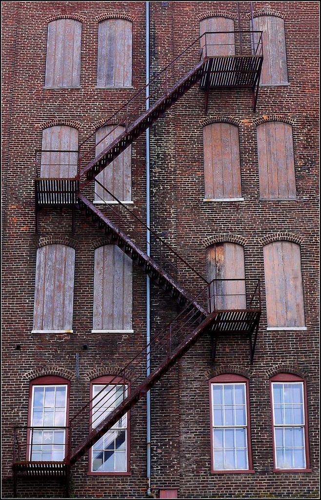
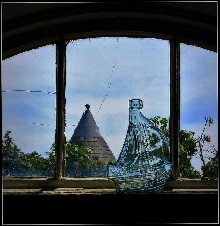
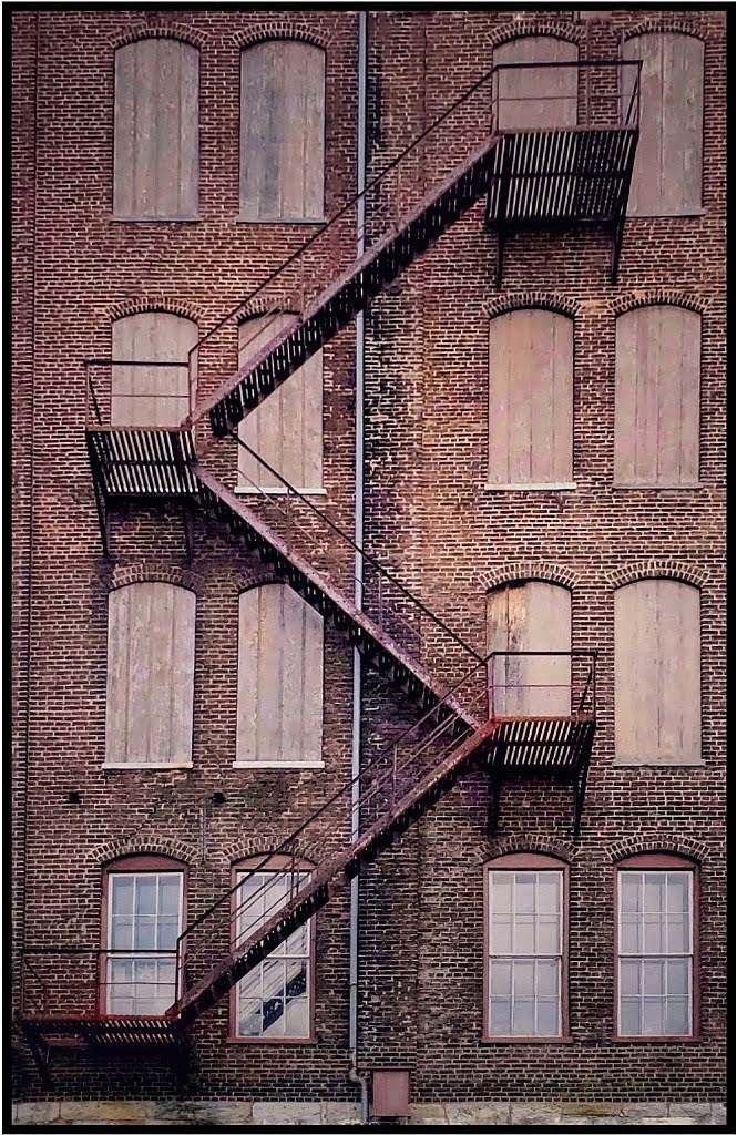
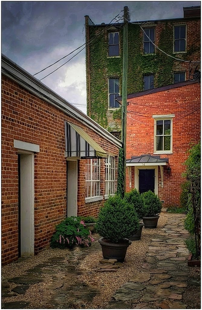
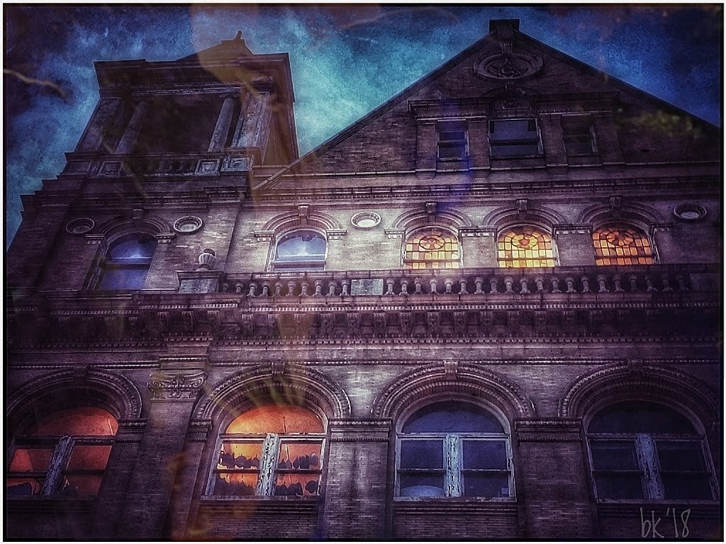
That's a wild building! At first glance I thought it was an abstract painting. It's very interesting, and I really think you don't need to make any changes. I might only crop the tiny area along the bottom to completely remove the windows. |
Jan 13th |
| 26 |
Jan 18 |
Comment |
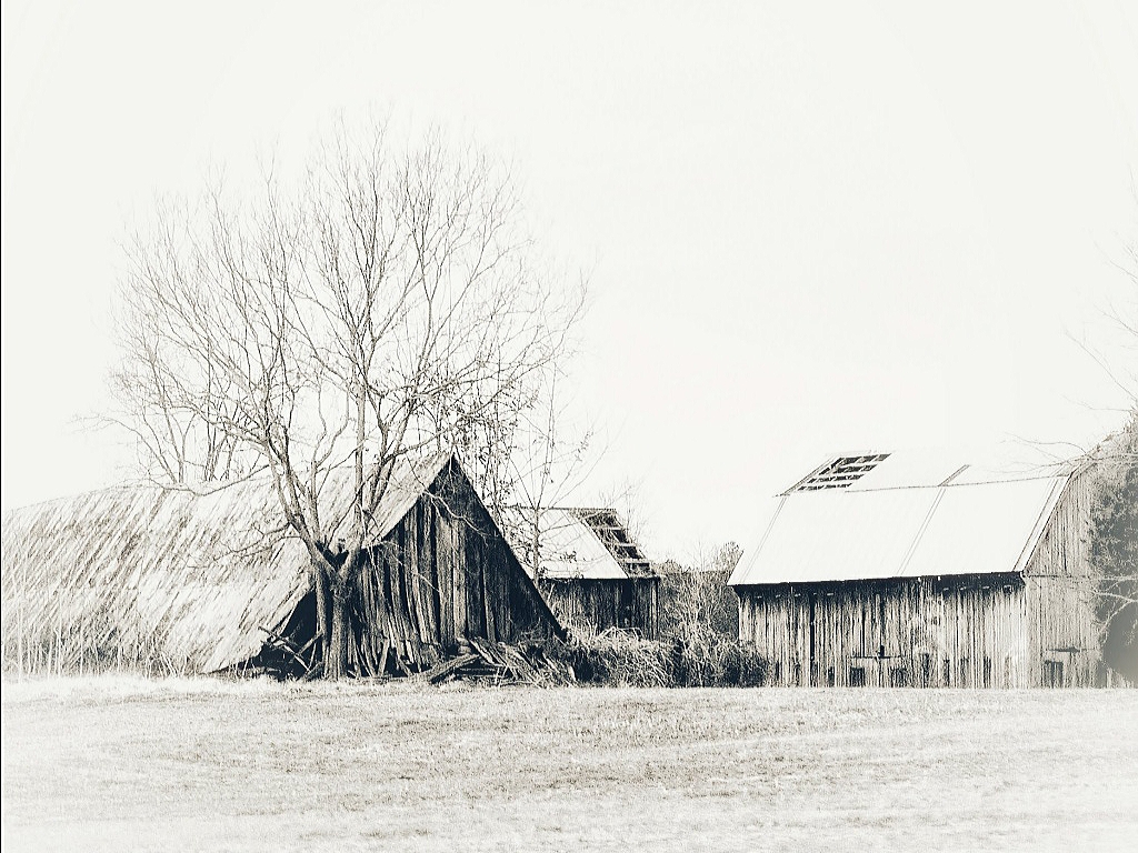
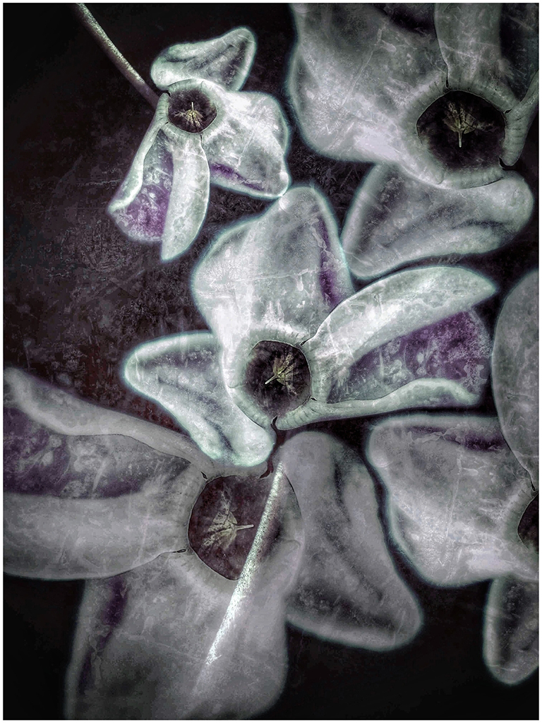
Old books make great subjects for still lifes. I might have composed more of a closeup to make at least some of the words in the letter readable. There is great curiosity there. As is, I would crop some of the left and reduce the grunge slightly. It might be interesting in a sepia tone too. |
Jan 13th |
| 26 |
Jan 18 |
Reply |
Thanks, I need to re-visit (clean up the junk first) and get closer. |
Jan 13th |
| 26 |
Jan 18 |
Reply |
Thank you. I was conflicted. Leaves, stairs. I need to go back and clean up the area and get closer. |
Jan 13th |
| 26 |
Jan 18 |
Reply |
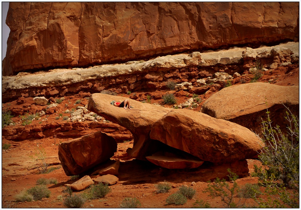
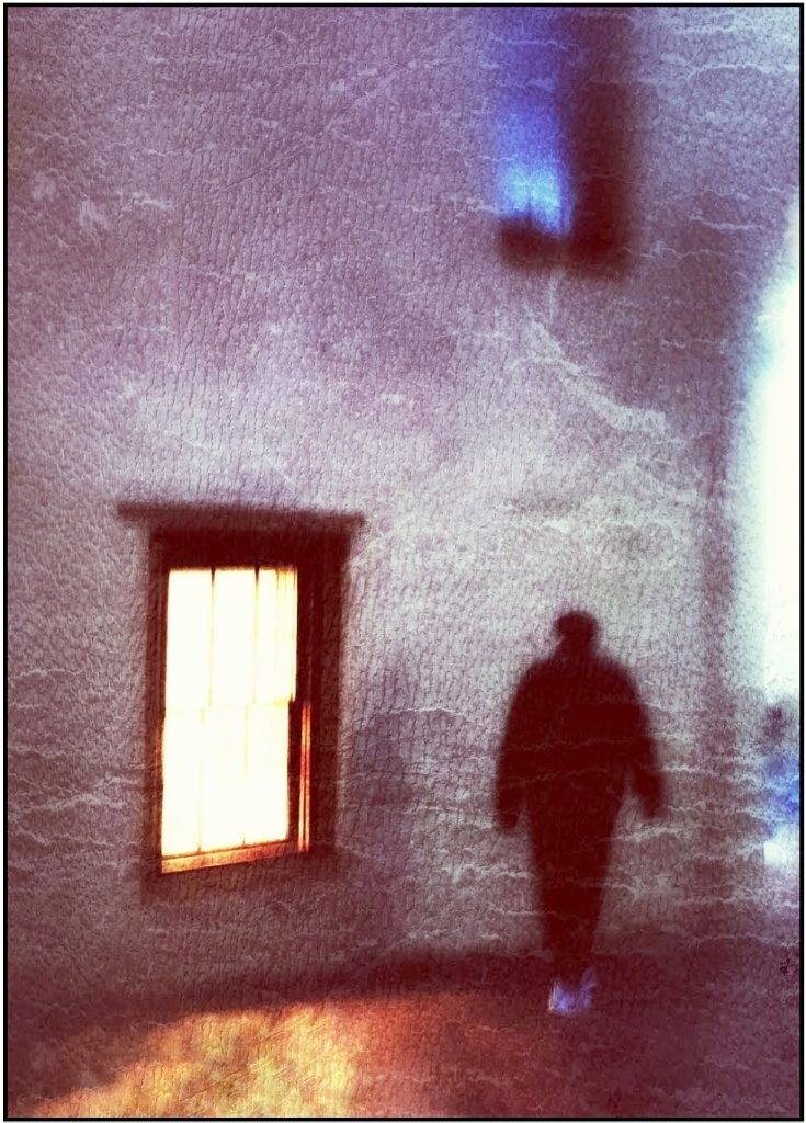
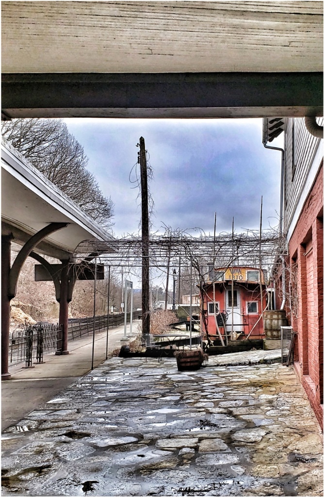
I, personally, like your original composition. I wouldn't crop. Yes, the large window is mid-frame, but that's not always bad. The focus is to the small open/broken panes and to me they fall in a good spot drawing the eye there (along a '3rd'). You might add another dark, open pane in the mid-upper part to draw the eye around, but that's extra effort! |
Jan 13th |
| 26 |
Jan 18 |
Comment |
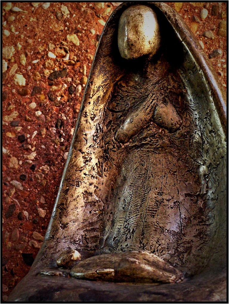
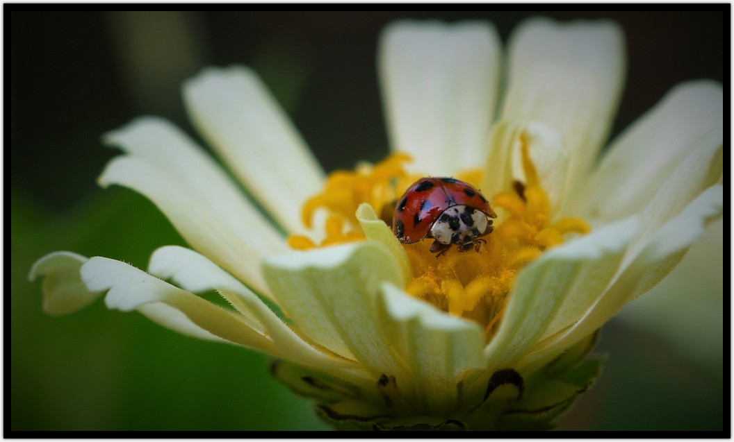
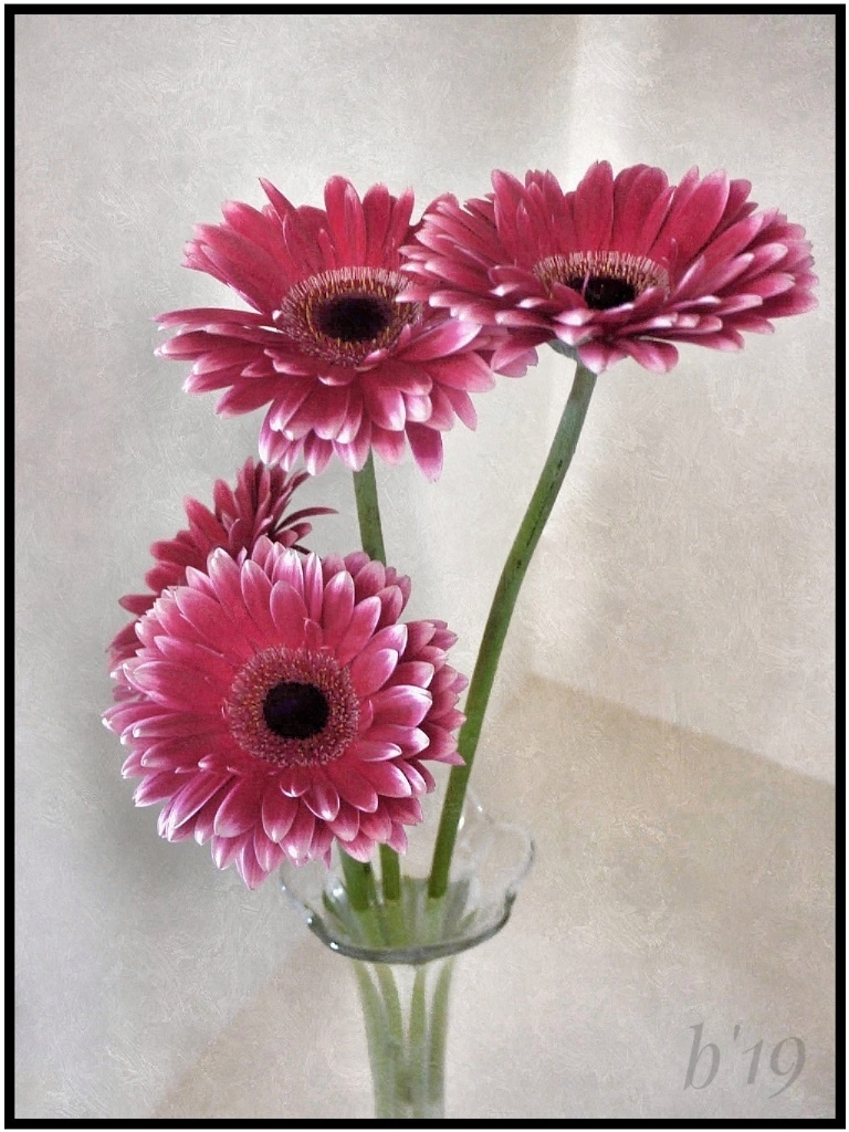
Welcome, Guy! I hope you enjoy the group! Very nice horse portrait, especially the expression. To me, he looks like he could be saying something. This is much improved from the original. You captured great details. Forgive my ignorance of horses, but I especially like the tiny chin (?) hairs. I like the bokeh in the background. To me it's interesting, not distracting. If you choose to do any cloning, I would work on only the hotter spots. I think the piece of window could be removed, and a small crop of the left might be preferable. I'm sure your sister will love this! |
Jan 11th |
| 26 |
Jan 18 |
Comment |
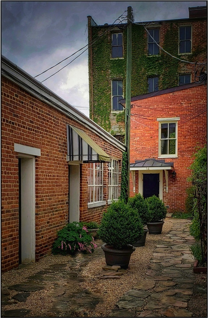
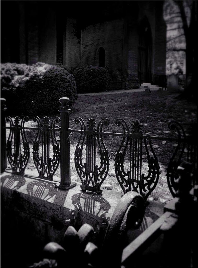
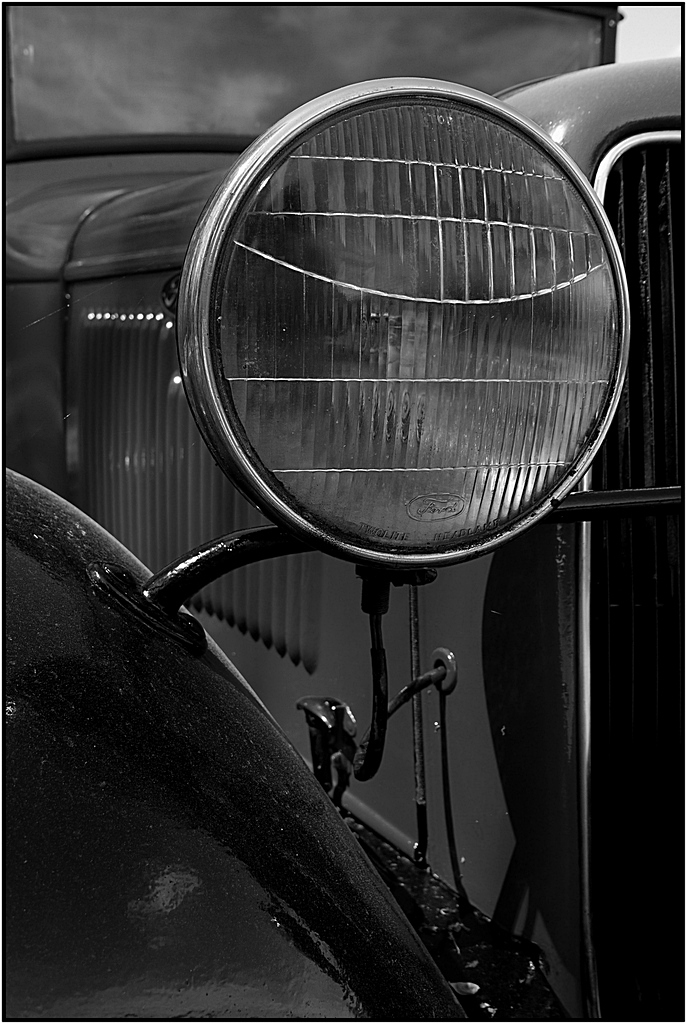
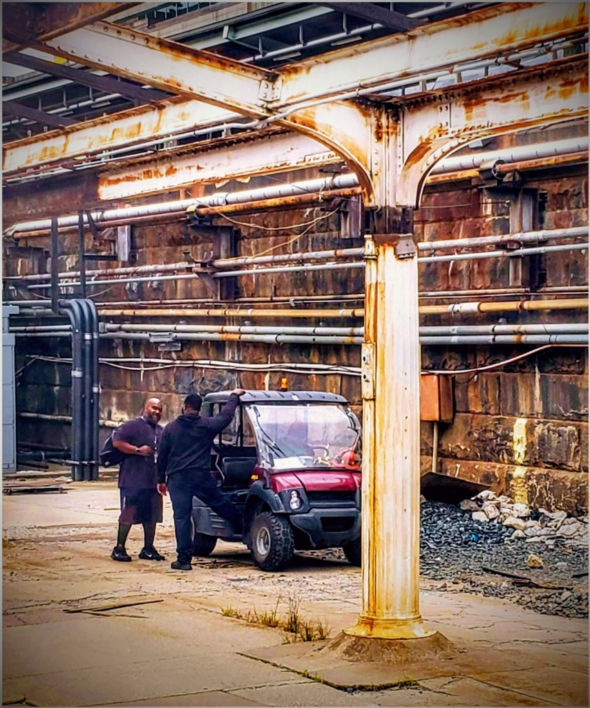
This is very neat 'grunge'. It reminds me of my dad's old garage. This image works great in B/W, and while I like the results for the windows in higher contrast, I prefer keeping the walls. I realize punching up the windows might result in overdoing the bricks so you might not be able to keep them. Nice and simple; yet, allows your imagination to wonder and wander through time. |
Jan 11th |
| 26 |
Jan 18 |
Comment |
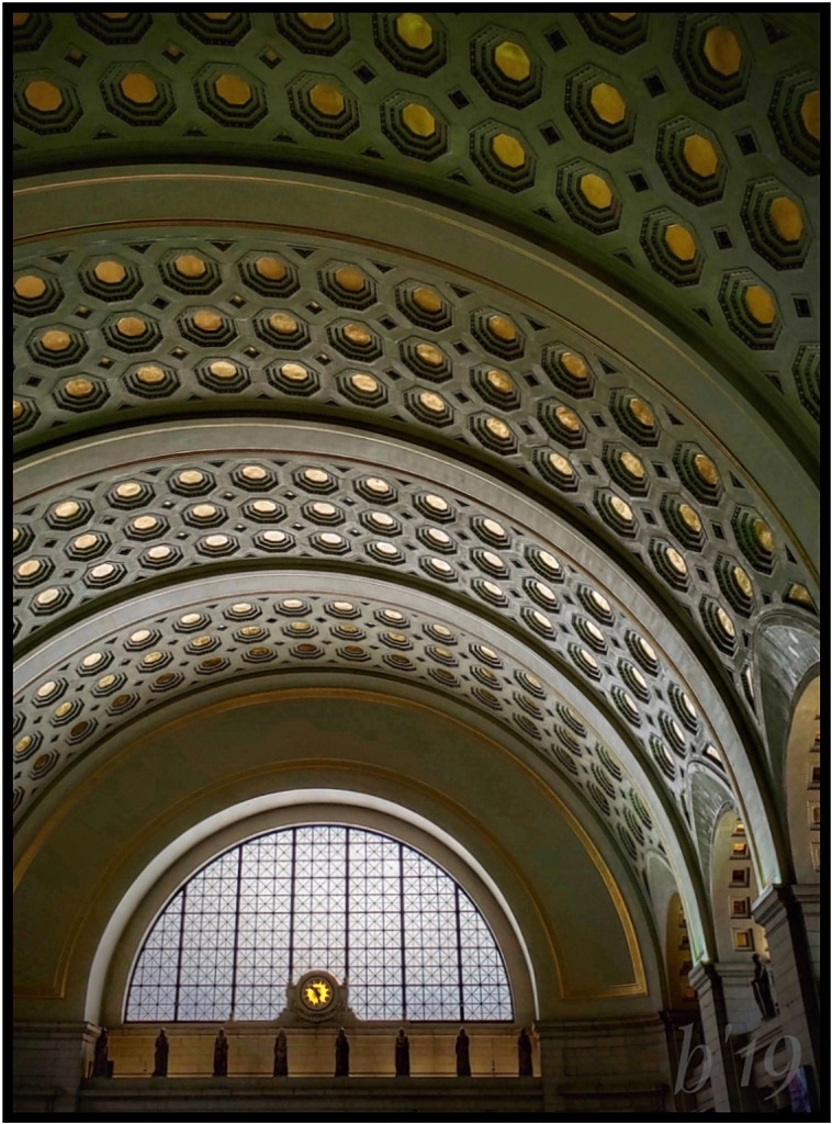
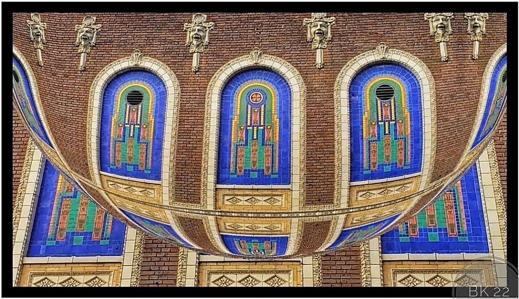
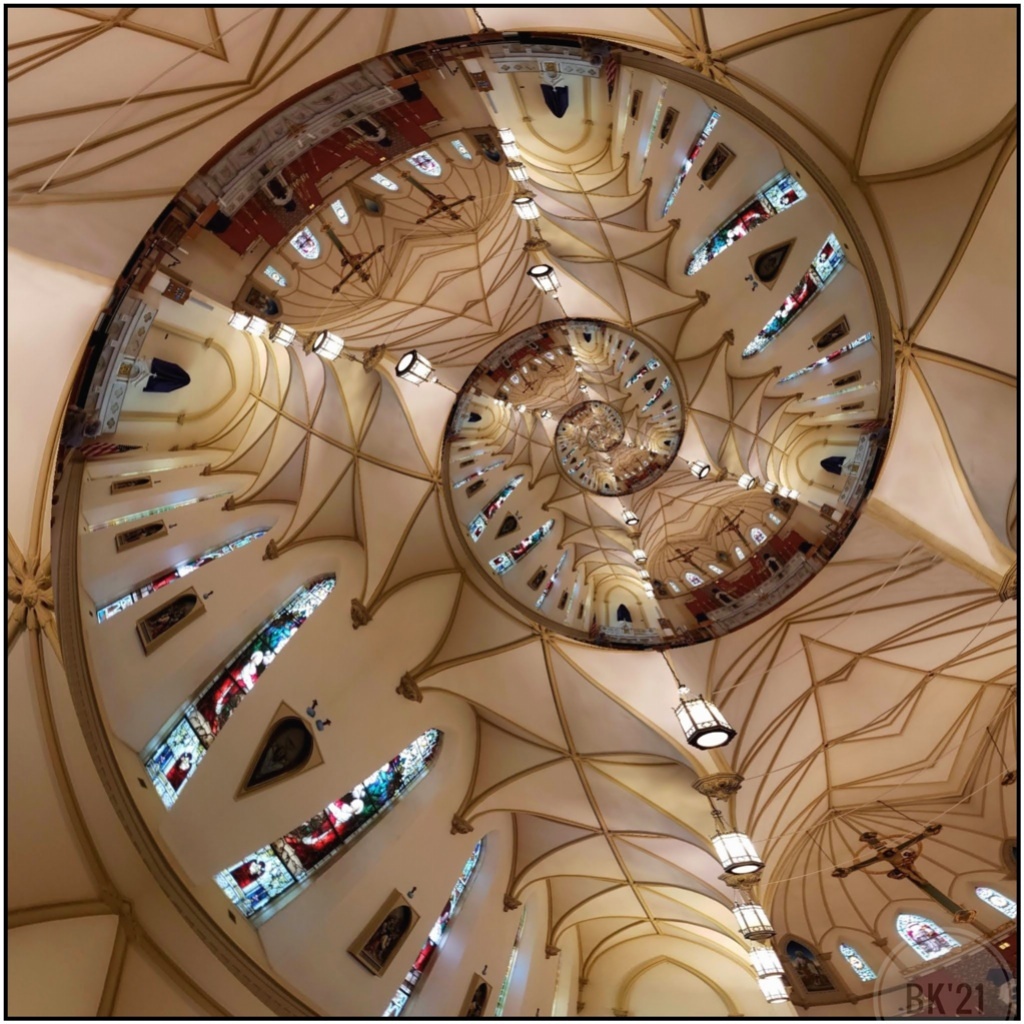
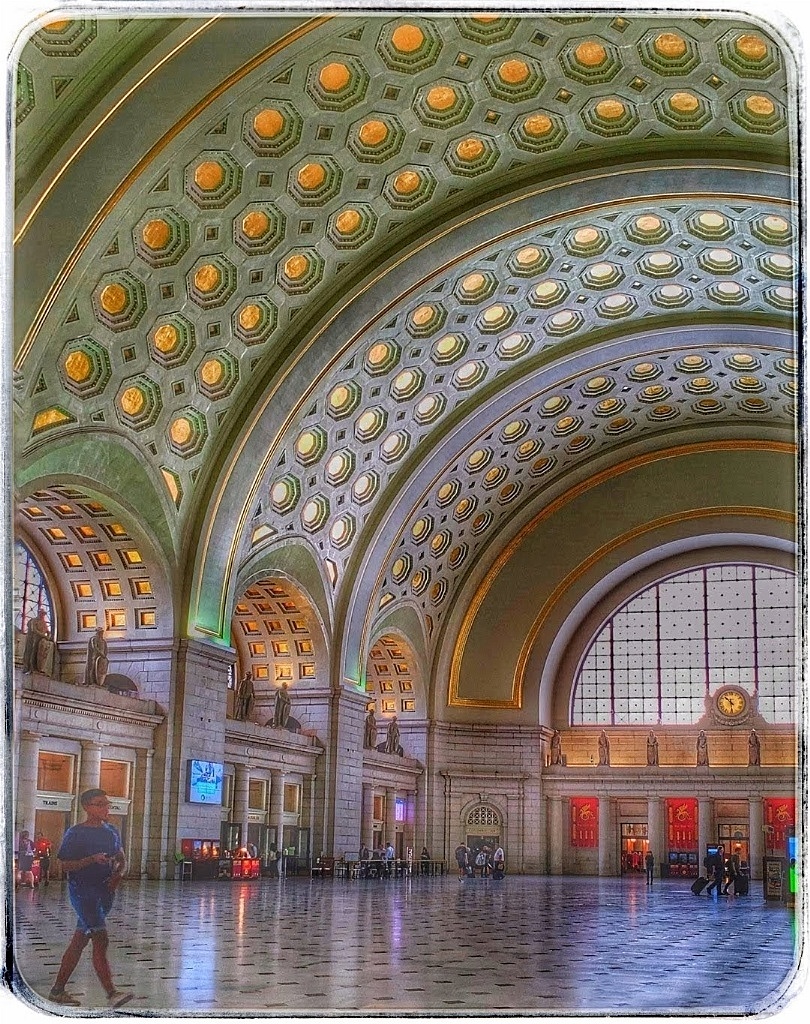
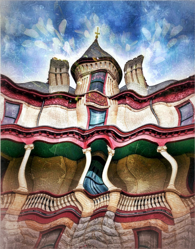
I would never know where to start with so many fantastic architectural details. Details revealed from processing are lovely, especially lighting and colors. On my tablet's monitor the image shows a bit of noise, but it may be the tablet (rarely used for critiques). Totally unnecessary, but I'd crop a smidgeon at the top, removing railing just to the first repetitive designs under the posts. To me it creates a neat, lacy look across the top. You might crop the bottom minimally, as well, removing the small light or shadow (?) in the bottom left or clone out. I agree with Dave, about the coffee table book but I think it could easily be the cover! |
Jan 11th |
7 comments - 4 replies for Group 26
|
7 comments - 4 replies Total
|