|
| Group |
Round |
C/R |
Comment |
Date |
Image |
| 62 |
Apr 26 |
Reply |
Thanks Pete for giving it a try: as I said: it is not a very sophisticated picture which I for reasons unknown to myself started to like. Hence there is probably not a lot to play around with. |
Apr 12th |
| 62 |
Apr 26 |
Reply |
many thanks Emil - the 161 is painted on the top left corner on the floor. I have no clue what it means but felt it gave a nice title to the picture :-)
Thanks and br, A |
Apr 6th |
| 62 |
Apr 26 |
Reply |
thanks Mike for sharing your /our common interests. My hometown Basel used to be an important harbour, where the goods shipped from Rotterdam down the Rhine were distributed further inland. For reason unknown to me the importance has dropped significantly in the past decades and substantial areas are now open to alternative uses, but they kept the old objects here and there as artefacts which makes them nice objects to photograph.
Take care and all the best. A |
Apr 6th |
| 62 |
Apr 26 |
Comment |
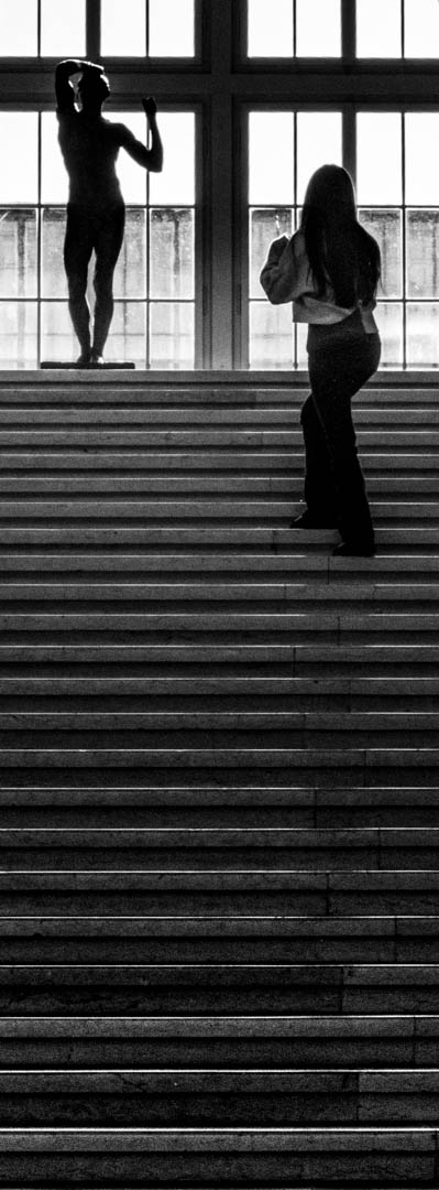
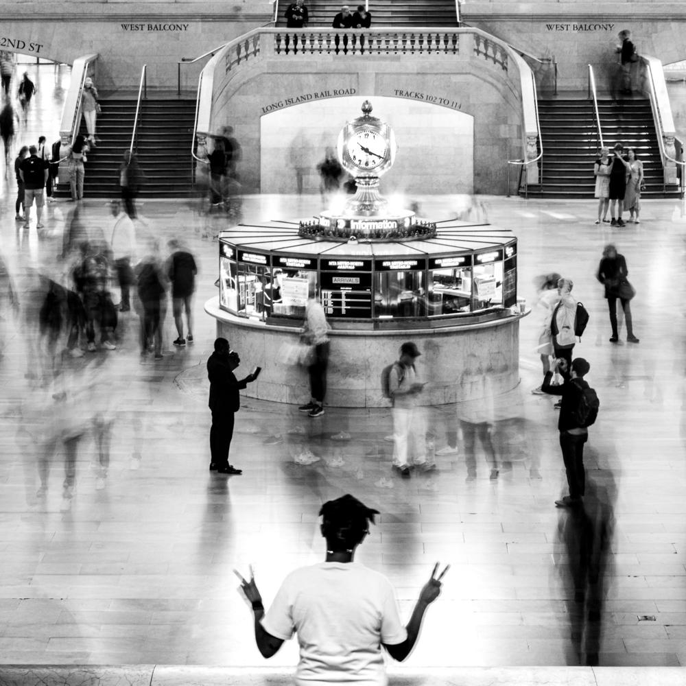
Micheal
Wow and double wow: that is a gorgeous picture. perfectly balanced and I honestly only saw at second glance that it is composited. Personally I obviously :-) very much like the panoramic format. Different from Emil I like the size of the people as they provide a contrast to the heavy pillars. Maybe try to light up the right person a bit?
Brilliant idea and brilliantly implemented. Very skilful.
Br, A |
Apr 3rd |
| 62 |
Apr 26 |
Comment |
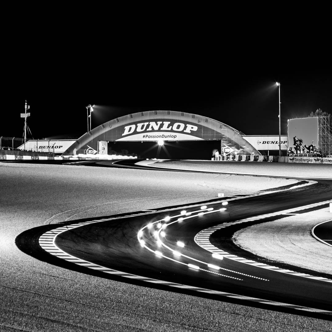
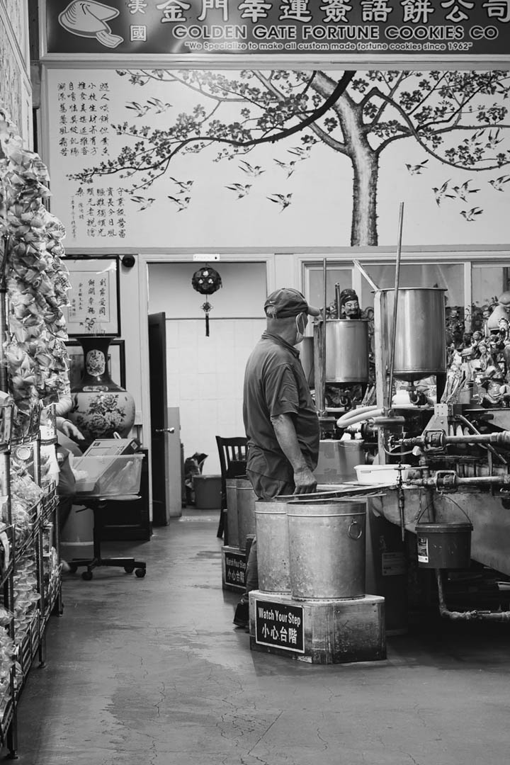
Chris
I like a lot the insight the picture provides into traditional handcraft, I trust these machines are in use since decades, at least. The nice marketing on top adds a nice contrast.
Is there anything I would change? Maybe I would try to darken the lights at the top (or even crop the picture that they are out, which will however impact the writing). You might consider a horizontal rotation in LR, so that the marketing plate is aligned with the border. Personally I was a but unhappy wth the door bar, so I decided to remove the right person entirely. What do you think? |
Apr 3rd |
 |
| 62 |
Apr 26 |
Comment |
Good that Pete has mixed up the pictures because after sending it, I started to like the picture better, where the circles are centred (which is now presented as the final version) |
Apr 3rd |
| 62 |
Apr 26 |
Comment |
Mark
Very nice capturing of a south european street atmosphere. I agree with Mr MEyersons advice and try to beef up my street photogrpahy similarly. I share your experience, that people doing photogenic gestures at the right time at the right place are a rare find ;-)
Br, |
Apr 3rd |
| 62 |
Apr 26 |
Comment |
Hi Emil - a gorgeous picture and a well deserved recognition. I like not only the feeling it conveys but also the many symmetries ît has at different places. BTW I also find the color version quite outstanding.
Simply brilliant!
Br, A |
Apr 3rd |
| 62 |
Apr 26 |
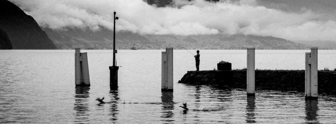
Comment |
Kamal - very well spotted and nicely captured. I actually like the sandbanks on the top of the picture, however I tend to agree with Pete's version, which is more focused.
Nice shot.
Br, A |
Apr 3rd |
| 62 |
Apr 26 |
Comment |
Hi Pete - you captured the gravitas of the county house perfectly and the tombstone is the cherry on the cake. I trust you also messed a bit with the sky - otherwise it wouldnt be blurry with a 1/320 sec.
What would I do different? Difficult as I like your version. For my personal artistic taste there are however too many interesting elements (tombstone, stair to the right, flagpole, tower etc) on it, and I probably would have rather tried to focus on one element.
Br, A |
Apr 3rd |
7 comments - 3 replies for Group 62
|
7 comments - 3 replies Total
|