|
| Group |
Round |
C/R |
Comment |
Date |
Image |
| 62 |
Nov 25 |
Reply |
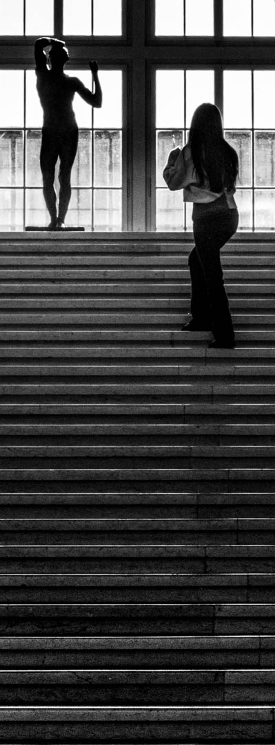
thanks Pete - I firstly had a more high key version, as I love Denis shadow as you say. The downside is the loss of the structures in the sand, which I found more important (in a panorama format) |
Nov 19th |
| 62 |
Nov 25 |
Reply |
Many thanks Mike - the other aspect of the name on the shirt is, that it humanizes the Torero. It is "poor" Denis on the flight :-) |
Nov 19th |
| 62 |
Nov 25 |
Comment |
Hi Mark - as a regular exhibitor (Off Arles) as well as visitor of the Rencontres, I strongly appreciate the topic of your image, in particular as I have never experienced relevant rain there.
Irrespective of the city I like a lot how you managed to transport the feeling of a rainy night. The only aspect I might consider changing, would be to straighten the lines. The houses seem to direct to the top right and may benefit from straightening a bit in LR.
Good job |
Nov 19th |
| 62 |
Nov 25 |
Comment |
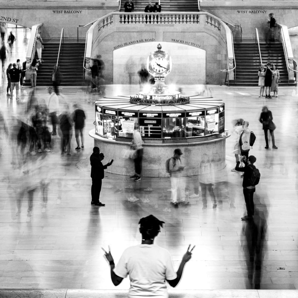
Hi Kamal
welcome to the group - I look forward seeing your pictures and getting your valuable input.
As I am doing lots of photography in the street I very much admire the clear concept of the picture: the regular white bags as contrast to Captain Hook.
Similar to Pete I probably would have cropped it closer, eg as square (or as a 3:2 with less sky). I am fight myself regularly against the halos, which typically come from post-production (eg dehazing of sky). A trick to remove it is to make a brush with the countermedicine (eg negative haze if this is the cause) with a low densitiy and the brush over the halo until it disappears. Obviously the first step is to know the cause ;-)
Take care and all the best, A
|
Nov 19th |
| 62 |
Nov 25 |
Comment |
Hi Mike - I love it. Very thoughtful how you cropped the irrelevant parts at the borders which would disturb the flow of the eye. There is nothing I can add, Very well done. BR, A |
Nov 2nd |
| 62 |
Nov 25 |
Comment |
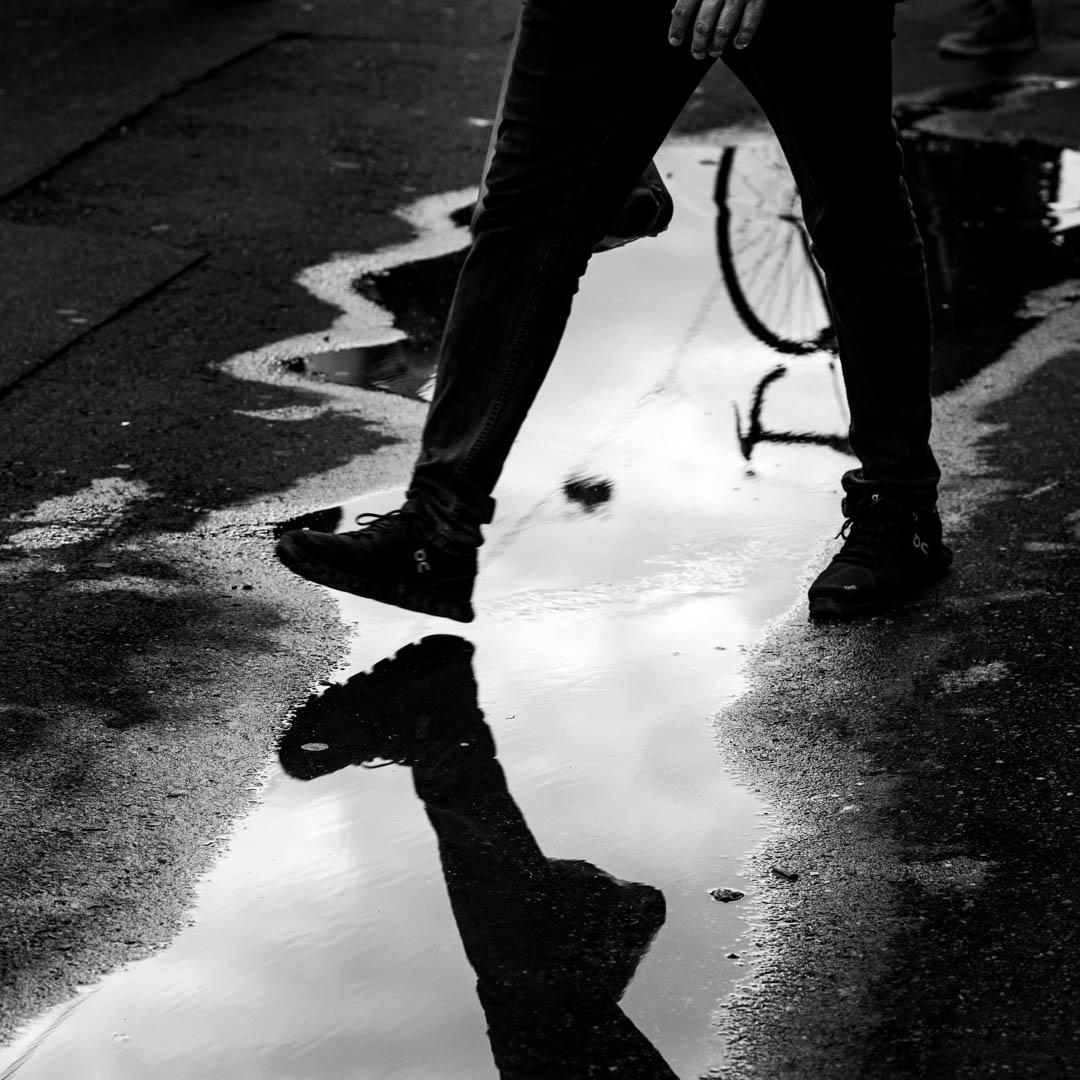
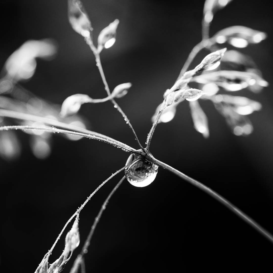
Hi Chris
Well spotted and great implementation. I love how you play with the depth of field.
I tried an alternative cropping which puts the drop into the centre. As it is smaller the viewer also sees the inside of the drop a bit better. What do you think?
Br, A |
Nov 2nd |
 |
| 62 |
Nov 25 |
Comment |
Hi Emil, again a brilliant shot of what I presume is an often shot topic.
I in particular liked how you worked with the white writing on the ground between the shadows. Well visible but not overly present. Very well done.
Is there a particular reason why you left the pole on the right visible but not on the left? I personally would prefer in that respect Pete's version which emphasizes the symmetry by having the left and the right side almost identical.
Congratulations. BR, A |
Nov 2nd |
| 62 |
Nov 25 |
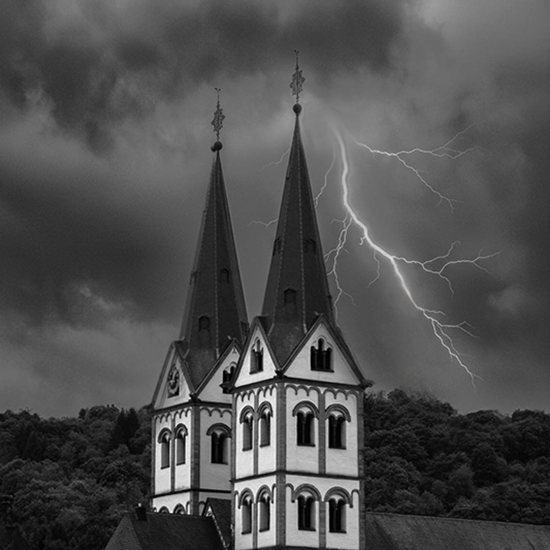
Comment |
Hi Pete, I like the idea and the European Church style gives it a flavour of dracula movies from Transsylvania. I wondered if it would be beneficial to remove the builsing in front to emphasize the veritical structure of the topic?
Br, A |
Nov 2nd |
 |
6 comments - 2 replies for Group 62
|
6 comments - 2 replies Total
|