|
| Group |
Round |
C/R |
Comment |
Date |
Image |
| 62 |
Oct 24 |
Reply |
Hi Michael - I like the sky much better - the cropping makes a lot of sense to me. Br, A |
Oct 12th |
| 62 |
Oct 24 |
Reply |
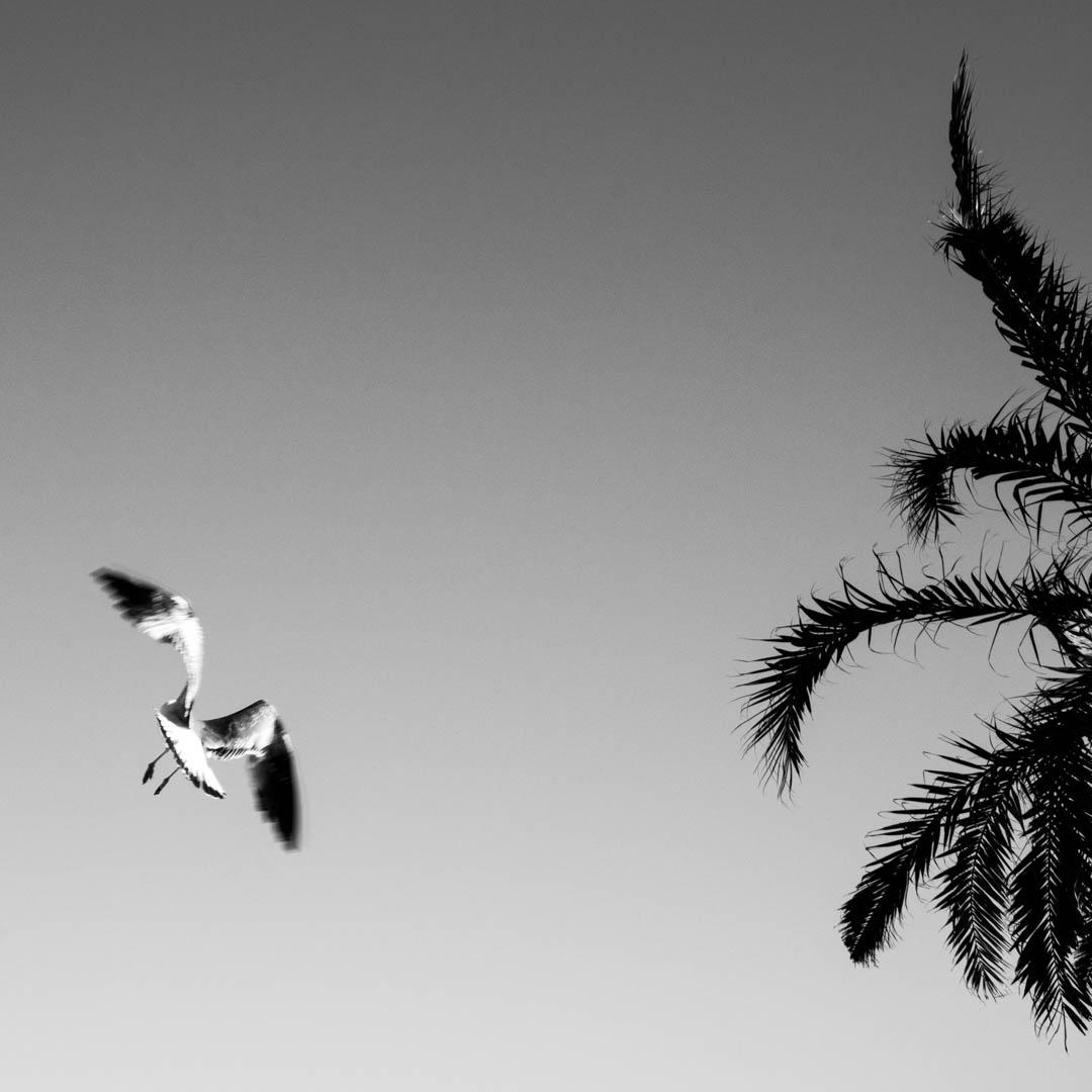
many thanks Emil - and yes the bird was firstly walking up and down in front of us picking up the leftovers from our lunch that had dropped to the floor. Br, A |
Oct 12th |
| 62 |
Oct 24 |
Reply |
many thanks Stephen for your valuable additional thoughts, to which I subscribe in any respect. |
Oct 9th |
| 62 |
Oct 24 |
Reply |
many thanks Steven for your feedback. I had to check the Dali picture on the Web and then saw the similarities in the wooden structure and see what you liked.
For purpose of homgenity (in exhibitions) I do all pictures in square format. I agree that this sometimes requires some concessions regarding the composition.
Thanks |
Oct 8th |
| 62 |
Oct 24 |
Reply |
Thanks Pete for your version. I needed a moment to spot the differences, which I took for a good sign, that my version isnt too far off :-)
Bottom line I have a slight preference for „my" version as it shows more clouds in the sky. However this is only visible in a direct comparison. |
Oct 8th |
| 62 |
Oct 24 |
Comment |
Hi Mike
A brilliant outcome of a difficult task :-)
I like the picture a lot. It captures brilliantly the postures of teenagers that have grown a bit to fast. The hand almost touching the waterline would be a picture for itself. The stone covering the horizon is another plus
Neverthless I felt tempted to play with the picture and reformatted in my beloved square format (ensuring that the distance of the hand and the stone to the respective borders are approx similar and that the horizon is at the upper line of third). I further added linear gradience over the sky with dehaze and some increased dynamics.
What do you think?
|
Oct 2nd |
 |
| 62 |
Oct 24 |
Comment |
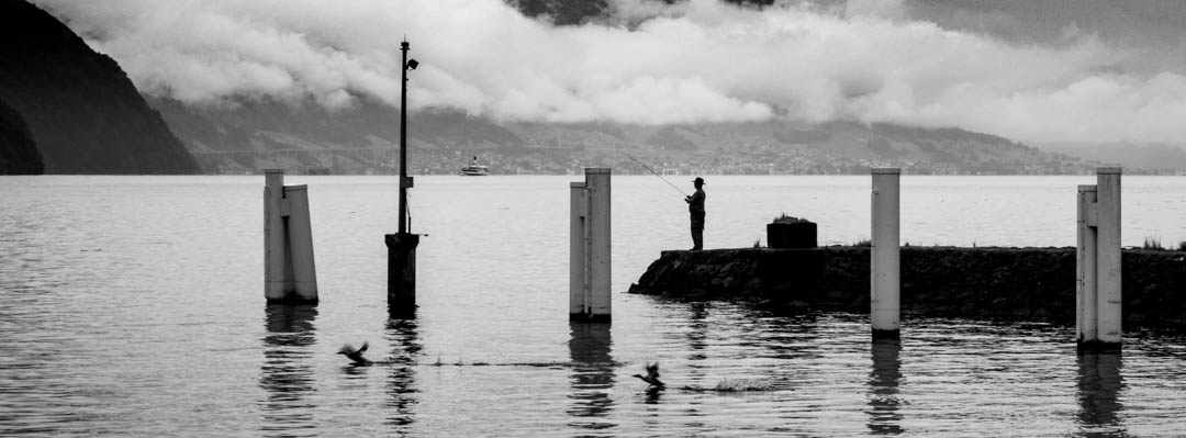
Hi Emil
A wonderful place - put perfectly in scene.
I could not îmagine anything to improve.
Great shot! |
Oct 2nd |
| 62 |
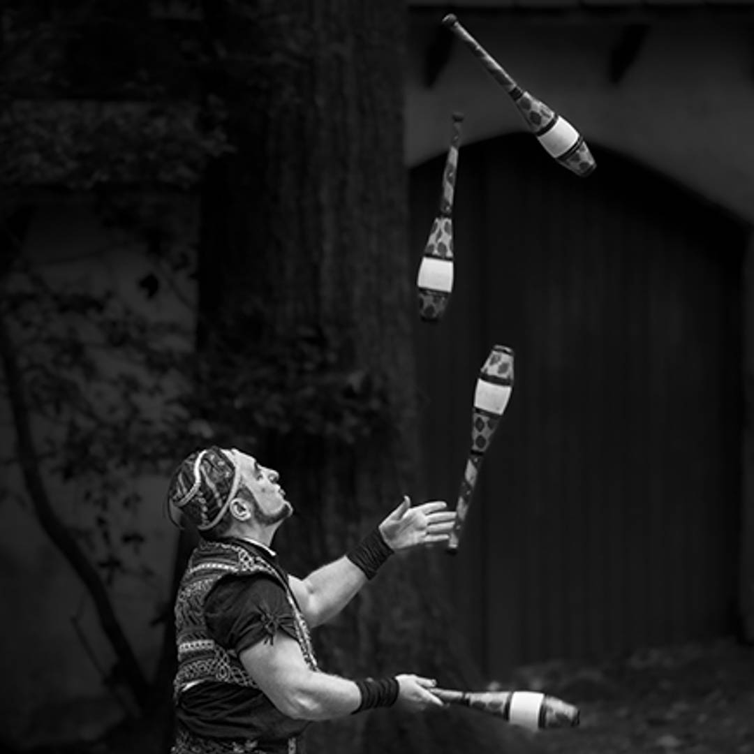
Oct 24 |
Comment |
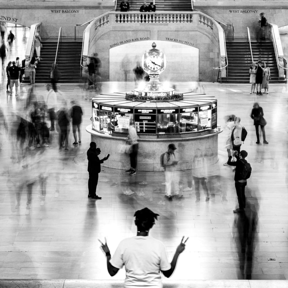
Hi Pete
Great story and great picture. Kudos for not having another speactor in the picture.
I like the way you handled the background and was struggling to make any recommandations. Then I did the following alternative version:
my beloved square format emphasizes the facial expression and the cones. I further attempted to darken the background a bit more by doing two linear gradients from the top right and the top left corners.I have increase the whites and reduced the balcks by 10 for increased dynamics.
I have not taken the effort to cut out the cones from the linear gradients, but this would certainly improve their visibility
what do you think?
Best. A |
Oct 2nd |
 |
3 comments - 5 replies for Group 62
|
3 comments - 5 replies Total
|