|
| Group |
Round |
C/R |
Comment |
Date |
Image |
| 8 |
May 25 |
Comment |
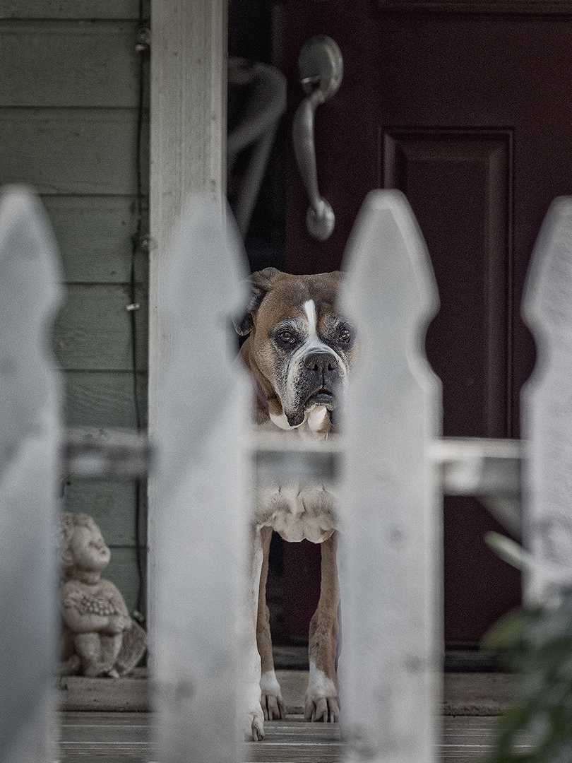
I like how the shadows curve. I think the Warp created distortions in the hexagonal pavers that give me a slight feeling of uneasiness. |
May 24th |
| 8 |
May 25 |
Comment |
Wonderful photo! Very pleasing that one is low and the other high. |
May 24th |
| 8 |
May 25 |
Comment |
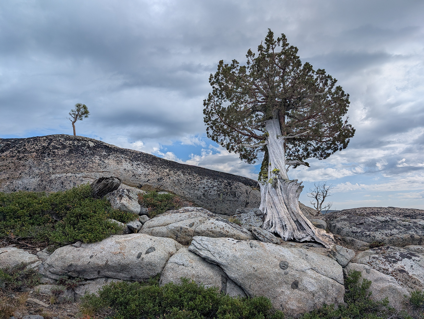
For me, the cloud is the star of this image. I see a bird soring, with a long tail. What do you think about cropping up from the bottom to eliminate the near foliage in the lower left and right corners? The image would lose some sense of depth, but I think that would be OK. |
May 10th |
| 8 |
May 25 |
Comment |
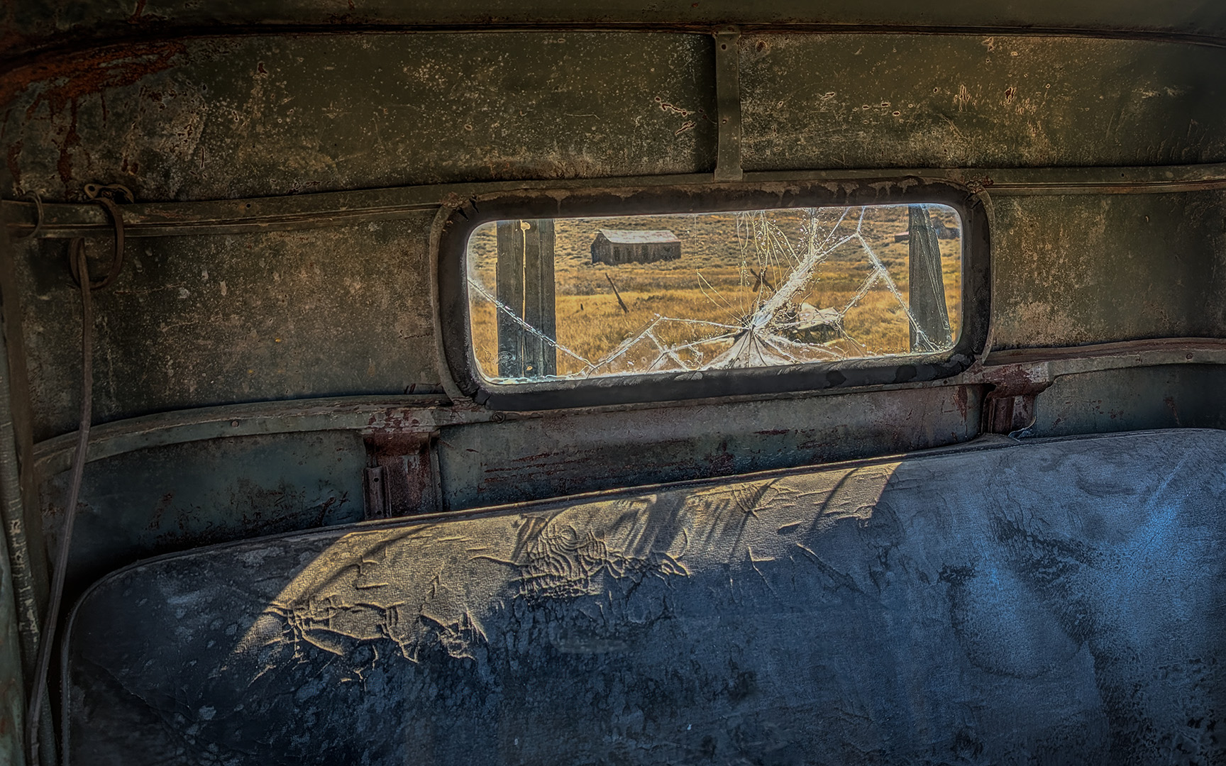
I wish I could make images like this. I'm loving everyone's images this month, but this one is my favorite, perhaps partly because I could never pull this off. Wonderful connection with your subject -- that's what really makes this special. Although I agree with you that the car works, I think this is fantastic with or without the car. I think the important thing is where you placed her in the frame. The one thing I'm unsure about is the bright white vertical post right of center. It contributes to the balance, echoes the cigarette, but I can't help thinking it draws too much attention to itself. |
May 10th |
| 8 |
May 25 |
Comment |
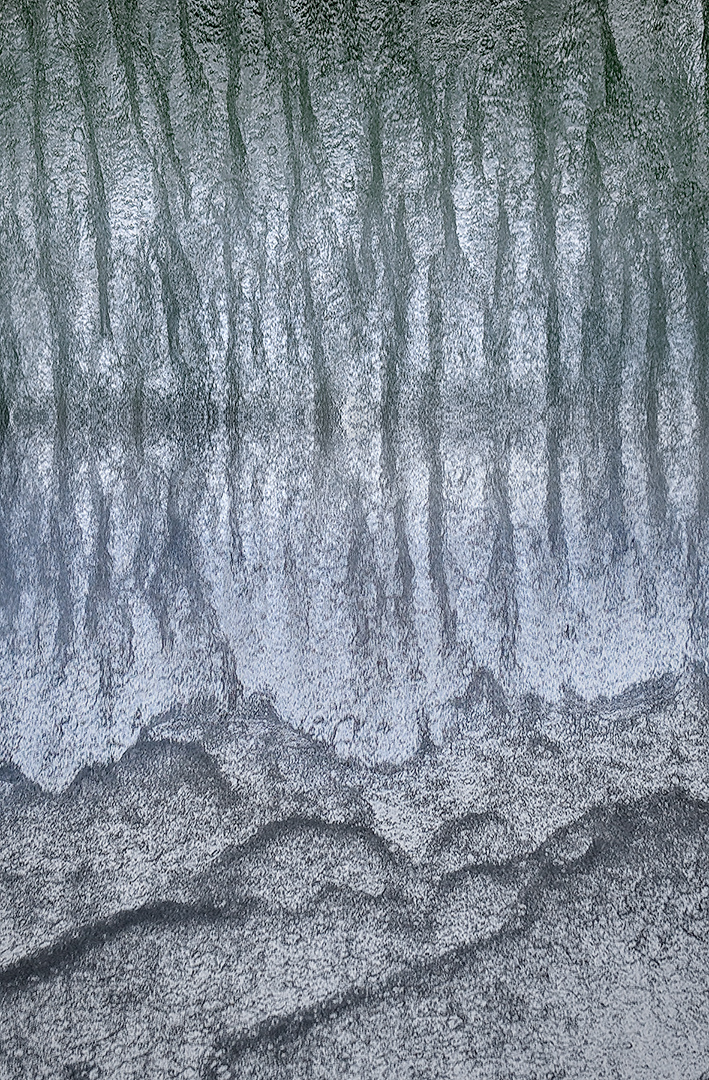
Wow, you found a great spot! For me, you nailed the saturation. We all love saturated colors, but I'm sensitive to over-saturation, and this goes right up to to the line, without crossing over. Maximum appeal. But what really makes this special for me are the patterns. I really like the lines/shapes of color you found. I don't know if you are open to removing things in your photographs, but if you are ... I'm wondering about that cloud at the top, just right of center. You have leading lines in your composition that direct my eye up there, and the brightness holds my gaze, yet that is not where I want to be looking. I wonder how your image would look with that cloud removed or, if you don't allow yourself such things, slightly darkened. |
May 9th |
| 8 |
May 25 |
Comment |
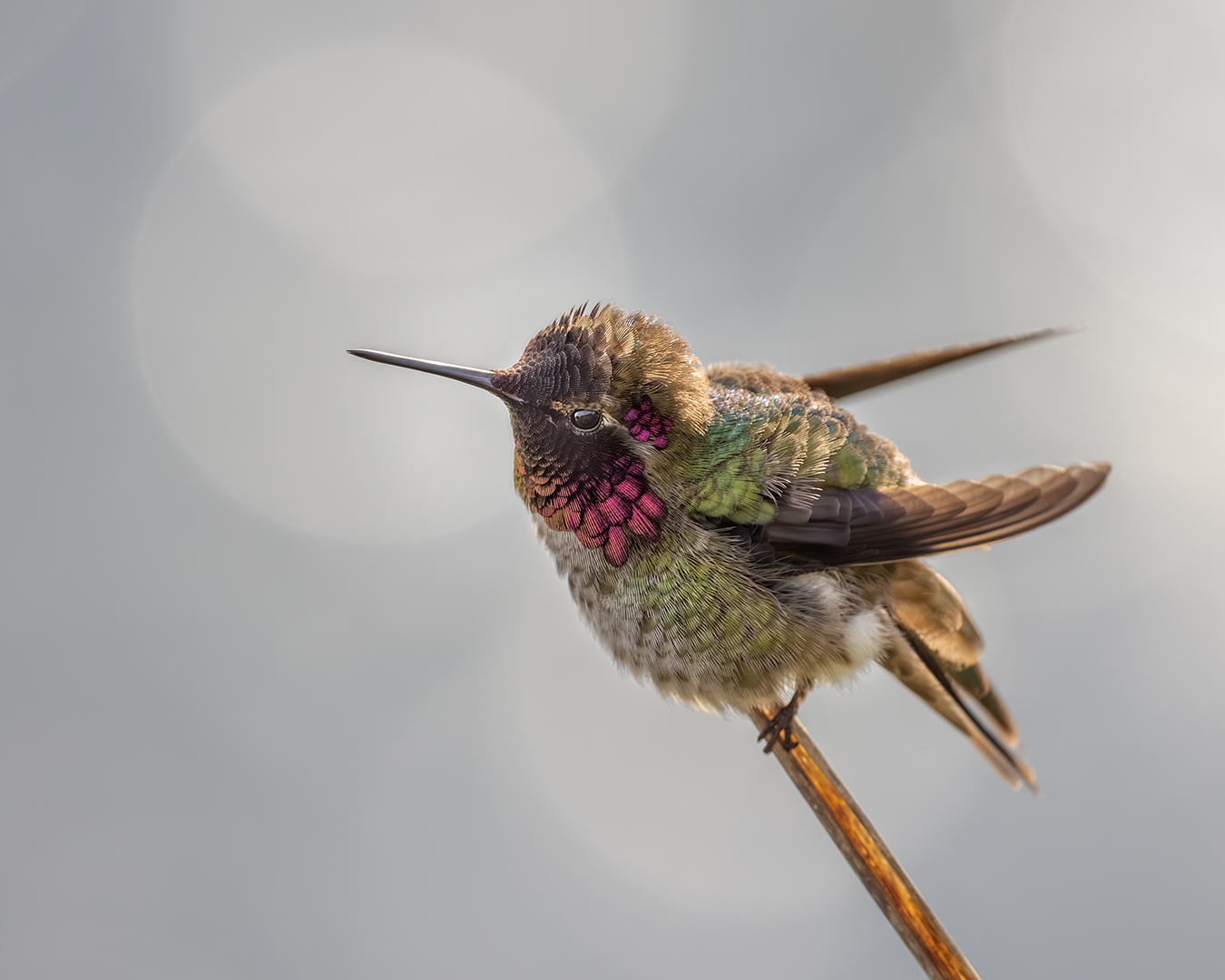
Bold move to go B&W, and I love it! There is so much pattern and texture that I suspect I would have overlooked if I was presented with all the brilliant saturated colors of a Peacock, so I very much appreciate what you have done here. The framing is spot on, the centered composition works great, the perspective is perfect, and I particularly like the graphic clarity of the back feathers. The only thing I'd consider changing if this were mine would be to try to get more visibility of the eye, because the composition works so strongly to take us there. |
May 9th |
6 comments - 0 replies for Group 8
|
6 comments - 0 replies Total
|