|
| Group |
Round |
C/R |
Comment |
Date |
Image |
| 83 |
Feb 24 |
Reply |
Thank you Don for your kind words. I'll make sure to more critically "clean" things up next time around. |
Feb 6th |
| 83 |
Feb 24 |
Comment |
Hello Lance! You taught me a different perspective (pun intended) on photography during your recent presentation to the VG Photography Club, namely that less is not always more as I try to do, but that sometimes more is better as you show us in this picture. I can smell the moss and hear the brook and rustling of the leaves. My only hesitation is that it looks like your position as the photographer may have been standing in the water. Talk about "Intimate with Nature" if I'm right. I must admit that I don't get the whole film that ends up digital versus directly digital conversation especially since third party filters are now supposed to make it look like a digital photo was originally shot on film. Vinyl or CD? I don't get it! |
Feb 6th |
| 83 |
Feb 24 |
Comment |
Hello Mark - What a great job you did going from the before to the after. I have only one word for that: "WOW!" Your cropping is wonderful and I love how you took advantage of the shades of grey to increase the feeling of depth. I think you did the right thing by cropping the river out. My only hesitation is whether the horizon as indicated by the row of trees or bushes is straight. In such a wide format, this becomes important. I love how your B&W treatment increased the depth and hilliness (?) of the dunes. How did you process your clouds? They match the hills quite effectively.
Bottom line: I wouldn't be surprised to see this picture hanging in a fine arts store! |
Feb 6th |
| 83 |
Feb 24 |
Reply |
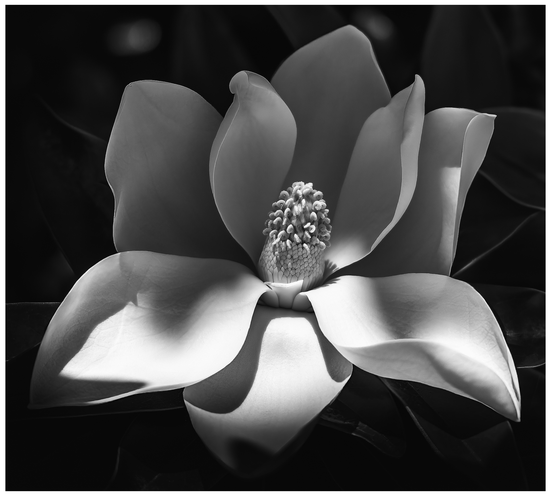
I added a slightly more obvious stroke. It took me time to find the right technique, but I love how easy it is to do. |
Feb 6th |
 |
| 83 |
Feb 24 |
Reply |
[a] Bird: I love that it might be a raven and everything this implies. Where is the bird in the original picture?
[b] Crop: You are correct that a wider crop doesn't add much.
For what it's worth, I usually take my pictures pretty wide then decide how to crop them later. You can always crop, rarely expand, though now with Generative AI... |
Feb 5th |
| 83 |
Feb 24 |
Reply |
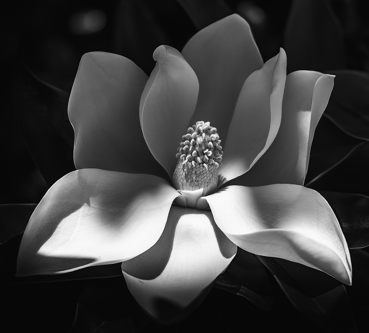
Thank you for your kind words, Michael. The idea of a colored stroke is brilliant. Why didn't I think of that!
PS: Since I can's seen to be able to edit my post, here are my technical details: Canon R6 handheld at 1/1000 sec, f/4.0, ISO 100 and 105mm w/RF24-105mm F4L IS USM lens |
Feb 5th |
| 83 |
Feb 24 |
Comment |
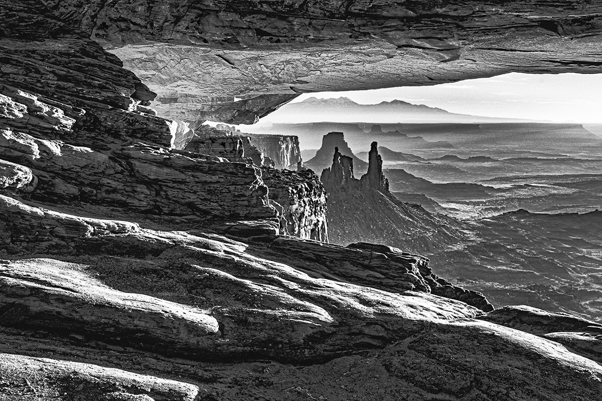
Hello Don - *6* levels from foreground to the horizon! *6*!!! What a treat! I love that you took a picture of mostly ochre and red rocks and turned it B&W. It definitely strengthens it in my opinion since this is a pretty popular site. In other words, when everybody else shows this site in color, you decided to go monochrome - Good job! Since you had an extra 15mm to spare, might you have been able to show more of the wide open space on the left? Finally, I took the liberty of playing with your picture to extract more details from the blacks and straighten the horizon slightly. I was hoping it would help bring attention to the Mesa (?) on the far right. I'm not sure I was successful. Bottom line: I love the different feeling you captured from a pretty well known site! |
Feb 5th |
 |
| 83 |
Feb 24 |
Comment |
Adi, congratulations on such powerful leading lines both and to the horizon, but especially on the street (see Only arrows). Well done! I don't mind at all the people and the business; after all that's what big cities are about. I'm wondering if you could have waited a couple seconds longer before taking your picture so that you "might" have had the leading lines straight in front of you like you captured, but also possible those from the street leading to the (top) left. I know you had to make the decision in on instant since you were on a bus (great idea!)... I also love the anachronism of the two little food carts on the street as if they had fed the man on the 'Taste of Time' billboard. Might you also have been able to keep the top of the buildings in the picture without cutting the two girls (bottom center)? Bottom line: I think the fact that you took a picture from a hypercolorized environment and turned it into B&W helped focuses the eye on the strong leading lines. Job well done! |
Feb 5th |
| 83 |
Feb 24 |
Comment |
Michael - Interesting picture. I love the grain you left in since it strengthens the feeling of sadness. I'm not sure how I feel about the bird. I think it distracts from the isolation and loss. Its movement possibly clashes with the stillness of the rest of the picture and as such has me focus on it specifically, wondering what type it is and why it's there. The somewhat dilapidated wall plays a big role in the feeling conveyed by your picture. Would it have been possible to show more of it? Bottom line, I love that your picture conveys a powerful feeling. |
Feb 5th |
5 comments - 4 replies for Group 83
|
5 comments - 4 replies Total
|