|
| Group |
Round |
C/R |
Comment |
Date |
Image |
| 2 |
Jan 24 |
Comment |
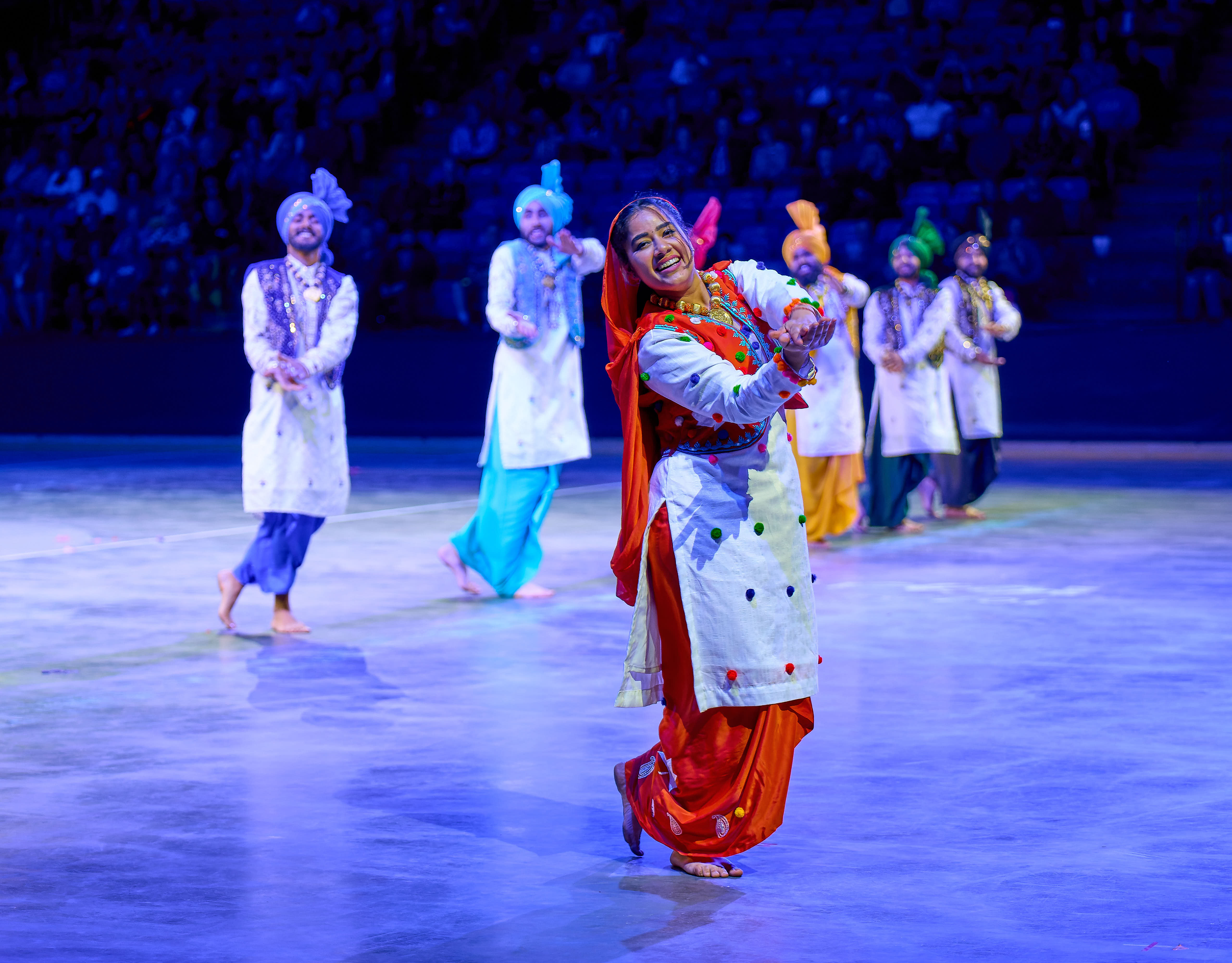
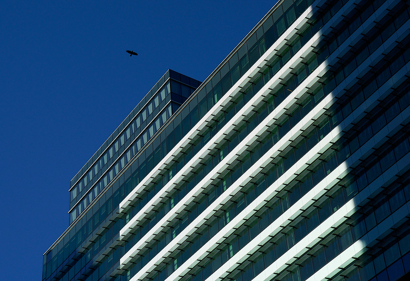
I'm really enjoying your image. The motion of the person prevents it from looking static and she provides scale as well. The bold geometric shapes and high contrast are a feature to me. If this was mine, I would consider making the grey street tiles just a bit darker, so the zigzag of the white tiles also stand out. It certainly is an exercise in bold geometry balanced with the organic element brought in by the woman. Cool!
Oh, just noticed that the wall lines on the top left aren't parallel with the top edge of the picture. If that bothers you, try keystoning it. Not a big deal to me though. |
Jan 6th |
| 2 |
Jan 24 |
Comment |
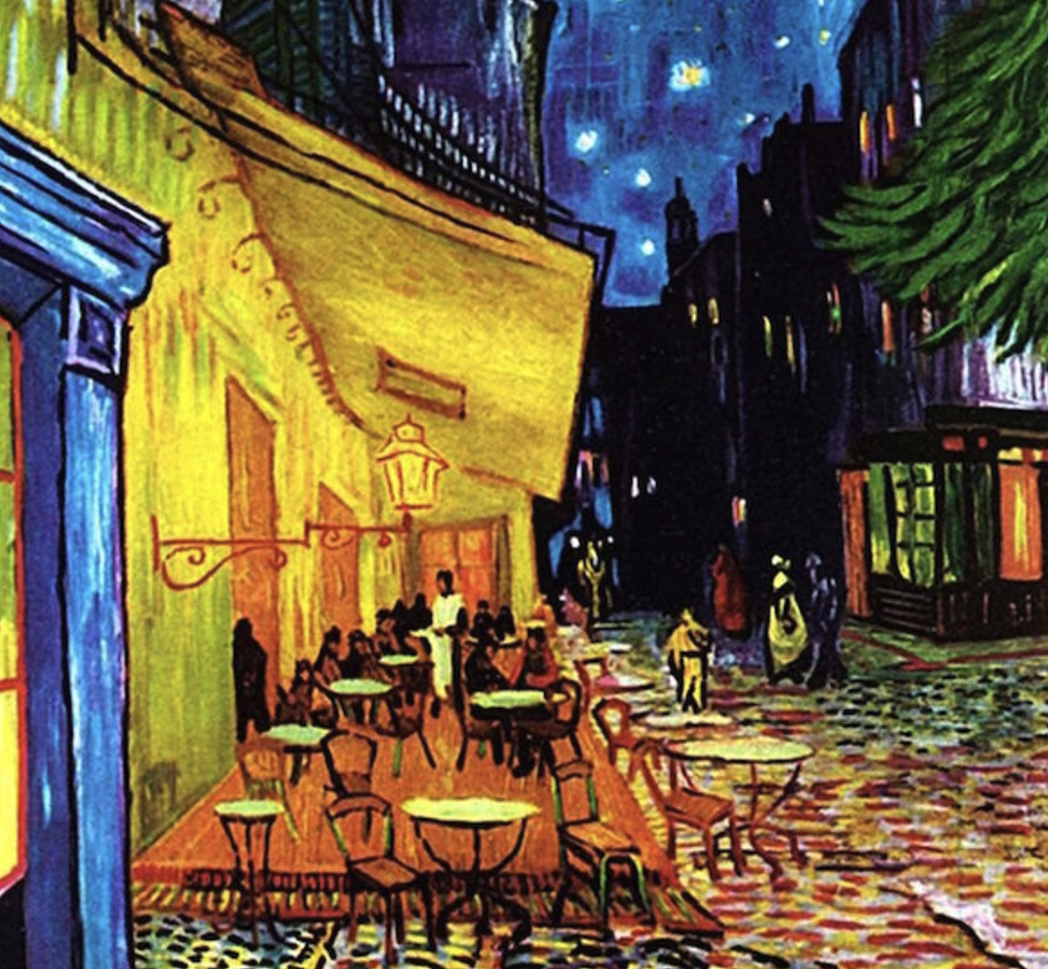
Cool image! The black trunks really draw you into the picture. I'm a fan of the bold colours, which you have in spades. If this was mine, I'd print it. Colour-wise your picture remindes me of Van Gogh's night paintings. Found the painting that was brought to mind. Hope it's ok to post it. |
Jan 6th |
 |
| 2 |
Jan 24 |
Comment |
Thanks Piers,
I'll play around with your ideas in post. See how it goes. |
Jan 5th |
| 2 |
Jan 24 |
Reply |
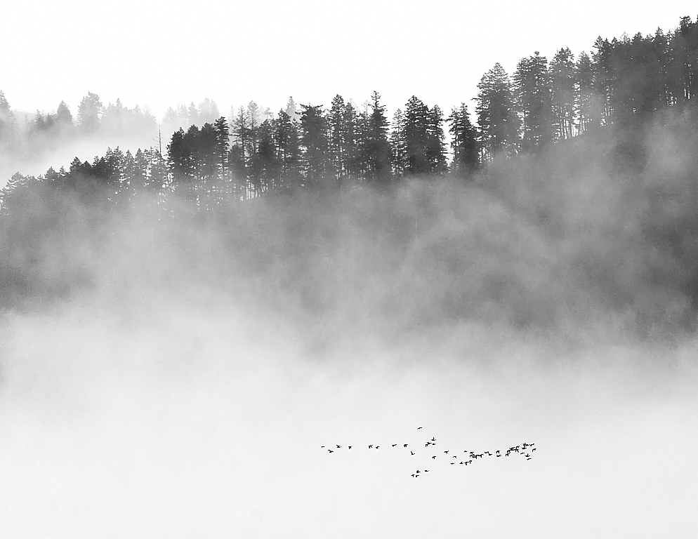
I like your idea of making only the trees the subject. We've got fog most mornings these days (instead of the snow that we're used to). I'll head out again and follow your ideas. |
Jan 5th |
| 2 |
Jan 24 |
Reply |
Thanks Martin!
I'm looking forward to learning with you guys. |
Jan 5th |
| 2 |
Jan 24 |
Reply |
Thanks for you comments! Yes, I agree that the geese aren't sharp. They lost their detail when doing the size reduction for the upload. I'll chose less detail-dependent pictures next time. |
Jan 5th |
3 comments - 3 replies for Group 2
|
3 comments - 3 replies Total
|