|
| Group |
Round |
C/R |
Comment |
Date |
Image |
| 14 |
Mar 18 |
Comment |
A nice image of a photographer at work. I have puzzled a lot over what bothers me. One thing is the excess contrast and lack of detail in the sunflowers. I am not bothered by the shadows on Samantha's face, natural result of a very sunny day. I would try to reduce overall Contrast and try Levels and increasing dark tones. But I decided my main problems I see two competing focuses of interest and I can't decide how to resolve the problems, Excellent image for a calendar. But is it Art or can it be make so? |
Mar 26th |
| 14 |
Mar 18 |
Comment |
Owl are a favorite with me. Not only are they a symbol of my college but also wisdom and knowledge. I prefer to ignore their diet generally consists of small furry animals. I think this is a handsome fellow and agree entirely with Larry's suggestions on making him stand out as well as a standout. |
Mar 26th |
| 14 |
Mar 18 |
Comment |
I heartily second Arun's comments. I love the monochrome--almost a lithograph-like texture. I agree the right dome is a bit too dark. I would add the lower right of the left dome as a bit too dark, especially when there are few shadows elsewhere. To me, Larry's lightening the center dome looks artificial. I visited Budapest briefly in the early '90s but do not recall visiting this spot, so I am looking at the image solely as an interesting view without "benefit" of reality. |
Mar 26th |
| 14 |
Mar 18 |
Comment |
|
Mar 26th |
| 14 |
Mar 18 |
Comment |
A wonderful image of childish joy. I assume this is a one-shot candid, as you did not try again to catch the child's face. I think that is not necessary--his body language certainly conveys his joie de vivre. However I do think the composition would have been improved f you had the child's figure further to the left--either by turning your camera to the left or asking the kid to run though the circular pipes and catch him heading to the right, heading out the increased space to his right and then, after pushing the shutter release on out of the composition. |
Mar 26th |
| 14 |
Mar 18 |
Comment |
Beautifully framed by the white border and the soft colored window. I only wish the golden domes and roofs were a but darker. For me, they verge on overexposure. |
Mar 20th |
| 14 |
Mar 18 |
Comment |
I agree the left side is overly darkened, thus losing valuable detail. The white house is a great focal point but the background seems somewhat garish, leaving me to wonder whether orI an looking at clouds or fprewt. |
Mar 20th |
| 14 |
Mar 18 |
Comment |
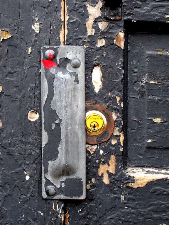
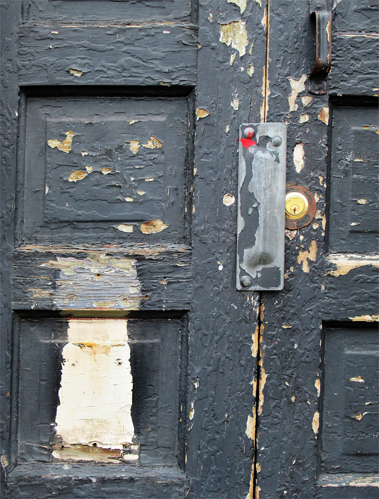
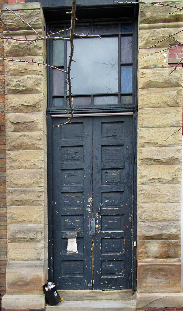
Thanks for all the comments. I think Evan's title, shortened to "Security", is my preference. So far. Other ideas welcome.
As for Larry's idea of an empty upstairs apartment? Most of the neighboring doors lead either to 1st floor stores or 2nd floor apartments or small businesses (e.g., hair salon, music teacher--with a small sign). This door had no sign but mail was in the mailbox--maybe ad circulars, maybe 1st class--did not look carefully. As for the steel plate--it looked to me as a way of preventing the lock from bin forced.
As for a border? I confess I goofed. I forgot the black background and added a black border! Yes, white,red or brass should have been used. I plan to enlarge this image but have not decided on mat color.
Thank you all |
Mar 17th |
8 comments - 0 replies for Group 14
|
8 comments - 0 replies Total
|
