|
| Group |
Round |
C/R |
Comment |
Date |
Image |
| 14 |
Feb 18 |
Comment |
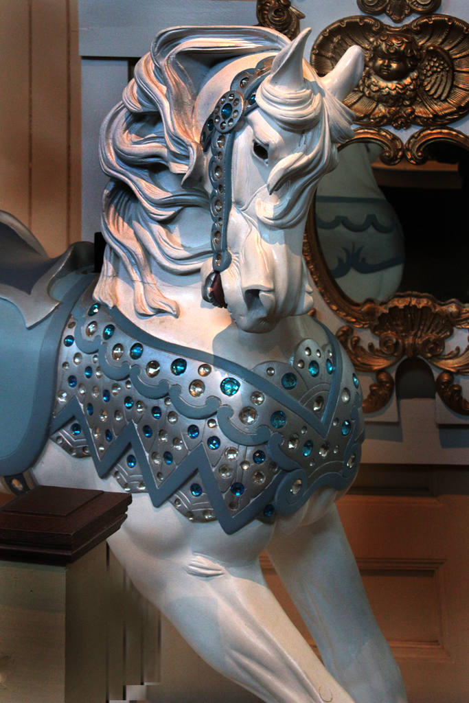
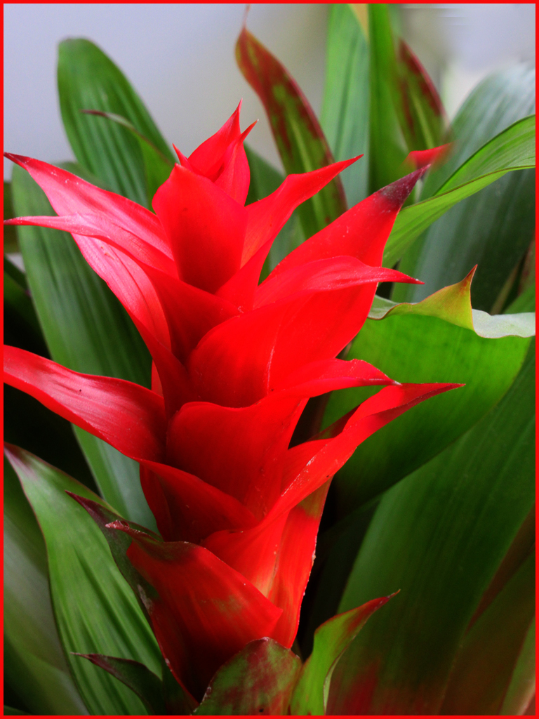
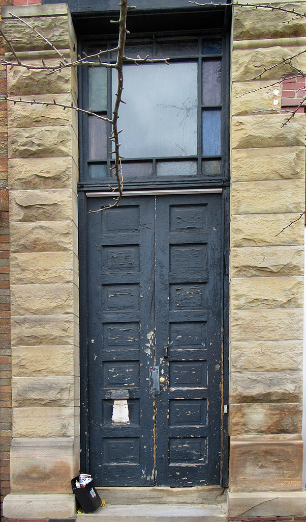
Thanks to all for your comments. Yes Larry. I like my subject and am indeed working it for all it's worth. Just wait until March! As for the perspective, in the original it is much worse. I thought I had corrected it but obviously did not do enough, I like the darker black that several of you noted but not Larry's vignette, which, as usual, I thought did not add anything. |
Feb 20th |
| 14 |
Feb 18 |
Comment |
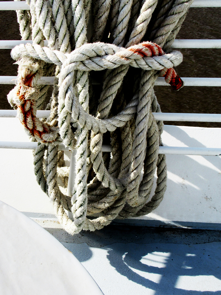
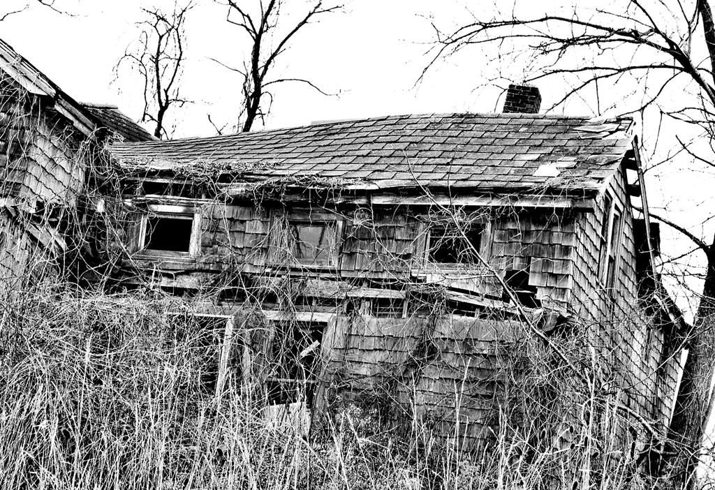
Welcome aboard Evan. I look forward to seeing more of your work. I like your image very much and saw in it mostly an abstract pattern, one of my favorite kinds of image. I did not see the "story" others refer to until I read their comments. I did not recognize the roll of barbed wire until it was so identified. I agree with Larry that the composition could be improved by increasing the contrast and darkening the wood planks, although probably not quite as dark as his. My main concern s that the texture of the barbed wire roll seems a bit soft, so the only remedy is to take another image-if possible. |
Feb 20th |
| 14 |
Feb 18 |
Comment |
|
Feb 19th |
| 14 |
Feb 18 |
Comment |
I agree this is a wonderful image but has some problems. I would attempt to enlarge the canvas and clone in the missing claw. I likely would fail this challenge and give up. But I would feee good about trying. Others are dismayed by the consuing aeeay of branckes. I wa about to suggest darkening the background. But Larry beat me to it! BTW last I heard the kinds of manipulation (aka editing) suggested here would disqualify this handsome fellow from PSA Nature competitions. Good job for a dunting challenge. |
Feb 19th |
| 14 |
Feb 18 |
Comment |
|
Feb 19th |
| 14 |
Feb 18 |
Comment |
I think you succeeded admirably in your recording a nostalgic composition. The mode is enhanced by the pale lavender of the rose. However I believe your goal would be furthered by backing the camera off a bit so that the rose has some space above it and allows the viewer to see the leaves. Similarly the book would be enhanced with a bit more space at the top and side so as to include the whole sketched rose. |
Feb 15th |
| 14 |
Feb 18 |
Comment |
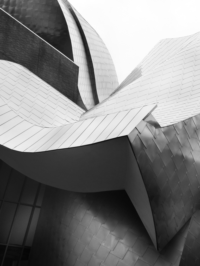
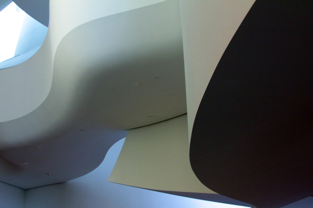
I agree with all that Charissa said. Arun has applied architectural distortion to yield a highly successful abstraction. Further I note that there are plenty of pure blacks and pure whites, thus enhancing the abstract pattern. |
Feb 15th |
| 14 |
Feb 18 |
Comment |
Unfortunately I find the colors on the near front on the side of garish Technicolor. The photo's right margin seems not to any logical reason for being where it is. I will shock you by suggesting that vignetting the two right corners might help in suggesting an end to the two mountain ranges. Alternatively, cropping the right end of the near colorful butte(?) just at the vertical end and cropping the left end either at the end of the color but including part of tree grove, or else cropping further left at the left end of that dark tree grove. I hope this is somewhat clear. Oh yes, the pink cloud between the two ranges seems unnaturally light/ |
Feb 15th |
8 comments - 0 replies for Group 14
|
8 comments - 0 replies Total
|