|
| Group |
Round |
C/R |
Comment |
Date |
Image |
| 14 |
Jan 18 |
Comment |
I'll add my 2 cents worth and "ditto" to remarks by others. Being creative has a time and place, which you have found here. Creativity for its own sake is not what I care for. I find fo my work I see something or a composition that I like and most of my post processing is to restore back to the vision I saw originally... Or else to enhance that vision. In your case you took two national symbols and merged them one vision. |
Jan 27th |
| 14 |
Jan 18 |
Comment |
The shawl is yellow and not what I meant. I was pointing to two dark gray ski-like vertical strips to the right (as viewer looks of his body and swal |
Jan 25th |
| 14 |
Jan 18 |
Comment |
Indeed. But this one reads to me right to left which bothers me but that is why I raised the question and shot down.
You often point out that the eye goes to the brightest area, at least in b & w, Which is what mine does to the sunlit slope on the right, which is why I briefly considered suggesting flipping.
|
Jan 25th |
| 14 |
Jan 18 |
Comment |
Another great portrait!. My first reaction was that there was too much space beside the musician but on looking agin I find it part of the atmosphere in which he belongs. What does bother me is the two slightly larger strips on his left, the viewer's right. At first glance I thought it was the pants of another figure. On second thought I think they are part of a large back pack. No matter, they are distracting and should be cloned out to match the door. Another small bothersome detail is the conical top of the right hand parking barrier--too bright, should be burned in. The left hand conical is o.k., same tone as the stone wall behind. |
Jan 25th |
| 14 |
Jan 18 |
Comment |
Wonderful portrait, from his attire to the anachronistic cell phone to his wonderful smile. I think the legs and knees are needed to give space to his large cross. I do like Larry's suggestion of darkening the background--it is a bit distracting. I find the buttons a bit distracting and suggest burning them in a bit. But a really great image. |
Jan 25th |
| 14 |
Jan 18 |
Comment |
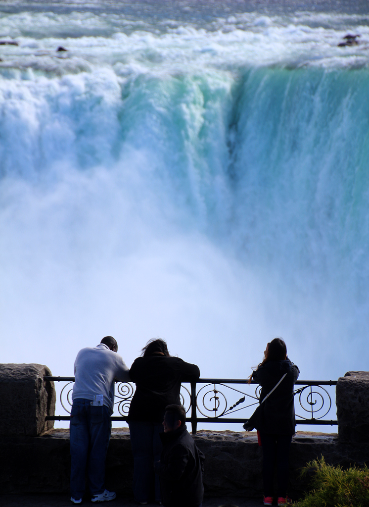
I agree this is a spectacular scene. I would be tempted to suggest flipping horizontally but think it likely you would point out that this is a real place--as I do when such suggestions are made. Your changes were to restore what you had seen. Sometimes you can't improve om Mother Nature! |
Jan 25th |
6 comments - 0 replies for Group 14
|
6 comments - 0 replies Total
|
