|
| Group |
Round |
C/R |
Comment |
Date |
Image |
| 14 |
Dec 17 |
Comment |
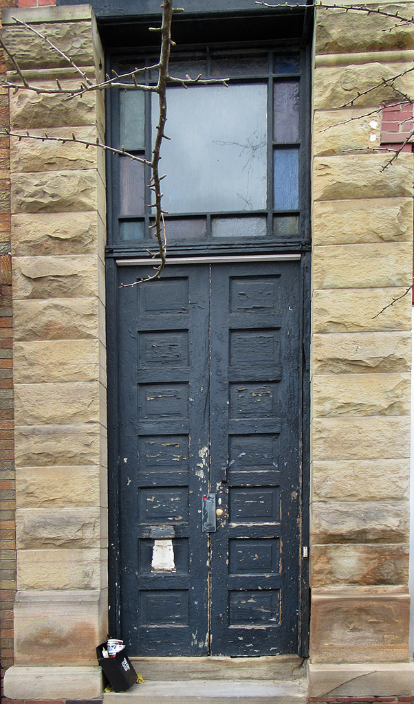
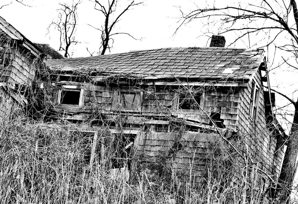
Actually the red bricks on the left were a mistake. The orignal had more that I intended to crop away completely. Another flaw that no one commented on was I did not succeed completely in eliminating architectural distortion resulting form me looking up two steps between the sidewalk and the door bottom |
Dec 27th |
| 14 |
Dec 17 |
Comment |
I agree with what everyone has said have said. Although I am not especially interested in sports or sports photography, you have really captured the action. The diagonal composition is great. The blue portion of the field does not distract and in fact fills what otherwise would be empty boring space--in fact I did not even notice it until it was called to my attention! I say: don't change a thing! |
Dec 26th |
| 14 |
Dec 17 |
Comment |
|
Dec 26th |
| 14 |
Dec 17 |
Comment |
I am not into Carnivale and don't find the excessive make-up particularly attractive. That said, you have an interesting subject, and have placed the person with no space wasted and tack sharp, no wasted space.
As for learning Photoshop:good luck! I suggest purchasing a book specifically for whatever version you get. I am not sure what they are doing now, what with charging a monthly fee. I dropped out at PS3. Still tons of tools I don't use and not sure I need. Another possibly would be to take a course at you local community college of other place of higher learning. Good for you! And good luck!
|
Dec 26th |
| 14 |
Dec 17 |
Comment |
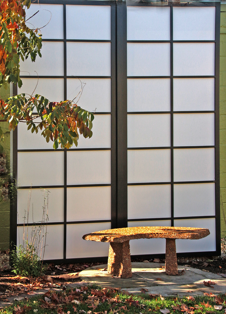
This is fantastic. You have certainly achieved your goal--no doubt in my mind, I agree with others that a tad more background is needed above the top right fork and agree adding to the canas is easy to do. It's lining up stuff and cloning that can cause problems--you have a simple composition here that should be easy. As for true white and true black, it looks to me like there is a white spot on the top tine of the left fork. And some of the shadows look pretty black to me. But some tweaking of Levels and Contrast might not hurt but I would be inclined to leave that alone for fear of losing your simple composition |
Dec 20th |
| 14 |
Dec 17 |
Comment |
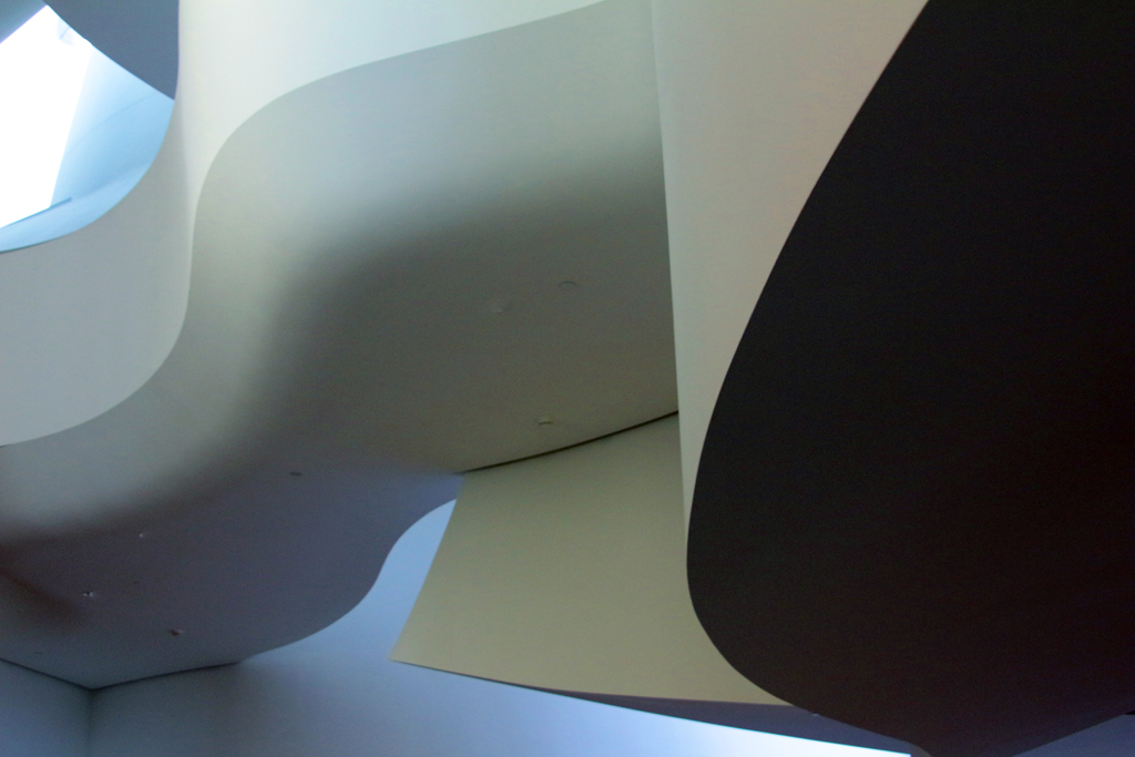
Once again I find myself not thrilled. I want to know what the curved stripes of light really are. To me the mdeitater ooks to much of a yupt, not hippie enough. Or maybe he is just too dark and the stripe too bright--they would distract me from my meditative state. Sorry to be so critical! |
Dec 20th |
| 14 |
Dec 17 |
Comment |
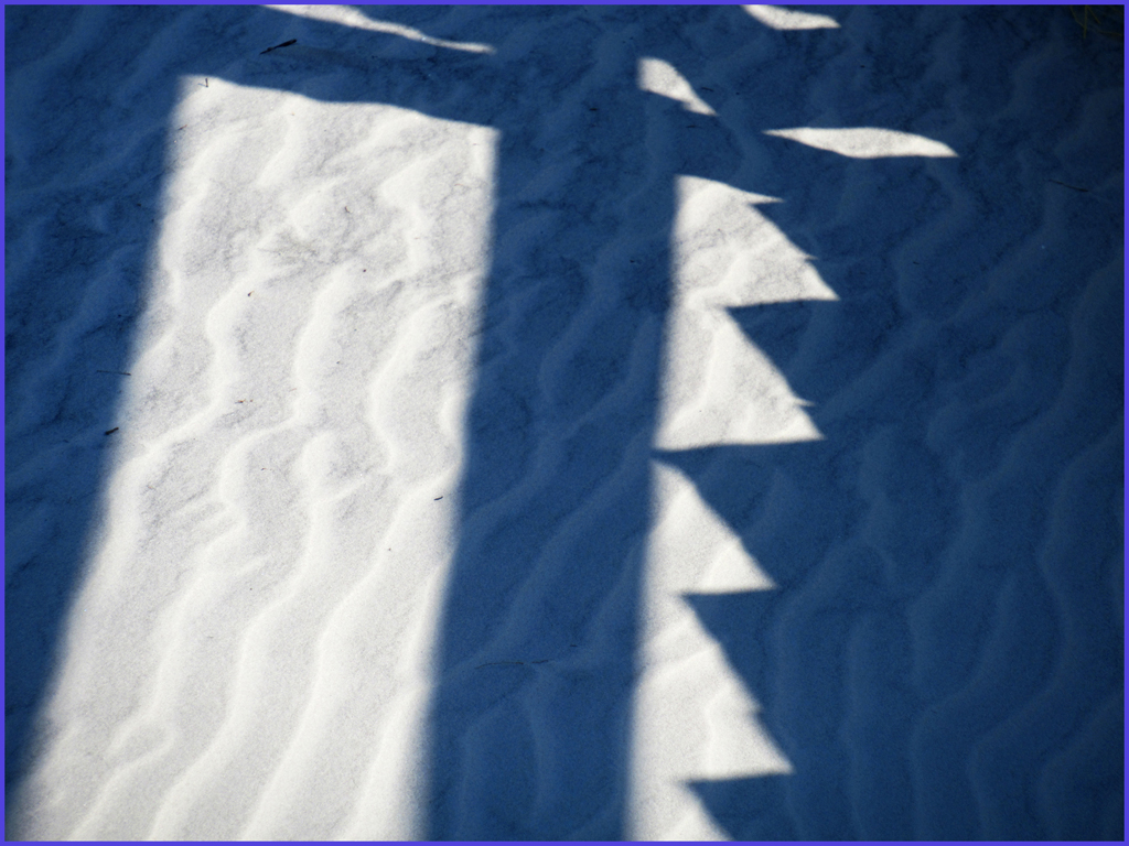
This image has the kind of pattern I usually like. Blue is a favorite color. It doesn't bother me that there is no focal point. Maybe it's the rust-colored planes mixed in with the blue? No rule of thirds--but that usually does not bother me. No bulls eye. Reasonably sharp. So why do I find myself not thrilled with it? |
Dec 20th |
7 comments - 0 replies for Group 14
|
7 comments - 0 replies Total
|