|
| Group |
Round |
C/R |
Comment |
Date |
Image |
| 14 |
Nov 17 |
Comment |
oops, I thought I had commented on all the submissions but see I missed Charissa's--sorry! I find the cats conversing with one another quite charming. The rim light on the cats is wonderful! I agree on the yellow line being distracting. But the lighter background does not bother me. The cats are dark enough to stand out in contrast to the background and the boring texture of the background helps minimize the tendency to focus on the lightest object. |
Nov 27th |
| 14 |
Nov 17 |
Comment |
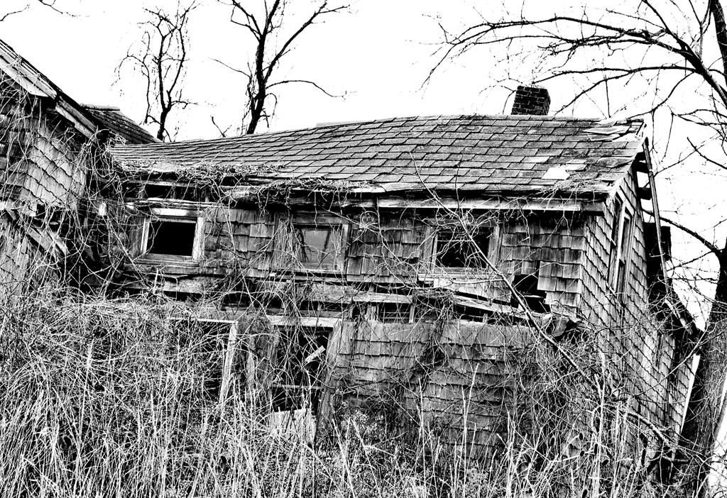
I like Larry's suggestion of cropping off the overhang to simplify your composition. |
Nov 27th |
| 14 |
Nov 17 |
Comment |
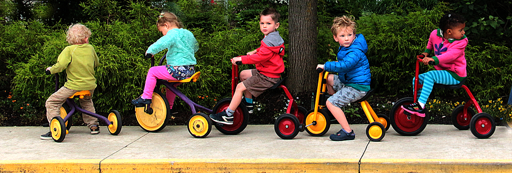
Thank you all. The "sky" Larry mentions is walls from a white building. I tried cloning the shrubs to cover those bright spots but guess I should have done more. I tried to clone out a last rider but clearly failed.
I love the Jane Goodall quote!
My question is: should I have left more at the top to balance the sidewalk.? I would need to do a LOT more cloning to keep it simple and poster-like. Since some of the kids' faces are clearly identifiable I would need to ask the director of the preschool before I disseminated it further than our community (and this discussion group). |
Nov 17th |
| 14 |
Nov 17 |
Comment |
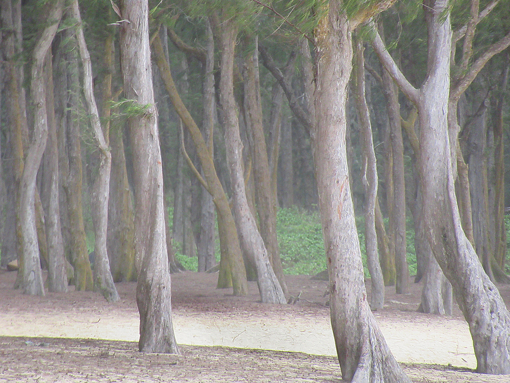
I nice nature image! However I am bothered by the huge (compared to the fungi) out of focus green blob in the upper left. It attracts my eye away from the fungi which are more interesting shapes and the focus of your image. I would use the burn tool to darken it. In fact it seems sharper and less intrusive in the original. I like the darker tree trunk in the original as less computing with the fungi. |
Nov 17th |
| 14 |
Nov 17 |
Comment |
I like the result of Larry's fussing with Levels. Except his (?) rear is a bit too close to the "rock" background in tone. I love the stump's light merging into shade. |
Nov 17th |
| 14 |
Nov 17 |
Comment |
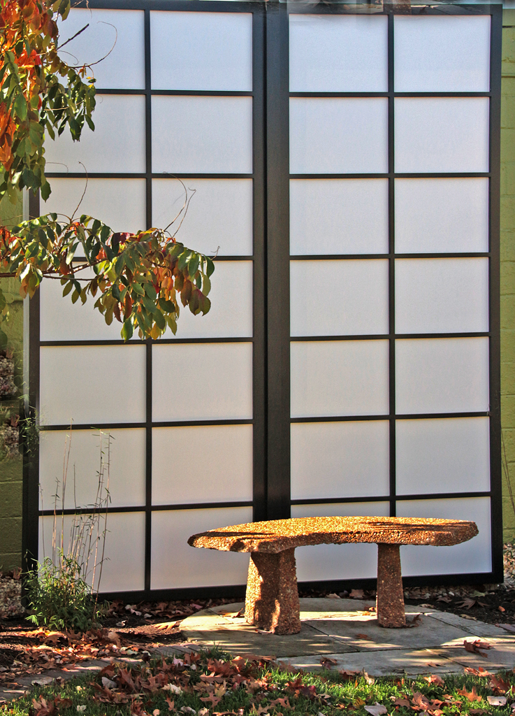
I too like the golden hues, as well as the geometric floor tiles leading the eye into a contrasting urban scene. In a way you have two images here competing for my eye. Although the overhang does frame the photo, I find some of what is between that & the floor tiles somewhat distracting--especially the sliver of a white building above the trees. I would be tempted to crop the image just above the treers. As usual, vignetting does not do much for me. Infact all detail is lost on lower right corner. |
Nov 17th |
| 14 |
Nov 17 |
Comment |
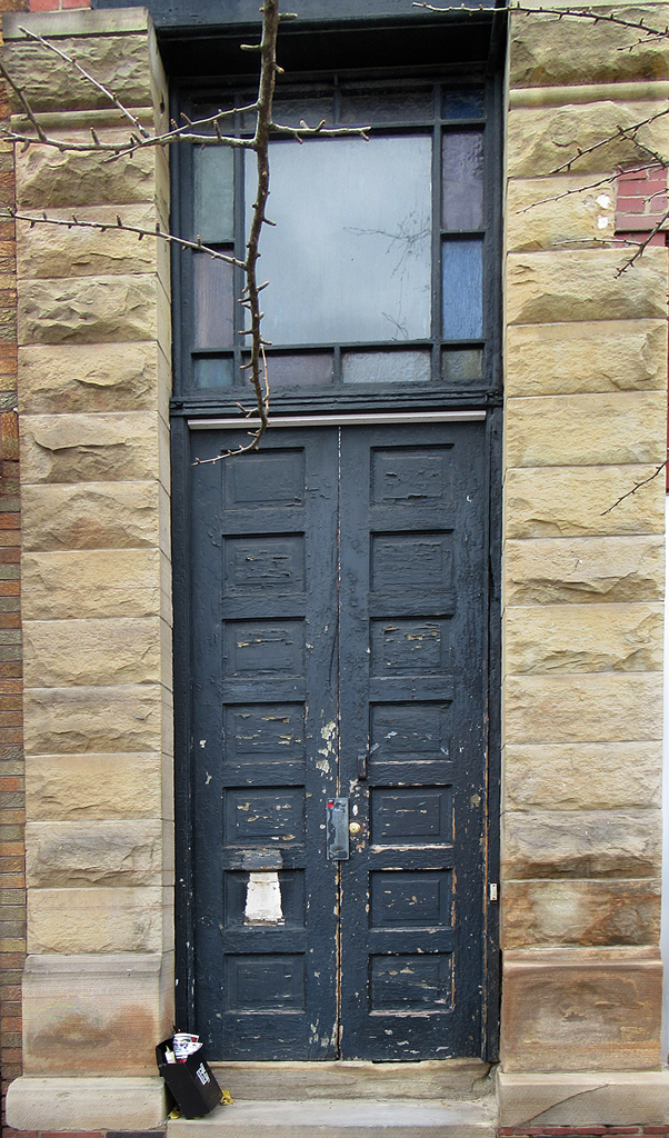
I agree it is simple and elegant. Including blue sky and white building. I agree the tree branches introduce a lacy contrast to the stark rood and window. I know it is sacrilegious (well, against the usual rule of thirds guidelines) but what if you had moved the camera to have the roofline centered, with only the bare tree limbs off center. |
Nov 17th |
7 comments - 0 replies for Group 14
|
7 comments - 0 replies Total
|