|
| Group |
Round |
C/R |
Comment |
Date |
Image |
| 14 |
May 17 |
Comment |
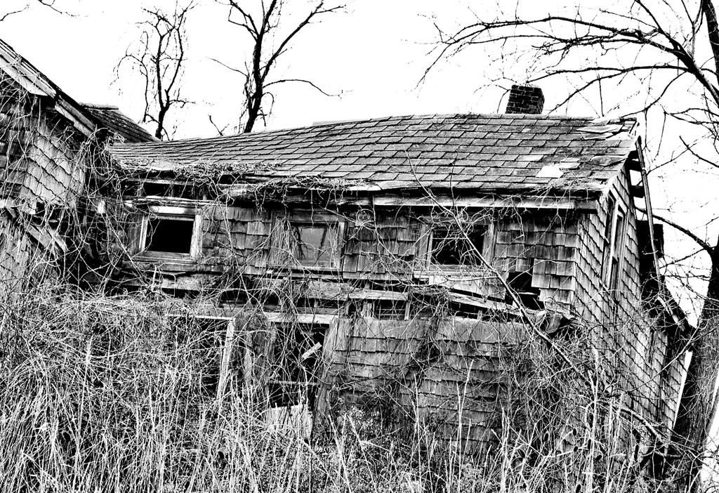
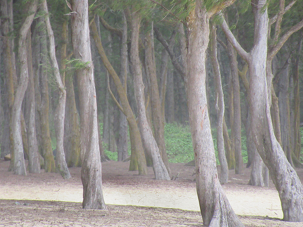
Wow! So different from our usual fare and so beautifully lonesome!. The tree appears like color negative, the frame as if inspired by an Impressionist. I too was a tad bothered by dust and twigs, but would only suggest cloning or healing brushing out a few of the more egregious ones--such as the black line on the right in the green layer and the brown one coming in from the right edge. The white spots in the dark layer at the top (night sky) could be stars but the white line coming in on the right side should go. But a great photo (I still wish you remembered the filter!) |
May 22nd |
| 14 |
May 17 |
Comment |
|
May 19th |
| 14 |
May 17 |
Comment |
I thanked Charissa via e-mail but will thank her again. Her editing has convinced me to look at the Nik collection--had been tempted before but never followed through!
|
May 19th |
| 14 |
May 17 |
Reply |
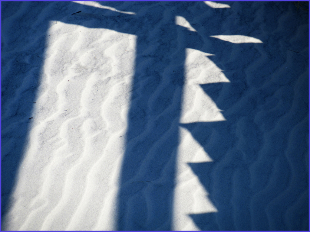
Many thanks Charissa! WOW! This was exactly what I was trying to convey--namely the ripples in sun and shade and overlaid with the steps shadows. Contrast is much better in yours! It becomes more the abstract pattern I was trying for. Please tell me what you did, including what software. However in your version there is some black stuff on the top third of the left panel of sand that is very light in my version--that I would take out via cloning. |
May 17th |
| 14 |
May 17 |
Comment |
At first I thought this image was kinda boring, but it grew on me as time went on. Vignetting in lower corners helps break up the monotony of many almost-identical grass blades. |
May 17th |
| 14 |
May 17 |
Comment |
I agree with Larry that the background is distracting but find the new dark dark bg to give a threatening feeling, which gets away from the security for the child seeking comfort inan adult's hand. I would try Burning in the bg so that is darker, but not scary dark.
Great idea! |
May 17th |
| 14 |
May 17 |
Comment |
Pink? Well I did think to try b&w coinciding with your final (serious?) suggestion. As for the P&S, I had it set on P (program). Will investigate further. I keep the P&S in my purse for times when I am not planning serious photography. I am finding that the weight and bulk of the SLR are increasingly burdensome--must be getting old. |
May 15th |
| 14 |
May 17 |
Comment |
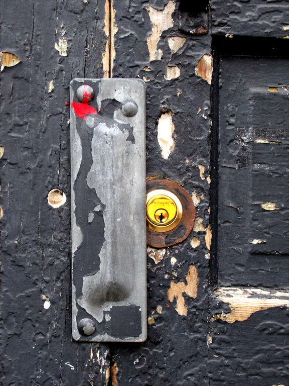
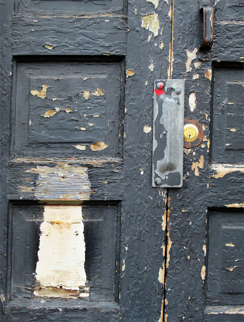
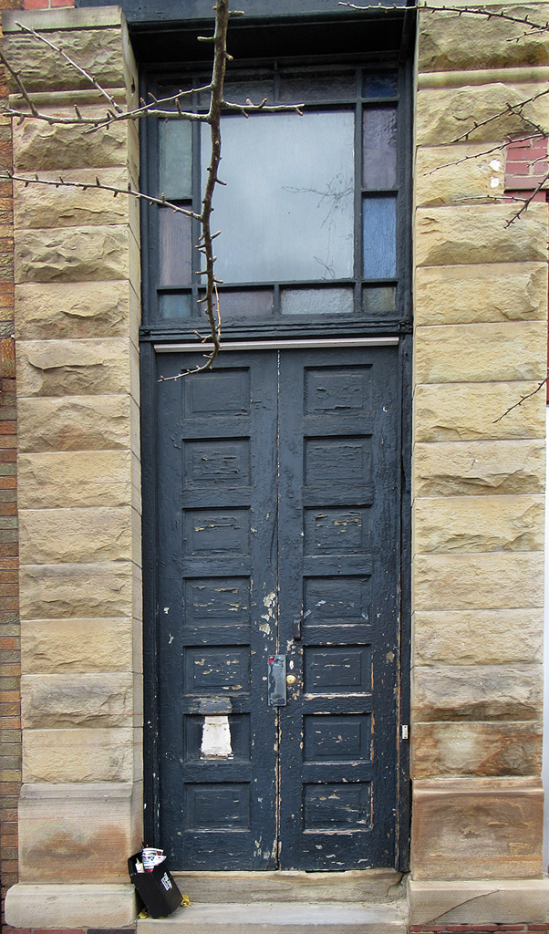
I like the triangle-shaped shadow to the left of the door and complementing it. I too am glad not to have vignetting. As for the patch--I like it and would suggest enhancing it so the viewer does not wonder if it is an accident. However the little twig or ribbon at bottom center of the patch is distracting and should be cloned out. There is something odd about the perspective that I can't quite figure out--all the lines are parallel to the picture edge, as they should be,
Did you "fix" the architectural distortion? Sometimes doing that (which I am fanatic about) introduces odd perspective |
May 12th |
| 14 |
May 17 |
Comment |
Terrific! Don't change a thing! |
May 12th |
8 comments - 1 reply for Group 14
|
8 comments - 1 reply Total
|