|
| Group |
Round |
C/R |
Comment |
Date |
Image |
| 14 |
Jan 17 |
Comment |
I find the original composition pleasing although the background is essential to compliment the pumpkin and flower but distracting. I afgree with Larry and would darken the leaves and vines by burning in. But I would not crop the context any further. BYW I do find the use of the word "nature", as several of yo have, in a PSA DD somewhat bothersome, even though we are not a Nature group. Pumpkins are a cultivated crop and I suspect most if not all are hybrids, a no no in nature competition. |
Jan 23rd |
| 14 |
Jan 17 |
Comment |
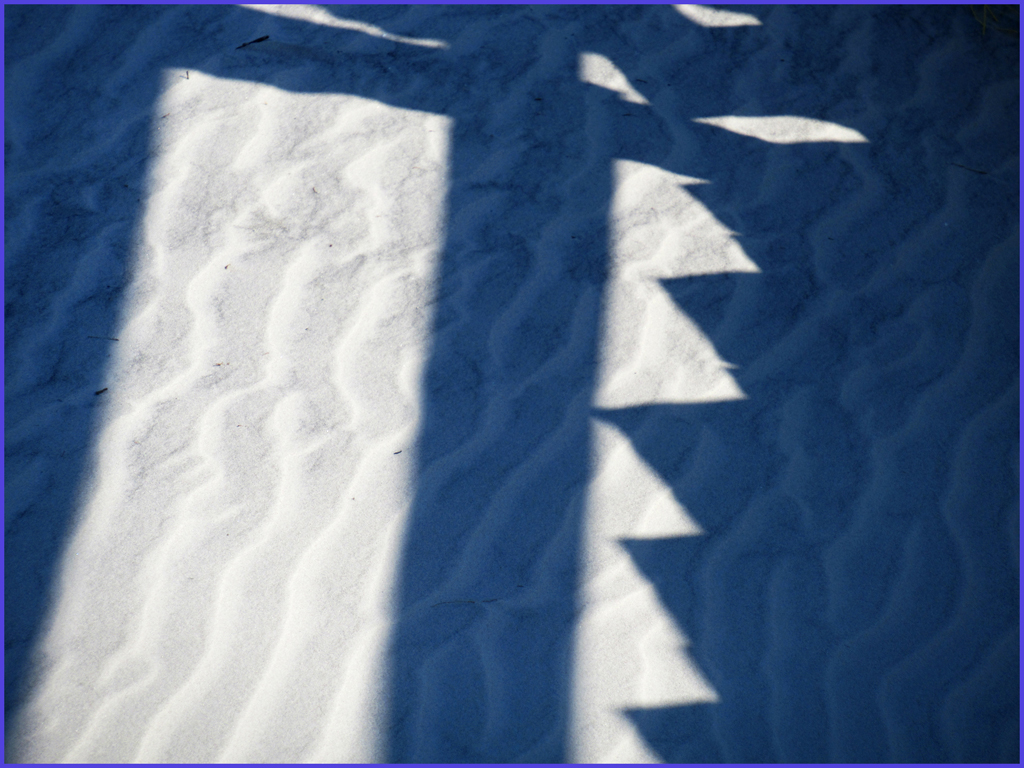
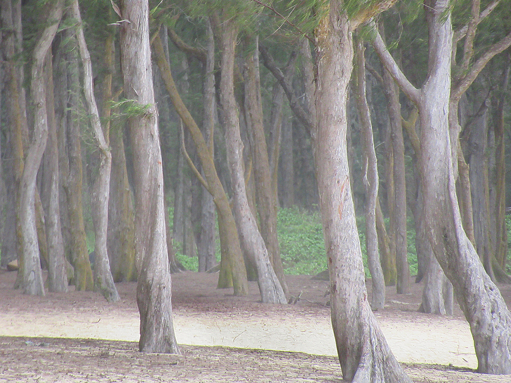
As you all may have noticed I am fond of patterns, frequently lacking a center of interest, claiming the whole thing is the center of interest. However this one seems to lack much sense of repetition...which does bother me. None of the individual dark/light areas is similar. I do like Larry's darkening but not the loss of sand grains, an integral part of the image. Perhaps if you had zoomed in on a smaller area it might seem a bit more orderly. Either on the original view or by cropping. |
Jan 23rd |
| 14 |
Jan 17 |
Comment |
Obviously the propeller is that slanty line at the bird' rear end! Seriously however, after I realized the bird was flying down to the right, I realize also that he had plenty of "negative space" to fly into. I think this is a remarkable capture of his wings spread out so dramatically. Was there a lady somewhere nearby? You have nothing to apologize for. And I have no suggestions.
|
Jan 23rd |
| 14 |
Jan 17 |
Comment |
You are so lucky to have this view from your perch inside long with hot coffee. It is a dramatic image and nicely composed. I would prefer a little less contrast between sun and shadows but somehow b&w does not do it for me. I thunk the main thing that bothers me is the blue snow in the shadowed areas.-royal blue! |
Jan 23rd |
| 14 |
Jan 17 |
Comment |
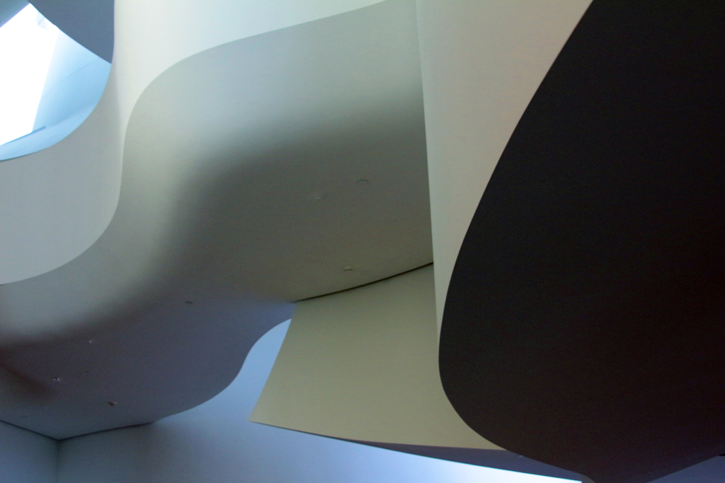
Welcome Stuart! Fascinating image of a museum that I am not familiar with. I too did not realize at first the I was looking upward!You could easily get rid of the upper left blue fragment AND correct the perspective. In PS 3, go to Edit/Transform'Skew, then pull on corner dots to make a slanting line parallel to the photo edge rather than leaning. As for the red flowe: I did not even see it until I read of it. I believe it is too small to be an important element in the composition and would make the whole thing a monochrome, perhaps increasing contrast with Levels (move midtones slider)or Increase Image/Contrast so that you get a true black. |
Jan 22nd |
| 14 |
Jan 17 |
Comment |
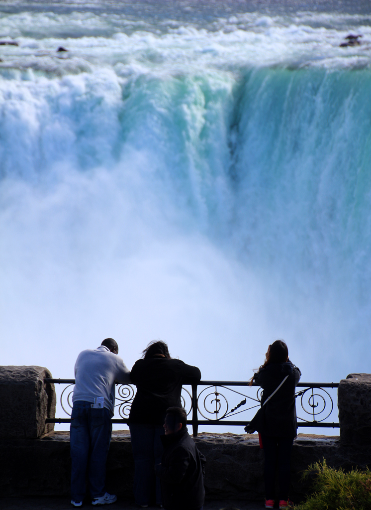
Well, y'all seem equally divided on the white shirt! I think I like the black shirt version better along with removing that telescope (or maybe weapon?) but I did not dare try cloning those corrections. I have developed a tremor in my right hand which makes it shake with fine movement (old age!. Making the figures all silhouettes and removing distractions gets across my goal: contrasting simplified people with power of those millions of gallons rushing by. By the way, I think the water is primarily blurred because my camera speed was too slow. O.K. by me! |
Jan 22nd |
| 14 |
Jan 17 |
Comment |
Nice capture. I would agree with Larry's suggestion of reducing sidewalk glare. I would go further and increase the light a bit on the area just inside the gate and darken the mother a bit. But great composition and catching the mother in mid stride?. Was it serendipity? Or did you ask her to pose? And thanks for correcting the perspective! so many otherwise excellent photos do not do this easy correction! |
Jan 22nd |
7 comments - 0 replies for Group 14
|
7 comments - 0 replies Total
|
