|
| Group |
Round |
C/R |
Comment |
Date |
Image |
| 60 |
Mar 24 |
Reply |
Hi Lance!
Thank you for your feedback and suggestions. I will definitely look into the work of Julia Margret Cameron. I definitely had competing interests when taking this photograph. I started wanting to highlight the drops on the petal and wanted a softness and increased depth of field to the greenery behind the flower. While preparing for the photograph I started to notice and like the lines/creases in coming from the center of the stem. Not really knowing what to do at that point to highlight the lines, I should have done as suggested, taken several experimental images. Once I looked at the image on my computer, I decided I didn't like the brick wall in the background and so I began to crop, which then lead to another change. Needless to say, I started with one goal, became a little distracted and didn't adjust, and finally changed the goal all together in post processing. Unfortunately it showed. Long story short, some planning, patience, and experimentation will go a long way :) |
Mar 18th |
| 60 |
Mar 24 |
Reply |
Thank you Dean. In retrospect, I wish I had focused more on the bottom of the petal rather than on the drops on the left side of the petal. But I am happy with the color. |
Mar 18th |
| 60 |
Mar 24 |
Comment |
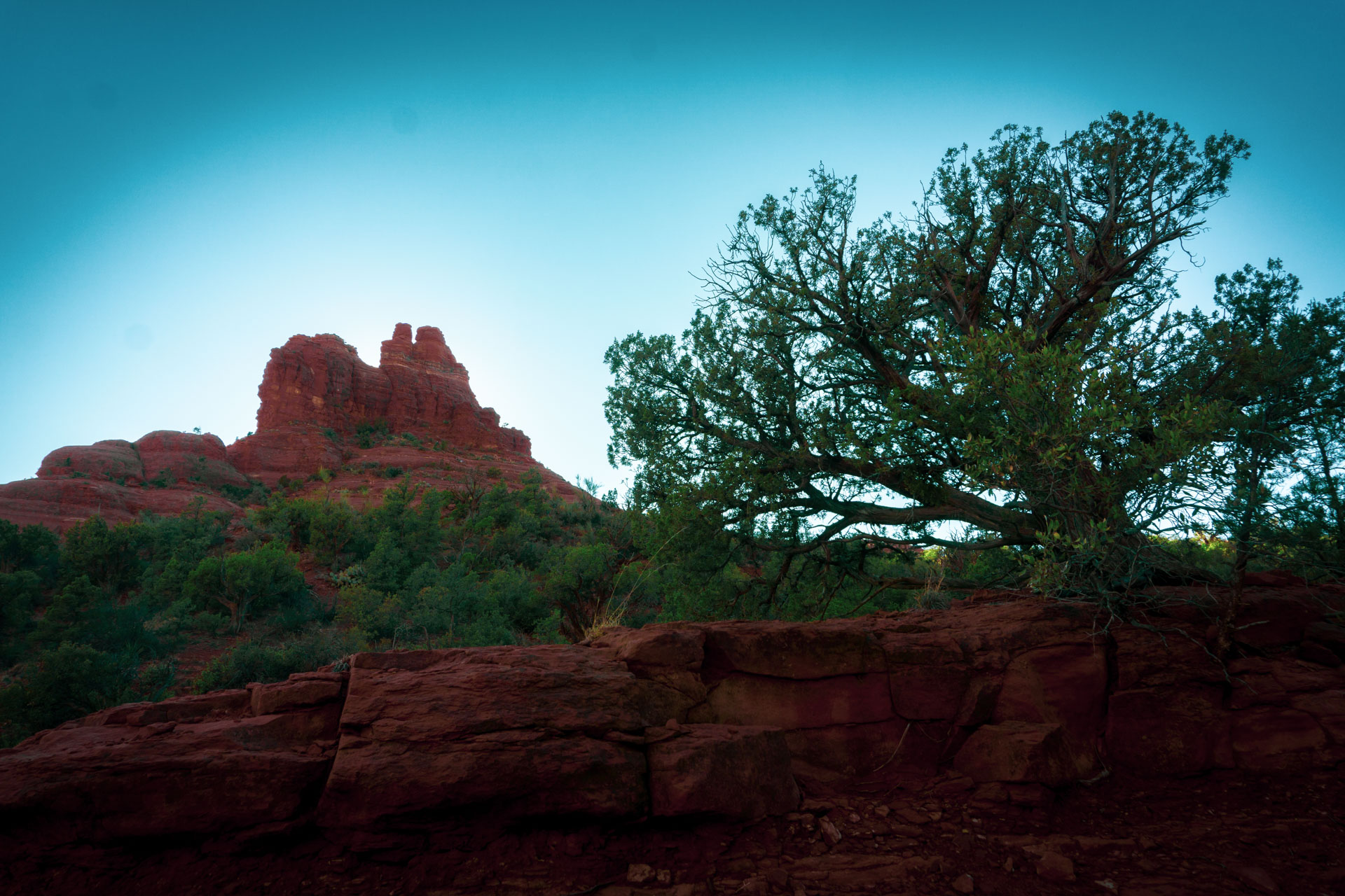
Hi Blair, this is a very peaceful image. I recently started hiking and nothing beats the views, sounds, and breeze from these settings. My views are still closer to the ground than most, but I look forward to working my way a little higher. I love the colors in the sky here. My only suggestion would be to saturate them a little more, so that that to top of the image has more color. |
Mar 18th |
| 60 |
Mar 24 |
Comment |
Hi Damon,
I'm glad you decided to apply the gradient on his hands. I think it really highlights curve of his right hand and how it complementing the shape of the developing vase. It is just barely touching the top and really gives the viewer a sense of the gentleness required of this art. |
Mar 18th |
| 60 |
Mar 24 |
Comment |
Hi Rita, I think you did a great job with this photograph. Your flowers are in good focus and there's a nice combination of colors. I thought about ways to improve the image with my very limited experience, but it would be tough without losing some of the other great features in the image (canyon and sky). |
Mar 18th |
| 60 |
Mar 24 |
Comment |
Hi Anne,
I think the yellow looks great against the background. The railroad tracks do a great job of bringing the eyes to the trains and the poles provide nice frame. Although there are a good amount of structures in the background, they don't really distract because they are similar shades. There's a red stop sign in the middle of the image, if I were to adjust anything it might be that, what do you think of toning the red down just a bit so it doesn't pop as much? |
Mar 18th |
4 comments - 2 replies for Group 60
|
4 comments - 2 replies Total
|