|
| Group |
Round |
C/R |
Comment |
Date |
Image |
| 81 |
Dec 25 |
Reply |
Hi Angela. No, it is not easy. I actually tried to recreate this with the traditional white baseball. It took a few tries to recreate the shot. However, the I felt the impact with the white baseball was much less that the orange ball, so I stayed with this shot.
Just one more piece of information for you: I took the shot from a little below and to the left. Having the point and shoot camera helped also. Because it is a smaller camera it was easier to keep it out of the shot.
I hope this works for you. |
Dec 15th |
| 81 |
Dec 25 |
Comment |
Nice shot. Very good technically as it is very sharp, and the exposure is well done. It is also centered well. Just one suggestion: It seems that your intent is to show off a specific part of the Miami Art Fair. So maybe expand the shot around the subject, so that more of the art pieces are visible. That might help the story a little. |
Dec 9th |
| 81 |
Dec 25 |
Comment |
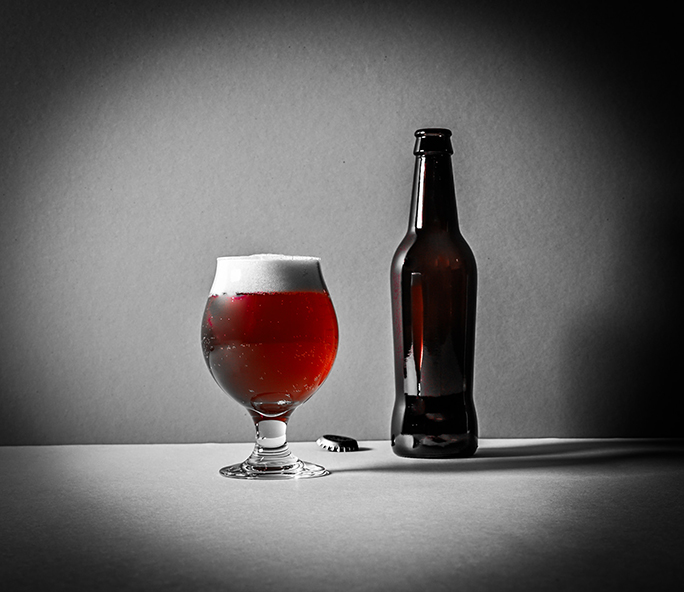
I guess this is our month for black backgrounds and lighted subject matter. This is a good photograph also. The soda bottle is well lit, well centered and stands out well against the black background. It is also very sharp. I agree with Angela, the key line helps with the image. |
Dec 8th |
| 81 |
Dec 25 |
Comment |
Great photo. Black and white was a real good idea for this photo. It really helps with the story of an old post office. You also did a great job capturing the shadows of the tree in the foreground. Image is really sharp. I don't know how much you cropped the photo, but my one improvement would be to include a little more on the sides and the top of the photograph. God job! |
Dec 7th |
| 81 |
Dec 25 |
Comment |
Well Done. Looks like a real foggy morning. The photograph is really well balanced between the sky, the forest and the field in the foreground. It is also very sharp with a real good exposure. The gray clouds and the fog did make me take notice of the photo. My nitpick is the frame, and it is real picky. The frame does not distract from the photograph, but I'm not sure that it helps either. But overall, really well done. |
Dec 7th |
| 81 |
Dec 25 |
Comment |
I initially liked the pastel version that you submitted, but I opened up both versions and looked at them side by side, and the black and white version is a sharper image, and I like that better. Good photo. |
Dec 1st |
| 81 |
Dec 25 |
Reply |
Hi Angela. I used two mirrors. It is hard to see in the original, but one mirror is a large mirror attached to the wall in my bathroom; the other is a small oval make up mirror that I set on the countertop. I do like your version because it does give the ball some motion, but I'm very used to having things in focus, so it is a little hard to look at, at first. Thanks for the feedback. |
Dec 1st |
| 81 |
Dec 25 |
Comment |
Great shot, and set up. The placement of the mask to the right is well done as is the slight tilt of the reflection. The lighting is excellent. It really brings out the red in the mask, and provides for a good reflection. The border is a good addition. The only nit-pick is maybe you could have left a little more spacing at the top and the bottom. Well done. |
Dec 1st |
6 comments - 2 replies for Group 81
|
6 comments - 2 replies Total
|