|
| Group |
Round |
C/R |
Comment |
Date |
Image |
| 81 |
Aug 25 |
Comment |
Thanks Jo-Ann. Just an FYI. The stitching of the photographs together is easily done in Adobe Lightroom. Lightroom has a photo merge feature that does this pretty well, if each of the photos you have taken is lined up correctly. Using a tripod helps with that. In this case there is a big guardrail that prevents using a tripod, so I needed a fast shutter speed and a steady hand. I used this technique to prevent the distortion that you get when using a wide-angle lens. |
Aug 24th |
| 81 |
Aug 25 |
Comment |
Good photograph. Good sharp image that shows the texture of the roses and the post well. The positioning of the roses is well done, and I really like the bokeh in the background. I think that really helps keep the viewers' attention on the roses and post. |
Aug 11th |
| 81 |
Aug 25 |
Comment |
I really like this photograph. You did a great job of framing the canyon with the higher peaks on the right and left, and I like how the waterfall is a little off to the right. But the canyon does bring your eyes to the waterfall. I agree with a little lighter exposure. And there is one more item that you might have to get used to from me, but I see these types of things. It appears that you have some spots on your lens. If you look close on the sky you can see them in the photo. They're easy to take out with your editor and will help the shot a bit. Nice photo! |
Aug 11th |
| 81 |
Aug 25 |
Comment |
Nicely spotted. I'm not very good at seeing these types of things, but you have done a good job here. I like how the arrangement of the leaves pulls your eyes from the top left-hand corner to the bottom right. I like the rough textured background of the street also. Well done. |
Aug 11th |
| 81 |
Aug 25 |
Comment |
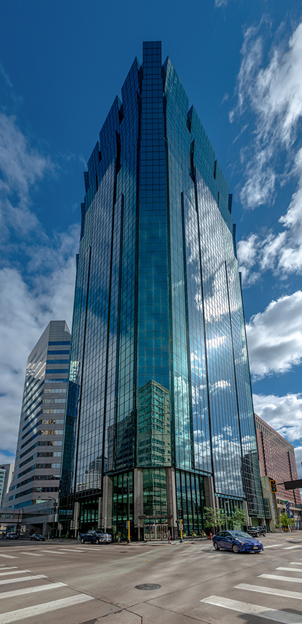
Nice sharp photograph. You did a real good job of capturing all of the reflections in both the base of the sculpture and the building in the background. I agree that the black and version is a little dark, and in that version the top of the sculpture is cutoff. The sun flare on the right side of the sculpture is a matter of preference. To me it is a little distracting but, in this case, it does seem to pull the eye to the sculpture. Nice job. |
Aug 11th |
| 81 |
Aug 25 |
Comment |
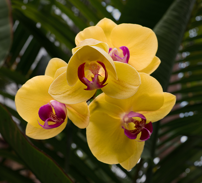
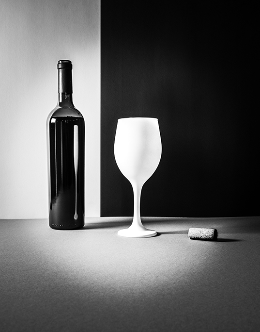
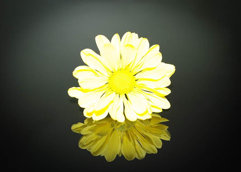
Hi Angela. Using the light pad is consistent with the original ideas that you have. I like the update to the background that you chose. I think that really highlights the subject matter well. I also like that you removed the yellow spot on the pedal in the upper left, as I thought that was distracting. Adding the orange border works well also. One nit-pick: You have one pedal very close to the border on the right side. Great photo! |
Aug 3rd |
6 comments - 0 replies for Group 81
|
6 comments - 0 replies Total
|