|
| Group |
Round |
C/R |
Comment |
Date |
Image |
| 81 |
Jul 25 |
Comment |
So, I needed to do a little research on sketch editing, it is not something that I have seen very much, but I like what you did with the photograph. Specifically, I like that you did not go with black and white. I saw a lot of that on-line, and a lot of it looks good, but I think sticking with color was the better choice here. I also fell that you have the right amount of a sketch look, instead of going with something that creates an outline of your daughter. I agree with Angela that maybe showing some more shoulder would help, but this was nicely done. |
Jul 7th |
| 81 |
Jul 25 |
Comment |
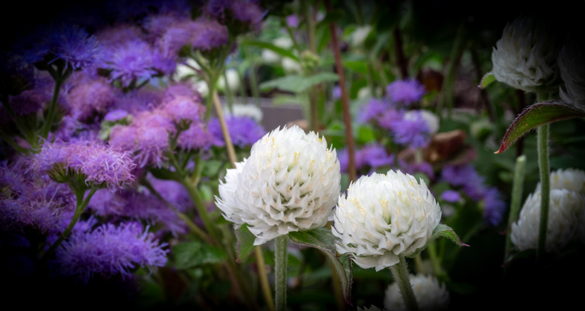
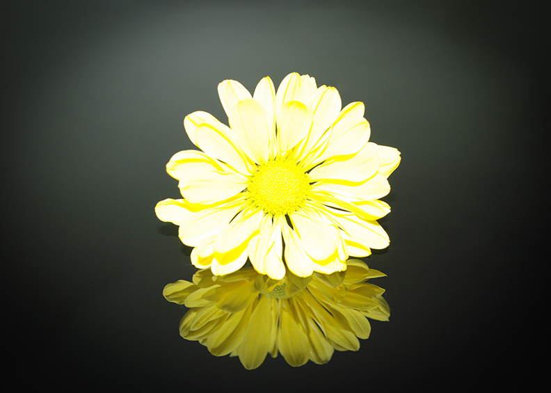
Another creative shot Angela. I had to look up high key image and AI describes it as bright and airy, dominated by light tones and minimal shadows, often evoking a positive or cheerful mood, and I think that you captured that here. I really like the lavender background, and the key line border appears to be a pastel color as well. One little thing is that the pot looks tilted to the right. But maybe that is intentional judging by the lavender petals that you placed at the bottom. Good photograph. |
Jul 7th |
| 81 |
Jul 25 |
Comment |
I live in Minnesota and we get trees covered like this every year.
Adding the cardinal was a big help to the photograph. The branches incased in ice is cool to look at, but adding the cardinal adds a little bit of a story to the photo. Good photo.
|
Jul 7th |
| 81 |
Jul 25 |
Comment |
Nice photograph. I agree with Angela to take the dark clouds out, but you did a good job with left, right and bottom cropping. That helped focus on the house. Straightening the photo was also good, and I like the black and white version. That version fits well with the time the farmhouse was built. Good photo. |
Jul 7th |
| 81 |
Jul 25 |
Comment |
First, congratulations on being invited to this event. The photo itself is a good example of avant garde, and I agree with removing the people and the landscape, those were distractions. Maybe it is my monitor, but the smaller, original seems like a sharper image. Good shot. |
Jul 7th |
| 81 |
Jul 25 |
Comment |
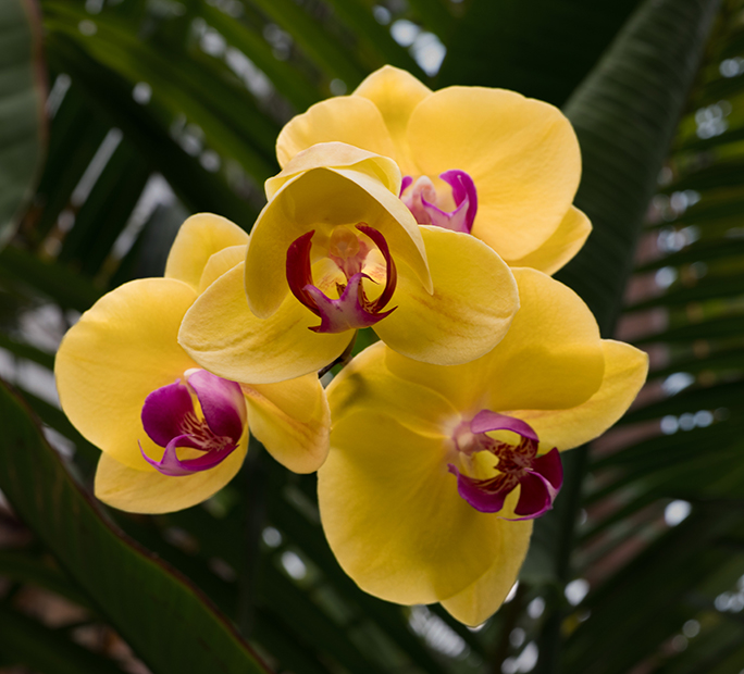
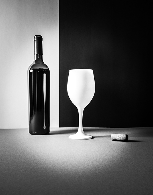
Sharp clear image. Well centered also. You did a good job on the cropping. Also, a good job removing the flower in the lower right corner, that was a distraction. I love the work that you do with your iPhone, but it is hard to get a bokeh with a phone. The dark foliage in the upper left corner I thought worked really well, but if you good decrease the exposure on the foliage on the right just a little, that would help bring the viewers eye to the flowers. Really good shot. |
Jul 7th |
6 comments - 0 replies for Group 81
|
6 comments - 0 replies Total
|