|
| Group |
Round |
C/R |
Comment |
Date |
Image |
| 40 |
Feb 26 |
Comment |
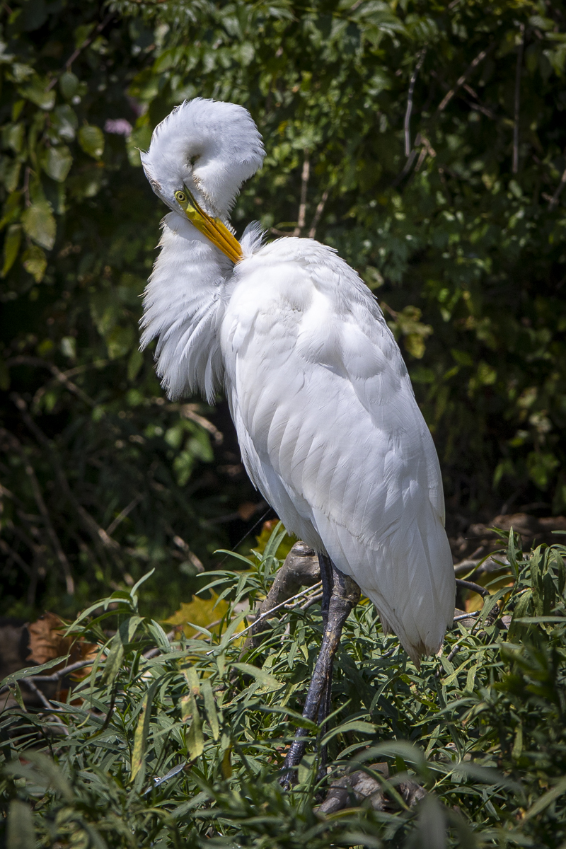
Hi Catherine, you did a really nice job of capturing the Milky Way! The stars ass well as the foreground look fairly sharp. Did you use light painting on the foreground? You might want to darken the highlights of the brightest parts of the tree - especially the thickest part with the lichen - to bring more attention to the sky. The whole image has really nice colors. Well done! |
Feb 14th |
| 40 |
Feb 26 |
Comment |
Hi Ling Ling, I really like how you got the flamingoes to line up for you. The colors of the water and birds are so nice! I love Julie's and Don's comments! I'm a little confused by the far background and can't tell if it's a mountainside or sky. Maybe the coloring is off for that part? You could crop out the 4 flamingoes on the far right since they're not paying attention to the beauty pageant. |
Feb 14th |
| 40 |
Feb 26 |
Comment |
Hi Julie, this looks like a fun event! You did a nice job of capturing the full reflection of the trees and balancing the light and dark at night - not so easy to do! It doesn't seem quite sharp to me. You might not want to flip the image since the wording on the banners on the far left are backwards. The lotus are really beautiful and there's a ducking in one of them! |
Feb 14th |
| 40 |
Feb 26 |
Comment |
Hi Don, this is a really nice image, and I like the color. Everything looks sharp, and the lines are all straight horizontally and vertically. I also like how it's centered evenly. Really well done! I wouldn't change anything! |
Feb 10th |
| 40 |
Feb 26 |
Comment |
Hi Shari, what a nice covered bridge! We have 3 about an hour from where I live, and I try to go there each fall. You did a GREAT job removing the handrails, power pole, and electrical line! I didn't notice anything in your photo and was surprised to see them in your original. The wood on the bridge looks nice and sharp and has good contrast. I think the left side would benefit from a lot more contrast, though. It's very gray. Or else you might want to crop off the left side to the edge of the 3 bushes. You could also be kind of playful and make the ribbon on the wreath red and leave the rest in black and white. |
Feb 10th |
| 40 |
Feb 26 |
Comment |
Hi Andrew, I like images like this where it shows patterns. Good job getting rid of the person! I especially like the shadow. If you crop out the gate at top left and crop off the right side where the pier ends, you'll be zooming in more, and it'll bring more attention to the shadow. If you don't want to do this, then I recommend straightening the gate so it's more vertical. Also, when I zoom in, I see purples and greens in the bridge. This can be corrected in Lightroom/Lens Corrections/Defringe. |
Feb 10th |
6 comments - 0 replies for Group 40
|
6 comments - 0 replies Total
|