|
| Group |
Round |
C/R |
Comment |
Date |
Image |
| 40 |
Nov 25 |
Comment |
Hi Catherine, your picture certainly tells a story! The colors are very nice, and the steam and hands holding the crabs add movement. I also wishes the bucket hadn't been cut off at the bottom and left, and I like how Don added them back in. You could darken the writing on the gloves so it doesn't make the viewer try to read them. Maybe also desaturate the red and white rim of the glove a tiny bit. The arms coming in from the corners draw the eye to the crabs nicely. |
Nov 16th |
| 40 |
Nov 25 |
Comment |
Hi Ling Ling, I think you did well to choose monochrome for this image. It definitely fits the theme of a spooky abandoned prison. I think you could keep the crooked stovepipe since it's part of the story. You might want to lighten the darkest areas and darken the brightest areas so we can see more detail in everything. The ceiling on the bottom floor has some very scary-looking HOLES which would be great to call attention to. I think you can do a lot with this photo! Well done! |
Nov 16th |
| 40 |
Nov 25 |
Comment |
Hi Don, I think you did a great job with post processing! I like the colors that you chose, although maybe the top yellow wall could be desaturated just a tiny bit so it doesn't attract all of the attention. Lines are all straight. I think the old lamp might look good if left in, especially if it's off-center and maybe if there's more space added above...not sure. I'd have to see both images to compare. I didn't notice the bright metal bars indoors until I read Julie's post. If you wanted to darken them, you might be able to use the color picker in LR. The rail lines are perfect and lead the eye into the image. |
Nov 16th |
| 40 |
Nov 25 |
Comment |
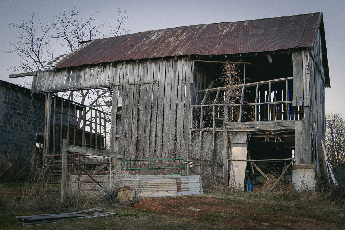
Hi Shari, welcome to the group! I think you did a really nice job of post processing. I definitely prefer the color one better - the greens against the rustic wood are so nice, and it provides separation and attention to the barn. I don't notice the barn in the b&w one. I agree with Julie that the wood on the right side should be darkened. You might also want to darken the white vertical reflection in the glass and lighten the barn a little bit to bring a little more attention to it. Well done! |
Nov 16th |
| 40 |
Nov 25 |
Comment |
Hi Julie, well done! Very cool that penguins go there! I like the "placement" of the birds, evenly spaced between the poles. You've greatly improved the sky, and the reflection in the water is very nice. The yellow tone doesn't seem natural. Maybe the tone or white balance can be adjusted, or highlights decreased. I like your crop, but if you wanted, you could crop in a little on the left and just leave half of that building so the bird is halfway between the left edge and the pole. |
Nov 16th |
| 40 |
Nov 25 |
Comment |
Hi Andrew, nice image! I like the colors of the green ivy and moss, and the red bricks. The figure at the far end of the tunnel is well placed. I recommend adding a vignette, at least on the right and left, as Julie mentioned. Also, you might want to lighten the path towards the figure so it leads the eye to him. I'm not sure I like the red graffiti in such a calm-looking serene scene. Maybe it could be changed from red to gray. |
Nov 16th |
6 comments - 0 replies for Group 40
|
6 comments - 0 replies Total
|