|
| Group |
Round |
C/R |
Comment |
Date |
Image |
| 40 |
Jun 25 |
Comment |
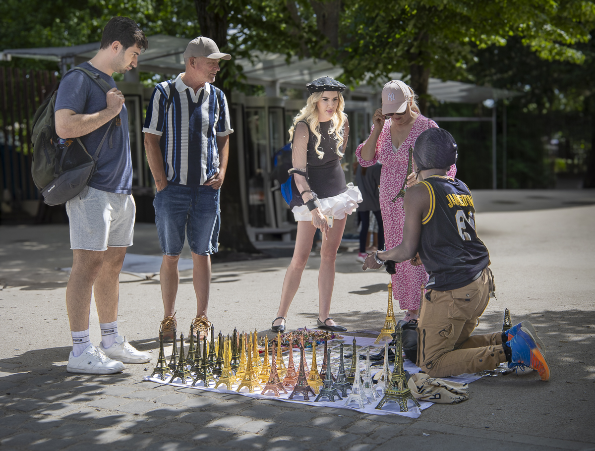
Thanks for your comments, everyone! I went back to the original and only removed a few people and darkened and desaturated some of the remaining people so it doesn't look so staged. The woman didn't know I was following her or photographing her. I pretended to take pictures of other things nearby. |
Jun 22nd |
| 40 |
Jun 25 |
Comment |
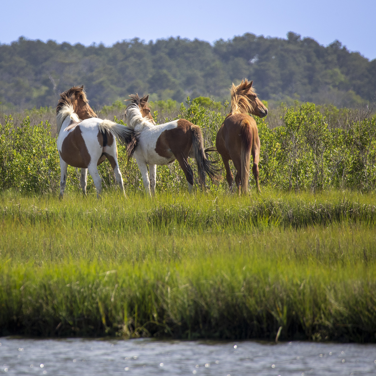
Hi Catherine, what a great shot! You were so lucky to see this - a wild horse AND a sunset! Are you allowed to lighten the entire image? The left tall tree seems a little strange or unnatural - maybe darker or less sharp than the other tree. Very pretty! |
Jun 22nd |
| 40 |
Jun 25 |
Comment |
Hi Ling Ling, I guessed this was Kyoto from seeing the buildings next to the sakura. Very nice image! I think it's good to keep the buildings there for context. The white curving line at the base of the buildings leads the viewer right to the sakura. I agree that the orange should be toned down/desaturated a bit. I like what Andrew did with the post processing. The cherry blossoms are a bit too bright and change color at the top. I think you probably tried to darken the sky. You might try using "select object" or "select subject" in Lightroom to select the cherry tree and adjust the tone equally across the whole tree. |
Jun 22nd |
| 40 |
Jun 25 |
Comment |
Hi Don, it's a nice image. I agree, it feels like I'm right there! I recommend lightening the dark part of the top of the lighthouse where the light would be, in order to show a little more detail. Otherwise, my attention is drawn to the lightest part of the image which is the walkway rather than the lighthouse. |
Jun 21st |
| 40 |
Jun 25 |
Comment |
Hi Henry, nice job! I need to learn how to do this. (I kind of learned a few years ago but didn't use it and have forgotten already.) The flowers are nice and sharp, and the background is a good compatible color for the flowers. To get rid of the white area around the flower petals, can you do a color pick (select white or whatever), and then change that to "invisible" so that the background mask will show through? Also, there's a tiny white spot near the 4th pussy willow from the top. |
Jun 19th |
| 40 |
Jun 25 |
Comment |
Julie, I like this image a lot. It's a very nice design. I think I like it better in color, and I agree it'd be worth a try to lighten the black chandelier parts, if possible. It looks centered to me except that the top half might be a little larger than the bottom half. |
Jun 19th |
| 40 |
Jun 25 |
Comment |
I like seeing the RR crossing sign with the train together in the same shot. You might want to darken the bright whites that are not on the train in order to draw more attention to the train. The main subject, the people, are right in the 1/3 vertical and horizontal lines, which is good. |
Jun 19th |
7 comments - 0 replies for Group 40
|
7 comments - 0 replies Total
|