|
| Group |
Round |
C/R |
Comment |
Date |
Image |
| 40 |
May 25 |
Comment |
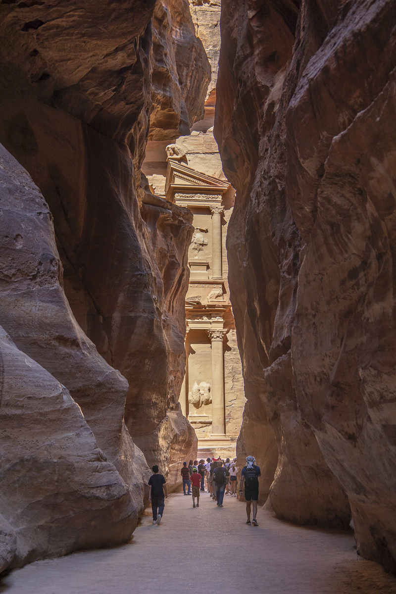
Hi Catherine, what a cool shot and experience! Someday I'd like to watch the Chincoteague roundup. It's unfortunate that the men's expressions weren't all good or all facing you. Ling Ling had a good suggestion of using burst mode. I recommend darkening the white jacket a lot, especially since that guy isn't looking forward. You could remove the other guy in back since only his head appears. If you do this again, it might work well to get down low so that the horses and men are towering above you - although you could get pretty muddy. This is well done for 25600 ISO! |
May 21st |
| 40 |
May 25 |
Comment |
Hi Ling Ling, what a great photo! Well done! I wouldn't change anything! The colors of the ceiling, walls and the floor all match, and the soft lighting all goes together so nicely. The 3 people at the far end are positioned perfectly and have separation between them and are also in soft focus. The lights on the left and right are at good positions to balance the photo. The bottom right leading line is right at the corner. You'll want to straighten the horizon line - the beginning of the wall/ceiling is lower on the left side than the right just a fraction, but you could lose points in a competition, and I hope you'll submit this! I forgot to add that you're very lucky this came out clear at 1/3 second, which is pretty slow - unless you had a tripod. |
May 21st |
| 40 |
May 25 |
Comment |
Hi Don, I love cactus! And very cool that you were right on the equator! I think you did a good job of post processing. I think the far left cactus is too close to the edge, though, so it might be better to cut off just a little bit of it. You could crop off a little from the bottom so the rocks aren't so prominent, but I like their color contrast from the cactus, so I'd keep some. The color and texture of the cactus seems a little unnatural, not sure why. Maybe they could be more saturated and brighter? Also, you could add some vignetting and darken the yellow cactus so the viewer's attention stays in the center. Each cactus is a different color, so you could play around with giving it more color/saturation variety and contrast. I agree it might also work well in monochrome. |
May 21st |
| 40 |
May 25 |
Comment |
Hi Henry, this photo made me laugh, with the outrageously bright yellow bike, all the "eyes" on the bike, and the expressions on the two people. It's great that you included the Harley Davidson sign in the background. Can you include the entire sign? I agree with removing the trashcan and darkening the bright cream brick structure. It'd be great if you could either remove the text or the sign where it says "No parking". You could also make a 2nd image of just a closeup of the bike's 3 sets of "eyes" and the riders' eyes. |
May 21st |
| 40 |
May 25 |
Comment |
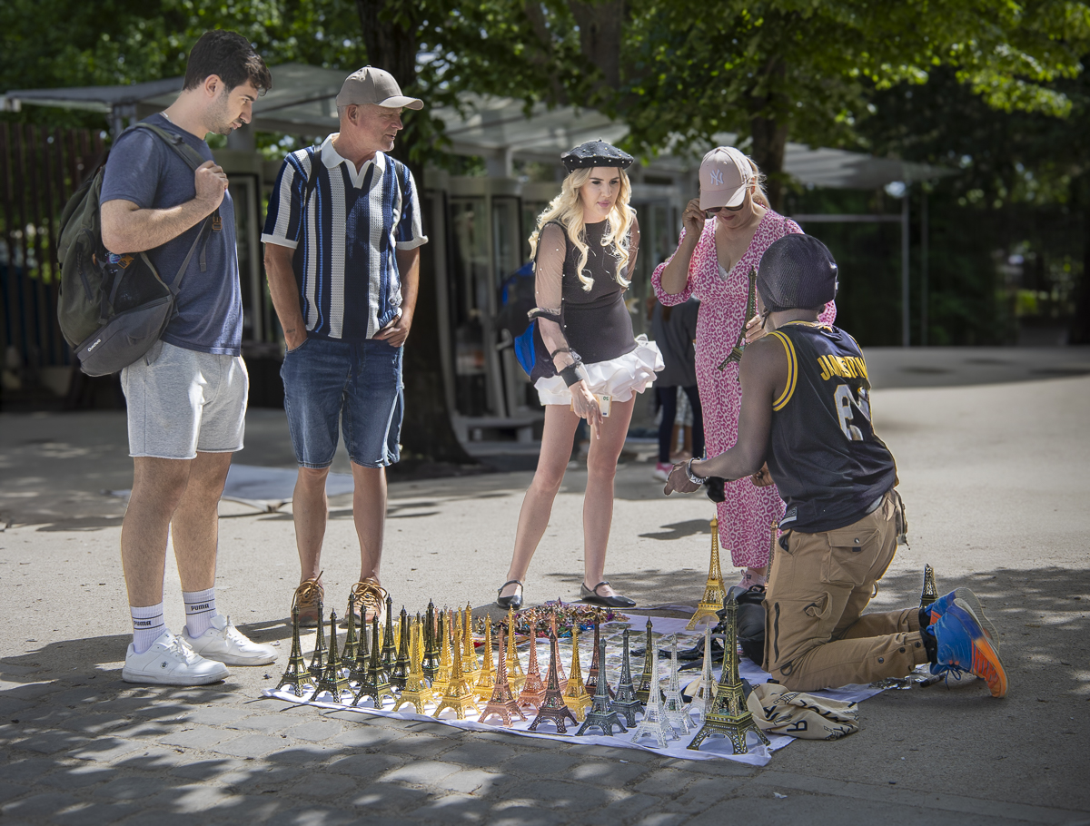
Hi Julie, I think you found a nice subject to photograph. It's kind of funny that there would be THREE locks next to each other. Why so many? This tells a story. I like that you increased the color saturation, but I think the colors need some adjustments to appear more natural. The gold has become greenish-yellow, and the red has become pink. Also, I think it might have been better to photograph this head-on (directly facing the door, instead of a little to the side). |
May 21st |
| 40 |
May 25 |
Comment |
This image has interesting colors and lines. It could be made into an abstract, but maybe the words, numbers, and plaque would need to be removed? It kind of bothers me that it's hard to read "Churchill" and that the image of a man is sort of there but hard to figure out - that the image is not completely abstract and not completely non-abstract, either, although I'm not usually into abstracts. I agree that the top right corner should be fixed. |
May 20th |
| 40 |
May 25 |
Comment |
Hi everyone, thanks for your comments! I submit 2 photos every month to my local camera club's competitions, each month with a different theme. And I submit these photos to you guys ahead of time to improve them or decide to submit something else instead. You guys are very helpful! My club allows edits to street photos. I've made the changes you all suggested and will see if maybe I have a better photo to submit instead. |
May 20th |
7 comments - 0 replies for Group 40
|
7 comments - 0 replies Total
|