|
| Group |
Round |
C/R |
Comment |
Date |
Image |
| 40 |
Apr 25 |
Comment |
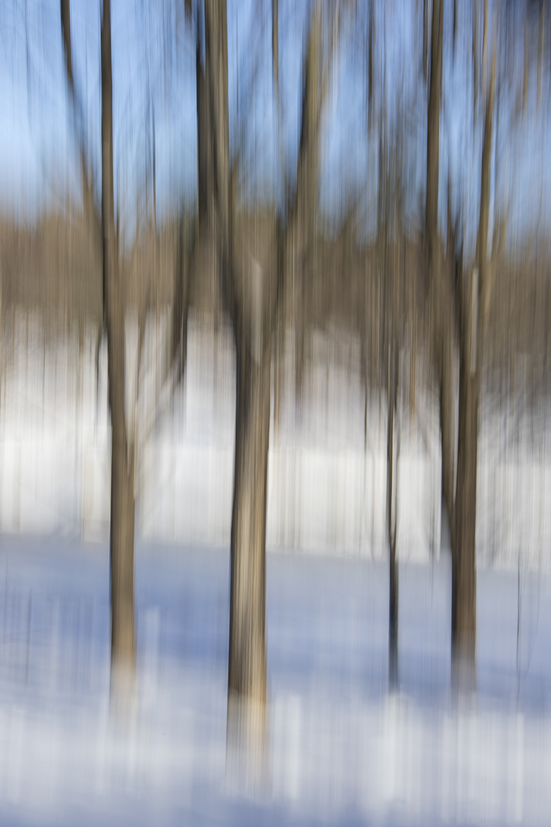
Hi Catherine, this is very beautiful! Well composed and well done in a square format. I agree with removing the sticks at the skyline. I recommend adding a vignette. You're brave to go to the beach in cold winter! |
Apr 24th |
| 40 |
Apr 25 |
Comment |
Hi Ling Ling, this is very beautiful! In Lightroom, you could either Select Background and then darken, blur, whatever, OR you could do a color pick, select green, and then change that to a darker green. The color pick option might work better since it looks like the background trees and the cherry tree are very close to each other. I also recommend using a vignette, especially on the bright yellow tulips at the edges of the image so they won't lead your eye away from the tree and out of the picture. |
Apr 24th |
| 40 |
Apr 25 |
Comment |
Hi Don, I actually like the color version better with the old, faded colors, peeling paint, and creepy dark shadows in the foreground. I also like that the entire hole in the foreground wall is shown in the original. In order to straighten the original and keep the hole in the wall, you might need to crop the left side, but I think that would be okay since the bright doorway can pull the viewer's attention away from the radiator in the foreground. In the monochrome version, you might want to decrease the texture a bit to appear a little more natural. |
Apr 24th |
| 40 |
Apr 25 |
Comment |
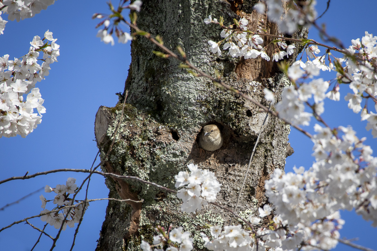
Hi Henry, the pink petals are really beautiful and the 2 closest are in nice focus. I think the green leaf could be lightened and brightened a little and would look nice with the pink petals. The bottom is really close to the edge. I don't know if you can add a little space to the bottom. Can you make the background (left and right sides) completely black? That way, the foreground would have nice breathing room all around it. |
Apr 23rd |
| 40 |
Apr 25 |
Comment |
Hi Julie, Australia seems to have very interesting architecture! Or maybe it's just your photos! Hahaha! Great job on post processing to remove the highlights on the windows! I recommend cropping the right to the middle tree. The building looks straight to me because the curtains are straight. Very cool building. |
Apr 23rd |
| 40 |
Apr 25 |
Reply |
Don, at first I thought you meant you wished you could see the original Pompeii (be there before the eruption). Hahaha! |
Apr 23rd |
| 40 |
Apr 25 |
Comment |
Hi Andrew, I really like your post processing. The colors and texture add a lot to the photo. Nice job! The fact that it's in Pompeii adds to the interest. I wish there was some way of showing that it's Pompeii such as an ancient sign or symbol, or volcano in the background, but that's probably impossible to do. I wouldn't change anything. |
Apr 23rd |
6 comments - 1 reply for Group 40
|
6 comments - 1 reply Total
|