|
| Group |
Round |
C/R |
Comment |
Date |
Image |
| 40 |
Mar 25 |
Comment |
Hi Catherine, at first I couldn't figure out how you got your image - double exposures. Haha! It makes you think! Very clever! I think the red is dark enough so it doesn't draw attention away from the blues and brick in the reflection. Be careful on the bottom left along the left edge where a sliver of the window is showing. The red vertical line is a little crooked. Maybe if it's straightened, then the window that's "cut off" will disappear. You could brighten the entire image a little, but make sure the red isn't overpowering the reflected colors. (As a rule, the color red in images draws more attention than other colors.) |
Mar 26th |
| 40 |
Mar 25 |
Comment |
Hi Ling Ling, this is absolutely GORGEOUS!!! I love it!!! It makes me feel like I'm standing right there in the peace and quiet; not sad and lonely. The only thing I recommend is erasing the far, far right tree at the top right of the photo where the bottom of the tree is missing and only the top is showing. You could crop a little of the sky from the top. I like the composition. I think there are leading lines with the trail on the left and the edge of the frozen river on the right, leading to a point in the middle, and above that point is the gap in the trees. The closest tree is a place for the eye to rest.
I totally understand how you're feeling about the country. I think things will get worse and then they'll get better, so hang in there. Better times are coming. Hopefully soon! |
Mar 26th |
| 40 |
Mar 25 |
Comment |
Hi Don, I really like this image. The colors in the sky are so nice, and I really like the s in the ironwork. The blue and yellow complement each other. Would you be able to show more of the roof lower down so that the railing wouldn't be on the center line? I agree that it'd be good to straighten the railing bars to be vertical. I don't think you should crop the sky - the colors are so nice. |
Mar 26th |
| 40 |
Mar 25 |
Comment |
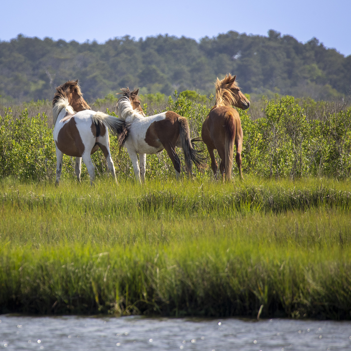
Hi Henry, I didn't know that horses still roam free out West. Maybe I should know that. I like how you took the picture from below the horses, looking up, so they appear more majestic. It might be a bit oversaturated. If the horses were interacting with each other somehow - looking at each other, facing each other - it might make a better image. But it's hard to control nature and get them to do what you want. Actually, you could experiment and make a completely different image by removing the brown horse and lightning the birds, so it'd look like the gray horse is watching the birds. I don't know if that would be an improvement, but maybe something to try. |
Mar 26th |
| 40 |
Mar 25 |
Comment |
Hi Julie, I think you did a great job of post processing. I prefer it without the white border. I have a phobia of fish, although I'm learning to eat it more often, but I really don't like to see what I eat, especially fish. But that's just me. If a fish touches me when I'm in the ocean, I go running for shore. The lighting and background are perfect. |
Mar 26th |
| 40 |
Mar 25 |
Comment |
Hi Andrew, I think you did a nice job post-processing this image. I like the patterns of holes and rivets. But the bright yellow is drawing my attention away from them, so maybe you could desaturate the yellow a little. I wonder if you could increase the saturation of the blues and reds on the metal of the ship. And compare that to monochrome. You might also want to erase the black dot and gray line on the yellow "ballard"(?) so that it doesn't look like the rivets are dripping onto the ballard. I'm not familiar with shipping so it confused me a little. Very cool image. |
Mar 26th |
| 40 |
Mar 25 |
Comment |
Thank you, everyone!!! I really appreciate everyone's comments! Catherine, I didn't know that! Don, I really like your edits and will try to do the same thing. Henry, negative space is kind of plain, bland, uninteresting, often same-colored background that should be un-noticeable around the subject. Lots of space in the photo is "unused" and can make the subject stand out more. |
Mar 26th |
7 comments - 0 replies for Group 40
|
7 comments - 0 replies Total
|