|
| Group |
Round |
C/R |
Comment |
Date |
Image |
| 40 |
Feb 25 |
Comment |
Thanks, everyone! Negative space means the image or the subject doesn't fill a lot of the frame - there's a lot of empty or uninteresting space. Don, I can't see any difference between your altered image and mine, but thanks for trying. |
Feb 24th |
| 40 |
Feb 25 |
Comment |
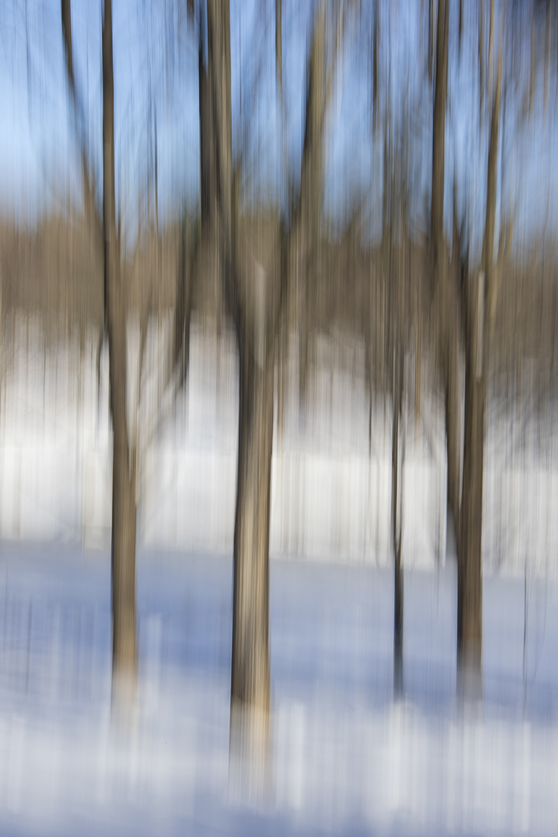
Hi Catherine, I like the soft, muted colors of the snow/ice and the twig on the right, and the shape of the shadows. I wish the left twig wasn't so plain and straight, but I like that it's parallel with the right twig. The twigs don't seem sharp, but I wish they had the same softness as the snow/ice. For some reason, I'm picturing this on a large canvas on the wall of a very modern model home above an off-white leather sofa. |
Feb 24th |
| 40 |
Feb 25 |
Comment |
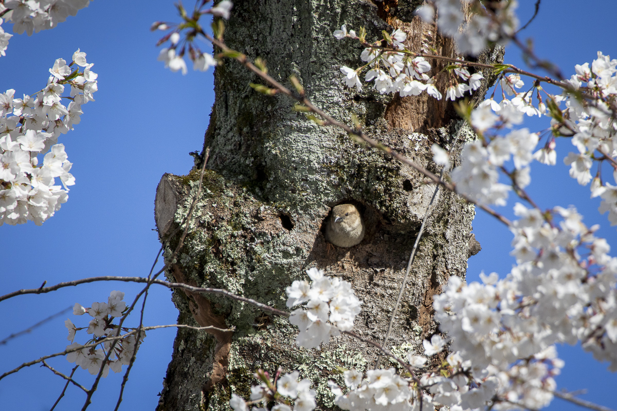
Hi Ling Ling, I think your image is really well done! The colors and composition are great, and you have just the right amount of blur. I agree with Catherine that the bright white tree could benefit from some darkening so it doesn't appear to be blown out, and there is that white "shadow". I wonder if you could use a remove tool in Lightroom or cloning or something to get rid of it. You might want to add a slight vignette so the bottom and right edges are darkened just a little. Really nice image! |
Feb 24th |
| 40 |
Feb 25 |
Comment |
Hi Henry, wow, you're creative! I like the composition, crop, and combination of the green and orange. The blurring of the grass is nice. The zigzag is a little strange to me, but it would make more sense to me if the background were blue and looked like water since it'd make the flower look like it's a reflection. |
Feb 24th |
| 40 |
Feb 25 |
Comment |
Hi Julie, this is an interesting photo! Good choice to convert to black and white. I like the tones. The lines are straight. I think there needs to be more space on the right - just as you had in the original. If you can't get rid of the power lines, you might be able to change the color of them in Lightroom so that they don't contrast so much from the surroundings. I don't know if "Select Object" would work on the power lines, but if you can select them as a mask and then use the color picker to adjust to the same color as their surroundings, they'll sort of disappear or at least not be so distracting. Also, I think it's kind of fun to guess which trees are real and which are shadows. |
Feb 24th |
| 40 |
Feb 25 |
Comment |
Hi Andrew, I really like this image. I thought it was the Chesapeake Bay here in Maryland until I saw who took it! It looks just like here, as Catherine said. I really like the colors and the composition. You could crop a little off the right, but I also like it just the way it is now. I thought the lone bird was a bit of dust until I looked closely, so you might want to remove it. I like the bit of blue in the sky which contrasts a little with the orange. Really nice! |
Feb 24th |
6 comments - 0 replies for Group 40
|
6 comments - 0 replies Total
|