|
| Group |
Round |
C/R |
Comment |
Date |
Image |
| 40 |
Dec 24 |
Reply |
If you can't get down lower, you can try tilting up the screen if you have a tilt screen, and just holding the camera at a low level. ?. Good luck! |
Dec 28th |
| 40 |
Dec 24 |
Reply |
Thanks, Henry. |
Dec 26th |
| 40 |
Dec 24 |
Reply |
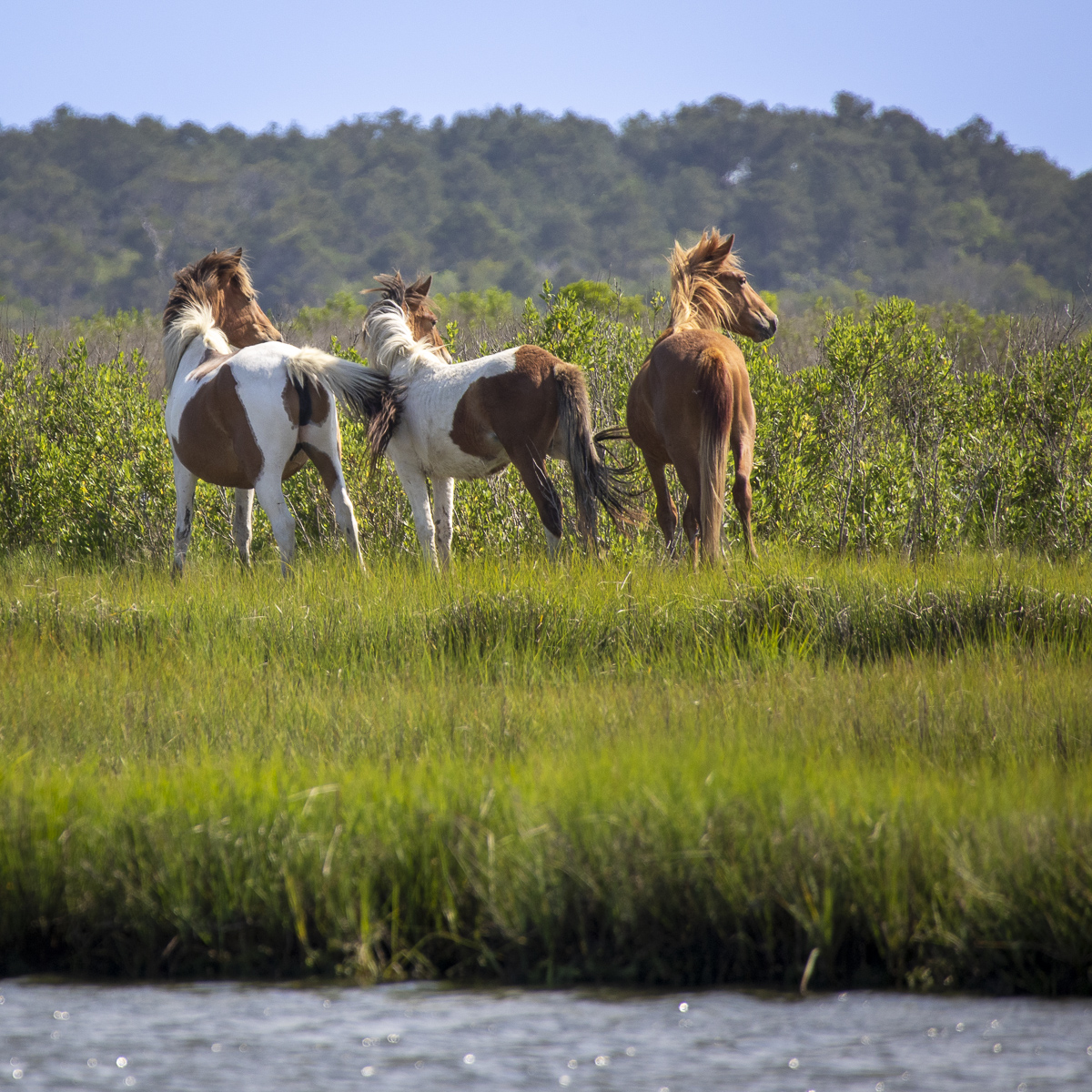
Hi Don, thank you. Very interesting that Topaz gives you 4 images to choose from! Mine doesn't do that. One of my Topaz apps wasn't set up to SAVE and export back to Lightroom, it'd just save as a TIF with no changes. I've got it set up correctly now. The horses in Iceland did NOT cooperate with me to line up and look at me while standing in front of a beautiful mountain as I went flying down the highway in the tour bus. I tried many times to get that iconic shot and felt this was the best one of my many attempts. Happy holidays! |
Dec 24th |
| 40 |
Dec 24 |
Reply |
Very nice! By the way, there's an app for a level. :-) Have a great trip and happy holidays! |
Dec 24th |
| 40 |
Dec 24 |
Reply |
Hi Ling Ling,
In Lightroom, you'd need to use a brush mask to select the snowy part of the reflection. Then adjust the brightness of the whites or highlights just for that selected area.
Great to hear you fixed the problem of your photos' sharpness! It looks much better!
--Janice |
Dec 22nd |
| 40 |
Dec 24 |
Comment |
Hi Catherine. I don't think I want to follow you! Hahaha! I think the image is well done, well composed, colors are nice, focus is good. I wish the path would lead me to something or someone - a person walking, a dog, or something. |
Dec 21st |
| 40 |
Dec 24 |
Comment |
Hi Ling Ling, this is beautiful! 3:30AM! Wow! I had no idea this was taken before dawn. Can you brighten the reflection a little, and especially the reflection of the snow? I like how the pier leads your eye towards Mt. Fuji, but would you be able to remove the gate part of the pier? I like the grass in the foreground. You could trim off a bit from the top if you wanted, but it's also fine as it is. Maybe darken the bright areas on the left side a bit? The whole image looks pretty sharp. I like the reflection of the city lights in the water. Everything looks very peaceful. |
Dec 20th |
| 40 |
Dec 24 |
Reply |
Hi Andrew, thanks for your comments. I agree with everything you wrote, and I like your revision. I found out what was "wrong" with my Topaz. I didn't realize I had 2 different versions of it - Topaz Denoise (free trial version?) and Topaz Photo AI (purchased). I was using them interchangeably without realizing it, and Denoise wasn't set up to export correctly so my changes weren't saved. Now I know and have imported my edited photos. :-) |
Dec 20th |
| 40 |
Dec 24 |
Comment |
Hi Don, I think this is a great image and you did the post processing wonderfully. The sky looks great, too. Just straighten the horizon. I agree with Andrew that you could crop a little off the right. I really like it, and I don't think you wasted your day. I hope you have a great trip to the Galapagos. Please tell me all about it afterwards because I'm thinking of going there. Thanks!
|
Dec 20th |
| 40 |
Dec 24 |
Comment |
Hi Henry, I can see how this is related to Monet with the weeping willow and lily pads and soft reflections in the water. However, I think I agree with Andrew. The bright red is drawing my attention, and I don't know what it is. I'd like to see more of the willow tree and lily pads. The tree trunk doesn't seem to fit with the colors and texture of the rest of the image. |
Dec 20th |
| 40 |
Dec 24 |
Comment |
Hi Julie, I really like your photo! Amazing architecture! I agree with straightening the horizon and the vertical lines, removing the blue exit signs (and maybe also the caution cone at the far back), and playing around with the color/temperature. I don't think it's exactly "abstract" because we can tell what it is - unless maybe you removed the man. If you return there, you might want to try shooting from lower down so you can see more of the ceiling. I don't know if that would be possible without distorting the vertical columns, though. |
Dec 20th |
| 40 |
Dec 24 |
Comment |
Hi Andrew. This is a nice photo, especially with the engineer leaning out and looking at the sign. It tells a story. And I like your title! If the engineer is the main subject, you might want to make him stand out more by darkening the things that are brighter than him - the sky, the window next to him with the reflection of a tree, and maybe even the bright copper pipes (just a little). You could darken the stuff on the left to hide it a little, but leave the pole and sign just as they are because they're important for the story. I wish I could see the front edge of the train. I don't know if the train was moving and if that would've been hard to capture. Well done! |
Dec 20th |
6 comments - 6 replies for Group 40
|
6 comments - 6 replies Total
|