|
| Group |
Round |
C/R |
Comment |
Date |
Image |
| 7 |
Apr 26 |
Reply |
Thanks Tom - the dash and the car interior are a part of the image - I understand what you said, but I want people focusing on the entire image - as you said it's different and most people tend to look at it as "frame" - I captured exactly what I wanted, but there's an old saying "If the student hasn't learned chances are the teacher hasn't taught" - similarly, I obviously failed to impart my vision - I doubt I'll pursue this further for all the reasons stated above - but this is what DD groups are about - and if people don't "get it" then I obviously haven't imparted it. Appreciate your comments Tom
|
Apr 18th |
| 7 |
Apr 26 |
Reply |
Judith and Hoshedar - First of all, I do appreciate your comments - both are thoughtful, thank you. Also, I don't mind when people critique or make suggestions to my images - that's why I belong to the group - to get other ideas. But if you think about it, and I did at the time, those smudges were raindrops a second or so before the sweep of wiper blades and they were realistic because they were real. Had I added some drops or turned off the wipers, which I did think of doing, they drops would have been sharp because that's where I focused (at the base of the windshield) and therefore eye-grabbers - As I said, I really appreciate both your thoughts on this but that's why I thought those smudges were pure serendipity sent down from heaven (no pun intended) |
Apr 16th |
| 7 |
Apr 26 |
Comment |
Thanks Hoshedar - I did put a lot of energy into it - always appreciate your input - thanks again |
Apr 13th |
| 7 |
Apr 26 |
Comment |
I think you have a winner here Tomi - a compelling wildlife image that captures a classic and moment with immediate impact. The suspended spray gives the photograph energy and a clear sense of behavior rather than just documentation. I think the simplicity works well allowing the viewer to focus entirely on the form and texture of the whale's tail. Detail is solid and enough sharpness in the droplets to add life. |
Apr 9th |
| 7 |
Apr 26 |
Comment |
Hoshedar, I've long believed that people love looking at interesting faces and this is a very interesting face. The sidelight on the hair is excellent. It creates separation from the background and gives the image a kind of halo effect without feeling artificial. The subject's face is compelling -strong eyes, weathered skin, full beard, and that flowing hair all contribute to a sense of story. This absolutely invites the viewer to wonder who this person is. That's a big win in competition. Best of all, the direct eye contact anchors the image it is extremely engaging without being aggressive. It literally pulls the viewer in and holds you there. The catchlights are subtle but present-
In my VF I toned down the hair on the left of the frame, and brightened the face, eye sclera, lips and eyebrows - What makes this image so appealing is that it combines impact with visual interest - terrific job Hoshedar
|
Apr 5th |
 |
| 7 |
Apr 26 |
Comment |
Between documentation and artistry, for good or bad, I focus on the artistry - that's why the Good Lord gave us Photoshop :-) |
Apr 2nd |
| 7 |
Apr 26 |
Reply |
Tom - I think it presents a better, what do you think? Those leaves in the cab were a major distraction |
Apr 2nd |
| 7 |
Apr 26 |
Reply |
Seriously, it's these types of candid and graphic city shots that win competitions - just outstanding Judith, just outstanding |
Apr 2nd |
| 7 |
Apr 26 |
Reply |
Removing those leaves makes a significant difference - I still like the truck turning into my view :-) |
Apr 2nd |
| 7 |
Apr 26 |
Comment |
Tom -
I think you know I edit and re-edit A LOT and I sent in the wrong review so here's the correct one. My apologies
You found a genuinely interesting subject - love old vehicles! However, the image feels left heavy. The front of the truck and dense foliage pull the eye to the left and hold it there, while the logs on the right don't provide enough visual counterbalance.
That said, what I love about the image is the subject and especially how you positioned yourself, so the vehicle's wheels are turned toward the camera - image with head on direction always have more impact, little things are important, good call
The big drawback though are the leaves. Especially those showing through the windshield breaking the integrity of the subject and making the truck, which is the star of the show, feel less dominant and more cluttered.
Perhaps you could have shifted your position to eliminate the foliage through the windshield - but that would have removed the tire angle that's great . Rebalancing could also be achieved by giving the logs more presence or cropping in from the left to reduce the visual weight of the greenery.
Subtly toning down the bright greens would also help the truck stand out as the clear focal point and perhaps darkening the logs and saturating the truck cab - but the big issue here is GREAT subject and good angle on the wheels but weighted too heavily on the left.
|
Apr 2nd |
| 7 |
Apr 26 |
Comment |
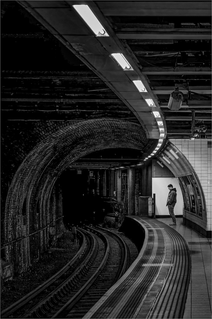
Judith - this is truly a fabulously interesting image - it's compelling and delivers a sense of aloneness and even mystery. It's also a great composition. Its strength is obvious - the curved leading line to the lone figure waiting for the train. That said, I spent a bit of time with my VF and really opened the shadows - I wanted to preserve the great mood you captured but at the same time the image needed detail in the tunnel, rails, and brickwork to create depth and guide the eye more effectively.
As presented, it almost felt like half an image with the entire tunnel area almost completely dark, when in fact it had a ton of detail and structure that's essential to the story. I tried to balance its mystery with readability, by providing more context that enhanced the lone figure rather than isolating him in a void. I did a LOT of dodging and burning (mostly very slightly) including giving more detail to the man waiting on the platform by increasing the exposure. As I said, this is a fascinating image and wanted to give it greater visual impact to hold the viewer's attention a bit longer.
|
Apr 1st |
 |
| 7 |
Apr 26 |
Comment |
Barbara - You chose a very interesting and colorful composition that draws the eye.
However, the gorget dominates the image because it's both the brightest and most saturated element, making it a visual magnet. The issue isn't that it draws attention-it should-but that nothing else in the frame supports or balances it, so the rest of the bird and foliage collapse into secondary or tertiary elements.
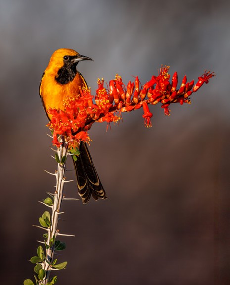
I think I know what you were going for and good on ya for doing so, but as presented the image is more of "an orange patch on a plant" than a fully integrated subject . And that affects its visual hierarchy. The bright orange gorget should be the entry point, not the entire experience. Right now, the viewer's eye lands there and stops, because the surrounding elements are comparatively muted and busy at the same time, which unintentionally amplifies the gorget's dominance. In another presentation the spider strand could be a welcome storytelling addition but, in this case, it really has no influence on the image.
|
Apr 1st |
| 7 |
Apr 26 |
Comment |
Tom - You found a genuinely interesting subject - love old vehicles. However, the image feels left heavy. The front of the truck and dense foliage pull the eye to the left and hold it there, while the logs on the right don't provide enough visual counterbalance.
Also, and I think this is even more important, the leaves showing through the windshield are distracting-they break the integrity of the subject and make the truck, which is the star of the show, feel less dominant and more cluttered.
Perhaps you could have shifted your position to eliminate the foliage through the windshield - that would immediately strengthen the image. Rebalancing could also be achieved by giving the logs more presence or cropping in from the left to reduce the visual weight of the greenery.
Subtly toning down the bright greens would also help the truck stand out as the clear focal point and perhaps darkening the logs and saturating the truck cab - but the big issue here is GREAT subject, but not well balanced.
|
Apr 1st |
| 7 |
Apr 26 |
Comment |
Gaetan - You got an interesting concept, but the execution doesn't quite deliver. To wit: the image is significantly underexposed, leaving the foreground as a near-black mass that fails to support the scene or guide the viewer's eye.
In fact, your attempt to frame the sun between the tree branches feels unintentional because the tree branches don't form a clean window, ergo, they compete with the subject. I can't help but feel the image feels caught between two ideas-a silhouette study and a sunset landscape but it's neither fish nor fowl.
Also, the centered horizon is a no-no in most cases and does not help this composition.
Nonetheless, if given the opportunity to strengthen the image, I would open shadows enough to give the foreground some presence and detail. Then simplify and commit to a single visual idea: either reposition to cleanly frame the sun within the branches in a graphic way, or separate the sun from the tree so each element reads clearly (I suggest the latter.) As noted, avoiding a centered horizon would really help. In short, clarify your intent and let one dominant idea carry the image.
|
Apr 1st |
10 comments - 5 replies for Group 7
|
| 67 |
Apr 26 |
Comment |
Thank you for you kind words Ann, they're genuinely appreciated |
Apr 7th |
| 67 |
Apr 26 |
Comment |
Thank you Larry - I always learn something when you review images - much appreciated |
Apr 2nd |
| 67 |
Apr 26 |
Comment |
He was running FAST! :-)
|
Apr 2nd |
| 67 |
Apr 26 |
Reply |
David - I gave this quite a bit of thought - and to be honest, I am very partial to symmetry (top and bottom) and out of the camera crops, i.e., 5x7 and 4x6 and I don't think Nikon, Canon and the like chose those accidentally - I could be wrong though, it's happened before :-) - I simply preferred the 5x7 to the rectangle you chose - love the simplicity. |
Apr 1st |
| 67 |
Apr 26 |
Comment |
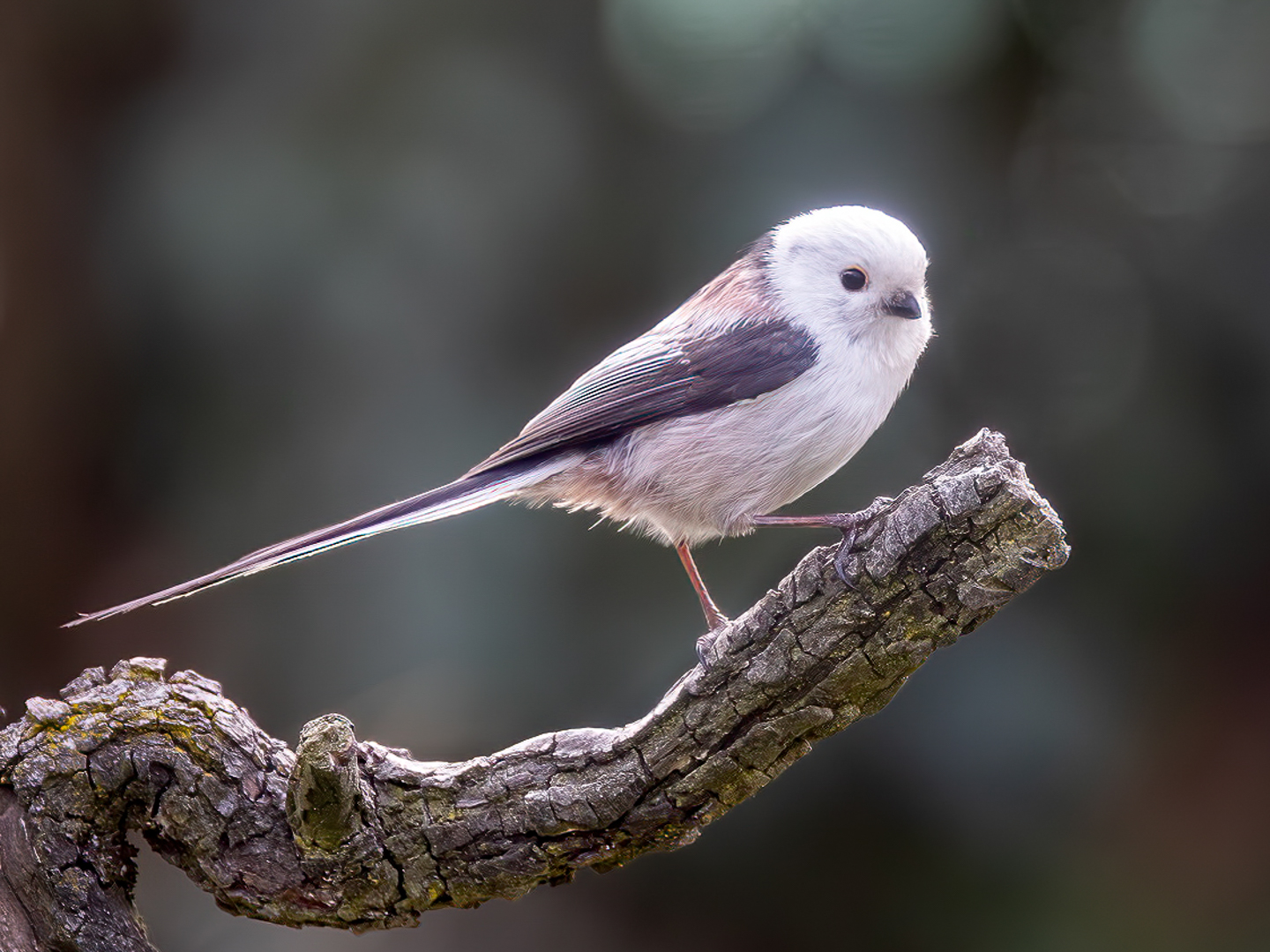
David - This is a clean, controlled, and technically well executed image with good feather detail with a reflection that adds both visual interest and a bit of elegance. As presented if feels like more of a refined technical study than a storytelling image, nonetheless, the simplicity works.
The composition could be refined a bit, so I cropped to a 5x7 format and saturated and brightened the subject's lores a bit to help it pop. Good for you trying something new, something I don't do enough of.
|
Apr 1st |
 |
| 67 |
Apr 26 |
Comment |
Bud - First of all, thanks for the info on you processing protocol - I'm not quite as advanced as you in post, so I'm going to look into it further. Now to the image - You have captured an interesting nature scene that's sharp and detailed where it needs to be with a wonderful reflection that adds to its visual interest - in essence, as presented the image compels me to examine it for a while.
Two aspects militate against the image IMO - the crop at the top of the frame is a bit tight and the image is loaded with distractions that pull the eye from the subject of swans taking flight. There are a number of mergers, the upper part of the image's background is a touch distracting and the lighter tone along the bottom of the frame pulls the viewer's eye a bit.
Having said that, I'm jealous because A) it's a truly interesting shot and B) I've never seen swans in the wild.
|
Apr 1st |
| 67 |
Apr 26 |
Comment |
Cindy - as photographers and artists I think we're always look for that money shot and you certainly arrived at the right scene - I've never been to Antarctica but if I ever had the opportunity, you could bet this is shot I'd be looking for. As I've written in my other reviews, wildlife is always about the story and this image nailed it. And having lived in the Colorado mountains for 20 plus years before moving to Tucson, I'm fully aware of the challenges of photographing snow. And for the most part I think you did a credible job especially with the ice flow that serves as your subjects' diving board.
As I'm sure you're away, the image is replete with distractions that continually grab the viewer's eye pulling it from the subjects. I don't know the protocols or logistics of such a trip, but I suspect it's not always easy to have a Zodiac driver maneuver the boat for optimal photography and my guess is this was the best perspective at the moment, and I'm happy for you that you were able to take advantage of it.
Nonetheless, capturing three Adélie penguins in a row in various stages of their respective leaps is special - kudos on capturing the moment.
|
Apr 1st |
| 67 |
Apr 26 |
Comment |
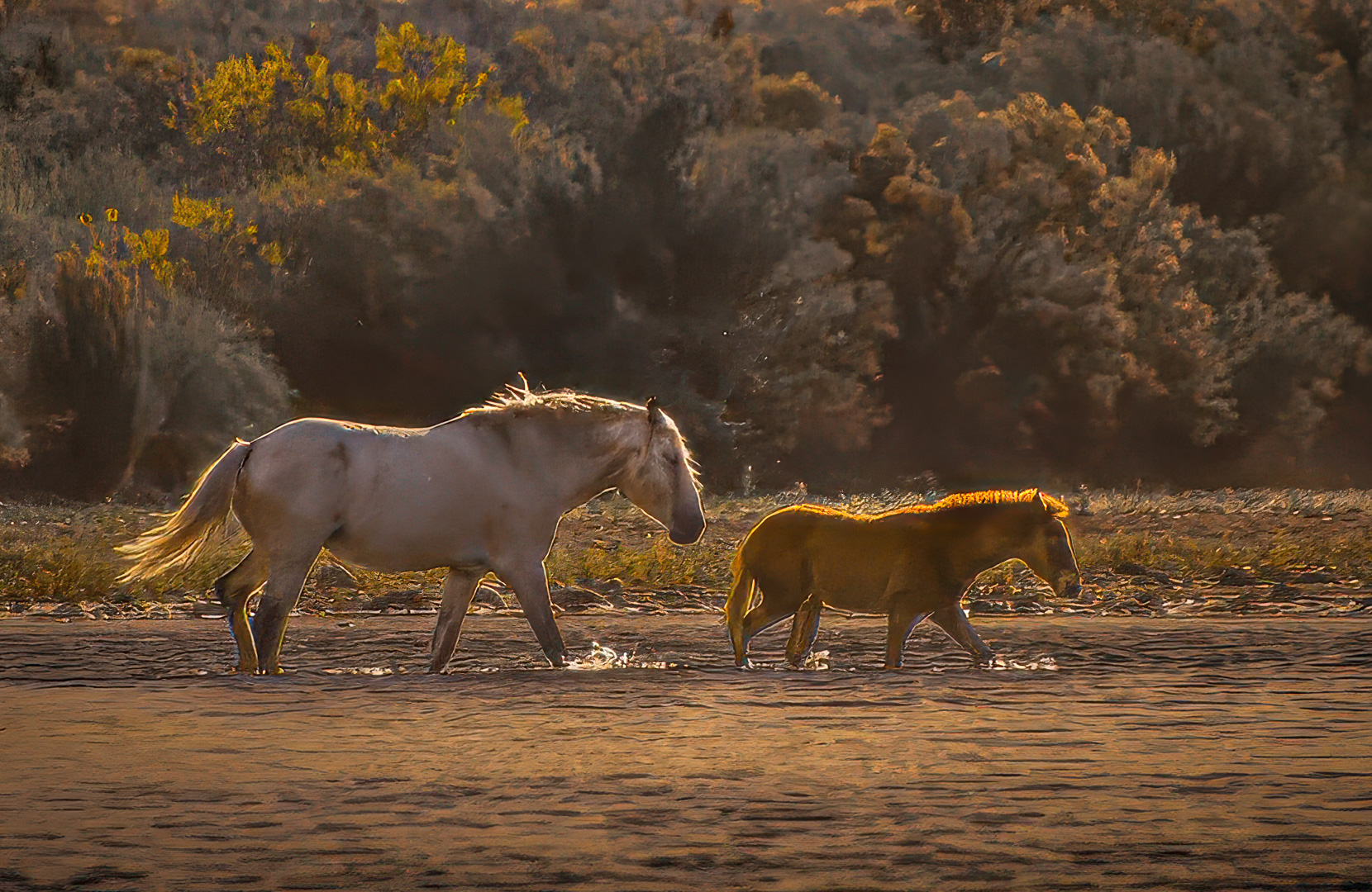
Ann, you've captured a compelling subject that evokes emotion, and that's about the highest compliment in photography - the image creates a soft and pleasing mood and really holds the viewer's attention. The relationship between the adult and juvenile is terrific storytelling and the rim light is special.
I also see from the original that you warmed up the image quite a bit - good thought and nice job with that. In my VF I took that a step further and used the Skylight filter in the Nik Suite at 50% opacity to take it up a notch.
The image was a touch soft but considering the subject matter I don't think it's that big of a detriment. Nonetheless, I sharpened it a bit and added texture, clarity and dehaze in LrC to help separate your subjects from the background. Your title is Mare and Foal - but most of the image comprises background trees, while they make for a beautiful scene the background also pulls the eye from the subject, so I cropped in tighter and made into a slight pano. Lastly, and I struggled a bit here, but I feel your horizon line is a bit canted right and I straightened it slightly.
None of those are deal breakers, so back to my first comment, you evoked an emotion - outstanding!
|
Apr 1st |
 |
| 67 |
Apr 26 |
Comment |
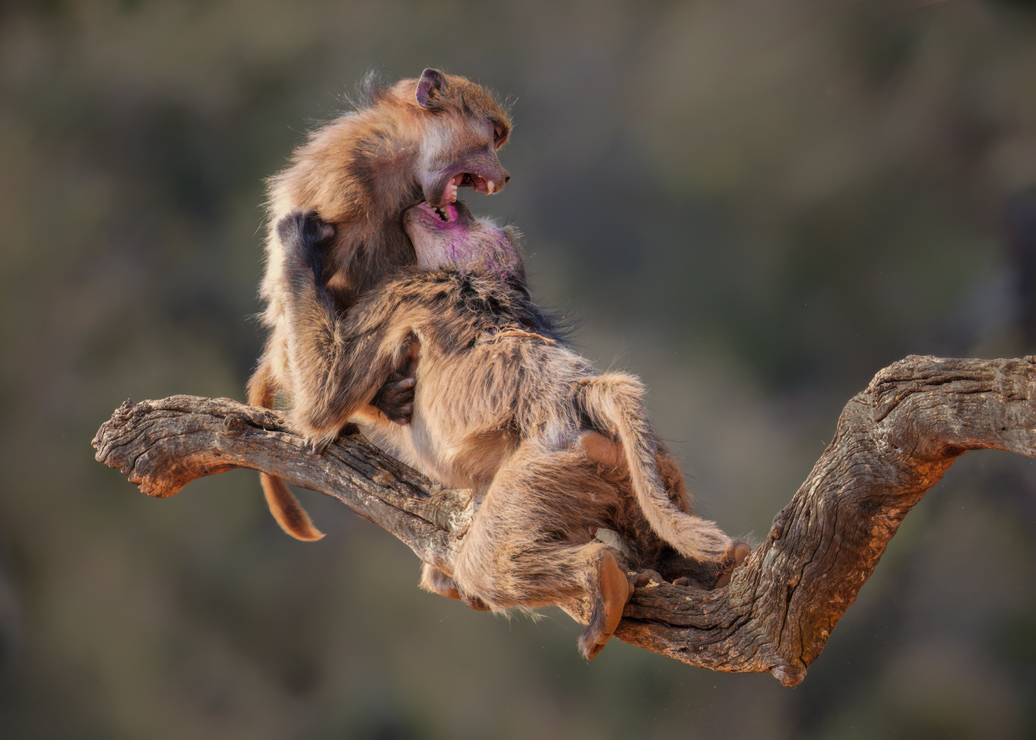
Gregg - the most important aspect of wildlife images is the story, and you've captured an outstanding intra-species interaction and that's an A+. In my VF I did a bit of dodging, burning, reducing highlights, opening shadows, adding both saturation and brightening in the head and mouth areas to draw attention to the action and story. I also removed what I thought was a very distracting tree branch that took the viewer out of the frame and a triangle in the lower left that was also an eye-grabber. But the image has impact, it's interesting and you have a great story - nice job - the technical and compositional refinements are secondary to story in this image. |
Apr 1st |
 |
| 67 |
Apr 26 |
Comment |
Larry - This is a good image revealing stealth, concealment and eye contact and that's the story in a nutshell - good impact as the viewer is drawn straight to the left eye. It strikes me as a bit busy background from an artistic standpoint, but I think that's the purpose of the vegetation - duh! What's appealing here is that it feels very authentic as if you could stage a 'gator.'
I did think you could control the highlights and or the background tone to help isolate the head more effectively. But most importantly, this is more than a record shot. It carries a certain mood. I am assuming you were on shore using a 500mm and since I know almost nothing about alligators, I also assume you didn't get down on your belly - I have no idea how they react to humans - about how far away from the subject were you? And why did you shoot at 2000Tv?
|
Apr 1st |
9 comments - 1 reply for Group 67
|
| 73 |
Apr 26 |
Comment |
Thank you Larry - storm chasing is hot, strenuous and FUN! I appreciate your comment :-) |
Apr 17th |
| 73 |
Apr 26 |
Comment |
Dave, to me, what really works well is that you captured a clear subject - no ambiguity. You also captured the "character" of a Joshua Tree, and the backlighting always adds interest - good call. The image has a real tactile quality which isn't always easy to do, again kudos. It's technically solid save for that purple area that Raymond highlighted - who knows what that is, I don't believe it's sun flare though - I'd just remove it. The branching structure of the subject is both a strength and a weakness: it gives the Joshua tree its character and energy, but because so many limbs radiate outward and terminate near or beyond the frame edges, they pull the viewer's eye out of the composition. Nonetheless, the image was interesting to look at. Nice job. |
Apr 16th |
| 73 |
Apr 26 |
Reply |
Thank you Gary - chasing storms is a benefit of living down here :-) almost makes up for the 100 degrees days we get so many of |
Apr 15th |
| 73 |
Apr 26 |
Reply |
Gary - I'm writing to ask a favor - but don't want to do it "LIVE" - could you send me an email, my address is bmazz68@iCloud.com - thanks, I look forward to hearing from you. |
Apr 15th |
| 73 |
Apr 26 |
Comment |
Ray, Thanks for the thoughts - as always, they make me think. What I see are three anchors - the rain shaft, the lightning bolt and the cloud mass - and my goal was to balance them. You raise an interesting point about foreground and as you know, cropping is always a challenge - like you, I'm going to play with it :-) - thank you again, I enjoy your work and you comments |
Apr 8th |
| 73 |
Apr 26 |
Comment |
Agree to disagree - great attitude and I always enjoy our interactions and do appreciate and understand the comments |
Apr 6th |
| 73 |
Apr 26 |
Reply |
Thanks Ian your comments are much appreciated |
Apr 6th |
| 73 |
Apr 26 |
Comment |
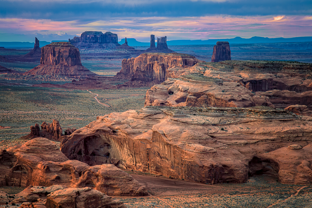
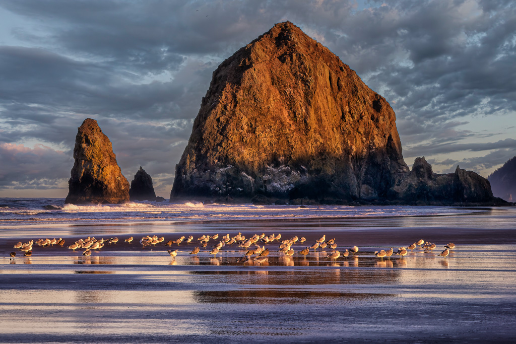
Larry - this image is stunning! - in my VF I wanted Haystack Rock even more prominent, so I moved it off center and cropped to an out of the camera 4x6 aspect ratio and added a touch of texture and clarity. Beautifully done, I felt the little tweak gave it more impact. It was great as presented but I thought the VF version had a touch more pop - Hope you agree. |
Apr 1st |
| 73 |
Apr 26 |
Comment |
Ian - You've captured a magnificent sky, soft and gentle. Your title "Pastel Sunset" tells us the sky is the subject, and no question that it's truly lovely-soft color transitions, gentle tonality, very calming. But the problem is the rest of the frame doesn't support the mood you're trying to create. The trees are dark and somewhat chaotic in shape, so instead of complementing the softness, they interrupt it. (As an aside, vertical lines are the most powerful eye-grabbing lines in photography, which is why telephone poles kill so many images) and here they become visual anchors that pull the eye and hold it there, away from the very thing the title tells us to appreciate. You do some really good stuff and in a case like this you might want to focus on simplicity, where whatever is not the sky, supports the sky - I hope that makes sense to you |
Apr 1st |
| 73 |
Apr 26 |
Comment |
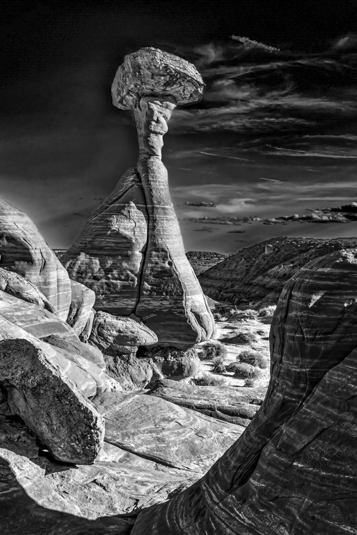
Raymond - You and I have traversed much of the same ground - I've stayed in Kanab several times on the way to the Grand Canyon when I lived in Vail. This is a very strong subject of a compelling formation that I have never visited but will now.
The hoodoo has a very powerful presence, and the surrounding landscape provides great context. Where it falls a bit short is in its tonal hierarchy and light. The formation doesn't stand out quite as strongly as it could. Similarly, the sky is a bit too dark and competes with the subject rather than supporting it.
The foreground helps but it feels more incidental than intentional and doesn't strongly guide the viewer into the scene. Nonetheless, it's a well-captured landscape, but it leans more toward recording a scene than interpreting it artistically. In my VF I did some light and contrast control and cropped to make the toadstool the clear hero of the image
|
Apr 1st |
 |
| 73 |
Apr 26 |
Comment |
Gary - first of all you did a terrific job in bringing the power of color out in post. Meanwhile, there's a contradiction, i.e., what makes this image compelling at first glance is also what ultimately weakens it. The pier creates a textbook leading line-strong, centered, immersive, and reinforced by repetition of the steel framework. It pulls the viewer straight into the frame with purpose. But that visual journey is interrupted by the lighthouse, which is not just off-axis-it's dominant in color and contrast. That saturated red becomes a second entry point, not a destination. So instead of a clean visual hierarchy, you get a split experience
The pier says: "Come with me." The lighthouse says: "Look at me." So, the viewer ends up doing both - in essence this is where cohesion breaks down. Ideally, a leading line should serve the subject. Here, it competes with it unless the leading line is your subject.
The eye travels down the pier, but never quite lands because the lighthouse sits outside that path. It feels visually important but compositionally disconnected. With all that said, he's what really, really works -
• The repetition of the steel structure is excellent
• The snow texture adds a ton of interest and reinforces the path.
• The color contrast is outstanding
However, those strengths aren't unified around a single idea. You've created a high-impact image with two very strong but non-integrated ideas. It presents as two compositions sharing the same frame rather than one cohesive visual statement
|
Apr 1st |
| 73 |
Apr 26 |
Comment |
Sherry - The sky is unquestionably the hero-dramatic color, nice cloud structure, and strong emotional pull. But the rest of the frame doesn't rise to meet it. The trees read mostly as a dark, somewhat undifferentiated band, and the foreground sand becomes a large, low-interest area that doesn't add to the story. So, the image ends up feeling top-heavy-all wow! in the upper third, very little support below.
In my VF I eliminated the sand to tighten the composition and brightened the trees to shift the image towards a sky-driven study with a discernible foreground that adds to the story
|
Apr 1st |
 |
9 comments - 3 replies for Group 73
|
| 97 |
Apr 26 |
Reply |
Jeremy - I saw that too but decided to leave it because it's also in the RAW file and I have no idea what caused it
I'm having other issues with both LrC and PS software so thanks for pointing it out |
Apr 2nd |
| 97 |
Apr 26 |
Comment |
Thanks Deborah - I played with spacing 16 ways from Sunday :-) |
Apr 1st |
| 97 |
Apr 26 |
Comment |
Ernoe - if you captured this handheld at 1/100th Tv I'm going to cry. The image is stunning and the log brings a ton of visual interest to the frame - as usual, you excel in the technical aspect of the capture - tack sharp, great detail and whites beautifully exposed. I'd like some feedback on my suggested modifications, but when someone is as skilled as you are, I don't want to question artistic intent. Having said that, with some minor modifications I think the image would pop even more.
In my VF I flipped the image horizontally - I know I do that a lot, but we read left to right and I have a bias for that. Also, your subject is gorgeous, and I tried to show it off more by cropping in which further separates the subject from its well blurred background - but you do have some eye-grabbing bokeh there. You have a sharp and well-detailed basically white subject so I thought a darkened background and log/branch would add more contrast - also, with contrast in mind, I darkened both the subject's eye and bill. That may sound like a lot but it's not really because the image as presented stands on its own very well - I just wanted to bring a touch more attention to it. I always enjoy your technical skills.
|
Apr 1st |
 |
| 97 |
Apr 26 |
Comment |
Peter - your subject has immediate impact; a clear eye, great detail, and an engaging pose that come together nicely. The image is genuinely interesting and would do well in competition I would think. That said, I thought the image might benefit from a tighter crop as there might be a touch too much canvas on the left side of the frame, but it's not a deal breaker. What does pull my eye from the subject are the branches to its right. Not knowing your feelings on such things, if I could make one concrete suggestion I'd remove most of the branches to the right of the subject with the PS remove tool. Nonetheless, your technical presentation is outstanding as usual. |
Apr 1st |
| 97 |
Apr 26 |
Comment |
Jeremy - I can see why it's done well in club competitions; it's an outstanding capture and your choice of BxW was excellent! The image in a word is, striking. And looking at the original brings to mind Ansel Adams' words, - You don't take a photograph, you make it. -
Your technical skills are evident throughout and the composition removes it from the common bird on a stick category. Sharp, detailed, interesting to look at - did I say detailed? You've really done a nice job with this.
While the subject is well separated from its background, the background itself is a bit of a distraction - in my VF I cropped in because the subject itself is so well presented technically and compositionally I wanted to show it off more, and also to reduce the amount of contrasting light/dark shading that I feel fights with the image. I then darkened all the background because it think it shows off the subject more and then flipped it horizontally - I have this Left-Right thing in the way animate object face within a frame :-) - dynamite job! |
Apr 1st |
 |
| 97 |
Apr 26 |
Comment |
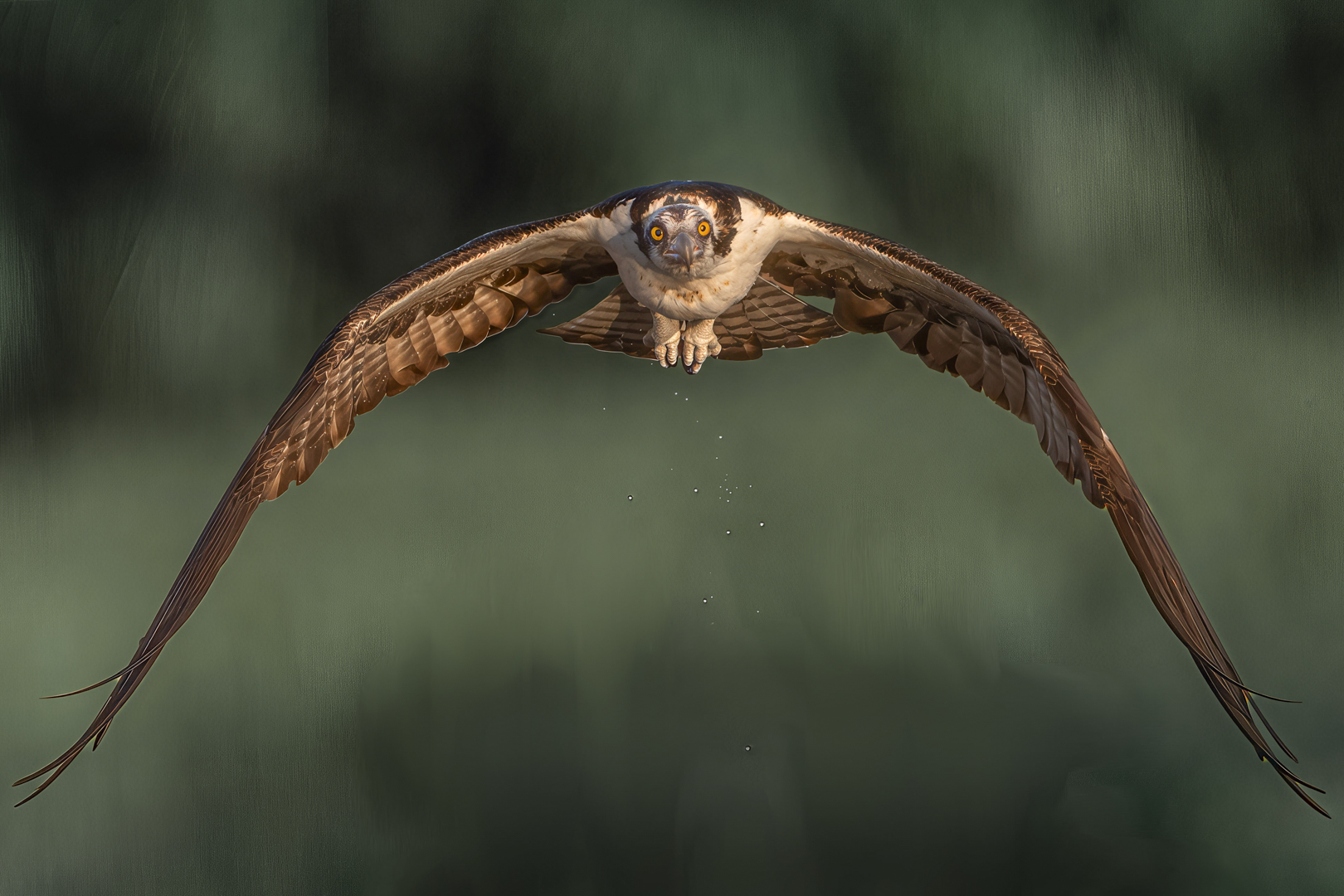
Roy - This is Spectacular! There is so much to like about this image it's difficult know where to start - and if I didn't know better, I'd think you were showing off. Actually, I don't think I've ever seen a head on photo of a bird of prey that's any better than this. I have a dozen good Osprey shots, and none compare.
Your image checks all the boxes - 1 - A compelling subject separated from its background. 2 - Immediate impact. 3 - A ton of visual interest; it's an image even the casual viewer will take the time to examine and 4 - A great story, the water droplets make this image come alive.
Don't think you could have chosen better settings. The compression factor of using an 800mm lens at 6.3 offers detail from the subject's beak to its trailing talons while blurring the background enough to really separate the subject from it - kudos! The detail is phenomenal and subject's eyes are riveting - did you brighten them - perhaps not, but they are eye-grabbers!
This wins most competitions hands down, perhaps your best. I am curious is how you managed to position yourself to capture this shot - anticipating osprey isn't always easy. I've positioned myself behind a nest, but then it was in full flight, you captured the subject leaving the water and those subtle droplets are the "pièce de resistance."
No matter how you slice it this image is boffo. Your subject is presented so well I thought with just a few minor tweaks you might bring even more attention to it. Green is a powerful color and here I think it fights with your subject a bit, so in my VF I desaturated the background a touch. I also opened the shadows to give even more detail to the underside of the subject's wings - but neither were necessary but thought they made a spectacular image even more so. Congratulations on the wonderful capture.
|
Apr 1st |
 |
| 97 |
Apr 26 |
Comment |
Deborah,
This is an emotional moment to witness, and the setting gives it authenticity. The challenge is the emotional story you describe isn't conveyed in the frame, And without that context, it reads more as a static scene than a narrative moment.
Moments like this are almost impossible to capture. But what elevates them from interesting to impactful is usually a clear gesture, strong eye detail or posture or clear subject isolation. I think the image needed one more visual cue to carry it on its own.
|
Apr 1st |
6 comments - 1 reply for Group 97
|
34 comments - 10 replies Total
|