|
| Group |
Round |
C/R |
Comment |
Date |
Image |
| 7 |
Mar 26 |
Comment |
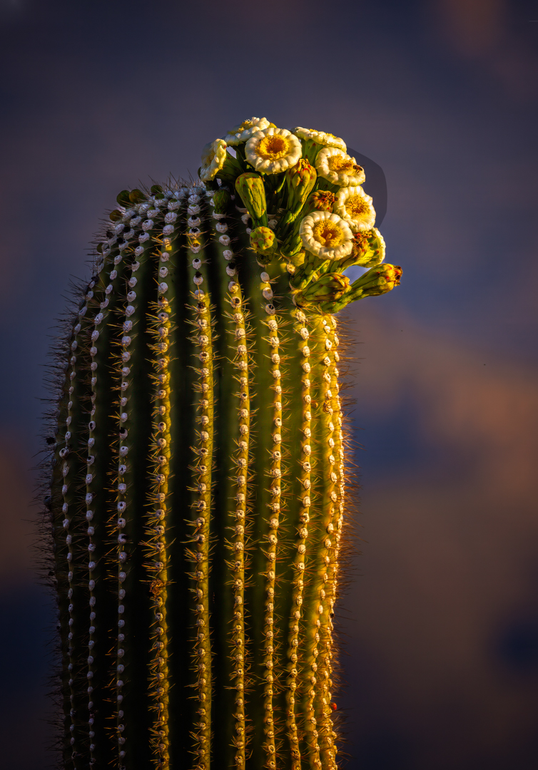
Yeah, that probably would be an interesting image :-) I went back to LrC and increase the exposure on the saguaro stalk and the flowers. I wanted to retain the same differential on both the stalk and the flowers so I did increase the exposure ever so slightly and yes I agree with you and Judith, it shows a bit better - thank you both- and Judith if you read this, I did reinstall the Nik Suite - the issue was with the skylight filter -again, good eye. |
Mar 23rd |
| 7 |
Mar 26 |
Comment |
Thanks Judith, I'm really glad you caught that - no I never touched the sky save for any global adjustments - that discoloration/shape has shown up on several other of my images and just didn't notice it before - it's not on the PS version but appears after sending to Color Efex Pro - I'm sending it to my Lightroom/PS guru - attached is the pre-Color Efex version - thanks again, I think I'm going to reinstall the Nik Suite - this is why I really like the DD groups - different sets of eyes |
Mar 17th |
 |
| 7 |
Mar 26 |
Reply |
Thank you Barbara for the kind words |
Mar 10th |
| 7 |
Mar 26 |
Comment |
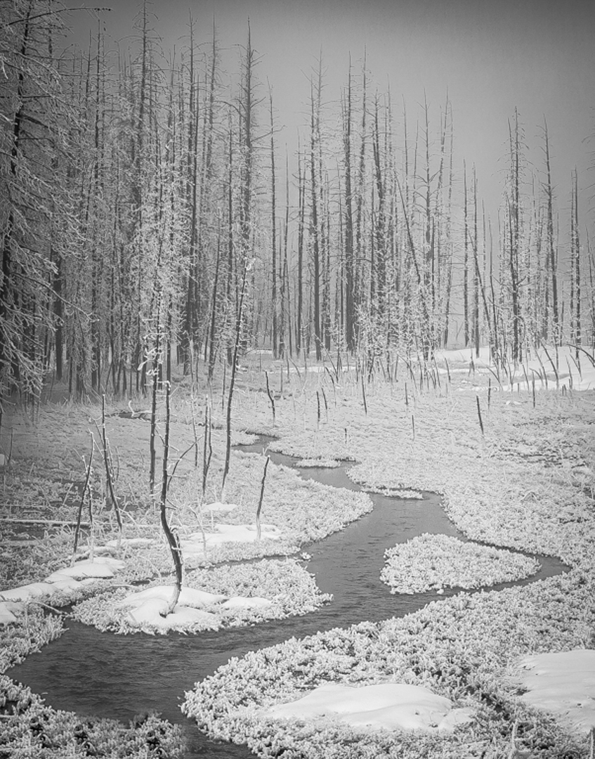
Judith, Reading your description of the image is most interesting inasmuch as you said your focus was on the crossed branches over the stream. However, it's stormy (replaced) sky that's the strongest element in the image. It creates a mood and tension giving the photograph emotional weight. Anytime we can get a foreboding sky it adds to the visual interest of an image - so good choice on replacing. I also think your story is a good one because your images conveys a sense of dampness, and wet weather, a quiet countryside and solitude, Additionally, the tree itself has a nice branching structure that does very well against the sky and this is somewhat rare, so good for you - the fine branches give the image texture and help separate it from the background clouds - normally trees that are 'almost' silhouettes project as dark clumps.
While technically well-done, the biggest negative issue is the lower 45% part of the frame that presents more as visual clutter than an essential part of the image, the very part of the frame that drew you to the scene. Loose sticks brush, tangled grasses, a muddy stream seldom help an image, and the lower part of the frame fights with the upper part for interest.
I am curious though - save for the weather, why not focus on what you thought was most interesting and what caused you to get out of the car and take the photo. Those crossed braches could have been an great closeup.
|
Mar 10th |
| 7 |
Mar 26 |
Comment |
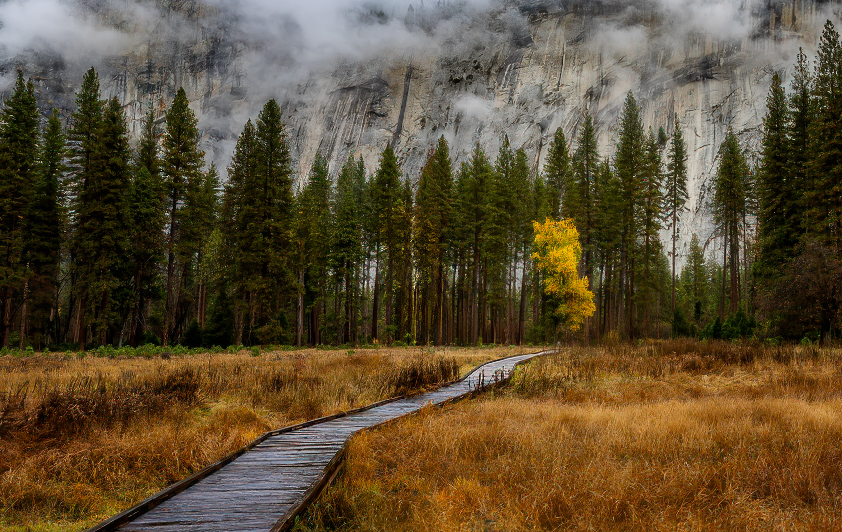
This image has all the components of a strong scenic landscape beginning with outstanding leading line that pulls the viewer thru the scene. You've created a mood with the mist and low clouds on the cliffs and then the fog adds mystery preventing the background from looking static. Also, the single yellow tree among the dark pines is an excellent visual accent that provides a natural stopping point for the eye and seasonal storytelling.
The downside, and major issue is that there is no clear primary subject - I don't know if it's the boardwalk, the yellow tree, the foggy cliffs or the meadow, which is the image's title, and titles are important. We don't know the answer and because nothing dominates the frame the viewer's eye wanders.
In essence I think it's a very pleasing image that could be much more striking. I'll make two suggestions - the first - eliminate the yellow tree because it fights with the boardwalk then crop in from the upper right to just above the top of the tallest tree on the right and so the boardwalk terminates at the lower right power point.
Or, and Tomi please don't take this as insulting, but I feel there's an absolute stone-cold winner in this frame with a few alterations in Photoshop - see my VF
|
Mar 10th |
 |
| 7 |
Mar 26 |
Comment |
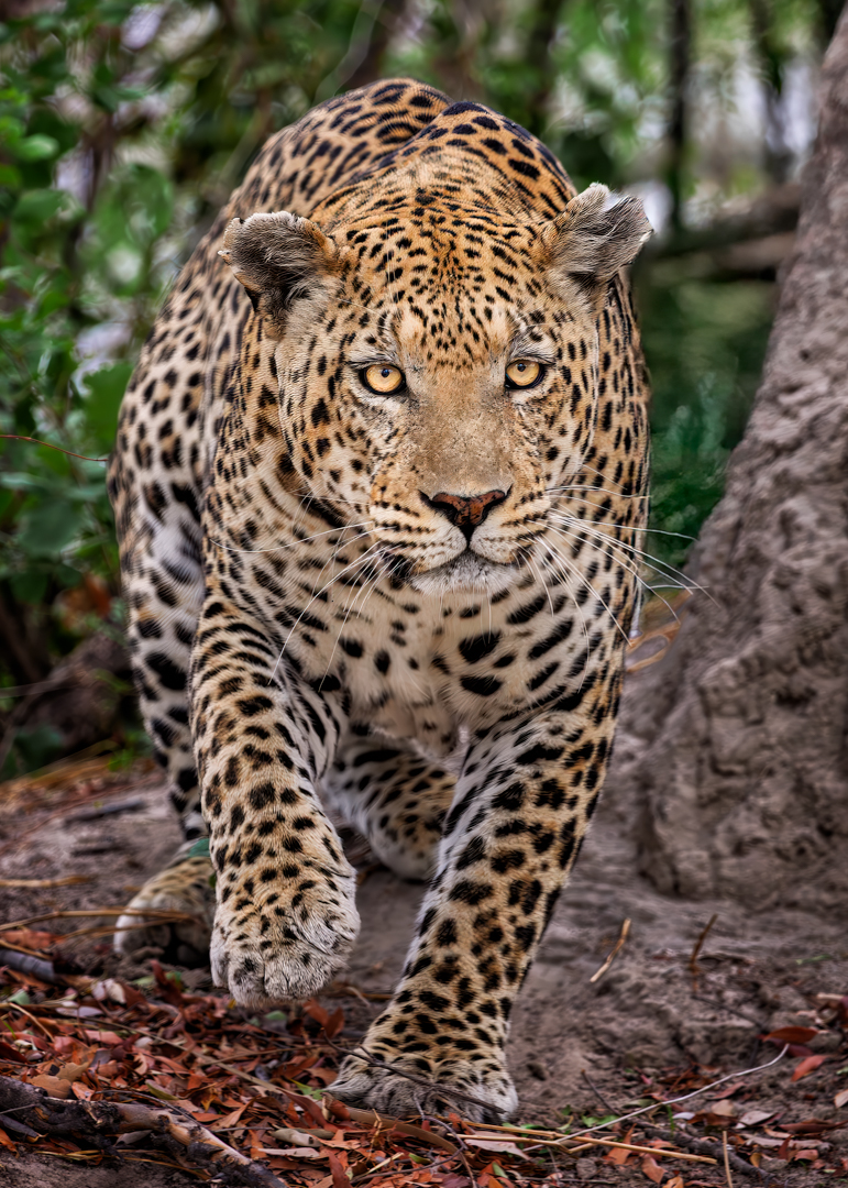
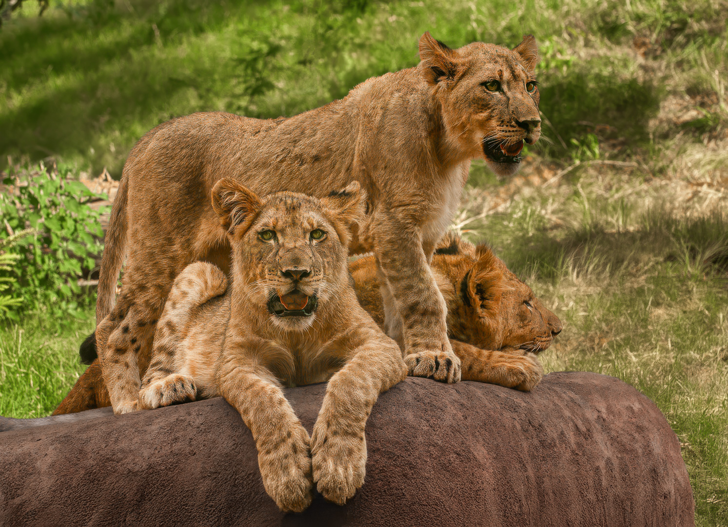
Tom - excellent composition on the lions - these cubs appear to be perhaps 10 months maybe a year old - nice job. I thought you needed a hero amongst the subjects, so I chose the lion looking into the camera - I brightened all three but the hero a touch more - brightened and saturated their eyes - I also brightened and slightly saturated the tongue on our "hero" - I think it's important that the eyes in wildlife are apparent and a noticeable part of the composition. I also desaturated the rock as I wanted more color separation between the subjects and the rock - I also desaturated the green grass bit - again, I wanted attention on the cats and green can draw the eye. As noted great composition I just felt you need to draw more attention to your subjects. |
Mar 8th |
 |
| 7 |
Mar 26 |
Reply |
Gaetan - it wasn't my intent to criticize your title, but I thought your image needed a center of interest or an anchor of some kind. Your image was filled with THE most powerful lines in photography - verticals - the eye goes to verticals quicker than any other line, which is why telephone poles are so distracting, the eye will find them in any image - you had different parts of the frame pulling the eye. It's a most interesting scene for sure, but no place for the eye to rest |
Mar 6th |
| 7 |
Mar 26 |
Comment |
Gaetan -
When I first look at your image, my eye is drawn immediately to the bright water in the center of the creek. From there it moves to the vertical tree on the right with the exposed roots, then over to the similar tree on the left before I begin to take in the forest in the background.
Because my eye keeps moving among those elements, it never quite settles in one place. That's interesting visually, but it also creates a bit of tension with the title "Stillness," which suggests a calmer, more restful focal point.
It's a beautiful woodland scene with great texture and depth in the trees and water. For me, though, the competing visual elements make it a little harder for the eye to come to rest and fully experience the quiet mood the title implies. |
Mar 5th |
| 7 |
Mar 26 |
Comment |
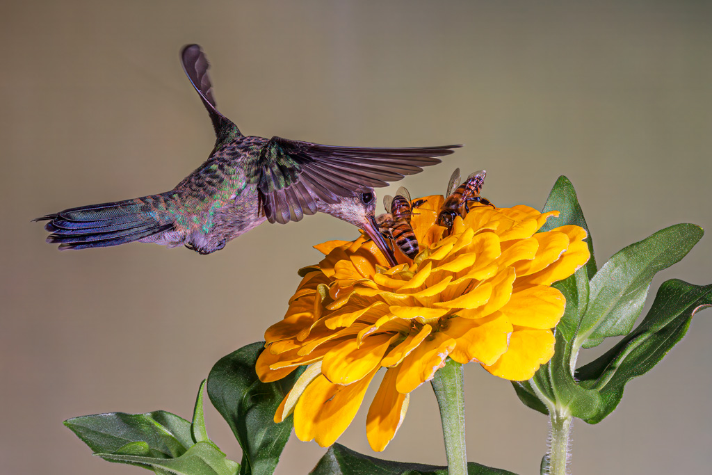
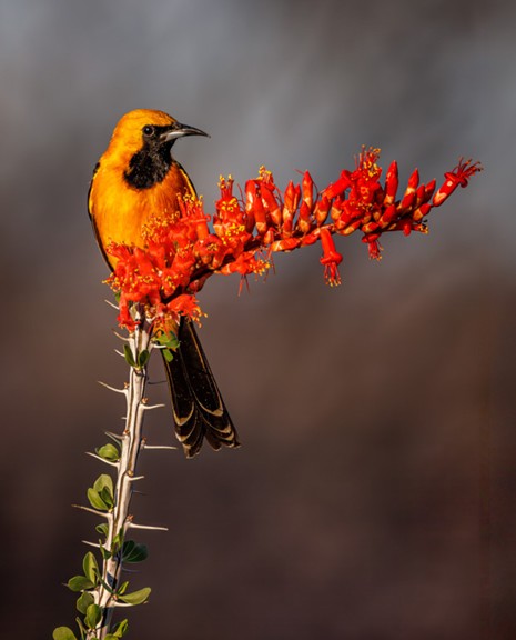
Barbara - Your subject is absoluely striking but the "visual order" in this image starts with the background highlight upper left, then the bright white lower petal and then the subject's yellow breast. The viewer's eye path is actually Background > Flower > Yellow breast > Bird's face
With that said, and even though the bird's face isn't the brightest element, it still holds attention because of excellent color contrast, the image's sharpness and ease of subject recognition. As noted, the bright petals and background highlights compete with the subject; however, these items are eminently fixable.
This is an excellent capture (composition) that just needs a bit of tweaking to make it an absolute winner!
|
Mar 5th |
7 comments - 2 replies for Group 7
|
| 67 |
Mar 26 |
Reply |
Thank you Gregg, comment appreciated Best regards
|
Mar 20th |
| 67 |
Mar 26 |
Comment |
Cindy and Ann - sorry, I didn't see your comments until today and want to thank you both. And Ann - I doubt darkening the tree would make much difference in a competition (at least it hasn't thus far) but nonetheless good eye, I hadn't thought of that - I did darken it after your comments and it does make a difference to me too - thank you :-) |
Mar 20th |
| 67 |
Mar 26 |
Comment |
Ann I'd like to ditto Larry's welcome and for what it's worth, I too know the issue with horses - but I thought you made lemonade from a lemon of a day - I'm not sure why you're disappointed with the shot.
Wildlife is about story and you've captured great intraspecies interaction - boffo- and technically again, an excellent job - in my VF I thought a square crop and a darkened background might help the image pop a bit more, but there's nothing wrong with it as it is. |
Mar 13th |
 |
| 67 |
Mar 26 |
Comment |
Thank you Larry, it is one of my favorite Africa shots |
Mar 9th |
| 67 |
Mar 26 |
Reply |
Thank you David - sometimes it's better to be lucky than good - appreciate your comments. |
Mar 6th |
| 67 |
Mar 26 |
Reply |
Thanks for the invite Larry - come the fall I will take you up on it - :-) |
Mar 4th |
| 67 |
Mar 26 |
Comment |
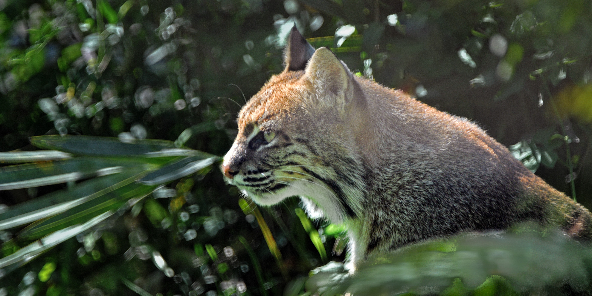
Larry, I think the strength of the image is two-fold - FIRST - being able to photograph a bobcat in the wild is an accomplishment in itself and SECONDLY the intensity and forward gaze of the bobcat FEELS like the cat is stalking , i.e., very strong implied motion and purpose. I also think the foliage adds depth and context, even better is the (very) subtle rim light on the cat separating it from the background. That glow gives it dimension.
On the flip side, I have never been partial to "partial animals" and this is "partial." Having said that - I think bobcats are THE most difficult cats to shoot - if you can find them. I see them occasionally here in Tucson, but I've NEVER been able to see them when I'm anywhere close to a camera - frankly I think it's amazing you captured what you did. And what you did capture is excellent!
In my VF - I brightened the subject and darkened the background - and cleaned up the area around the subject's nose.
|
Mar 4th |
 |
| 67 |
Mar 26 |
Comment |
Cindy, you captured THE decisive moment - the skua mid-lunge, wings flared, the penguin chick recoiling, and the adult penguin watching it's like watching a hold-up in progress. Great story and that's what wildlife photography is all about.
The three subjects form a natural triangle which I think keeps the image nicely balanced. I think the subtle shadows are effective and the raised wing is spectacular. If I had an improvement wish, it would be for that the subject to be better separated from the background. -a 10 plus capture.
|
Mar 4th |
| 67 |
Mar 26 |
Comment |
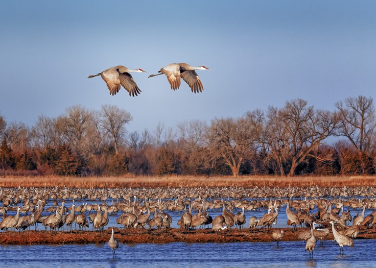
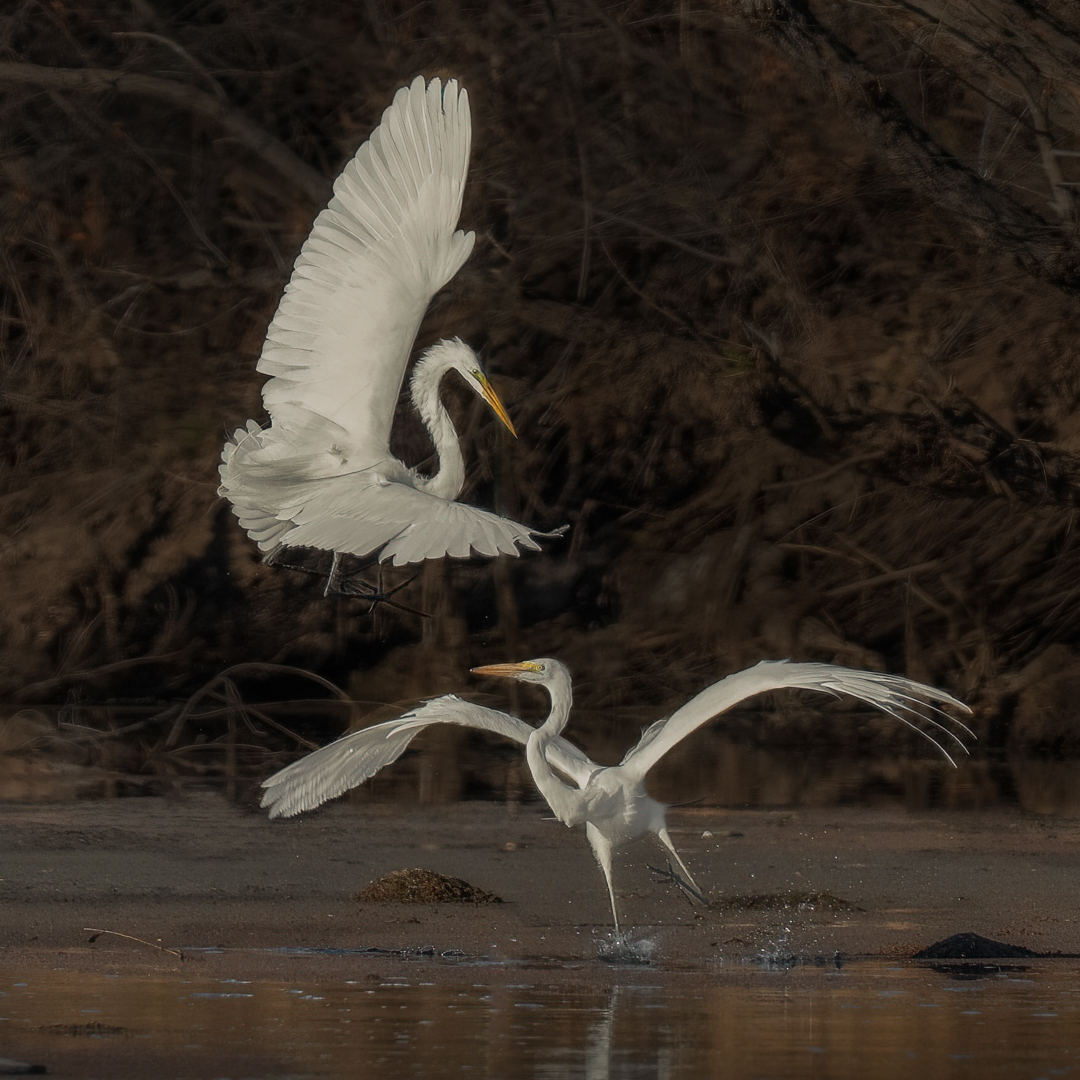
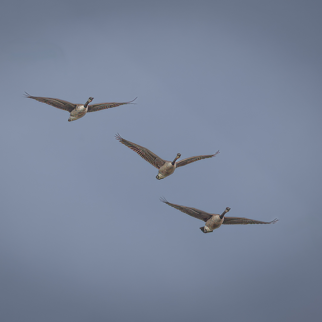
David - There's an implied migration story here and story is the most important aspect of a wildlife image so score one for objective #1. Also, the image has a strong directional flow (lower left to upper right) however, the subjects are flying counter to that flow. At the same time, you did a very nice job with the clear blue sky as the solid background isolates the birds well.
The biggest problem I see is there no primary subject among the five birds - where am I supposed to look first? Also, the uneven spacing doesn't help the image artistically and it dilutes the impact a bit.
In my VF I wanted to make the image pop more and thought I'd use a square crop and use three birds instead of five - I thought the three formed more of a unit giving the image more cohesion, visual impact and balance. I opened up the shadows and desaturated the sky a touch so the birds would show better.
|
Mar 4th |
 |
| 67 |
Mar 26 |
Comment |
Gregg - you asked, "Is this a good shot?" that's kind of a loaded question because that depends upon your definition of good, and I'm not being facetious.
There is no question that the image has an immediate visceral impact so you succeeded there; predation scenes always elicit a reaction, and of course the viewer understands what's happening immediately. Meanwhile, the subject's left eye is the best part of the frame and is the anchor point of the image - unfortunately, the rest of the image is only adequately sharp, and the brightest part of the image is in the upper left corner, which is distracting.
I feel your crop is too tight for the image to score well in a club competition - yes, we know it's a lion eating, but the image lacks context. So, what you have is a study in the texture of the meat and the subject's fur, which brings me back to, what's the story?
Gregg, I don't like to harp on the technical, I think the spirit or artistry of a photograph is what's important, but at f9 and this distance a club judge will expect the mouth and teeth plane to be sharp. And while the left eye is 'decently' sharp, the lower teeth are soft. When the crop is this tight, sharpness expectations rise dramatically.
But back to your question - I think you captured a very good safari memory shot and a decent wildlife image - but the really important thing is whether or not YOU like it, and I think you've already answered that question
|
Mar 4th |
| 67 |
Mar 26 |
Comment |
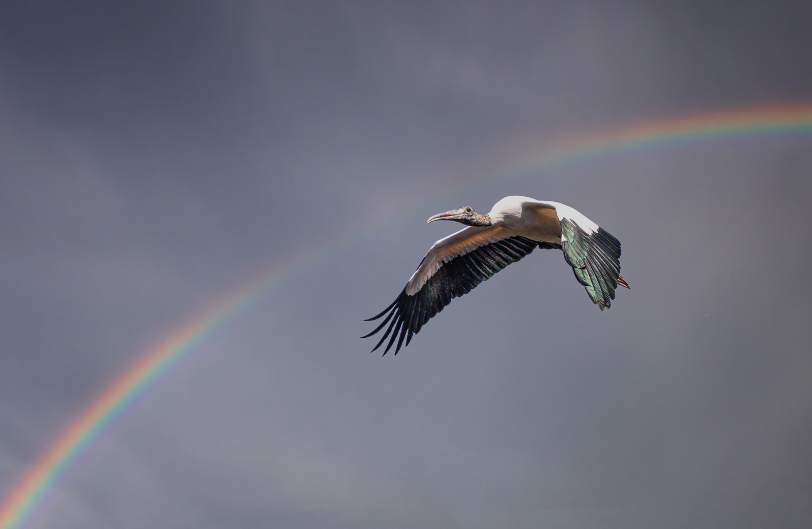
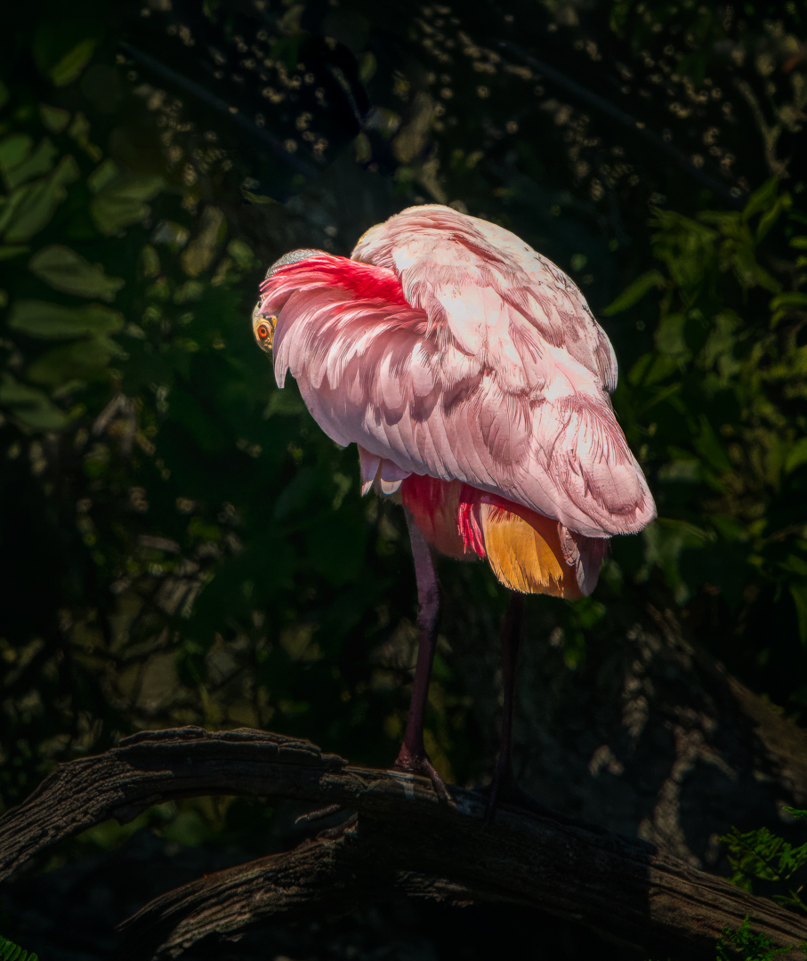
I really like this image Bud - you've captured a spoonbill from a perspective not often seen - just a part of the subject's head and only the whole eye showing. I think it's more art than wildlife I've never seen the back of a spoonbill like this, and you have terrific color contrast, again, more art than wildlife to my eye. I thought there were some distracting branches emerging from the subject's back, so I removed them in my VF as well as darkening the background somewhat. |
Mar 4th |
 |
8 comments - 3 replies for Group 67
|
| 73 |
Mar 26 |
Comment |
Thank you Gary - comments appreciated :-)
|
Mar 24th |
| 73 |
Mar 26 |
Comment |
Good eye; I don't modify or substitute skies - that's the sky the way it was that evening. Thanks for the comments |
Mar 16th |
| 73 |
Mar 26 |
Comment |
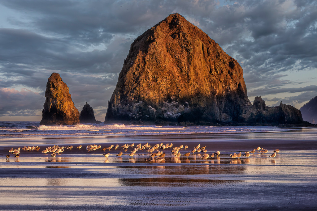
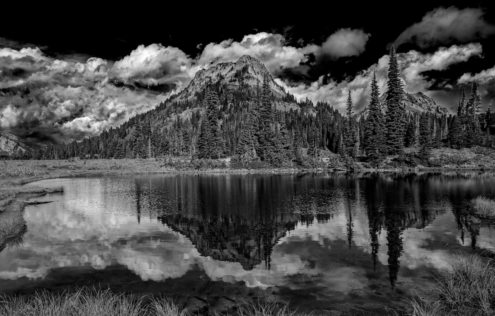
Gary - I absolutely love this image and good, no make that an excellent choice of monochrome. Even better yet was my reaction the second I saw you shot - "IT FELT COLD" wow, that's not easy to do, kudos, your image elicited an emotional response and you can't ask for much more - my only issue with the image is that I've never liked images where water appears to run off the page. As presented the greatest expanse of water in is at the bottom of the frame which detracts from the stream functioning as a leading line into the frame. In my VF I "closed up" the mouth of the stream which I think forces the eye to follow the stream into the frame a bit more - great shot and your thoughts on my VF? |
Mar 14th |
 |
| 73 |
Mar 26 |
Comment |
Yup, Arizona skies have to been seen to be believed sometimes - thanks for your comments |
Mar 14th |
| 73 |
Mar 26 |
Comment |
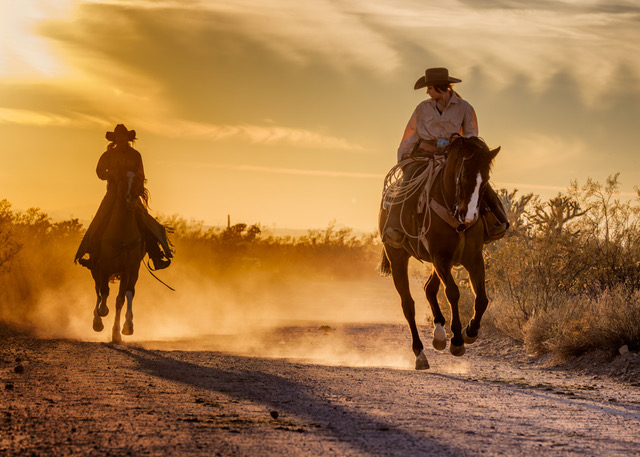
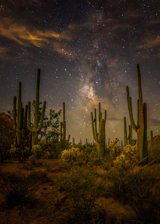
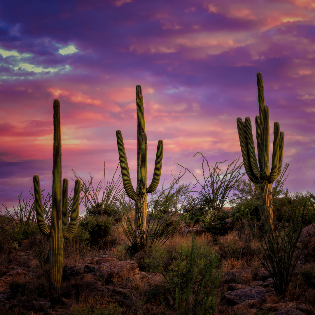
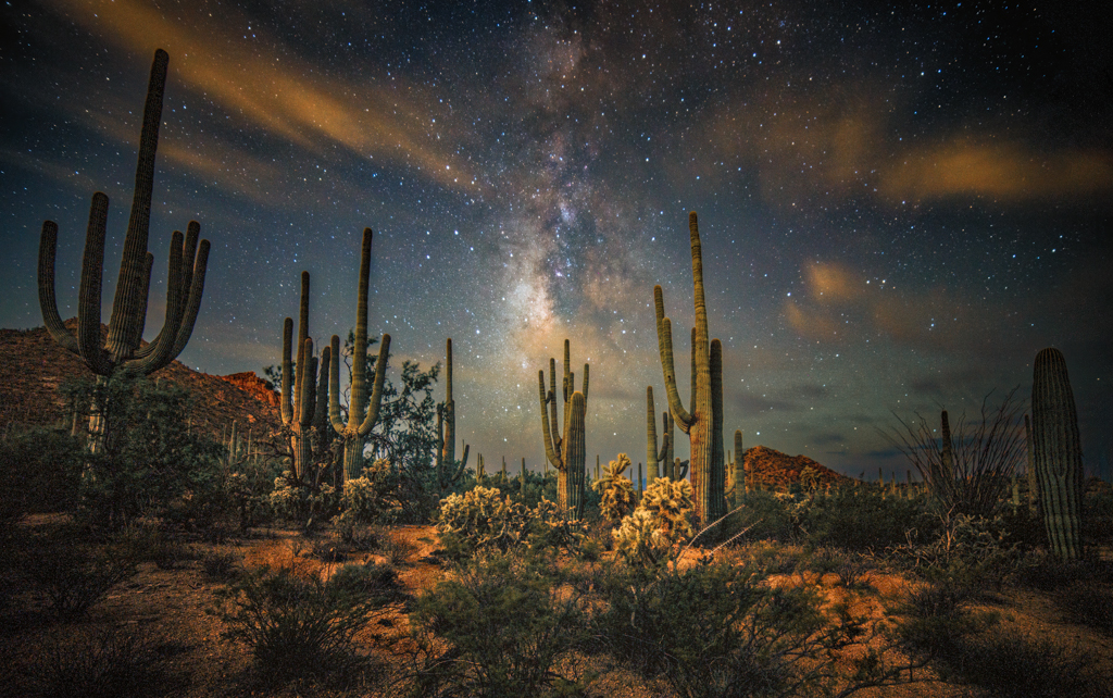
Thanks for your comments Ian - Arizona skies can be unreal and my fear in many cases is just that, that they don't look real. I seldom if ever use saturation in post, sometimes on a woman's lips, or a red car, etc., but almost never in landscape. Actually this is just a section of the scene I shot - it was one of those cases where the scene itself was so spectacular I wasn't sure how to compose so I shot wide and played with the composition in post on and off for a couple of sessions before I decided to crop way in focusing in on the three big Saguaros. |
Mar 14th |
| 73 |
Mar 26 |
Comment |
No suggestions other than a crop - but I did want to emphasize what an absolutely outstanding sunstar you captured - I don't think I gave you enough credit in my review - it's special! |
Mar 6th |
| 73 |
Mar 26 |
Comment |
Ian - you captured a clear sense of place - the cruise ship, harbor traffic, the bridge instantly establishes location and scale - nice job. The image feels authentic and alive. You also did a nice job with layering and depth and kept my eye moving thru the frame - the ferry wake added a nice touch, but then the whole image seems to flow from lower left to upper right. The image has a lot of visual energy; I like looking around. On the downside, who or what's the hero? - the cruise ship, the bridge, the ferries or the ferry traffic in the distance? I think this image would benefit from a clear center of interest - as of now it feels more like a travel documentary scene than a single-impact image. Lastly, I think if shot within an hour of sunrise or sunset the image would have a lot more impact. |
Mar 4th |
| 73 |
Mar 26 |
Comment |
Sherry - another excellent image - you have a dominant subject and an excellent sunstar exploding giving the image immediate visual impact. I also think you did a great job in creating depth. The third big plus is the color contrast; the warm rock is very effective. BTW - the sunstar itself is excellent and suggests tight aperture and exposure control - nice! You've also kept detail in the snow - kudos.
Having said that, I do think there's a bit too much empty sky, hence my crop in VF - from personal experience empty space gets dinged unless it serves a clear compositional purpose. As presented, the viewer's eye goes sun ? rock ? then drifts into empty sky because there's no strong element pulling the eye back. Nonetheless, one of your best - I enjoyed viewing it.
|
Mar 4th |
 |
| 73 |
Mar 26 |
Comment |
Raymond, what immediately strikes me is your image's strong compositional symmetry - great mirrored structure and your sky is dramatic creating a mood and the illusion of movement. I also thought you did a great job of retaining detail in the blacks and whites. There's a bit of foreground clutter that may compete with the reflection so you might consider cropping up to eliminate part of it. Terrific shot. In my VF I cropped up and removed the vertical near the bottom center and brightened the mountain top just a touch. |
Mar 4th |
 |
9 comments - 0 replies for Group 73
|
| 97 |
Mar 26 |
Comment |
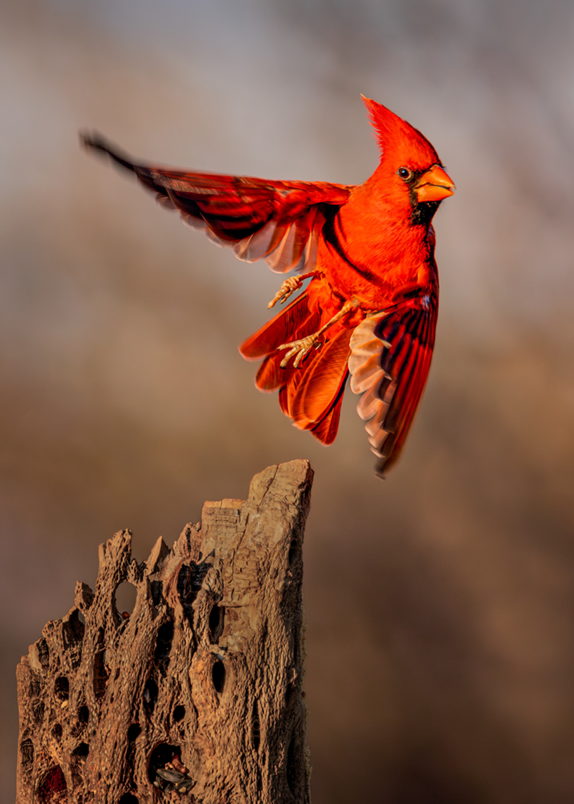
My goodness Deborah you have traveled to some fascinating places - good for you. Regarding your image; this is a high energy image with a great eye-level perspective, your background is clean and the subject well separated from it, however the image is a tad soft so I upscaled and sharpened in Topaz. I wasn't crazy about the horizon line cutting across the subject's legs, but that's what you needed to get the great perspective. Since there's not much of a story, save the take-off, or an interesting background or an interaction of some kind, I thought I'd try to make the image pop a bit more by cropping in tighter. Please tell me if I'm wrong, but my guess is that at 800mm and 1/2500th second Tv this was handheld and not on a tripod with a gimbal head. Certainly and interesting subject - and as noted, it's energy is its best feature |
Mar 14th |
 |
| 97 |
Mar 26 |
Reply |
Thanks for your comments Deborah |
Mar 13th |
| 97 |
Mar 26 |
Reply |
Roy - I'm gonna disagree with you on this one for several reasons - the title "Red Alert" was a play on the spectacular color of the subject; and the color you see WAS the color of the cardinal, perhaps it was even more vibrant in natural daylight and to me that was what I was looking for and feel that toning down the subject misses the point - I also feel reducing the prominence of the cactus also diminishes the image - the detailed dead cactus is an essential part of the scene -green leaves and dark bark in foliage are very common and I felt that cropped as submitted balanced the frame with the subject moving in the opposite direction. Nonetheless, as always, keep the comments coming - I learn from everyone. |
Mar 7th |
| 97 |
Mar 26 |
Comment |
Thanks Ernoe - you saw what I was hoping to get - I thought the hollowed out dead cactus was the key to the image and I'm glad you appreciate it - I watched this bird for a while and he was always hidden on the far side of the cactus until just before he took off - as I said, thank you. |
Mar 7th |
| 97 |
Mar 26 |
Comment |
Jeremy - the first thing that grabbed my attention in your image was its sharpness, clarity and detail - kudos, it's a lovely image. The second thing I noticed was the "stroke," i.e., the border. Your border is one of the most unobtrusive I've come across, so again, kudos. But the problem with borders in wildlife images is that instead of looking into the scene, the viewer becomes aware that they're looking at a framed subject, and just like a watermark, a border becomes a part of the image and I think they weaken wildlife images.
But review is not about borders, nonetheless, it's something you should be aware of as many venues don't allow them, especially in wildlife images.
So back to the subject, the capture is outstanding. When I taught photography at Colorado Mountain College in Vail, CO, I would preach to my students that wildlife needs to be facing within 90 degrees of the camera, but in this image, I think the pose is one of the image's strengths - it implies awareness and movement and engages the viewer.
The light is spectacular and the reflection in the water has detail. But I think you could eliminate the tree trunk reflection on the water that's under the subject. Once you see it, you can't un-see it.
|
Mar 5th |
| 97 |
Mar 26 |
Comment |
Roy - you've captured exceptional detail and sharpness - the feather detail is extremely crisp-especially in the crest and shoulder. The texture almost jumps off the screen. A top-tier capture, with immediate visual engagement & very intense eye contact. Plus, there's a graphic simplicity to the image.
At the same time, the subject feels almost "confrontational" and definitely over-processed- the blacks appear crushed and hyper polished and the edges look metallic. Also, the green feels a bit too saturated giving the subject an unnatural look, almost AI generated.
I cannot put my finger on it, but I find this image fascinating for about 5 seconds, then I'm done! It strikes me as mostly texture and novelty and more 'odd' than beautiful. I don't know if it's the subject, the way it was processed or a combination, but there's a "visual coldness" about the image that bothers me as a viewer.
|
Mar 4th |
| 97 |
Mar 26 |
Comment |
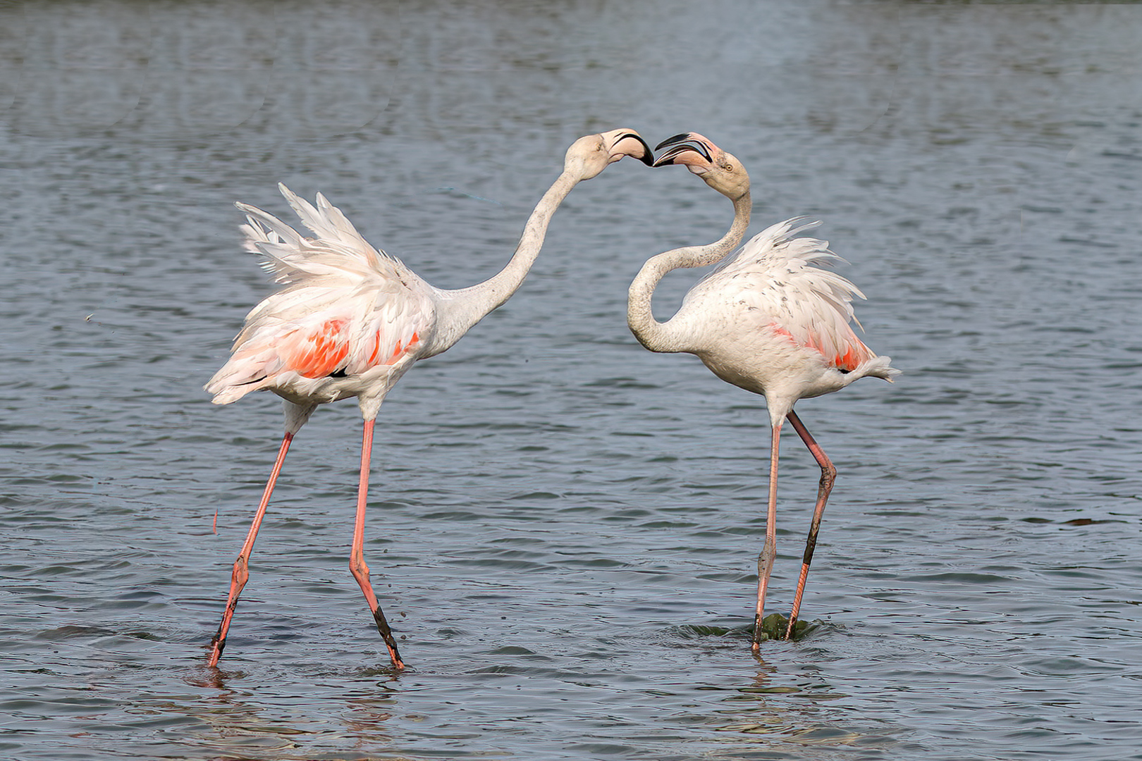
Ernoe - you've managed to capture a great story, with dynamic postures among the subjects, the wing flare that adds a ton of energy to the image and you've captured excellent feather detail. The problem is that the third bird hurts the composition, the "extra" flamingo breaks up the natural elegance the subjects possess and contributes to a bit of visual confusion as the viewer has three heads competing for attention. I realize taking out a bird is not allowed by PSA but I did my VF with photographic artistry in mind |
Mar 4th |
 |
| 97 |
Mar 26 |
Comment |
Peter - The image should be on the cover of a naturalist magazine - I'd say it's just about perfect. There's an old saying, there's three kinds of sharp, "Almost sharp, Sharp and Wickedly Sharp" - this is Wickedly Sharp! Along with the sharpness is the Detail from the subject to the branch it's perched on. Yes, it's a bird on a stick but the composition and processing make this image absolutely riveting. I also thought you handled the background extremely well - an uneven background is a bane for many photographers but here you managed to create a separation between the earth tones and the foliage precisely at the point where the subject is perched,- that was simply outstanding and the mark of a real pro. I would consider brightening the subject a touch especially its head. One of your best |
Mar 4th |
| 97 |
Mar 26 |
Comment |
Thanks Peter - your comments are taken to heart, I appreciate the thoughtfulness on your part |
Mar 4th |
7 comments - 2 replies for Group 97
|
31 comments - 7 replies Total
|