|
| Group |
Round |
C/R |
Comment |
Date |
Image |
| 7 |
Feb 26 |
Reply |
So was I at first but after I removed it, it just didn't 'look right' and wanted some of the grasses across the entire subject so I hit control Z - nonetheless, a great shot. :-) |
Feb 24th |
| 7 |
Feb 26 |
Reply |
Thank you Hoshedar |
Feb 13th |
| 7 |
Feb 26 |
Comment |
Thanks for everyone's comments. Sometimes Mother Nature doesn't cooperate so you take what she gives you, I don't like carrying a camera and not pressing the shutter button :-)
|
Feb 13th |
| 7 |
Feb 26 |
Comment |
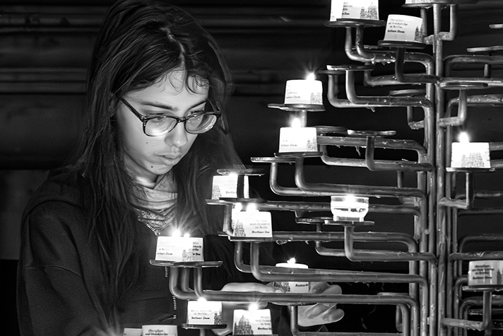
Hoshedar,
First of all, this is very creative and excellent choice of monochrome. Your title is Lighting a Quiet Prayer, that tells the viewer this is about a moment of reverence and or ceremony and not the candles that occupy most of the frame - so the focus should be on the young woman and the moment.
You could crop in several different ways, and I chose to make the young woman the focal point instead of the distracting lights. When I first looked at the image I knew instantly it was some sort of ceremony, but my eye wandered looking for a place to settle. Tightened, it becomes obvious this is about the moment, and the candles become an ancillary feature to tell the story.
The tighter framing feels intimate, private and respectful - that we're witnessing a quiet moment, while the wider frame feels observational or documentary.
Ansel Adams said, "You don't take a picture, you make a picture."
|
Feb 10th |
 |
| 7 |
Feb 26 |
Comment |
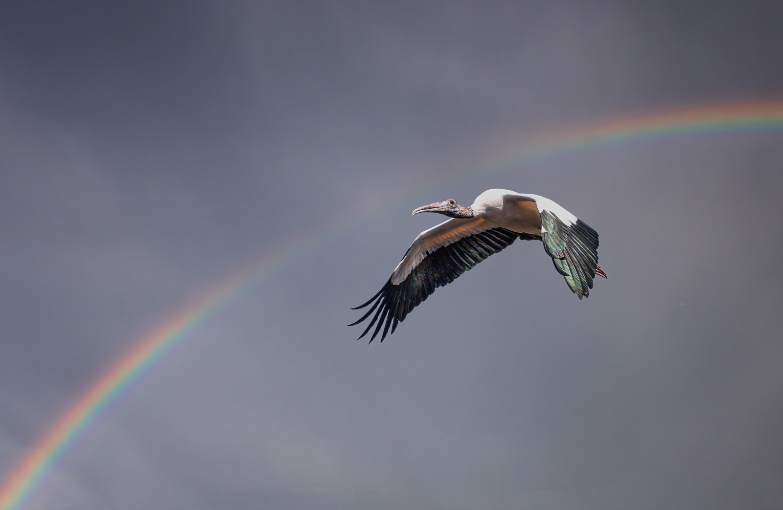
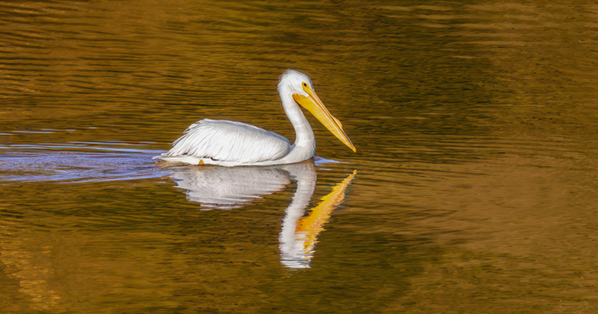
Barbara,
You have succeeded in your goal, i.e., pictorial photography emphasizes aesthetic impact, mood, and artistic interpretation over strict documentation and you nailed it. This is less about here is a pelican doing X behavior and more about here is a visually beautiful, expressive scene that happens to include a pelican.
This is clearly mood over biology and art over record. Light is the star of this image and compensates for the slight softness, due I suspect to the capture being handheld. (more and that later.)
Your shot exhibits the golden hour perfectly, with dramatic shadows and tonal richness.
I cropped and flipped in my VF to allow for more balanced negative space and to focus on the subject's reflection & symmetry. Additionally, you have exceptional color harmony, and your story here is absolutely emotional rather than informational - as a suggestion, since the subject is touch soft, you might think of blurring or softening further to ensure its interpretation as art versus documentation or record - Well Done
|
Feb 10th |
 |
| 7 |
Feb 26 |
Comment |
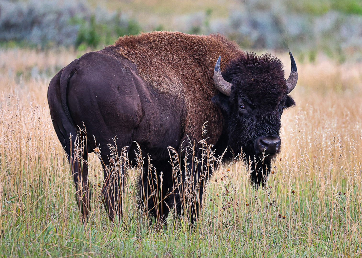
Somewhat satisfied? This is one of the best bison portraits I've seen. Bison aren't the easiest to shoot and I've been to Teddy Roosevelt NP and never got off one as good as this - First of all - Immediate Impact and a high degree of Visual Interest (strong subject matter) - the story is pretty standard, but wildlife portraits by nature (no pun intended) aren't noted for storytelling.
In my VF I opened the shadows on the bison's face, brightened the eye, whitened the catchlight and removed the tall stalk of grass partially obscuring the subject's tail. In PS I removed the eye grabbing yellow tree and back to LrC to darken the background. Cropped to a more "standard" if there is such a thing, 5x7 format creating equal space from where the subject's hooves would be if visible and the space between the subject's back and the top of the frame - If I'm a judge I'm giving this a 10! - Don't be too hard on yourself, this is an outstanding image. |
Feb 10th |
 |
| 7 |
Feb 26 |
Comment |
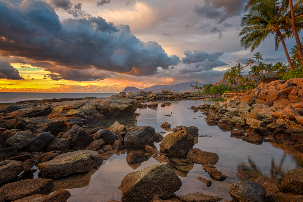
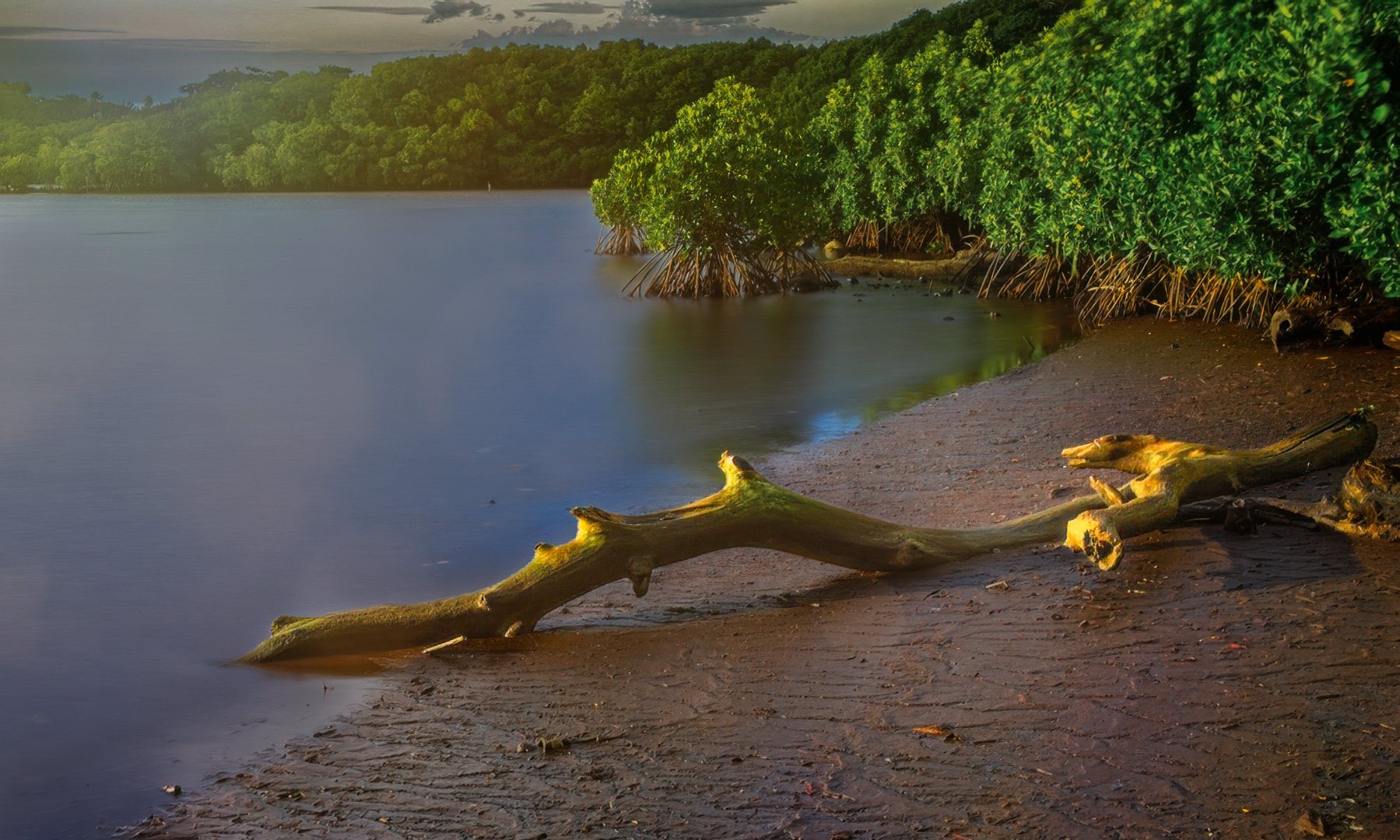
Let me begin by saying this image is gorgeous with a great visual entry - your light is spectacular with great color harmony, and you've created a calm, minimalist water surface (30 sec Tv.)
I also feel there's a bit too much low-information water on the left side. A bit too much foreground and composed as is, the image lacks a strong visual anchor.
I tried to address these in my VF - LMK what you think.
|
Feb 5th |
 |
| 7 |
Feb 26 |
Comment |
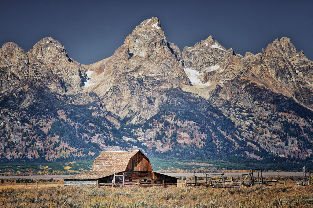
If ever an image with a Colorado feel, this is it. The second I opened the page it felt like home, even though we moved from Colorado almost three years ago. I've probably driven right by this house but don't recall it specifically although I wish I had stopped if I did.
Your metadata says this was shot on February 1st - No way! This is classic Colorado fall along Hwy 162, southwest of Buena Vista and east of the Continental Divide and my guess is late September-early October - and at 10,000' there would be snow if it were any later than that.
Even though this reminds me of home, this image has immediate pull even if I were from Florida. Weathered wood, golden aspens, and a classic Colorado brooding sky that really adds to the scene. Strong three-dimensional feel with the main structure leading back to the secondary building and outstanding use of diagonals in the rooflines.
The narrative is clear - this is a place that once mattered. I'm glad you did not include any people or animals. The setting, season, and condition of the building reinforce the same message - terrific Thomas, terrific.
|
Feb 1st |
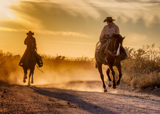
6 comments - 2 replies for Group 7
|
| 67 |
Feb 26 |
Reply |
Maybe you could make a diptych, I think it would be fabulous!
|
Feb 11th |
| 67 |
Feb 26 |
Comment |
Yes, I did try flipping it and I went back and forth, but it just didn't seem to work - besides I always feel that flipping is 'cheating' - not that I haven't done it, but I try not to. |
Feb 10th |
| 67 |
Feb 26 |
Reply |
Thanks Larry - comments appreciated
|
Feb 10th |
| 67 |
Feb 26 |
Comment |
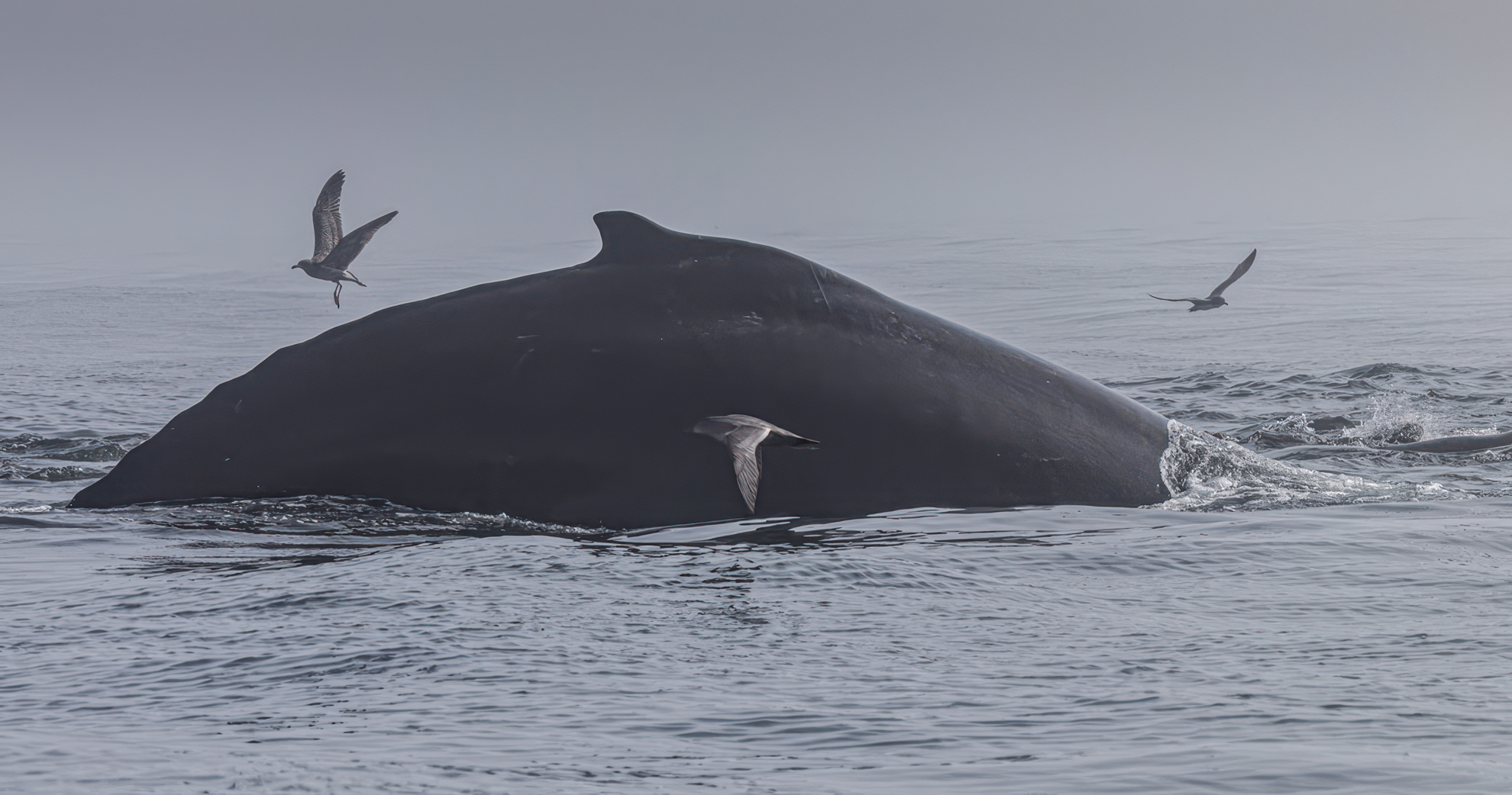
Gregg, welcome to the group, good to have you.
Strong wildlife photos tell a story, and this is a story of natural behavior - you didn't just capture a whale - you captured an ecosystem moment - excellent. Mood is important in photography, and you captured both mood and atmosphere - foggy with soft tonal transitions but I don't feel the mood compensates for the lack of detail.
I'm not familiar enough with humpbacks so, just for a nanosecond at first glance I thought the whale was a rock - and as a casual viewer I did not immediately recognize the subject. The bright grey/white sky is an eye-grabber, I realize it's part of the mood, but in this case, I don't feel it helps the image. Lastly, since we read left to right, I flipped the image, so the movement of the whale is left to right.
In my VF I tried to address as much of this as I could including brightening the gull crossing the whale right to left (flipped version) so it didn't get lost against the dark whale.
|
Feb 6th |
 |
| 67 |
Feb 26 |
Reply |
David, you made lemonade from a lemon :-) - One remedy is to shoot a bit wider knowing you will likely have to crop in - perhaps that's cheating but unless you're going for billboard size, I say why not, especially with wildlife when as you say, "things were happening fast" - I still love the action of your capture, and that's what wildlife photography is all about. |
Feb 6th |
| 67 |
Feb 26 |
Comment |
David - one of your better efforts - a great capture. I think the image might have more impact if the viewer could see both subjects completely - it's an idiosyncrasy of mine, but I'm not fond of partial subjects in wildlife, especially one with such outstanding action |
Feb 5th |
| 67 |
Feb 26 |
Comment |
Frankly Larry - I love them both and both are wow photos- not much to say other than kudos for being in the right spot at the right time and then maximizing the opportunity - a couple of your best efforts - absolutely nothing to improve upon from my perspective. |
Feb 5th |
| 67 |
Feb 26 |
Comment |
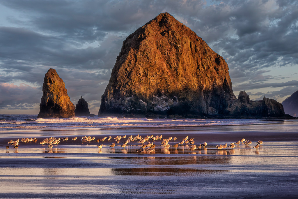
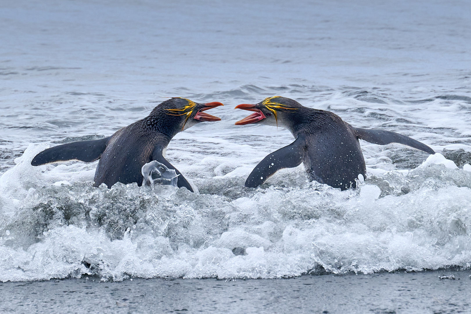
Whoa Nellie! What a spectacular nature image -I reduced the highlights and whites in the water above the scrapping birds because I thought it pulled the eye - an absolute winner I wish I had taken - not much to complain about here - this is a wow! |
Feb 5th |
 |
| 67 |
Feb 26 |
Comment |
Bud your image hits immediately - love the explosive spray pattern, frozen droplets, and low, skimming flight. My eye rides the water trail across the frame, and I think that's the strength of the image.
I think you know that I feel too much focus is spent on finding technical deficiencies instead of looking at the spirit or essence of the image. And as noted, the essence of this image is in its action. At the same time - winning photos have their subjects well separated from their backgrounds and here I feel the tip of the subject's left wing of your subject almost disappears against the dark water making it appear clipped, even though it's not - that's an easy fix, so no biggie. I also believe wildlife images work best when the subject is facing within 90 degrees of the camera lens or is moving toward the camera lens - I don't have a protractor, but it appears your subject is facing about 100 degrees away from the camera lens.
Lastly, since we read left to right, did you consider flipping the image? All in all, an excellent wildlife story and capture.
|
Feb 2nd |
6 comments - 3 replies for Group 67
|
| 73 |
Feb 26 |
Comment |
Ian - thank you, your words are so kind and really appreciated. That's exactly what I try to do and it really makes me feel good when it's recognized. Thanks again. |
Feb 21st |
| 73 |
Feb 26 |
Reply |
Thank you Larry, I was pleased with the shot |
Feb 20th |
| 73 |
Feb 26 |
Comment |
The two trees and exposed roots create a powerful "frame within a frame" that pulls the viewer straight to the waterfall. Tonal contrast and texture control (excellent monochrome choice)
The black-and-white treatment really works with silky water, dark rock masses and midtone bark/roots. The long exposure water contrasts perfectly with the solid, ancient-looking roots and rock. It creates a subtle narrative: time and flow vs. permanence and age. That visual elevates the image from a "pretty waterfall" to fine-art landscape
|
Feb 12th |
| 73 |
Feb 26 |
Reply |
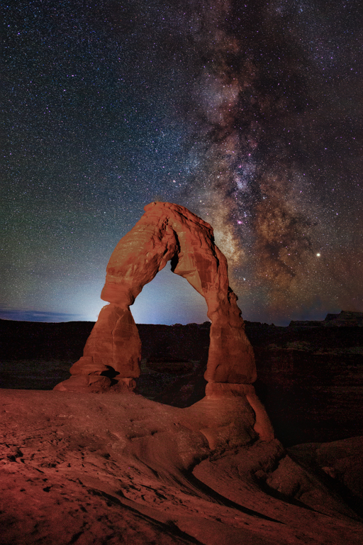
Thank you Ray - it's about an hour's drive off the highway if I recall, maybe a little less and it always seems the weather is different just a few miles out of Moab - hope you get there. |
Feb 11th |
| 73 |
Feb 26 |
Reply |
Thank you Sherry - we were on the same page,or at least the same road :-) |
Feb 11th |
| 73 |
Feb 26 |
Reply |
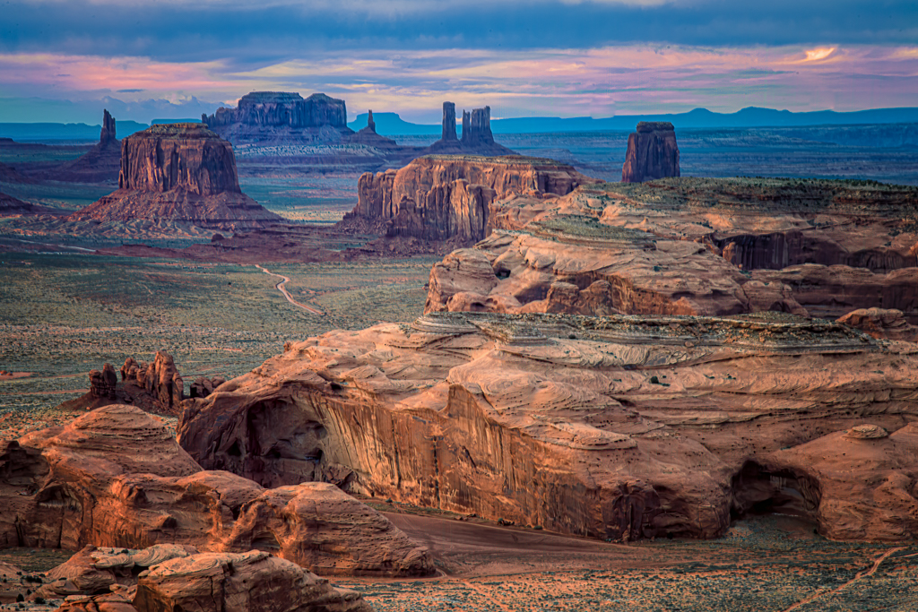
Thanks Gary - and candidly, I prefer this image to Monument Valley anyway. |
Feb 11th |
| 73 |
Feb 26 |
Comment |
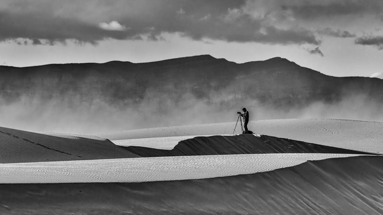
This is a certainly a mood-driven panoramic nightscape. The warm city lights against the cool, dark mountains and sky are the image's biggest visual hook. The moving clouds and faint stars add texture and mood. And the panoramic format suits the subject
At the same time, the heavy dead space in the foreground is its biggest weakness - The bottom third is mostly featureless black and reads as "empty," not "mysterious." There's a distraction on the left edge and no clear focal point.
On balance, the image needs less dead space and more detail.
|
Feb 11th |
| 73 |
Feb 26 |
Comment |
Larry - you obviously put time and energy into your photography. I see this as a quiet, mature landscape-more contemplative than dramatic-and it mostly succeeds on its own terms.
You've built a classic, effective stack: textured foreground but it needs a bit more contrast, I think. There's a calm, almost meditative quality to your image - nice job - mood is important.
The the clouds are protected, and the shadows in the trees hold detail but they need to be opened a bit more. My biggest issue is that there isn't a visual anchor. Your layering is excellent, but there's no single dominant subject-tree, peak, cloud, or break in tone-that says, "start here."
The sagebrush/plain foreground occupies a lot of real estate, and it's largely uniform so a slight tonal dodge/burn pattern or a subtle compositional tweak could give it more intention.
Your sky is pleasant but not compelling. The clouds are nice, but they're supporting actors. I think stronger directional light or more dramatic structure would help.
This is a thoughtful landscape photograph where you have 4 to 6 distinct layers depending upon how one measures such things and my goal was to separate them in my VF
|
Feb 10th |
| 73 |
Feb 26 |
Comment |
Masterfully done, Impact and Visual interest on steroids. I've been to Monument Valley several times but never from the backside of Totem Pole Ridge. An absolutely sterling image Sherry you should go full manual more often :-) |
Feb 6th |
| 73 |
Feb 26 |
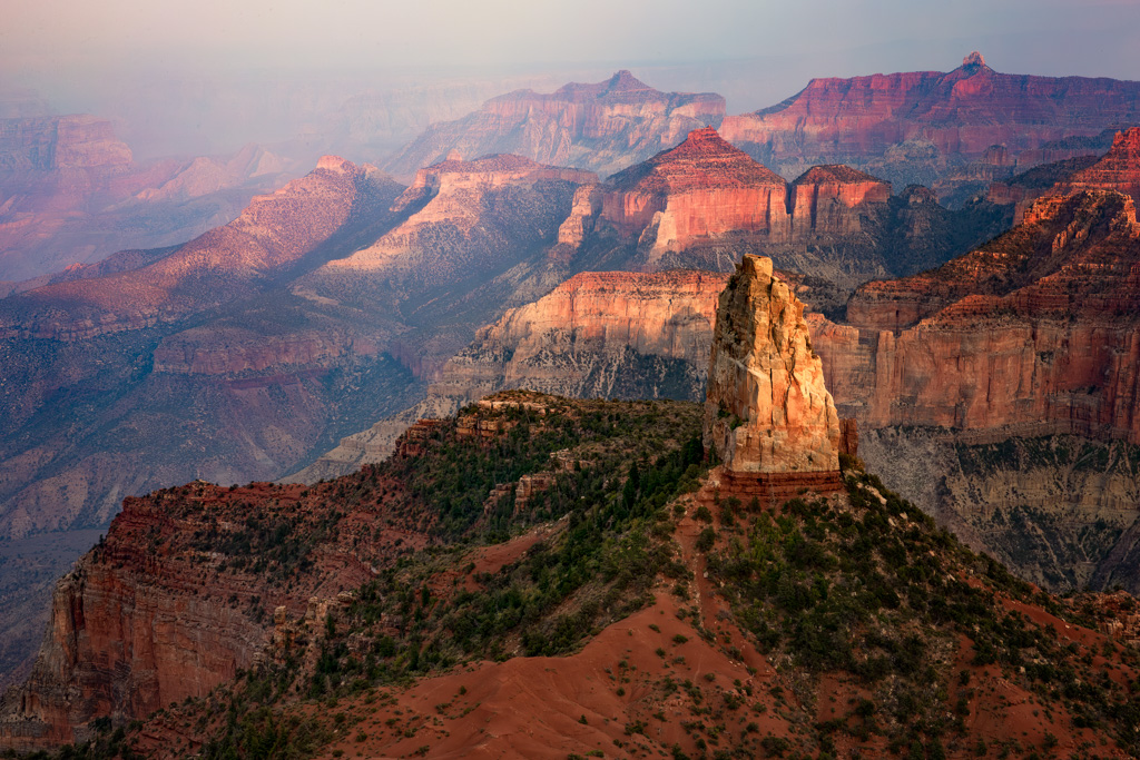
Comment |
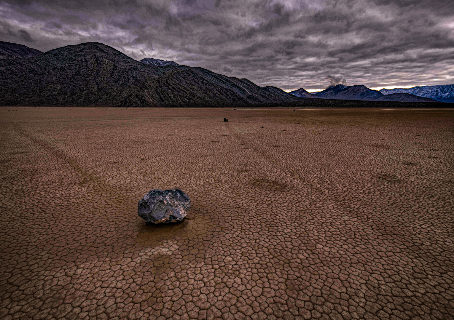
What strikes me first is the immediate subject clarity. The foreground rock anchors the frame beautifully. I've seen a number of these images and this one of the better ones. Excellent texture, depth and detail with good leading lines - I think the heavy overcast sky creates a brooding mood - mood is a good thing in landscape and needless to say your composition is very strong!
The four compositional elements (the rock, the playa, the mountains and the sky) come together very well, but the image as good as it is, does not pop as much as it could. In my Visual Feedback I tried to separate the elements and have each of them pop using various combinations of contrast, texture, clarity, exposure, a touch of skylight filter (Nik Suite) and a super subtle vignette,
This is one of the best I've seen and you were fortunate to have a plan B when a clear night sky was not in the cards - This happened to a group of us in Rocky Mtn National Park many years ago when a snow storm came out of nowhere in August and park rangers had to escort us down the mountain - I call that a plan D! You did well with this image, kudos.
To be clear, I did not want to alter nature but rather I try to reveal the strongest visual and narrative elements of a scene. |
Feb 5th |
 |
| 73 |
Feb 26 |
Comment |
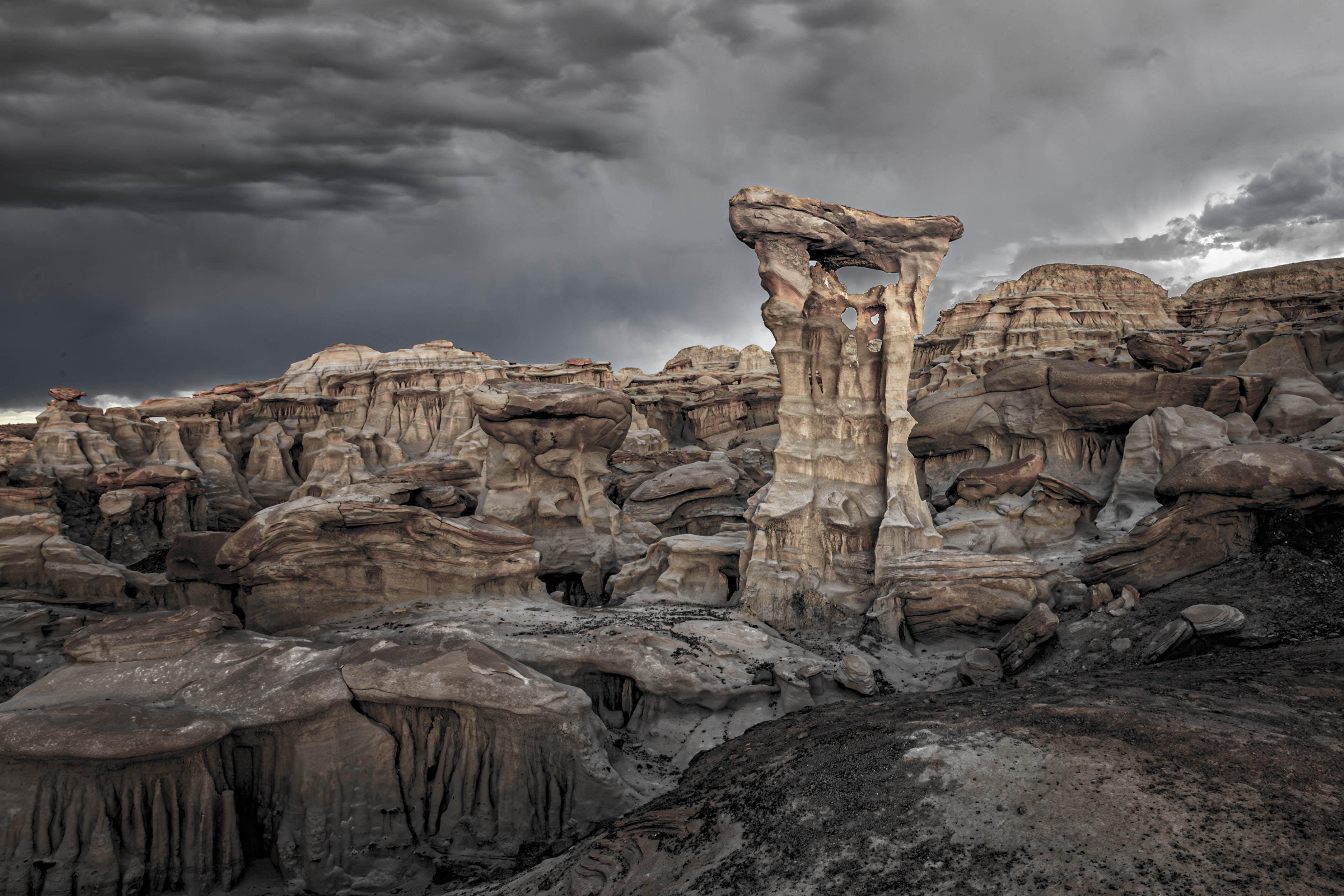
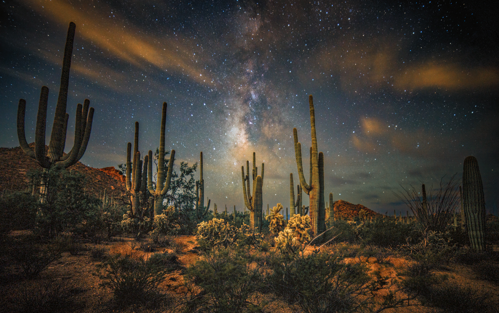
This reads as a classic infrared landscape done with INTENT!- not gimmick - good on you. It has mood, scale, and drama - and the title "Afternoon Lowlands" fits the calm AND weighty feel very well. I really appreciate the image's dramatic tonal contrast and I think it's its biggest strength. The white IR foliage against the near-black sky is textbook powerful.
Also, the clouds aren't just pretty - they have layers, shape variety and directional movement and that gives the image energy. You also have strong horizontal layering, a textured foreground and a glowing tree line that 'feels' once again, intentional. Finally, good title because the scene matches the title and I landscape photography I think that's "sophisticated storytelling."
My biggest question is - What's your subject? Right now, it's a gorgeous sky over land but it lacks an anchor. It's a beautiful scene but what am I supposed to look at? The foreground is a bit flat and feels more like empty space than negative space - so you might consider cropping up by 15%-20%. I also feel the midground dark strip blocks the flow of the image- I'm not sure how I would remedy that except to possibly lighten it. And lastly, 2/3rds of the image is dark sky that overpowers the lower 1/3rd of the image.
Don't get me wrong, this is a strong IR image; and for what it's worth, I think this image would do quite well in a club competition if you are so inclined.
|
Feb 4th |
7 comments - 4 replies for Group 73
|
| 97 |
Feb 26 |
Comment |
Ernoe - The power of this image is in its simplicity, story, and humor - with an artistic flair. Outstanding. At first blush I thought high technical quality, then I looked it and said "wow ,, there's something compelling about this image
Having said that, I didn't think the extra background was necessary to the story, so I cropped in and moved the subject a bit more off center. Next, I reduced both the contrast and exposure in the background, then saturated the subject's beak very slightly. I don't recall if I touched the eye. Nonetheless, those are minor items! Certainly a wall hangar from my perspective - nice job.
|
Feb 12th |
 |
| 97 |
Feb 26 |
Reply |
Deborah - I'm unclear about your comment "I think the angle does make it difficult" - what specifically are you referring to? |
Feb 11th |
| 97 |
Feb 26 |
Comment |
Peter - I increased texture and clarity on the subject in my VF, but I'm not skilled enuff in PS to get a bluer sky - I love your perspective and also feel the fruit is both soft and distracting
|
Feb 7th |
 |
| 97 |
Feb 26 |
Comment |
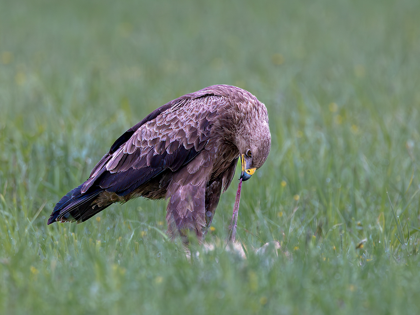
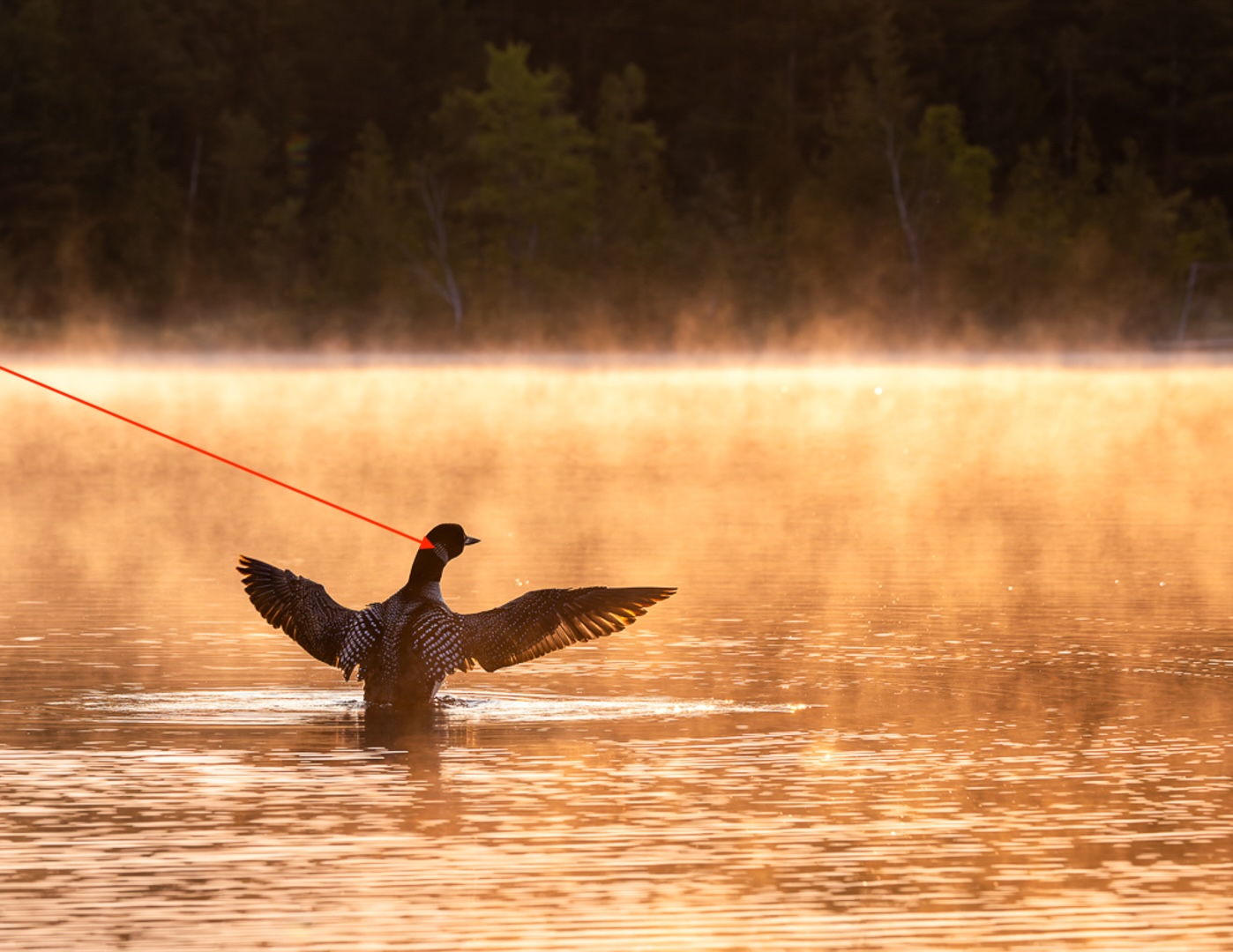
I brightened the subject and recropped - am unsure of what the mark on the subject's neck is - see red arrow |
Feb 7th |
 |
| 97 |
Feb 26 |
Reply |
I agree with you Ernoe, I like my Jan version better, but I wanted to see how a similar image's color version would fare. My goal was to photograph the subject in dappled/shadowed light from an unusual angle. As always, your comments are very much welcomed :-). |
Feb 7th |
| 97 |
Feb 26 |
Reply |
Thank you Jeremy - other than changing the profile from Adobe Standard to Adaptive Color and darkening the log I didn't think it needed much editing save for expanding the tonal range. So yes, this might be a tough image to edit, so I didn't edit it much - thanks for your comments |
Feb 7th |
| 97 |
Feb 26 |
Comment |
Roy - on a 10 pt scale I'd give this image an 11.5 - fabulous shot - Like you sometimes I can't help myself and in my VF I brightened the subject and darkened the background but I don't think it gets much better than an 11.5 :-)
And kudos on your perspective - this is a WOW! Plus |
Feb 6th |
 |
| 97 |
Feb 26 |
Comment |
Always appreciate your comments Roy - thank you
|
Feb 6th |
| 97 |
Feb 26 |
Comment |
I like this one better - just a terrific image - that said, I'm still bothered by the crop because I think it's important to see where the feet "would be" if not masked by the brush - that's always a tough choice, but these are two excellent images- as I said, welcome aboard I really look forward to more. |
Feb 1st |
| 97 |
Feb 26 |
Comment |
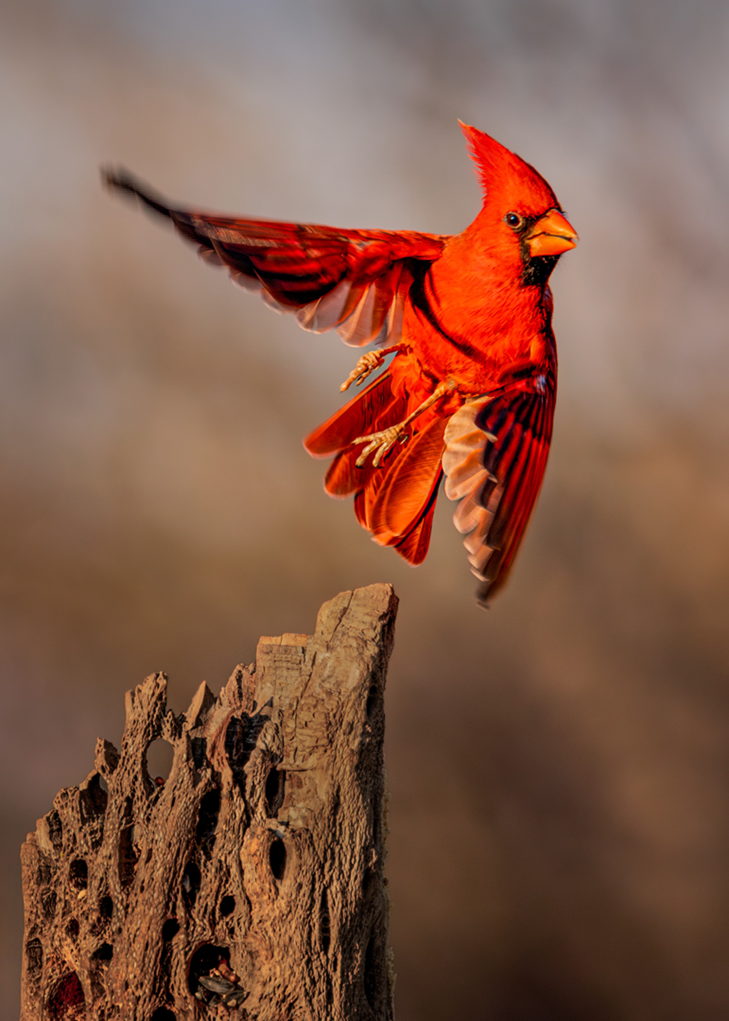
Welcome aboard Jeremy and sorry about the Bills this year, but what a way to start with this DD Group. Your image incorporates the big "3" - Impact, Visual Interest and Story - this is one of those images that needs no explanation. The backlit wings, the gesture of landing, and the bright green nesting material against the warm light create instant drama. Gee, did I say, great light! The image feels intimate, not just documentary. The storytelling is the image's superpower because it checks all the boxes, i.e., behavior, purpose (nest building), relationship and a moment in time - You captured them all, terrific job. If I were judging in a club competition I give this image the highest score.
With that said, I think there is room for improvement. Due to PSA rez limitations the top of the heron's left wing "may" be blown out - would need to see the RAW histogram. I also feel the extended right wing of the heron is cropped a bit too tight, and although we may not be able to see the second heron's feet due to the grasses and nesting material, I feel the image should be cropped as thought the feet are present, if not if "feels" as if I'm looking at a partial subject.
Your image pops and makes me want to examine it - I look forward to seeing more
|
Feb 1st |
7 comments - 3 replies for Group 97
|
26 comments - 12 replies Total
|