|
| Group |
Round |
C/R |
Comment |
Date |
Image |
| 7 |
Dec 25 |
Comment |
Thanks Judith - I think we all have a tendency to become 'technocrats' when looking at images and forget that wildlife images are primarily about the story they tell - Merry Christmas! |
Dec 24th |
| 7 |
Dec 25 |
Comment |
Gaetan, there's a lot going on in this image. You have managed to capture four interesting and distinct components: the pier & hut, the foreground rocks (that's also a leading line) the 'almost' glasslike water and the blurred clouds. And even though your title is "The Pier," I wasn't sure of your intent because 80% of the image is negative space that pulls the eye from your subject. One thing for certain you've created a mood (kudos) and if that was your artistic intent, you did it that very well. |
Dec 12th |
| 7 |
Dec 25 |
Comment |
Hoshedar - I uploaded my VF yesterday but today it's gone and then as I was typing this it reappeared :-) Honest, that's what happened - anyway, I hope it sticks this time but just in case I'm uploading again , |
Dec 12th |
 |
| 7 |
Dec 25 |
Comment |
Very artistic Judith - minimalist, delicate, with a sense of calm with your usual artistic flair - nice job. The soft gray background and the sculptural glass vase work well with the salmon-colored flowers and it has the 'feel' of a studio piece. The overall impression is one of a clean, elegant still life but that could use a bit more depth. I'm not as artistic as you and I wouldn't know what to suggest - perhaps some light shaping or changing the background, so it supports the subject a bit more - nonetheless, another well-done artistic image on your part. |
Dec 12th |
| 7 |
Dec 25 |
Comment |
I love this image for many of the reasons you cited - I tried to get the sky to pop a bit more in my VF |
Dec 12th |
 |
| 7 |
Dec 25 |
Comment |
Tom - this image is not only interesting, it's flat out gorgeous. I did some selective dodging and burning,added tonal contrast throughout and a slight vignette and sky filter in the Nik Suite - this is so good you might consider a catchier title, something like, "Reflections in the Abstract" - one of your best, nice job! |
Dec 12th |
 |
| 7 |
Dec 25 |
Comment |
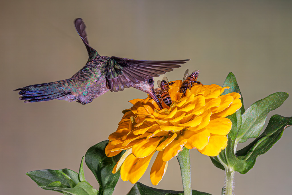
Barbara,
This is an exceptional behavioral moment - capturing a hummingbird mid-hover and actively feeding is always compelling and requires timing, awareness, and patience. Beautiful iridescence on the gorget - it's extremely well captured vis-à-vis shooting thru glass - nonetheless, you shot it at an excellent angle and in good light to reveal that structural sparkle. I also think the hovering stance and visible eye provides a natural point of connection.
Wing motion blur is natural, and the general softness may be the result of window shooting :-). The red flower is blown out, losing texture; a slight exposure compensation or selective highlight control might retain detail. The background is visually active; a cleaner or more distant backdrop might improve the minor background detractions.
A beautifully rendered and engaging wildlife moment with excellent color on the gorget. I really think if shot outdoors and a touch sharper, this would do well in a club competition.
|
Dec 11th |
| 7 |
Dec 25 |
Comment |
Hoshedar, I don't think I fully understood what you wrote, but as a documentary image you captured it - also, I think waiting for just one person to inhabit the scene was masterful - the scene SCREAMED for the human element - nice job - in my VF I tried to punch up the image and highlight the woman taking the photo although I thought you captured the moment well - nonetheless, I think the VF version pops a bit more - would love your thuoghts |
Dec 10th |
 |
8 comments - 0 replies for Group 7
|
| 48 |
Dec 25 |
Comment |
Tom - you commented on my image in DD 67 so I thought I'd return the favor - your subject's facial expression makes this image, YOU NAILED IT! Having said that, I felt the artwork dominated the image thus crowding you beautiful subject. In my VF I wanted the vibrant artwork to feel like an extension of her personality (and love of color) rather than competing with her - would love your thoughts |
Dec 6th |
 |
1 comment - 0 replies for Group 48
|
| 67 |
Dec 25 |
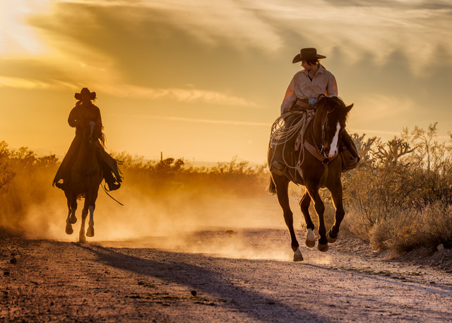
Reply |
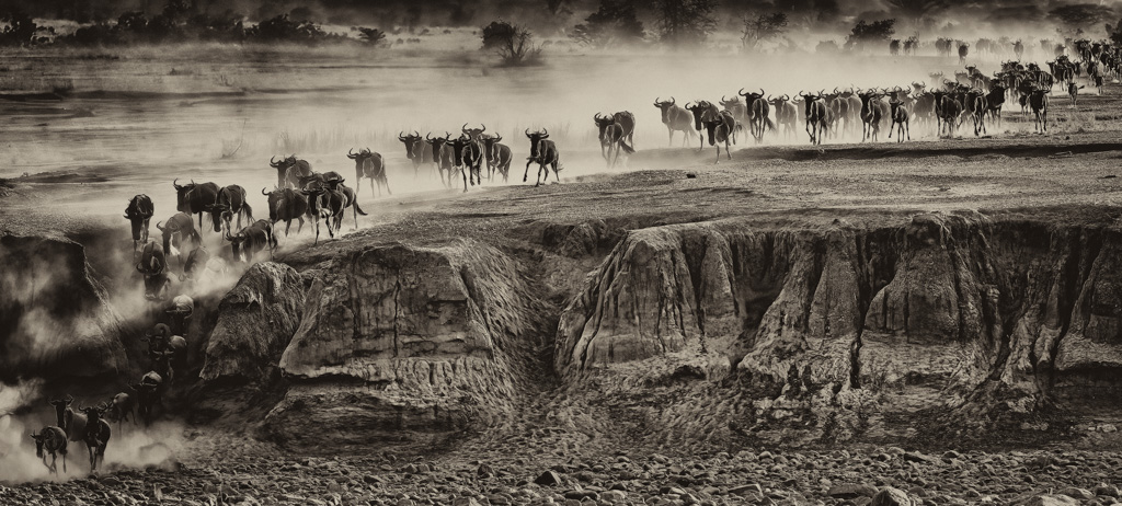
Thank you to everyone, I don't receive notices when an image receives comments - so, as noted, I really do appreciate all the kind words - and yes, it was almost surreal and we were very fortunate and David - I know the feeling :-( been there too
|
Dec 19th |
| 67 |
Dec 25 |
Comment |
That's why I referenced this one Tom - I got about 16 good crossing images - the one in DD group 7 is the calmest of the group - this is one of 5 that are truly chaotic - thanks for checking in Tom |
Dec 16th |
| 67 |
Dec 25 |
Comment |
David - Immediate impact and strong visual interest, the color palette is striking, and I think the strength of this images is in its creativity - bold, original, and visually arresting. The main critique is that the background verges on overpowering the subject - a different crop might address that and with many ways to go I suggest the maker experiment - a beautiful image, nice job. |
Dec 12th |
| 67 |
Dec 25 |
Comment |
Bud - I love the color and the bokeh. Yours is a beautiful, sharp and detailed Allen's Hummingbird - so that's what I focused on in my VF - and tried to eliminate is whatever detracted or drew the eye from your subject. I also flipped in post because we read left to right and I thought you had a great leading line (not to mention the bokeh highlight behind the bird.) A well-done photo of a subject I wasn't familiar with |
Dec 12th |
 |
| 67 |
Dec 25 |
Comment |
Jenny - a wise choice of settings, especially the Tv - birds can move quickly and I've lost many a good opportunity with too slow of a shutter speed. I think there are three points of high visual interest here - your subject, the dead tree and the snow - the snow is the la pièce maîtresse - so I tried to eliminate everything else while emphasizing those aspects in my VF.
Also, please note, I was creating an image that would score well in a photo club, so by eliminating the branches I'm sure I violated PSA nature rules, but as implied, I tend to think "photo club" and not PSA. Also, the few snowflakes added to the version you submitted, in my VF cropped the three snowflakes that remained in my crop served more as distractions rather than adding environment, so I removed them.
|
Dec 12th |
 |
| 67 |
Dec 25 |
Comment |
Scott - we've all been in situations where we were unable to get the preferred "eye or ground-level" perspective. To minimize that issue I chose to crop in and focus on what I found the most visually interesting part of the image, i.e., the subject, the rock it's standing on and the ground area while deemphasizing the water, that while essential to the story is also an eye-grabber. I would have liked to move the subject off center as you and Larry have it, but I did not want "half of a pedestal" the subject is standing on. I added texture and clarity and skylight (Color Efex) to the subject, the rock to the surrounding area and then neutralized the whites about 50% also in Color Efex Pro in the Nik Suite. |
Dec 12th |
 |
| 67 |
Dec 25 |
Comment |
Cindy - This is a terrific shot, I agree with Bud, one of your best! Great perspective and good detail where you needed detail. I thought the image could pop more, so in my VF, I selected the subject, inverted the mask LR and reduced the highlights about 2/3rds for the entire background. Again, in LR, I darkened the exposure on the rocks in the lower right using the Linear Gradient Tool and lastly, I brightened the subject's eye. I realize that may sound like a lot, but it's not really - the essence was there- my goal is to highlight/reveal the best part of an image not to change the image. |
Dec 11th |
 |
| 67 |
Dec 25 |
Comment |
Larry - Great shot! The mid-air male bluebird with wings flared and the open-billed female peeking from behind has a ton of impact and visual interest. The courtship interaction is a great behavior story. The subject's wings really give the image impact and is its strongest feature.
Technically your image as usual is spot on and the translucence of the male's wings is boffo. I also thought the female's tail sticking out added to the story, I thought about cropping in a touch from the left because the dark brown (tree I imagine) pulls my eye, but I'm torn, because I really like the space for the subject to fly into. You obviously prefer the wider canvas with the brown, but I find it pulls my eye a bit and it doesn't if I crop in. - nonetheless, love this shot. Also, please LMK if you received a notice of my review - I still don't get them
|
Dec 11th |
| 67 |
Dec 25 |
Comment |
Thanks Bud - btw, are you notified when someone comments on your images? I haven't receive a notification in years
|
Dec 11th |
| 67 |
Dec 25 |
Reply |
Thank you Tom - much appreciated - we saw 10 crossings in 5 days - some bigger than others and I feel that I got 16 keepers, so I cannot complain. |
Dec 6th |
8 comments - 2 replies for Group 67
|
| 71 |
Dec 25 |
Comment |
Tom - I enjoyed looking at this image and agree with Mr. Patterson to the degree that a human element would add energy and interest. However, if you added a person or people, I feel your anchor (the red phone booth) is so strong that the two might fight for attention.
Two thoughts - first, you might consider opening the shadows just a touch (see my VF) but more importantly, unless I'm missing something, nothing in the image visually signals daydreaming.
It's a beautifully composed environmental scene-sharp, colorful, and structured-but it's literal, not emotional or introspective. A viewer won't intuitively connect it with the idea of daydreaming because there is no person, gesture, or mood suggesting it.
This is a classic, charming, slightly nostalgic street-scene with a bright red British phone booth, flags representing the UK and its cultures, old-world pub architecture, empty café tables suggesting early morning quiet hours and a strong sense of place, i.e., Savannah's historic district making this a story about locale, culture, and personality of the street, not internal emotion
|
Dec 6th |
 |
1 comment - 0 replies for Group 71
|
| 73 |
Dec 25 |
Reply |
Thank you Ian, most kind of you - be well |
Dec 28th |
| 73 |
Dec 25 |
Comment |
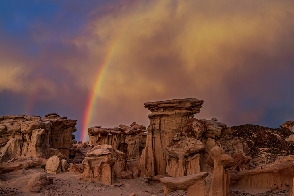
I try not to shoot on blue bird days, ergo I get clouds and sometimes get lucky with rainbows - Send me your email and I'll send the RAW - that was my jacket and tripod but that was how the sky appeared in my RAW. And shame on me for not picking up on the jacket and tripod - had to leave it behind due to terrain if I recall - shot a loooong time ago. Appreciate your comments, they're constructive and instructive - thanks |
Dec 25th |
| 73 |
Dec 25 |
Comment |
Gary - I thought you did a nice job with this image and 3 things immediately jumped out at me
1 - the angle you took - terrific
2 - The logs near the center of the frame, which I feel are a distraction as much as a natural barrier and
3 - Unlike many waterfall images along a moving stream, you kept all the water in the frame - in too many waterfall images in forest the water flows out of the frame taking the viewer's eye with it - so really a nice job with this |
Dec 16th |
| 73 |
Dec 25 |
Comment |
Larry - welcome to the group. And fyi, I would love to see your work but there's no website listed in your bio so you might want to check with Sherry or Barbara Miller (bembrit@bellsouth.net.)
I realize you submitted the BxW version, but I think the color version has far more impact and visual interest. Meanwhile, what I don't understand is the different crops (color version v the submitted monochrome.)
But a few comments on what you submitted - great subject, perspective and technically well done, but the monochrome version is a touch flat. Also, in the version you submitted, I feel there's a bit too much uninteresting sky and not enough interesting foreground - whereas your color version is more balanced compositionally.
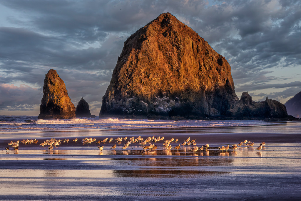
In my VF I used the color version because I LOVE the image - that said, I did modify it a touch. I cropped in from the left, sent the image into the Nik Suite and used Color Efex Pro's Tonal Contrast for the entire image then ran it thru Photoshop, masked everything but the sky and returned to the original sky without the Tonal Contrast. I also removed the bright white distraction offshore and its reflection and darkened the "beach area" as I thought it grabbed the eye too much. I think it's a sterling image and again, welcome.
|
Dec 12th |
 |
| 73 |
Dec 25 |
Comment |
Raymond - this is a beautiful capture, congrats, it's an attention grabber. Also, just so you know - when I edit a nature image, I'm not trying to make it something it wasn't. I'm trying to reveal the part of the scene that made me stop and raise the camera or review an image in the first place. Sometimes that means cropping tight to isolate a gesture. Sometimes it means toning down a bright area that's stealing attention. Sometimes it means simplifying the chaos of a landscape so the eye flows where it should.
I'm not altering nature - I'm revealing the best of it. I'm not following rules - I'm following the story and that's at the heart of how I edit and why I photograph the way I do. So please don't take offense at my suggestion to remove the city lights on the right side of the frame,
|
Dec 10th |
| 73 |
Dec 25 |
Comment |
Sherry - as usual, you image delivers - it's pleasant and has immediate impact with the warm lighthouse contrasted against ocean blues. The colors are appealing, the structure pops well against the soft sky and is a feel-good image with a clean subject.
However, the impact plateaus quickly because the composition isn't pushing toward drama, mood, or storytelling. It's a pretty shot-but not unforgettable. In my VF I cropped to reduce the amount of uninteresting sky, added both texture and clarity to the sky and tried to get the subject to pop but deepening the color of the lantern roof in an attempt draw the viewer's eye - also, I thought Island Sentinel might be a good title.
|
Dec 6th |
 |
5 comments - 1 reply for Group 73
|
| 97 |
Dec 25 |
Comment |
Peter and Roy (or any other member of the group) - you both commented on my comments or edits - the following is my philosophy and would like your thoughts if you don't mind. When I'm taking pictures, editing in post or reviewing and or re-editing photos of others, my goal is to create images with a high level of impact and visual interest, i.e. pictures that a uniformed viewer will take the time to study and consider. I don't try to alter nature or a scene; but rather to reveal the strongest visual and narrative elements of the image. Please, comments welcomed - thanks |
Dec 11th |
| 97 |
Dec 25 |
Comment |
Thanks for the suggestions Roy, much appreciated. That said, head shots bore me to tears and will usually only use them when the body isn't up to competition standards, but hey, we all don't like blue suits, so good on ya. As far as lightning bolts, here's my philosophy on nature shots - I crop and adjust to direct attention, not to "improve reality." I remove distractions, strengthen gesture, enhance tonal flow, and highlight the subject's natural presence. My approach isn't bound to PSA compositional rules; it's driven by the principle that the most meaningful part of the scene deserves the clearest expression. My goal is simple: to reveal the best of what nature offered in that moment |
Dec 10th |
| 97 |
Dec 25 |
Comment |
Roy - whew! So glad you told us the body and the head were not the same animal - what a creative idea, as I said, killer image |
Dec 8th |
| 97 |
Dec 25 |
Comment |
Deborah - welcome aboard and glad you made it :-) Your capture contains a contains an absolutely outstanding moment of peak action. That said, the two surface penguins and the bright upper background compete with that peak action for attention, and my eye isn't sure where to settle. So, in my VF I cropped to isolate the three airborne birds, which IMO allows the viewer to experience the peak action with more immediacy, and treated the non-airborne birds as distractions. I think you know from our study group that I treat all images as if they're in an Open Category where interpretation and refining are encouraged; and that's what I did. I feel the tighter crop transforms the image from a very nice and broad 'documentary record' into a more intentional, artistic rendering of the moment. It's not my intent to change reality, rather I try to reveal the strongest parts of it. I hope that makes sense to you. |
Dec 6th |
 |
| 97 |
Dec 25 |
Comment |
Roy - This is an artistically daring composition and I love it - to me, this is what photography is all about. That said, the image may be a bit overprocessed, which moves it away from authenticity and into digital-art territory, which is fine, so long as that was your intent.
I love that this is not a natural history shot and for lack of a better term I'd call it an abstract portrait. To my eye, the image is all about graphic design and color-field interaction and I would consider retitling to "You Talkin' to Me? This is a KILLER image!
|
Dec 6th |
| 97 |
Dec 25 |
Comment |
Absolutely amazing peak action - talk about perfect timing, you nailed it. Impact, visual interest, and story all rolled into one - that said, two technical issues - the image appears a touch soft (which I don't understand considering it was shot at 1600 Tv) and I'd get rid of those bright lights at the shoreline and below the subject's right wing. |
Dec 6th |
| 97 |
Dec 25 |
Comment |
Stunning is a perfect word for this image - the backlight and rim glow with the sparkling water droplets are absolutely boffo - your title isn't too bad either :-) - NICE JOB |
Dec 6th |
| 97 |
Dec 25 |
Reply |
Thanks for your kind words Peter - I too thought the background was perfect, and no, I did not change a thing - that was the actual sky that day, nature provided this backdrop, not PS or LR - sometimes nature is very generous :-)
PS - I did isolate the subject in LR and increased the exposure on the subject. |
Dec 6th |
7 comments - 1 reply for Group 97
|
30 comments - 4 replies Total
|