|
| Group |
Round |
C/R |
Comment |
Date |
Image |
| 7 |
Dec 24 |
Comment |
Thanks you Judith - it was a fun shoot |
Dec 28th |
| 7 |
Dec 24 |
Comment |
As you would know, the background was challenging - I could not change it, nor would I want to, so I managed the image by cropping |
Dec 22nd |
| 7 |
Dec 24 |
Comment |
Thanks Hoshedar, I have a series of images but I've never entered this one. |
Dec 20th |
| 7 |
Dec 24 |
Reply |
Thanks Tom - it was a most interesting shoot |
Dec 15th |
| 7 |
Dec 24 |
Comment |
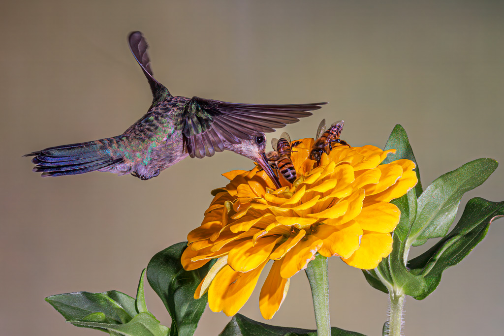
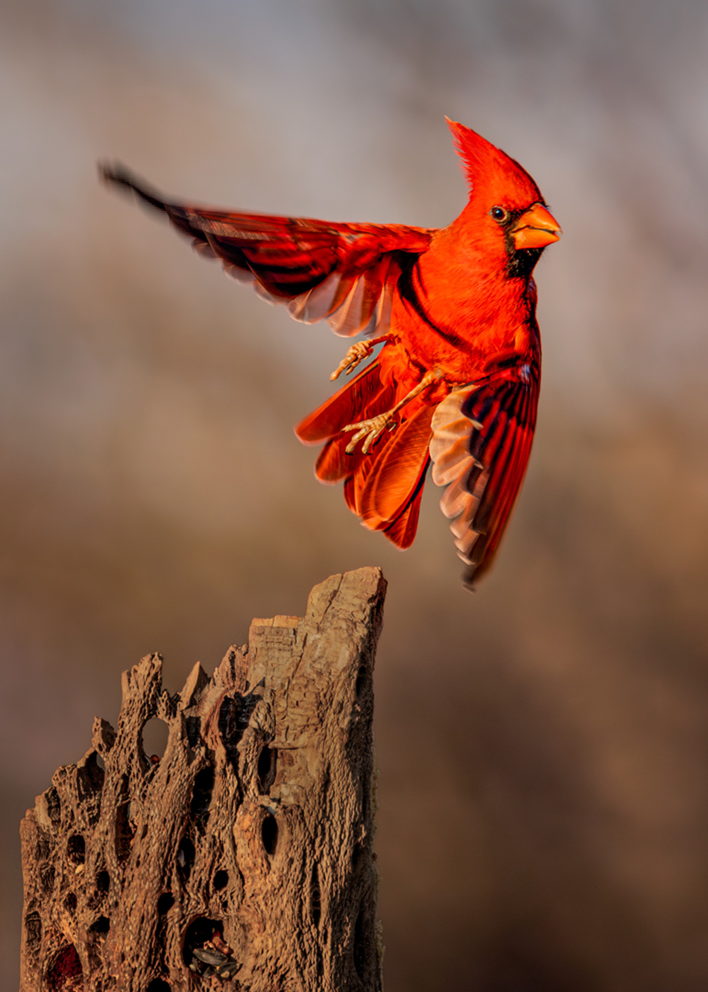
Barbara - here's a little known hack when buying Canon gear. If you contact Canon directly and ask to buy a "Refurbished" camera (maybe all equipment I'm not certain) but if you ask to buy refurbished you'll pay about 25-30% off retail for a brand new never used camera. E.G.,If Canon ships 20 Mark II' to B&H and B&H can't sell them all and B&H returns 10 of them to Canon, Canon puts those 10 camera's in a different box labelled "Refurbished" - but it's a brand new camera - I bought my old 1DX, a $6,995 price tag at the time, for $5,100 - now that's the way is was a few years ago, so I don't know if they're still doing that, but it's worth a try.
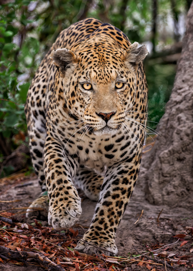
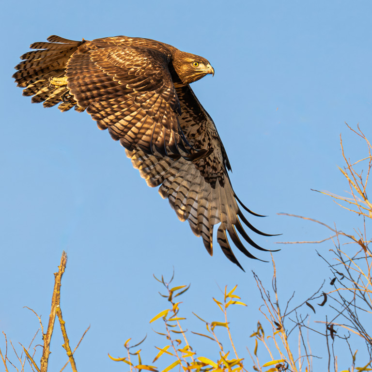
You image is a GREAT capture of a hawk in flight but you have a few technical and compositional issues - in my VF I removed much of the branches; I've never thought it wise to have lines in an image that lead the viewer out of the frame - it appears you were trying to frame the subject - great idea, but not with such obvious "leading lines". While a great capture, the image is soft - personally I never shoot birds in motion at less than 1/2500th Tv and usually 1/3000th. I also opened up the shadows in my VF - in winning bird images the eyes should be tack sharp, you want detail in both the light and dark feathers and the motion should be frozen - perhaps the wingtips might show SOME blur in SOME cases, depending on the composition, but in this image I feel 1/800th Tv was a stop and a half to two stop too slow. I also added a slight vignette on the subject's head to keep the viewer's eye from wandering |
Dec 13th |
 |
| 7 |
Dec 24 |
Reply |
Thank you for your comments Barbara, it was a truly fascinating and most interesting experience - here's an adjunct to the story - I blew this shot up and added it to my "Wall of Fame" that I had in our previous house and we had Comcast come by to handle a cable connection issue when the young Comcast rep he asked me how did I come to have his brother's photo on my wall - small world sometimes :-) |
Dec 13th |
| 7 |
Dec 24 |
Reply |
Thanks for your comments Gaetan |
Dec 13th |
| 7 |
Dec 24 |
Comment |
This is a solid shot Hoshedar - sharp, good detail, well-exposed and a good composition. In my PSA competitions & exhibitions course my instructor said
"Impact, Visual Interest, and Storytelling are the fundamental characteristics that most often succeed in competitions; thus, these three aspects of an image need to be the hook that grabs and keeps the viewer's attention and outweigh any minor technical deficiencies.
1. Impact - is the ability of an image to immediately grab the viewer's attention.
2. Visual Interest - Is a matter of subject selection, for example, an image of a Bengal tiger is going to be far more interesting than a similarly composed image of a common housecat. Visual interest means the subject itself must be something that a uniformed viewer will take the time to study and consider.
3. Storytelling is a first cousin to visual interest and conveys the emotion and significance of the moment.
...and that's the guide I use when submitting images into competitions - I hope that helps to answer your question
|
Dec 10th |
| 7 |
Dec 24 |
Comment |
Hi Tomi - welcome and congrats on a very nice capture - you asked about changing or improving so in my VF the first thing I look at when shooting birds is get the pupil of the subject's eye as sharp & clear as possible to help the image pop. So, I brightened the eye and saturated it, (and I almost never use saturation because I feel it distorts as many times as it helps an image) but I felt it necessary in this image.
I removed the branches on the right and while they add context, I feel they're more distracting than additive to the image. I added canvas because while the title is taking off, the bird appears to be flying downward and I wanted it at least in level flight, and lastly, since we read left to right I flipped the image in LR and darkened the background somewhat.
|
Dec 7th |
 |
| 7 |
Dec 24 |
Comment |
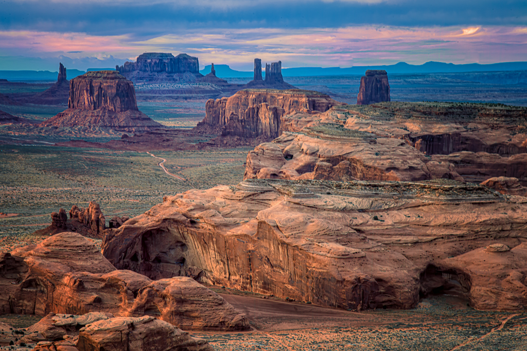
Your title is appropriate and you captured it beautifully. This image could be cropped and re-composed in a quite a few different ways - and all a matter of taste. Centered subjects aren't always ideal compositions although in this case it's not objectionable - having said that, in my VF I placed the sun on the rule of thirds because I didn't think the black enhanced the image and I thought by moving the sun I also moved the clouds above to balance the image. Not necessarily better, but an alternative |
Dec 2nd |
 |
| 7 |
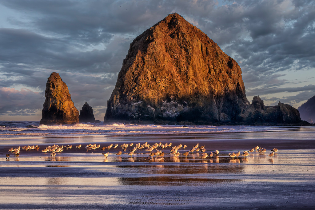
Dec 24 |
Comment |
Tom - a beam of light on the driftwood could have made this image pop off the page. |
Dec 2nd |
| 7 |
Dec 24 |
Comment |
Judith - I'll review this as if I were judging at a club competition. In the abstract this could be an interesting composition, where less is more, and the story is implied. That said, let's begin with your title. A title should reflect what the viewer sees in the frame. Naming images is important for several reasons, first, just as a watermark becomes a part of your image so does your title. Additionally, your title presents a window to your vision and ideas, while providing both context and information about the photograph for the viewer. So, if you had the reflection or even a partial reflection of a Salvation Army kettle or Santa's sleigh the title would fit the image far better. A valid question for a photo club judge might be, "What in the image tells me it's Christmas shopping?"
You asked about the gold reflection - I think the reflection from the wet pavement helps the image - you'll notice in movies and TV commercials the pavement in many cases is wet because it adds life to an image, so I thought you did a nice job with that.
As far as the blur - you should have shot with a smaller aperture, perhaps f5.6 if possible or a faster Tv Compositionally, the image is a bit underexposed (see my VF) I cropped down below the hands because they drew the eye from the subject's feet, which is your center of interest. I also cropped up as I felt there was too much stone that did not add to the story and I opened the shadows to get a modicum of detail in the black shoes
|
Dec 2nd |
 |
9 comments - 3 replies for Group 7
|
| 73 |
Dec 24 |
Reply |
Thanks Sherry - yup - cant go wrong with any of those states - thanks for your kind words, much appreciated
Best,
Butch |
Dec 17th |
| 73 |
Dec 24 |
Comment |
Thanks Gary, I'll miss going there every year since we've moved - anyway, thanks for your kind words |
Dec 17th |
| 73 |
Dec 24 |
Comment |
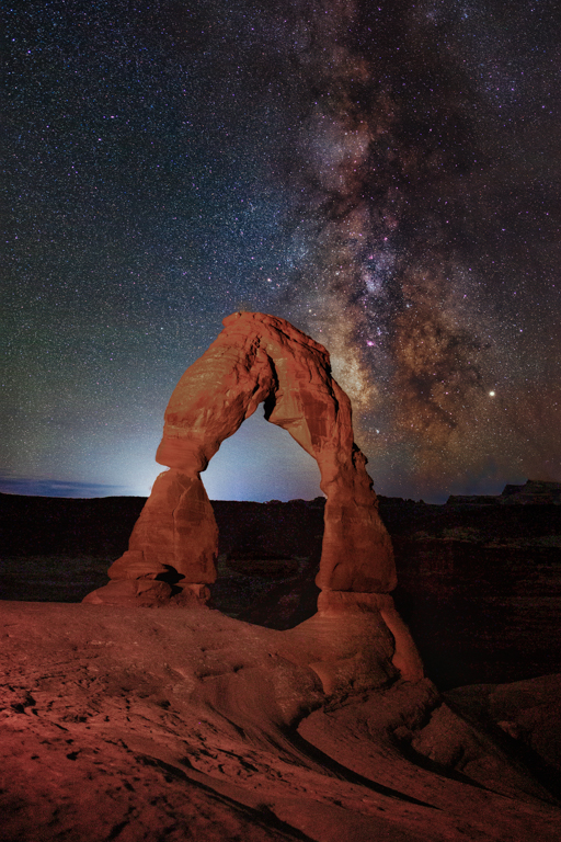
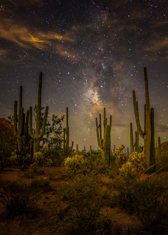
Thanks Ian, I used to live about three and half hours from Arches NP so it was easy for me to get there in the fall - I've been there about 5 or 6 times, hiking, biking, etc., and spent a day or so shooting on three of those occasions - dark skies, the galactic core rises early in the fall (in this hemisphere) and it has an interesting angle in relation to the earth in August and September, which makes creating a good composition easier. |
Dec 11th |
| 73 |
Dec 24 |
Comment |
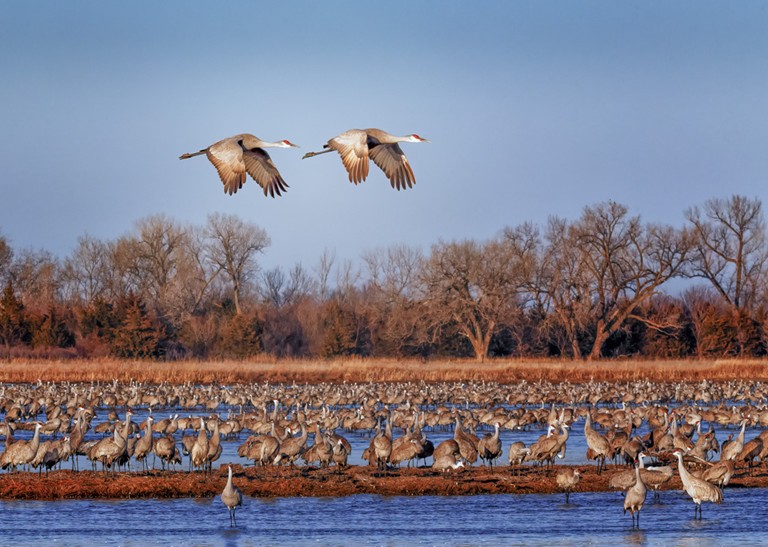
Gary - this is a nice image but it appears canted to the right so I straightened it in my VF. As far as ideas to improve the shot, I would reduce the amount of water in the foreground and increase the amount of sky above the scene - see my VF. Please note, the two main structures, i.e., the building in the center and the building on the right appear to lean into each other, that is, they do not appear parallel to each other and I have no ideas about that.
|
Dec 10th |
 |
| 73 |
Dec 24 |
Comment |
A beautiful and visually interesting composition, the image is technically spot on and is very creative with the long exposure - I love how you bring the viewer into the frame and lead him or her to your COI - this is just an outstanding photo that I would hang on my wall - nice job Ian, truly a nice job on this, there's nothing I would even consider changing. |
Dec 4th |
4 comments - 1 reply for Group 73
|
| 97 |
Dec 24 |
Comment |
Thank you Kathleen - I agree, many images appear soft when using the PSA rez limit - don't know why they limit us, but I suppose there's a reason. Anyway, thanks again for your kind words. |
Dec 11th |
| 97 |
Dec 24 |
Comment |
Thanks for the explanation Peter - lovely shot!
|
Dec 7th |
| 97 |
Dec 24 |
Comment |
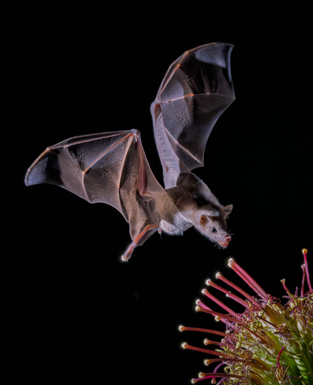
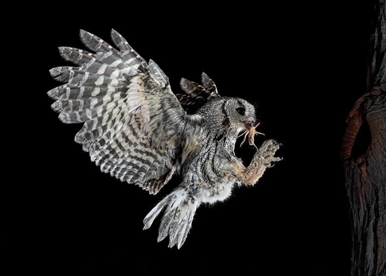
Exquisite detail, catch light in both eyes and classic off-center composition. Peter, another outstanding image from you but let me ask a question - the subject's tail feathers are a bit soft, so do you think that would militate against you in a salon competition? |
Dec 7th |
| 97 |
Dec 24 |
Comment |
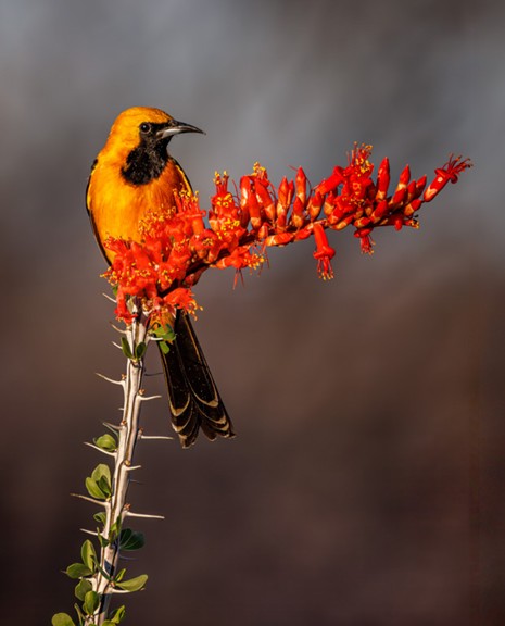
Kathleen, you did a great job with the capture and captured the subject's wings in a perfect position - nice job - in my VF I sharpened and brightened the subject's eye, darkened the background and removed some of the branches as I thought they distracted a touch from your subject |
Dec 7th |
 |
| 97 |
Dec 24 |
Comment |
I KNEW there was something I didn't like - Roy, you nailed it!:-) |
Dec 5th |
5 comments - 0 replies for Group 97
|
18 comments - 4 replies Total
|