|
| Group |
Round |
C/R |
Comment |
Date |
Image |
| 7 |
Nov 24 |
Reply |
Good thought, thank you Hoshedar |
Nov 26th |
| 7 |
Nov 24 |
Comment |
Thanks Barbara - yes, I know the clouds are oversharpened everyone agrees ;-) - appreciate your comments |
Nov 15th |
| 7 |
Nov 24 |
Reply |
I agree with you - the S curve adds interest and it leads the viewer into the over-processed clouds :-) hence the title of the image - but all opinions welcome |
Nov 14th |
| 7 |
Nov 24 |
Comment |
Barbara - I shoot with an R5 - here's a link to the best tutorial I've found https://www.youtube.com/watch?v=bpNGsmvqhJ4 - lmk if that helps bmazz68@icloud.com |
Nov 14th |
| 7 |
Nov 24 |
Comment |
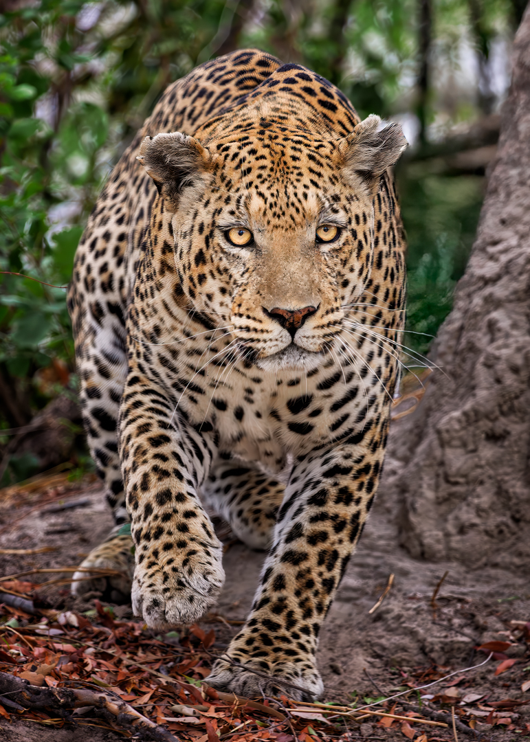
Hoshedar - when environmental portraiture is done well it's spectacular. Good photos begin with good subject and this is pretty close to perfection when it comes to impact and visual interest. To answer your question, I'm not skilled enough in PS to do this image justice but in my VF I "tried" to give you and idea of how you could take full advantage of the subject by separating your subject from a distracting background. I canted the image slightly to take advantage of the bow, as I thought it might have more impact if it led the viewer's eye more towards the upper right corner of the frame instead of off to the side - wow, this image is dynamite - in my VF I also brightened/whitened the subject's eye sclera and teeth |
Nov 10th |
 |
| 7 |
Nov 24 |
Reply |
I should have added I learn something from everyone, so please, no need to hold back. You were right, this is overprocessed and I learned something about going back and forth between LR and the Nik Suite, so thank you. Also, re: your comment about expecting a particular point of interest, I had hoped my title gave that away, i.e., Into the Storm - I hoped the viewer would find impact in the BxW clouds and visual interest in the S curve road leading into the storm. I'm a photo club guy and I make no bones about it and this is how I can get feedback before entering. Also, this is a discussion group, and you raised an interesting point about expecting a particular point of interest at the end of the road; I'd love to get other comments on this, it's an interesting topic - again, thanks for the review |
Nov 9th |
| 7 |
Nov 24 |
Comment |
Nothing to be sorry about - everyone has their own perspective - that's how we learn and why I belong to DD groups |
Nov 9th |
| 7 |
Nov 24 |
Comment |
Gaetan - this is a nice shot and an interesting subject that creates a soft and peaceful mood. There are a couple of distractions in the upper left you might want to clone out and the yellow palm fronds along the top left of the frame. I think the viewer has a tendency to move his or her eye from the subject to the water to the right and above the subject so in my VF cropped in, denoised, upscaled, and sharpened - then I placed a slight vignette on the image as whole and lastly flipped horizontally so the viewer could let his or her eye travel from lower left to upper right instead of vice-versa |
Nov 8th |
 |
| 7 |
Nov 24 |
Comment |
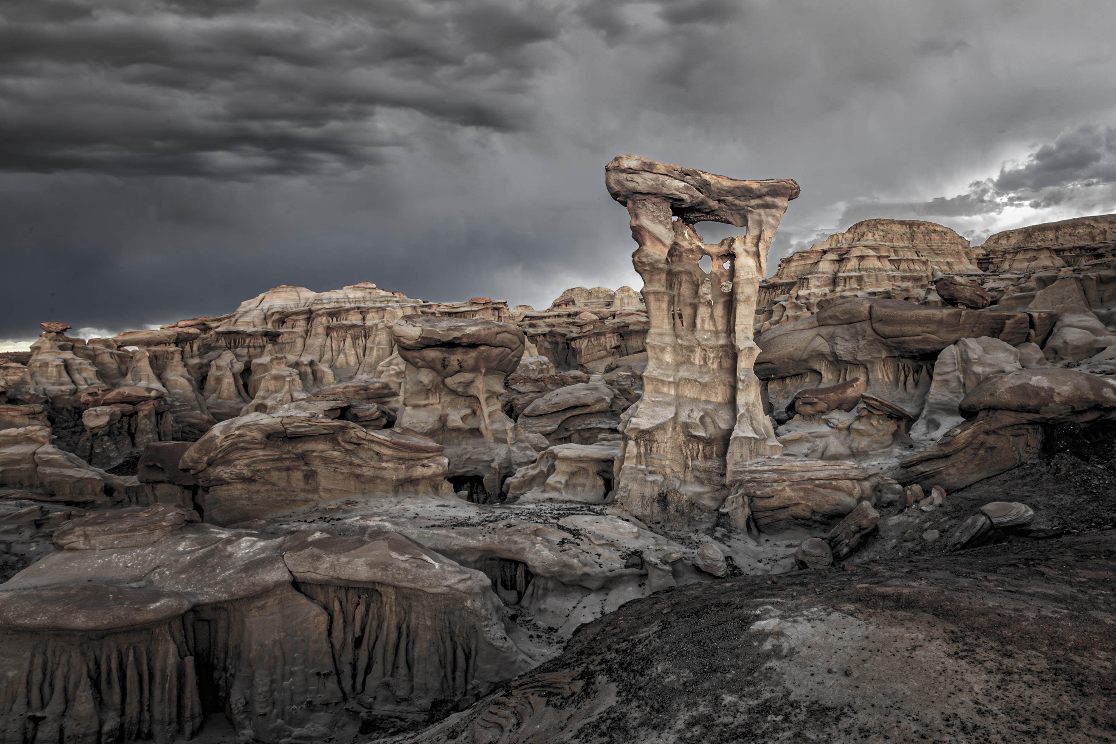
Tom, this is a strong image, with a lot of powerful elements, but I think you could have chosen a title more reflective of what's in the frame. As you know, just like a watermark, the title becomes a part of the image and "A good title should reflect what the viewer (or a judge) sees in the frame; and is descriptive to the point that it piques the viewer's/judge's interest and draws him or her into the frame."
Your title is Seul Choix Point Lighthouse, so naturally my mind's eye began looking for a lighthouse, but the lighthouse itself is one of four (4) eye-grabbing features in the image, i.e., the partial fir trees on the left, the rock wall the stops the viewer's eye from going thru the frame, the red house that occupies the most prominent position in the frame, and of course the lighthouse itself.
Nonetheless, this is a boffo image that captures the scene beautifully, but you might consider re-titling it to better reflect what the viewer is looking at or re-composed to reflect the current title - see my VF
This isn't nitpicking - this is a digital discussion group, and I want to initiate a discussion about an overlooked part of photography. As noted, I love the image and if it were a special place for me, I'd be proud to put the image as shot on my wall - but with a title more reflective of what's actually in the frame.
Having said all that, As a photograph, I like your image as presented better than my VF version, but would change the title. And lastly and for what it's worth, I have a 40-minute presentation called "33 Hacks to Improve Your Scores in Club Competitions" posted on Club Hubthat and this is hack #26. I hope others weigh in on topic.
|
Nov 8th |
 |
| 7 |
Nov 24 |
Comment |
Absolutely stunning. If you ever have the chance I'd love to know how you created that image - creative, simple and evocative. |
Nov 7th |
7 comments - 3 replies for Group 7
|
| 73 |
Nov 24 |
Comment |
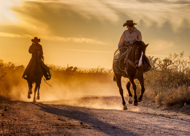
If I lived close by I'd go back again and again and shoot this scene 7 ways from Sunday. Your placement of the city off center was a good choice, having said that, had you taken a step or two your right, you could have avoided the merger between the tower on the GG Bridge and whatever bright light source is just to the right of it and still kept an interesting relationship between the GG Bridge and the light of SFO - your technical work was outstanding, nice job |
Nov 26th |
| 73 |
Nov 24 |
Comment |
Peter - most creative. When I look at the image I find it a two step process - the leaves you used as a frame and the mountain scene - I cropped in a touch in my VF |
Nov 26th |
 |
| 73 |
Nov 24 |
Reply |
Thank you Gary |
Nov 26th |
| 73 |
Nov 24 |
Reply |
Thank you Ian, much appreciated |
Nov 24th |
| 73 |
Nov 24 |
Comment |
Thanks for your comments Sherry |
Nov 22nd |
| 73 |
Nov 24 |
Comment |
Sherry, this is lovely as shot and as your comments suggest, you captured the feeling or emotion that was important to you. Can't ask for more. When I'm reviewing image in either a study or discussion group I approach the image as if it's been entered into a club competition, so, I cropped, sharpened and added both contrast and a vignette and feel it might score better if entered into a competition - see my VF |
Nov 8th |
 |
4 comments - 2 replies for Group 73
|
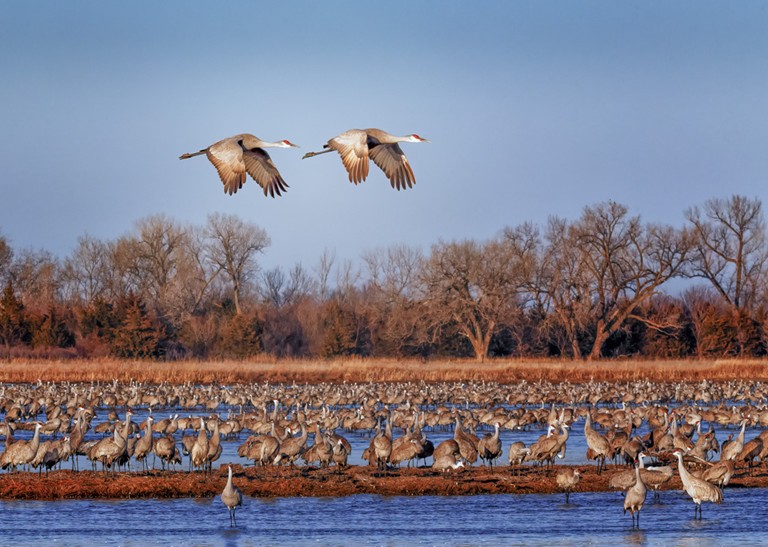
| 97 |
Nov 24 |
Comment |
An excellent image technically and compositionally - the diagonal composition adds needed energy to the image, but it still lacks drama such as a prey in the frame or interaction with its environment, or a more dramatic sky. That said, it's still an excellent capture and a great job in post |
Nov 26th |
| 97 |
Nov 24 |
Reply |
Thank you Peter - everything was outdoors and it took much experimenting to get the light 'right' and I'm still not sure I did although your comments made me feel good about the it :-) |
Nov 11th |
| 97 |
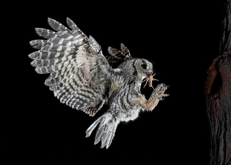
Nov 24 |
Comment |
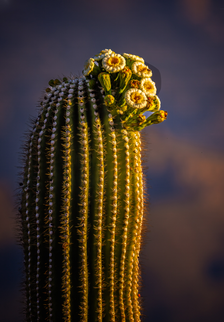
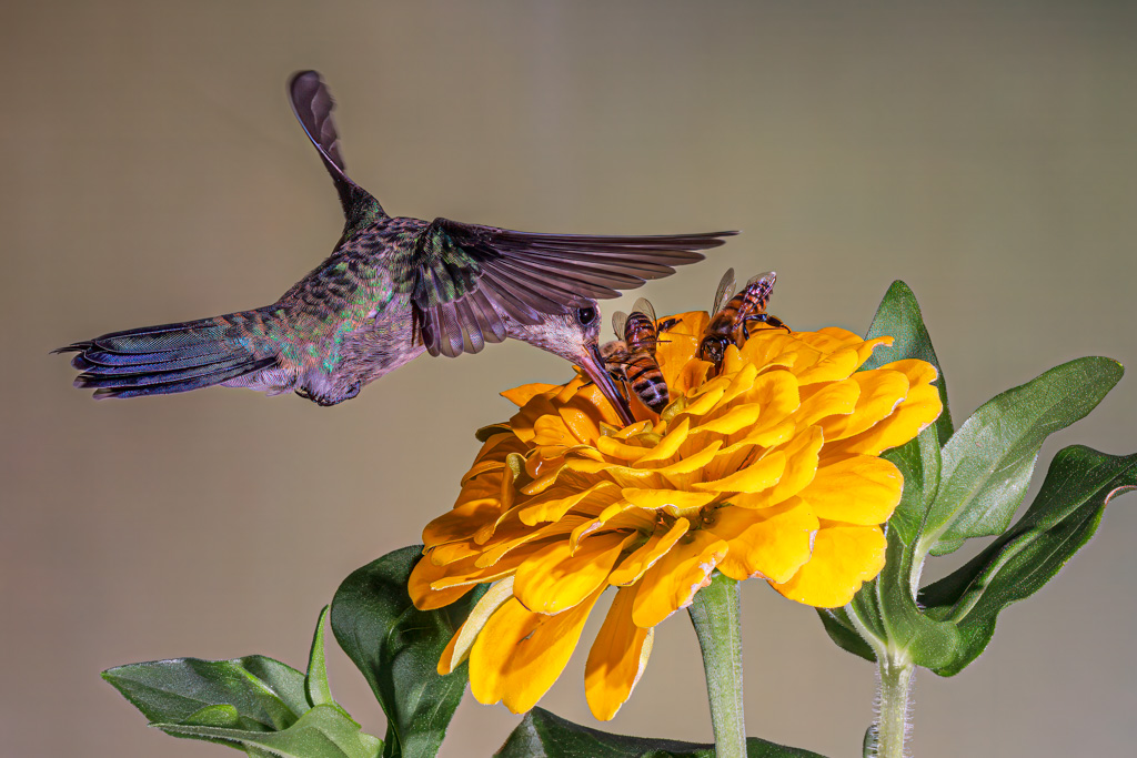
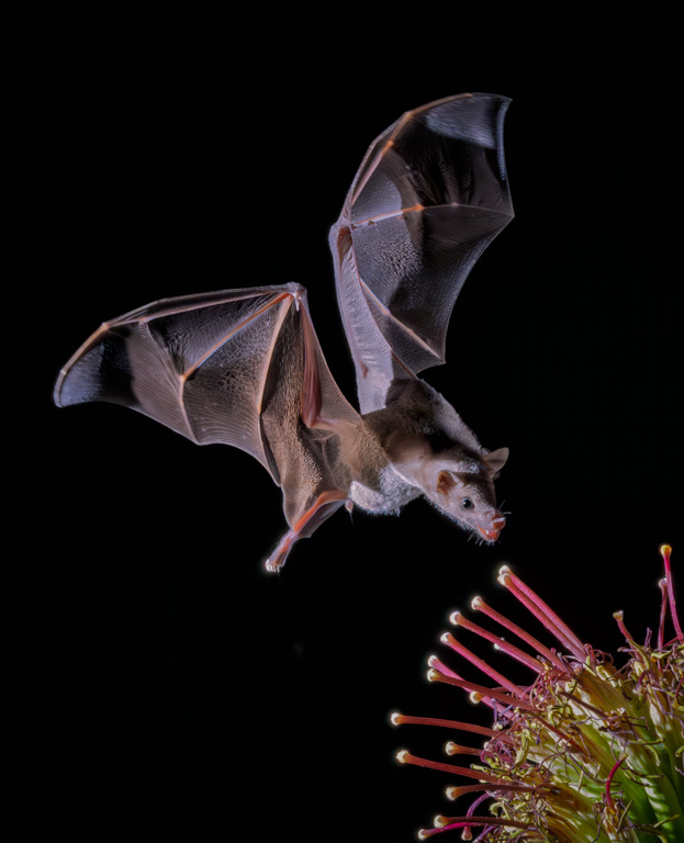
Catch light is critical with wildlife - that's why I had four flashes surround the flower |
Nov 10th |
| 97 |
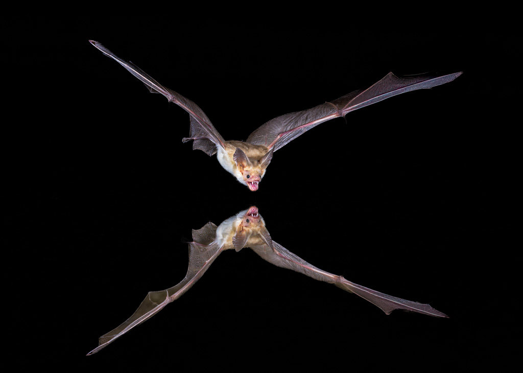
Nov 24 |
Reply |
I've seen soooo many humingbird shots I wanted something different, an interaction or at least a proximity of two species - if was fun doing it :-) |
Nov 10th |
| 97 |
Nov 24 |
Reply |
I took PSA's image analysis course several years ago and followed that up with another course on making photos for international competitions - and here's what I took away from it - and I live by it now.
Impact, Visual Interest, and Storytelling are the fundamental characteristics that most often succeed in competitions; thus, these three aspects of an image need to be the hook that grabs and keeps the viewer's attention and outweigh any minor technical deficiencies.
1. Impact - is the ability of an image to immediately grab the viewer's attention.
2. Visual Interest - Is a matter of subject selection, for example, an image of a Bengal tiger is going to be far more interesting than a similarly composed image of a common housecat. Visual interest means the subject itself must be something that a uniformed viewer will take the time to study and consider.
3. Storytelling is a first cousin to visual interest and conveys the emotion and significance of the moment.
BTW, I love the shot :-)
|
Nov 10th |
| 97 |
Nov 24 |
Reply |
I see your point Roy, and for years I did the same thing, and for years judges dinged my images in competitions :-) - a good image is one that you like, so go with it, but when I review I review as I do when judging at photo clubs. |
Nov 10th |
| 97 |
Nov 24 |
Comment |
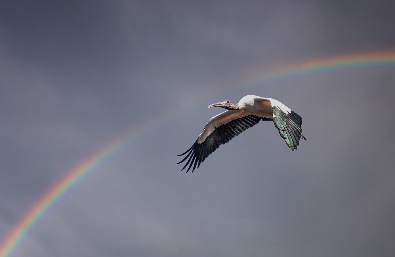
Capturing backlit bird with wings spread is very special - you did a really nice job. That said, I thought the image a bit busy and too contrasty - in my VF I tried to clean up the lower left of the image and also darkened the background. |
Nov 10th |
 |
| 97 |
Nov 24 |
Reply |
1976! Whoa, you're still a young man :-) - Wasn't Pax River a haven for Navy test pilots? For me, MCAS New River, USS Boat, Vietnam, Camp Lejeune and discharged in '71 |
Nov 10th |
| 97 |
Nov 24 |
Comment |
Sylvia, you did a really nice job of capturing the subject in flight. I have to ask, did you add a vignette of some type because when I enlarge the image the corners all appear a touch darker - perhaps it's my screen or PSA's resolution, don't know but it appears that way. I do a bit of judging and will tell you that IMO the subject's wing position is about perfect. Regarding the crop however, most judges that I know prefer to see the entire subject unless there's really something special going on with subject's beak or bill, e.g., an open bill or carrying material for its nest, or a fish to feed its young, etc. I can no longer see Roy's crop - it was there when I opened the image but suddenly it's gone - that's happened to me as well, probably a glitch in the system - but from what I remember, the right wing is too dominant when it's tightly cropped which loses one of the two biggest assets of the image, its graceful wing position. Just a thought |
Nov 10th |
| 97 |
Nov 24 |
Comment |
|
Nov 10th |
 |
| 97 |
Nov 24 |
Comment |
Great capture Roy - I have a couple of comments but let me first qualify my review inasmuch as I approach reviews as if I'm reviewing a photo club competition.
As I said, excellent capture, especially with the subject's beak open - classic! That said, judges usually want to see the entire subject and I don't think the clipped wings help your story, which is a good one btw, but it doesn't help. I feel the image is 'a touch soft,' although I'm amazed at how sharp you did get it at 1/800th second - nice job. Nonetheless, I did sharpen it in Topaz Sharpen I don't live there so I could be way off base, but the blue sky doesn't look quite natural to me, so I softened it a touch by reducing saturation. You're also dealing with a rather harsh shadow on the back end of the subject, which is a distraction - the same shadow under left wing isn't as distracting. Nonetheless, as a nature story - it's absolutely outstanding. |
Nov 10th |
| 97 |
Nov 24 |
Comment |
Just about perfect - a 10 on a 10 point scale! In my VF I cropped in a bit tighter than you did - just a suggestion. Really a nice job. |
Nov 10th |
 |
| 97 |
Nov 24 |
Comment |
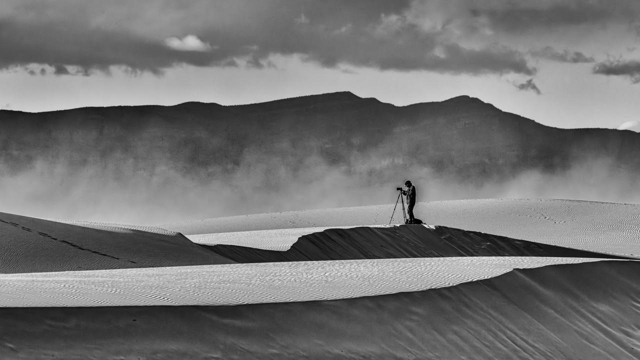
Enro - I thought the subject needed to be brightened so I opened the shadow and highlighted its eye - I also removed some messiness in the upper right and added quite a bit of contrast as I thought you needed a bit more detail in the snow. I left the object in the upper left purposely because without it, the image lacked depth. |
Nov 10th |
 |
8 comments - 5 replies for Group 97
|
19 comments - 10 replies Total
|