|
| Group |
Round |
C/R |
Comment |
Date |
Image |
| 7 |
Sep 24 |
Comment |
Rich - thank you for your kind words |
Sep 28th |
| 7 |
Sep 24 |
Comment |
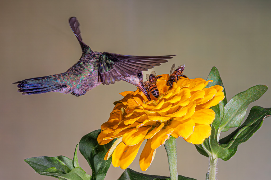
Thanks for your comments Barbara - I took about 2,000 shots and have 16 keepers - the only images I kept had both birds & bees, hence I titled the collection "Butch's Birds & the Bees Collection" - don't know if, when or where I'll ever use them but it was fun setting it up and shooting - you're spot on about the hummers avoiding the bees, which is why I loved the shots of two species interacting - I've attached another favorite since you liked this one - except on this image I changed the backdrop |
Sep 22nd |
| 7 |
Sep 24 |
Comment |
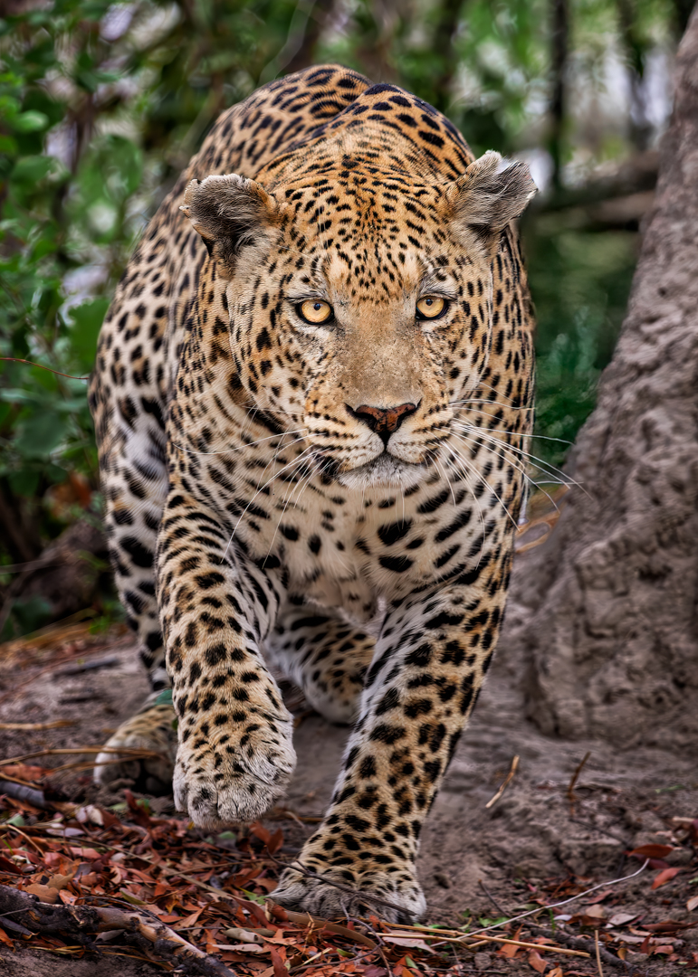
Judith, thank you for your input and the time & effort to improve the image. Ironically, two days ago I walked through the gallery at PSA's Photo Fest here in Tucson and the images blew me away. Having said that, what these premier images illustrated was that Impact and Visual Interest are the fundamental characteristics that most often succeed in competitions; thus, these two aspects of an image need to be the hook that grabs and keeps the viewer's attention and outweigh any minor technical deficiencies, with Impact being the ability of an image to immediately grab the viewer's attention, and Visual Interest being a matter of subject selection. For example, an image of a Bengal tiger is going to be far more interesting than a similarly composed image of a common housecat. Visual interest means the subject itself must be something that a uniformed viewer will take the time to study and consider. And in wildlife photography, "Story is King" and interaction between species is usually the first consideration of judges. Having said that, after looking at your VF, I went back and lightened the background on my image it answered my question for me - see my revised image and how I'm going to submit in my photo club competitions
|
Sep 22nd |
 |
| 7 |
Sep 24 |
Reply |
I agree about the natural aspect but I will submit to my club competition in the Captive & Controlled category - I will quote Larry Treadwell who oversaw PSA's competition & exhibition course that I took about a year ago "Impact & Visual Interest are the fundamental characteristics that most often succeed in competitions; thus, these two aspects of an image need to be the hook that grabs and keeps the viewer's attention and outweigh any minor technical deficiencies. Having quoted Mr. Treadwell, I welcome alternative viewpoints and hope others offer their opinions too - |
Sep 19th |
| 7 |
Sep 24 |
Comment |
Gaetan, thank you so much for your comment - you raise an excellent artistic point and I hope others join in with comments. Allow me to explain my thinking - I believe "standard" formats (if there is such a thing) i.e., 5x7 and 4x6 formats are more pleasing to the eye, especially in landscape and wildlife images. So, unless I'm doing a pano or a square crop, I try to use one of those two formats. In this case, using either 5x7 or 4x6 places the center of action in the center of the frame. And with regard to centering a subject I'm a follower of Rick Sammon's hack on centering your subject, that "dead center is deadly" so I usually refrain from centering my subject or center of interest because when an subject is centered the viewer tends to look around the frame, whereas when the subject is placed off center the viewer's eye tends to focus on the subject - it's one of the reasons for the rule of thirds. In this case, keeping the entire leaf on the right pretty much forces me to place the action in the center of the frame and I did not want to do that. Additionally, since the flower was cropped from bottom and much of the stem and other leaves are also cropped and the leaf on the right is not essential to the story, I thought it made for a better composition to retain the 5x7 format and crop a touch of the leaf. Having said that, I've attached the full frame image so any of the group can play with it and see what they feel works best, as I said, you raise a VERY interesting artistic point and I think that's what these DD groups are all about - well done, thanks again. |
Sep 19th |
|
| 7 |
Sep 24 |
Comment |
Rich, I don't know either - the image has immediate impact, which is what we want, but at the same time, I can't see the tiger's eye, and the subject lacks clear separation from the background and if you had not mentioned 'grooming' I would never have guessed a tiger had a tongue that long - that said, to me, impact and visual interest are the two most important aspects of a photo and you nailed the impact part - good for you that you tried with a captive subject. |
Sep 11th |
| 7 |
Sep 24 |
Comment |
The most positive thing I can say about this image is that I find it "most interesting" - I think it 'violates' a couple of 'rules' (bicycle tire a bit close to the edge of the frame and a few distracting elements around the edges) but to me it makes no difference - I think the fact that you made me WANT to look at this image says it all - nice job - A+ |
Sep 11th |
| 7 |
Sep 24 |
Comment |
This could be a spectacular image - but Athena's right leg appears grossly distorted - but other than her legs this is a dynamite image in my opinion |
Sep 10th |
| 7 |
Sep 24 |
Comment |
Beautiful image Barbara - great composition and you really did yourself and your viewers a favor by ensuring the tree did not merge with the butte in the background - if I'm judging a photo club competition this gets a 10
Interesting subject, excellent composition including how you lead the viewer into and thru the frame, well-done technically and outstanding light! Kudos |
Sep 10th |
| 7 |
Sep 24 |
Comment |
I like the red against the white as well - what I cannot ascertain is how much detail is in the snow, but I suspect that's due to the rez we use. In any event, I really like this image, it's simple, clean and tells a story - nice job Tom |
Sep 10th |
9 comments - 1 reply for Group 7
|
| 73 |
Sep 24 |
Comment |
Ian - Export the image to your desktop or wherever you keep your images before emailing, then open in your Preview, then go to Tools and you'll get a drop down menu, then annotate, then choose the arrow as I've done in my VF - your eyes are much better than mine so please show me. In any event, I fail to get your point. What is it about the quality of the photograph that you're trying to improve? |
Sep 24th |
 |
| 73 |
Sep 24 |
Comment |
Ian - I appreciate your comments but I'm curious, what gave the impression this was a location where boats could shelter from the open ocean? The sign on the road to the area read, "Ko Olina Lagoon straight ahead", not Ko Olina harbor. Also, I cannot find the sign/marker you speak of. There's "something" out there, perhaps it's the mast of a catamaran a sailboat or perhaps it's a fishing or diving boat, who knows, but even at 200% it's not identifiable - but whatever it is, I didn't notice it until you pointed it out, and since it's not identifiable and almost miniscule my question is why bother. I guess if I were submitting to an international competition I'd review the image with a magnifying glass, but as I've written - Impact and Visual Interest are the most important aspects of a photograph and far outweigh any minor technical deficiencies even thought I'm not even sure this is a deficiency - obviously you feel differently, but in either event, thank you for taking the time to comment |
Sep 23rd |
| 73 |
Sep 24 |
Comment |
I went to flight school in Pensacola and for years my wife and I traveled to Sarasota on the West Coast or St. George Island on the panhandle and I/we much prefer the Gulf side of the state. Unfortunately, when we traveled to Hawaii I did not possess the skills I have now so I missed a lot - Hawaii abounds with photo opportunities, and in my opinion far, far more than Florida. Florida is a lot less expensive and easier to get to but Hawaii can be a photographer's paradise - I just missed it :-( |
Sep 12th |
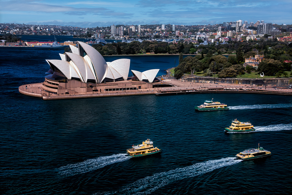
| 73 |
Sep 24 |
Comment |
If I were to travel to Australia this is the image I'd have hanging on my wall at home - I did make a few modifications in my VF - 1) I added a wake behind the second from the bottom ferry, 2) I'm not a fan of pure blue skies so I added some clouds for texture in the upper part of the frame, 3) I also added contrast to increase the texture of the water, 4) and added a very slight vignette centered on the ferries in the harbor and lastly 5) I warmed the image using the skylight filter in Color Efex Pro in the Nik Suite - while this may sound like a lot, it's really not - this is such a dynamite image I just wanted to fine tune a bit. |
Sep 12th |
 |
| 73 |
Sep 24 |
Comment |
Great concept for a composition Gary - isolate a stationary subject against a moving background. And kudos for shooting this hand held at 1/4 second. A thought: if you're versed in PS, the next time you try something similar you might consider taking two shots, say one at 1/200th second to get the object tack sharp and blending it with a second file shot a full second or even longer, but to have smooth rushing water and a tack sharp COI is most creative. In my VF I used the motion blur filter to accentuate the movement of the water then cropped in and cleaned up the growth to the left of the main plant and opened the shadows on the shoreling to give you an idea of what I tried to illustrate |
Sep 12th |
 |
| 73 |
Sep 24 |
Comment |
Perhaps the most dramatic image I've ever seen of Mt Kikjufell - in my VF I darkened the white strip of land across the lower left of the frame - just spectacular Peter |
Sep 11th |
| 73 |
Sep 24 |
Comment |
Simple elegance! Beautiful Sherry, just beautiful. |
Sep 11th |
7 comments - 0 replies for Group 73
|
16 comments - 1 reply Total
|