|
| Group |
Round |
C/R |
Comment |
Date |
Image |
| 55 |
Apr 24 |
Comment |
Second try to post my VF
|
Apr 25th |
 |
| 55 |
Apr 24 |
Comment |
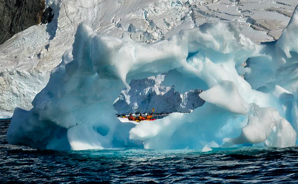
Let's begin with the fact that you did an absolutely outstanding job shooting from an ocean kayak - kudos!
Technically this is very well done and I'm assuming from your comments that your 'story' is the other boat, even though your title is "Antarctica" - The impact and visual interest of this image comes from the framing of your subject through the ice. With that in mind, I cropped in a quite a bit and added a slight vignette to focus the viewer's eye on the what I thought was the subject, i.e., the other boat. |
Apr 25th |
| 55 |
Apr 24 |
Comment |
Alec, I think you said it all - "I was struck by the geometric shapes and interesting lighting" - I think so too - this is simply a fun image and a great abstract. I do a bit of photo club judging and this would score well in my book - great eye! |
Apr 25th |
| 55 |
Apr 24 |
Reply |
Glad you found success with LR's Enhance - and thank you for you comments Alex |
Apr 16th |
| 55 |
Apr 24 |
Reply |
Rick, thanks for your comments, but I use LR Enhance as much for the RAW details as I do the noise reduction - even when I'm shooting with a low ISO, say 100 or 200 I can still notice that the DNG is 'clearer' in all aspects - IMO it just makes a better image - with Topaz' improvements, noise can be handled in different ways but by Enhancing I'm addressing the entire image.
Good luck when you get to Arches :-) |
Apr 16th |
| 55 |
Apr 24 |
Comment |
Rick, first of all the image has great impact and clarity, it's bold and holds the viewer's attention. Technically it looks pretty darn good, but I do agree with Zina about the dark prow, it's an eye-grabber, which is a shame because even by opening the shadows it still grabs the eye. I agree with Lori that I believe the image would be improved with a different crop assuming you cropped up. As it is, I think the image would benefit from more real estate along the bottom of the frame and lastly, there's a hand of man tower or poll almost dead center that also grabs the eye and I would eliminate that. I realize that's a lot of nits to pick but I believe a photo club judge would ding it for those items - but it doesn't negate the fact that you captured a very powerful image |
Apr 15th |
| 55 |
Apr 24 |
Comment |
Glad you enjoyed the tips |
Apr 14th |
| 55 |
Apr 24 |
Comment |
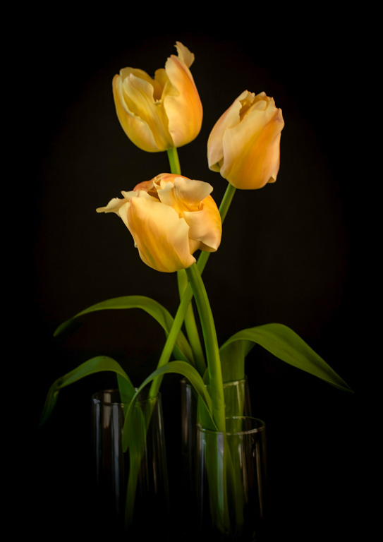
No laughing here, you did a great job with natural light but I think you short-changed yourself - you have two powerful colors and you might consider 'featuring' them more - I almost NEVER use saturation because I feel it distorts, I usually use Vibrance - however, I did saturate and brighten the tulips and then just brightened the green stems - I can't shoot a flower to save my soul but I like what you've done here.
Re: the Nik Suite - it's my go-to form of post processing. I Enhance, then expand the tonal range in LR by holding down the Shift Key and Double Clicking on the White in the Tone panel in Basic, then hold down the Shift Key and double click on the Word Black and watch the histogram. That's my starting point. Depending upon the situation sometimes I'll continue in LR but many times, especially with landscape images I'll go straight to Nik - just be sure to de-noise first - I use Color Efex Pro about 70-80% of the time, using Tonal Contrast, the Skylight Filter and Darken Lighten Center - it takes some time, but it's a powerful tool and highly recommend it. |
Apr 5th |
 |
| 55 |
Apr 24 |
Comment |
Matt - a beautiful image that I suspect would do well in competitions. I can see Lori's point about the white-water wave in the lower right, however it really doesn't bother me even though I know to never have something brighter than the subject around the edges. I experimented and cropped up to eliminate the white water but then cropped down to make the image into a pano - either way IMO - nice job |
Apr 5th |
 |
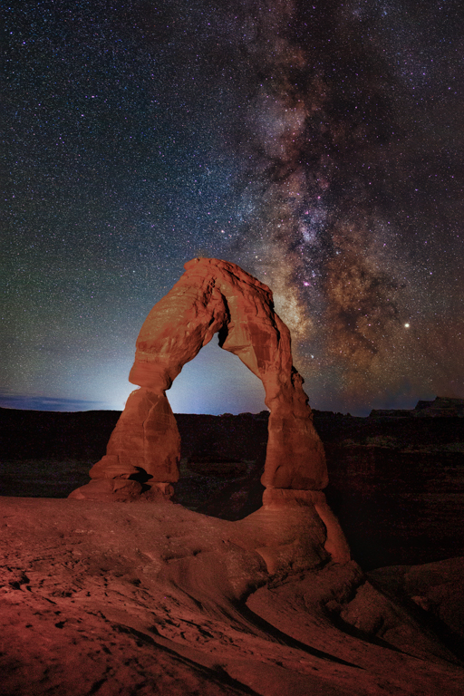
| 55 |
Apr 24 |
Comment |
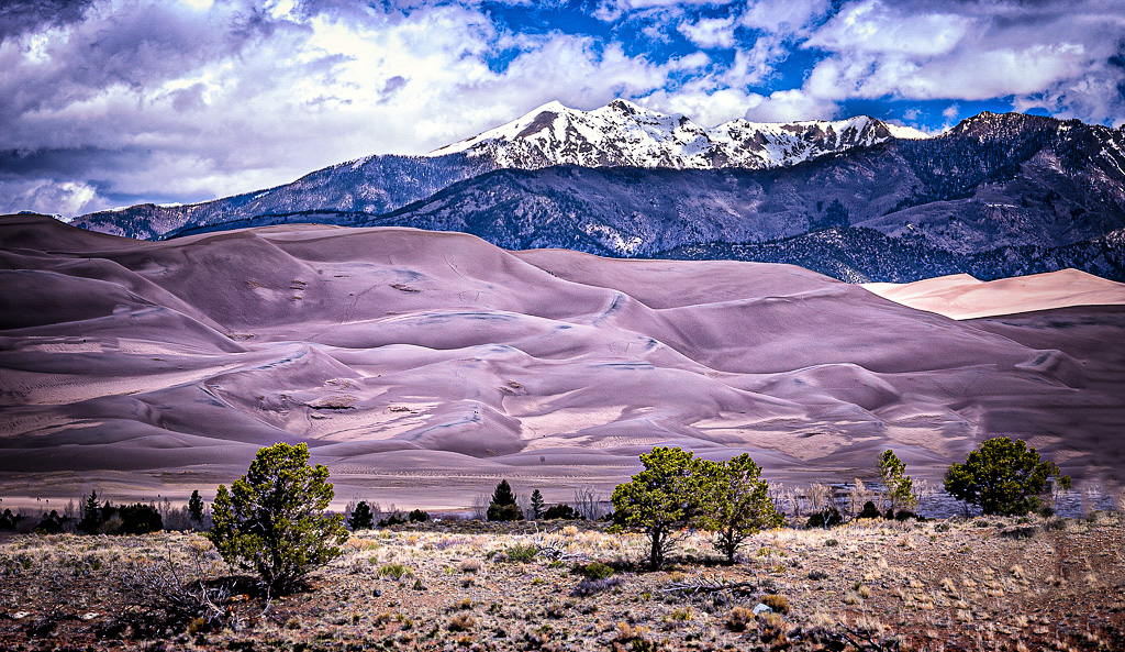
Lori - I really don't know if other parks have instituted the no light painting rule - but Arches is the most popular of the NPs in Utah to the best of my knowledge so it's not surprising. Having said that, every NP I've gone to out west is more crowded today than it was when I first started shooting - and the Slot Canyons are in my opinion THE most restrictive - But if you have the chance, Arches is an easy park to visit plus it's right there, just outside Moab so a 10 minute drive back to your motel - thanks for your kind words and hope you get the chance to shoot it |
Apr 5th |
8 comments - 2 replies for Group 55
|
| 73 |
Apr 24 |
Comment |
Thank you Dave, your comments are appreciated - Best
|
Apr 28th |
| 73 |
Apr 24 |
Comment |
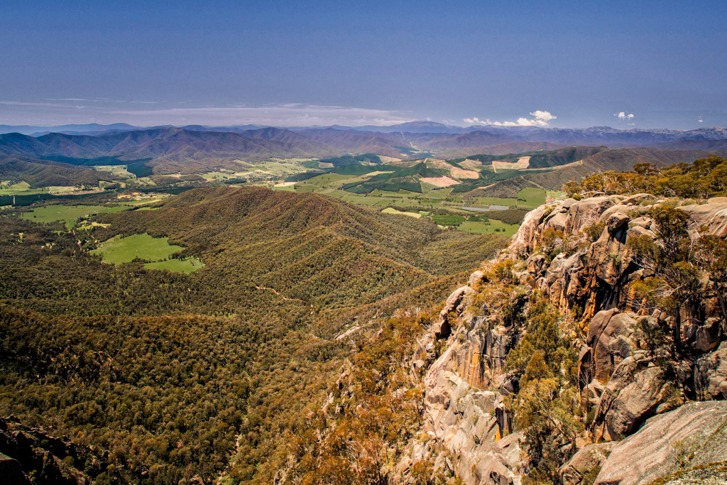
Layers, layers, and layers; I count six (6) from the foreground to the sky. Getting six interesting layers with detail in each is rare, so kudos for the effort, a really nice job. Having said that, if you're going to submit into a photo club competition you might consider a few minor modifications to the composition beginning with the foreground. It appears you darkened the lower edge of the image - So, first, you might consider lightening the darkened area so it looks a bit more natural, as it is, it does grab the eye a bit. You also might consider removing the partial foliage (trees, shrubs) at either end of the frame. While not absolutely critical, partial trees seldom add to an image and unfortunately, usually detract. I realize too that removing partial trees can be tricky but I think you can do so with the "remove tool" in PS, or just cropping in so it might be wise to try both since cropping in will change the pano. Lastly, the sky while interesting it's also an eye grabber and pulls the eye; so again you might consider cropping cropping down a touch. All this may sound like I'm beating you up, but this is such a nice image that it would be a shame to have judge ding it for those minor compositional elements. I had to try to modify the image without PS, and PS would do a better job and I'll send a VF later if I can get it working - but the main point here is you did an outstanding job in creating those layers and I'd hate to see a judge ding the such a nice capture. |
Apr 27th |
 |
| 73 |
Apr 24 |
Comment |
Dhananjay - terrific mood shot - anytime we can capture "atmospherics" as I refer to them, it really gives impact to an image and this is a good one. In my VF I removed some of the distractions as best I could since my Photoshop is down so I had to do it in LR - but hopefully you get the idea - I think it's cleaner without the distractions - I also used dehaze to capture more texture in the mist. |
Apr 26th |
 |
| 73 |
Apr 24 |
Comment |
Terrific capture Dave, just terrific. I've included an option in my visual feedback - sometimes less is more and would like your thoughts on my suggested crop and suggested dodging |
Apr 24th |
|
| 73 |
Apr 24 |
Comment |
Sherry - you took a lot of visual information and composed it beautifully - the deep red flowers could easily have dominated the image but they don't - I appreciate how you left a little blue sky at the top of the frame so the white clouds didn't take me out of the frame - technically spot on as well - lovely image Sherry, thank you for sharing |
Apr 24th |
| 73 |
Apr 24 |
Comment |
Thanks Ian, it was an adventure
Best, |
Apr 23rd |
| 73 |
Apr 24 |
Reply |
I see your point Gary, and I actually gave it some thought but with that said, I prefer 4x6 or pano for landscapes and if I cropped in I don't think the crop would do the scene justice, but good eye and food for thought - thank you Gary |
Apr 17th |
| 73 |
Apr 24 |
Reply |
Thank you Sherry - it was a fun trip |
Apr 17th |
| 73 |
Apr 24 |
Comment |
This is an interesting image with good detail Ian, and I believe you've done a very, very nice job with the composition. That said, you might consider tweaking the technical a bit - I suspect you used the wide angle 20 mm with a polarizer - the give-a-way was the upper right of the frame where color of the sky is distorted- polarizers can do that with wide angles lenses, but I wasn't there so that's speculation. I made a few tweaks to your image as follows and would appreciate your thoughts.
1. Horizon appeared slightly canted right, so I straightened it.
2. I replaced the sky as close as I could to what you had because I wanted a clean sky without the distracting discoloration in the upper right.
3. I thought the green in the image looked a bit unnatural so I played with it a bit to tone it down - I would have loved to have seen the RAW
4. Added Tonal Contrast, Skylight Filter, and Lighten-Darken Center in the Nik Suite
As I said, I would love your thoughts on what I did.
|
Apr 5th |
 |
7 comments - 2 replies for Group 73
|
15 comments - 4 replies Total
|