|
| Group |
Round |
C/R |
Comment |
Date |
Image |
| 36 |
Apr 26 |
Reply |
I appreciate the suggestions. Thank you, Bill. |
Apr 24th |
| 36 |
Apr 26 |
Reply |
Thank you, Adi. Glad it interested you. |
Apr 24th |
| 36 |
Apr 26 |
Reply |
Sure. ISO 500, 100mm but cropped in, f8, 1/600ss. Canon r6 mark 2. Thanks for your comments. I'm going to start paying more attention to the histogram. I have a tendency to stay too much in midtones, I think. Thank you. |
Apr 10th |
| 36 |
Apr 26 |
Reply |
Good idea. Thank you, Barbara. |
Apr 8th |
| 36 |
Apr 26 |
Reply |
That's so interesting. I played with the tone panel in LR, which I had never done before, just to see how it would change things. The histogram is more spread out. This version looks more like a child's depiction of the Grand Canyon, which fits the finger painting theme. I'd go back and start over, but this gave me something to think about. LS������ |
Apr 6th |
| 36 |
Apr 26 |
Comment |
Ah, very helpful. Thanks. |
Apr 6th |
| 36 |
Apr 26 |
Reply |
Thank you very much for your suggestions. I'll try that. |
Apr 5th |
| 36 |
Apr 26 |
Comment |
Adi, The cheerful tents. The beautiful view. The pink sky after sunset. What a setting. I understand what Larry is saying about the lean on the trees on the right. What lens would be a better choice for that scene, I wonder. I'd love to have others weigh in on some concrete suggestions. |
Apr 5th |
| 36 |
Apr 26 |
Comment |
Bill, I love these little streets. And the cat in the foreground really adds to the scene. I looked at the original and can definitely note the improvements you laid out. That blue sky feels authentic to Greece, but it's blue enough in your edit. One little suggestion: There's some kind of a shiny cover under the cat. I'd remove that if you could so that it doesn't compete with the kitty. |
Apr 5th |
| 36 |
Apr 26 |
Comment |
What a cute cottage. I understand how this evokes Peter Rabbit. It's cheerful and that fence--wow. So much fun. I wonder how it would look if you darkened the dark part of the cottage just a little to give it some contrast with the white trim and white fence. Alternatively, you could darken the greens just a bit. A feel good photo. |
Apr 5th |
| 36 |
Apr 26 |
Comment |
Michael, For me the colors are what stand out in this photo. What's interesting to me is that the colors of the sky are dramatic but the sky is soft, allowing for the lighthouse to stand out and be seen since it is sharp and has the nice red to draw your eye. The leading line helps as well to draw our attention to it, of course. I also appreciate the turn that happens on the left so that it isn't just a straight line to the lighthouse. |
Apr 5th |
| 36 |
Apr 26 |
Comment |
This is really helpful for me to see, Larry. As a beginner in the world of landscape photography, I would wonder where to concentrate my attention. I'm drawn to the water coming in sheets from the top of the photo which leads to the spray going down the left side, which I might not notice at first with the white sheet of water coming down. I like the water at the bottom as a place to rest. Following the dark rock from the top, down the left and to the water also makes for a nice curve in the photo. |
Apr 5th |
| 36 |
Apr 26 |
Comment |
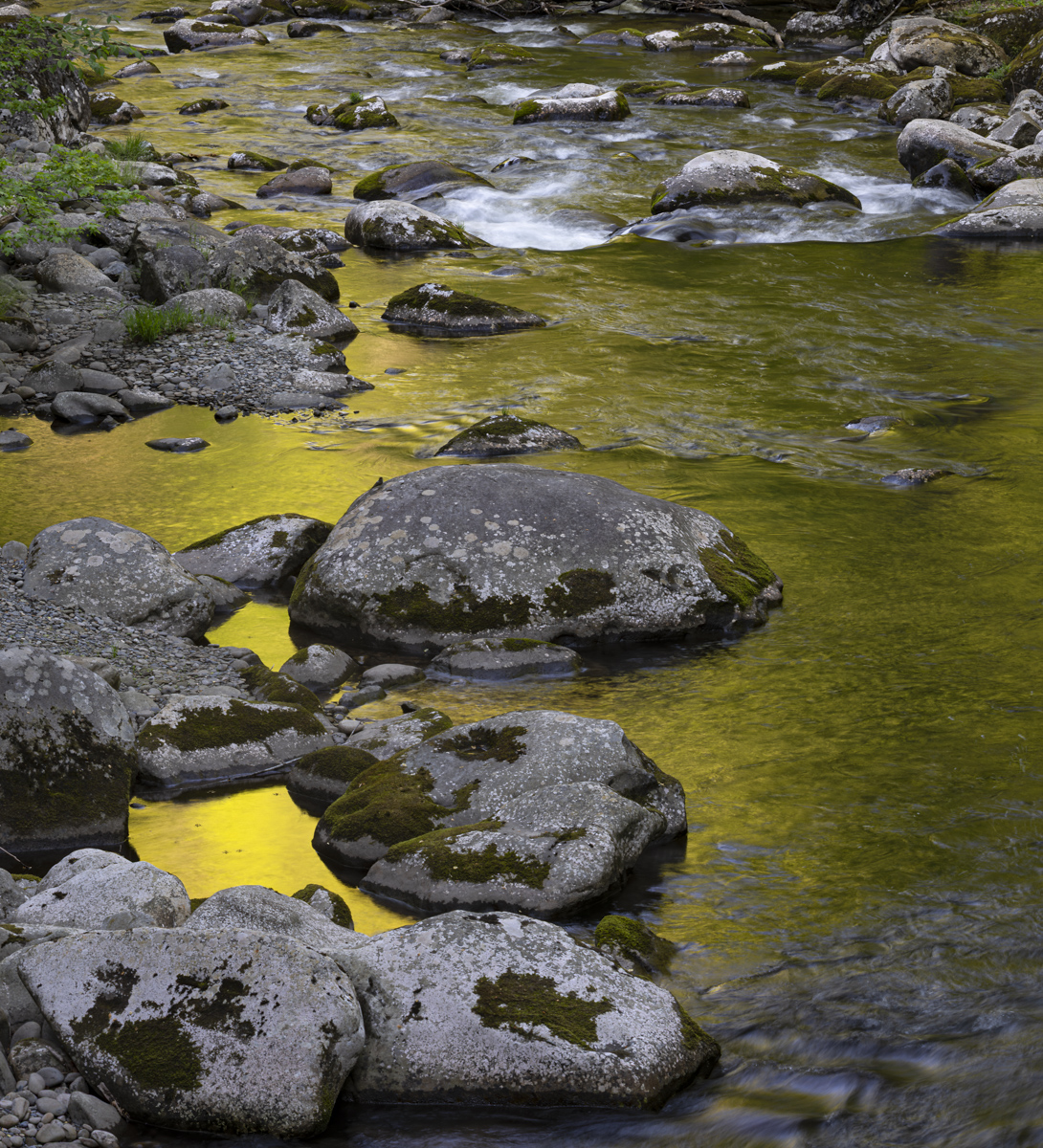
Barbara, First let me say that my eye loves the golden color. Whether I'm looking at a large version or a small version of the photo, it rests easily there. You have the same issue I do with photographing a forest. There's just so much stuff that I don't know what to do with. We live in the woods and it should be a rich studio, but it just hasn't been for me. I'm going to try looking for a tree that has more space around it or a slope so that my eye can travel a little farther. I look forward to more photos from you of the forest to help me figure out what I can do as well. |
Apr 5th |
7 comments - 6 replies for Group 36
|
7 comments - 6 replies Total
|