|
| Group |
Round |
C/R |
Comment |
Date |
Image |
| 12 |
May 25 |
Reply |
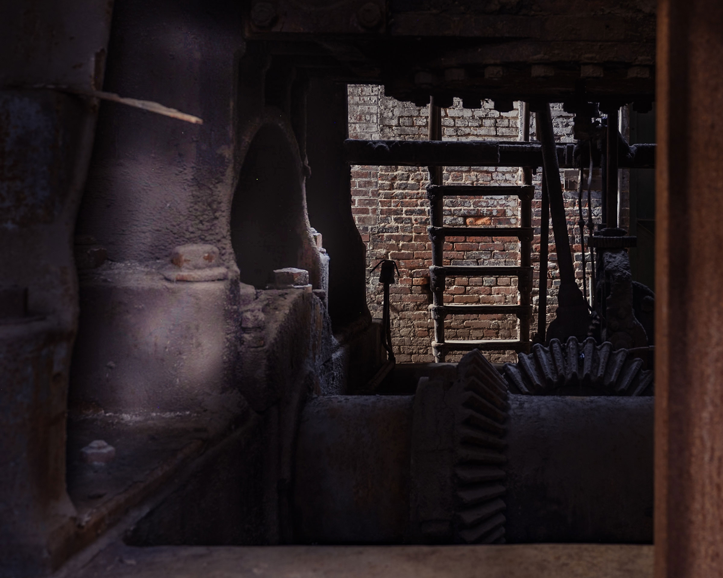
Connie, I think you are in sync with my instructor. His name is Sam Altman if you have heard of him. I love his photographs and I learned a lot from him, but some of his instincts and advice ran counter to what I have learned elsewhere. He was a National Geographic photographer for many years and has won many awards. Perfect example in this photo:: several people were distracted by the cord in the window, including me. But I left it in on an hunch and sure enough he said that added to the whole photo, made it more authentic. He also preached separation of your main elements and the advantages of light grey skies! His belief was a light sky as background lets your subject dominate. And generally do your best to keep as much of your subject above the horizon as possible. |
May 25th |
| 12 |
May 25 |
Reply |
Thank you Ally. See my comments to Lisa above re the background. I do love photographing things that are "well used," and the chess set certainly fit the bill. |
May 25th |
| 12 |
May 25 |
Reply |
Thank you Lisa. Personally I do like the spirit of your crop and the darker background, but our assignment when I took the photo for a class was to combine a still life photo with the outside environment so I think I would have gotten dinged if I deemphasized the background! |
May 25th |
| 12 |
May 25 |
Reply |
Thanks Jarrod, I look forward to seeing more of your photos as well. |
May 25th |
| 12 |
May 25 |
Comment |
Ally - Wonderful colors, and the fruit looks so appetizing! I like what Carole did with the background and agree that the lightened pineapple becomes a bigger part of the story, but in the process that little pop of color in the bottom right of the photo was lost. I would try to keep that if you can; it's blurred but I think it adds a bit to the overall image. |
May 13th |
| 12 |
May 25 |
Comment |
Jarrod, we're so glad to have you join our group! I really like your photo and the wide open aperture that you used; generally lots of blur in a photo feels peaceful to me and I think that works particularly well here with your subject. I can tell that the Bible has been well read; all that worn texture tells a story. You also incorporated nice lines. Looks like you have a winner with your lens! |
May 13th |
| 12 |
May 25 |
Comment |
Lisa, this is a wonderful image. The colors are amazing, and so unexpected for leaves. The textures of what you included are wonderful and you did a nice job of capturing them. I agree with Bunny that the uneven lighting gives everything more interest. That wood that runs along the top of the image is as interesting as the leaves because of the texture and light. |
May 13th |
| 12 |
May 25 |
Comment |
Connie, very cute idea and well arranged. I don't know if you did it intentionally, but I also like the fact that the main colors in the image are orange leaves and the bluish tones of the chicken heads and tail feathers.
It is great to have a collection available to pull things like this together in a photograph; I have a husband who likes to collect things and have a love/hate relationship with all of it. I don't really like having to store so much "stuff," but I admit I regularly raid it when it's time to take a photo. |
May 13th |
| 12 |
May 25 |
Comment |
Bunny, I like your selection of items to include in this still life--the flowers seem particularly well chosen to go with the rest of items in your image, and together they all create a lovely story about ballet, classical music, and beauty. I am also generally a fan of natural light when you can do it.
Did you cover the idea of leaning towards keeping the number of objects in a still life at an odd number in your class? I have heard and read that in a few places, and my gut tells me it's good advice. Based on that I might have considered removing one of the pages of sheet music and arranging the violin so that the neck perhaps at least touches the music in the image to tie all the items together. |
May 13th |
| 12 |
May 25 |
Comment |
I love to see your crochet work, and the fact that I can see the detail and the textures of the yarn and the pattern. Count me with the others as far as not including the yarn label in the photo. The mood of the crochet work by itself speaks to handwork and something tiny that was created with love; the yarn label changes the feel completely and makes it feel more like an ad for yarn.
And P.S. love the finished photo you created; I'm impressed that you added something with AI To the background. |
May 13th |
| 12 |
May 25 |
Reply |
Thank you Bunny. I completely agree with you; I plan to reshoot that chess set at an angle (and maybe a different location) where I have to worry less about the background and more about getting a close-up of the chess set. |
May 13th |
| 12 |
May 25 |
Reply |
Thanks Carole. It was a tough assignment; I had to just about lay on my back to get most of the chess pieces above the "horizon line" (the window frame in this case). Also interesting that you mentioned the cord; that is something I considered removing but decided against; our instructor was previously a National Geographic photographer and he seemed to lean in favor of not taking out things that might add to the authenticity of a photograph. We did talk about that cord in the review session and he said that was the right decision. I'm still on the fence about it! |
May 13th |
6 comments - 6 replies for Group 12
|
6 comments - 6 replies Total
|