|
| Group |
Round |
C/R |
Comment |
Date |
Image |
| 12 |
Apr 25 |
Comment |
Bunny and Carole, agreed it does stand out much more. Thank you! |
Apr 29th |
| 12 |
Apr 25 |
Reply |
Thanks Carole. As I told Bunny I'm going to play with this a bit more and I will try your tip about picking a green color and toning the image. I don't do that a lot in Photoshop and it will be a good exercise for me. Sorry for the late responses; Reed's workshop was all-consuming and I'm just now getting back on top of things. |
Apr 21st |
| 12 |
Apr 25 |
Reply |
Good catch on the red, and you are right about the yellow, although it looked green to me - I guess because I knew it was green in reality but the light changed the color. I took it into Lightroom and was unable to come up with anything I liked as much as the original, although I'm going to play with it a bit more. Thanks for the insights. |
Apr 21st |
| 12 |
Apr 25 |
Reply |
Thanks Connie, I agree that darkening the background is an improvement, although I think I would leave enough of it showing so you could still make out the shapes. |
Apr 21st |
| 12 |
Apr 25 |
Comment |
This is a great image, it feels like you were right in front of him. Your timing in capturing his expression was spot on. I agree generally with the comments about increasing contrast between him and the background, although I would avoid making the background so dark that you lose the context. |
Apr 21st |
| 12 |
Apr 25 |
Comment |
This is the kind of photo I know I need to get better at - set up your scene and wait for something to happen. Nice capture, especially that horizontal bolt of lightning. It takes your eye through the entire photo. I might try flipping it horizontally so you have the vertical bolt on the left, then the viewer's eye would travel from left to right across the photo which I have been told is more natural since we read from left to right. The colors in this really work for the subject. |
Apr 21st |
| 12 |
Apr 25 |
Comment |
Bunny, sorry for the tardy comments - I've been on an all-consuming photo workshop but I'm finally starting to get caught up. I love this! Given the content, purple feels so much more appropriate than black and white. The background, your instructor and his reflection in it all work. I actually like the negative space to the right, given the way he's jumping it feels right to me. |
Apr 21st |
| 12 |
Apr 25 |
Comment |
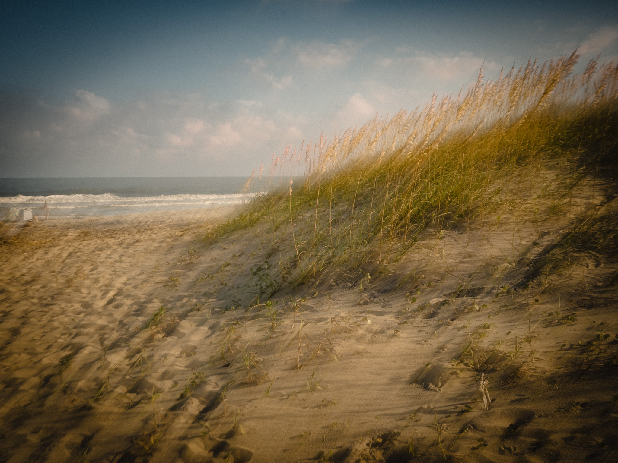
Perfect subject for this, Carole. Isn't it amazing how blue they really are? And the hazy layers are lovely.
Only one suggestion - I would consider taking the branches out completely. They don't really add anything to the photo, and because they are so much darker than the mountains they draw my eye. |
Apr 4th |
| 12 |
Apr 25 |
Comment |
This is great Ally - both the original and the black and white are monochromatic, and your decision to convert to black and white was a good one. I also like the way you let focus get blurry toward the edges; that adds to the feeling of outer space. |
Apr 3rd |
6 comments - 3 replies for Group 12
|
6 comments - 3 replies Total
|