|
| Group |
Round |
C/R |
Comment |
Date |
Image |
| 12 |
Sep 24 |
Reply |
Ally, thank you so much for the comments and for taking time to visit the project. You picked up on the kinds of things I find interesting in these buildings. |
Sep 23rd |
| 12 |
Sep 24 |
Reply |
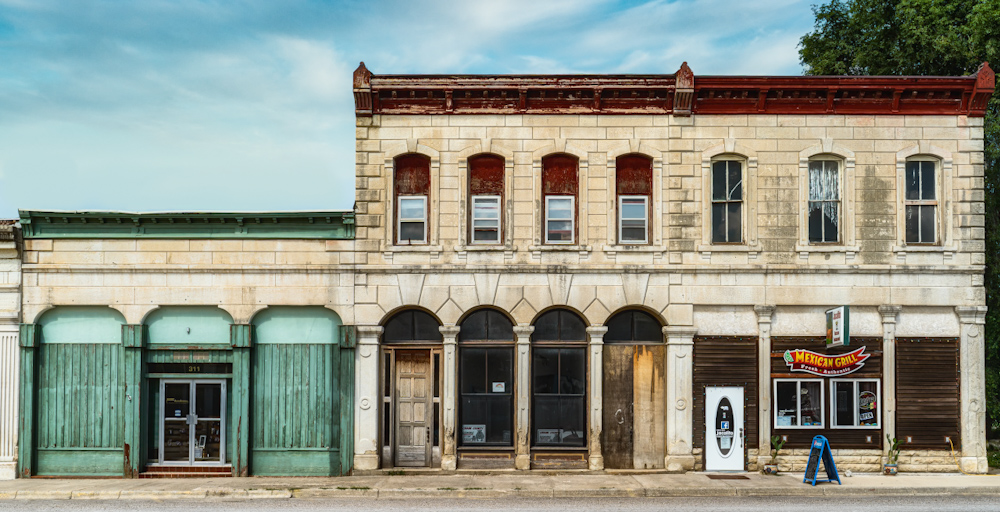
Thank you so much Connie for the feedback. Interesting that you say it has a melancholic feel. I frequently feel that about many of these old buildings, but other times I feel more positive that someone is keeping things maintained and possibly making use of the building. This one seemed to be pretty well maintained although I think the only business operating in the building is the Mexican Restaurant. |
Sep 23rd |
| 12 |
Sep 24 |
Reply |
Thanks Lisa. I like the signs on the right as well; they let you know there is still an active business in the building. |
Sep 10th |
| 12 |
Sep 24 |
Comment |
I am so glad I picked this topic; every one of the photos has been interesting and they are all so different. This is a wonderful piece of architecture, and I particularly like the way you framed it with that curb at the front then that stretch of walkway that leads me to the front door. I find it intriguing that the door seems so small in comparison to the windows above. The sky is just right and adds to the overall somber mood of the photo. I do like the straightened version. Great photo! |
Sep 9th |
| 12 |
Sep 24 |
Comment |
Srijan, a really great photo. I can see that you have a real flare for using color in your images. Tha areas that are particularly colorful draw my eye right where you want it to go - the street and that circle of lights under the arches. That black sky makes a nice counterbalance to all the color and activity going on below.
The only suggestion I would make, and this is a pretty small detail, would be to clone out the car at the left edge of the photo. I didn't see it for a while, there is so much going on in the rest of the photo, but when I finally did find it I was led out of the photo. |
Sep 9th |
| 12 |
Sep 24 |
Comment |
Lisa, this is a wonderful series of photos, and while it's nice to have the context of the entire structure I agree that the detail shots are the most compelling. I also gravitate more to the "Original 2" image, it just draws me in. And while they are all documentary, I would also classify that image as artistic. You could easily frame it. The sun flare doesn't bother me greatly; I had to look a bit before I found it. It might take some fiddling but I'll bet you could fix it in post. |
Sep 9th |
| 12 |
Sep 24 |
Comment |
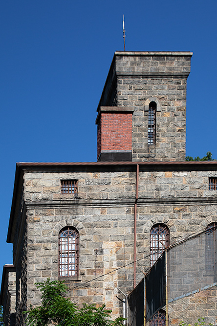
Love, love, love old buildings, and this one looks really special and very spooky. The story behind it is particularly grim. But you can find beauty in the structure in spite of its original purpose - the mottled colors and texture of the stone, the whitish outline where it looks like there was once a chimney. That narrow window in the smaller structure at the top looks particularly intriguing. What was it? A guard tower? A place designed for solitary confinement? That high fence around what I assume was some kind of exercise yard for the prisoners?
Out of curiosity I tried straightening the lines In Lightroom because I am somewhat OCD about straight architectural lines, but as I suspected you lose more of the photo around the edges than you probably want to lose.
|
Sep 9th |
 |
| 12 |
Sep 24 |
Comment |
Melissa, this is a wonderful photo and I get why you continue to play with it. Some photos keep calling you back! I don't mind the clouds or the buildings on the right, but I can see that it might also be a compelling black and white. The contrast is so great.
I would keep playing; noise reduction software keeps getting better and better. I don't notice any noise in the photo you posted, but this is probably a pretty low resolution photo. |
Sep 9th |
| 12 |
Sep 24 |
Comment |
Carole, this is a wonderful photo that carries so much emotion for so many of us. The sailors standing guard plus the information that it is an actual girder from the World Trade Center are each powerful in their own way. I like the diagonal line of the roof and the slanted light, both give the image more dynamism than a straight-on shot would. I was not aware of this statue or the ceremony, very timely. |
Sep 9th |
| 12 |
Sep 24 |
Reply |
Thank you Srijan - I responded to you, Melissa, and Carole in a single response after Carole's comment below. |
Sep 9th |
| 12 |
Sep 24 |
Reply |
Thanks Melissa - see my response to Carole, I wanted to address all the feedback I've gotten so far in one response. |
Sep 9th |
| 12 |
Sep 24 |
Reply |
Melissa, Srijan, and Carole -
Thank you all for your feedback, it all fits together in an interesting way, at least in my mind so I'm going to combine my responses into one overall observation. I'd be highly interested in any additional reactions you may have.
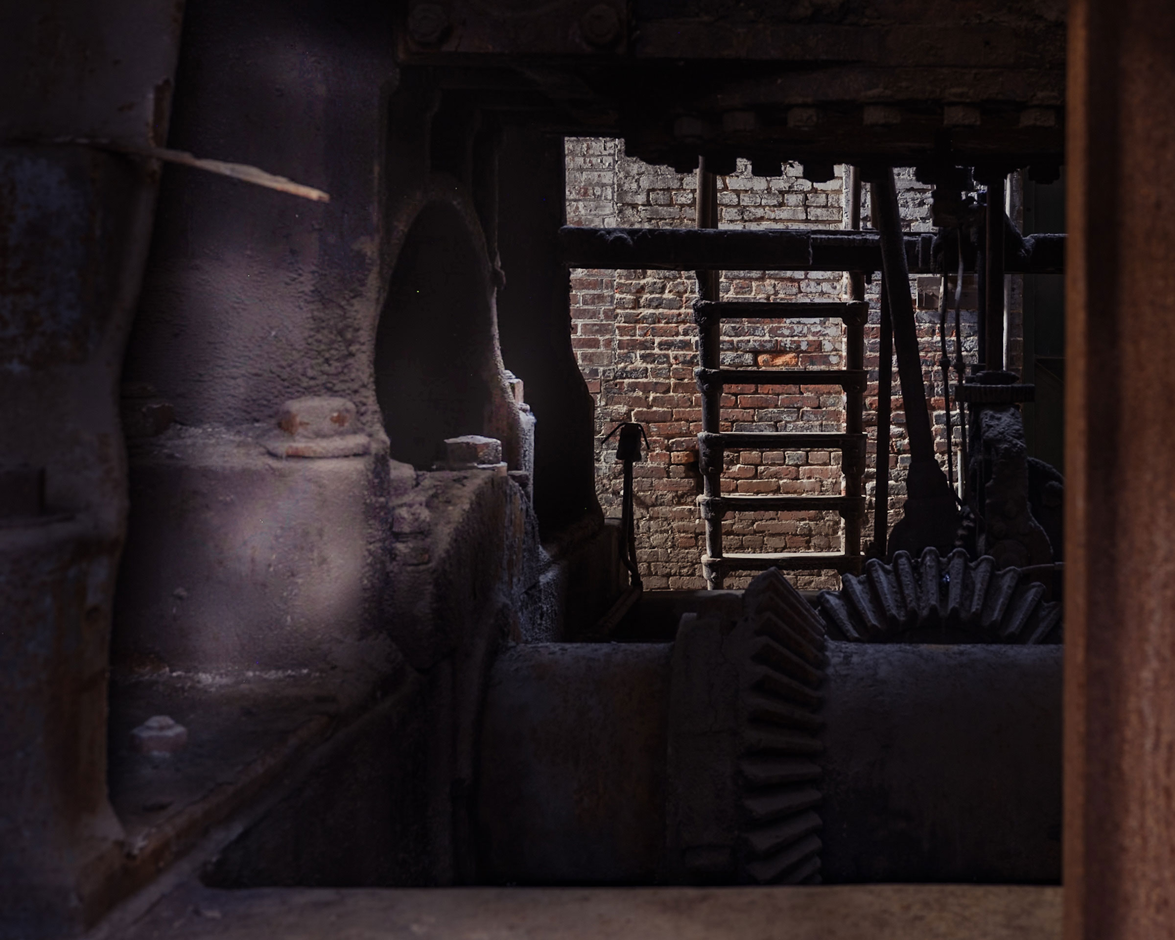
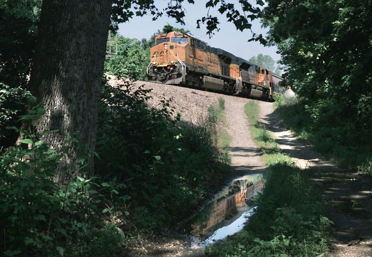
This is a single image from a series I've been working on of different buildings in Kansas and Missouri, mostly from small towns. I've taken a couple of workshops from professional fine art photographers, and they both emphasized putting together cohesive projects/ collections of photographs that have a similar look and feel, which in theory should end up having a stronger impact than any individual image.
Since the emphasis is on the buildings, none of the photos include any people. I understand that many viewers would find the inclusion of people more interesting, but that would completely change the project. Hopefully it's okay to provide a link to an outside website here - this is a link to my "Main Street" project on my website, a work in progress but it includes the image I submitted this month. I do have a goal of suggesting the presence of people through the years, even if there are none actually in the photo.
https://www.nancyarmstrongphotos.com/portfolio-1/main-street
Thank you for your insights!
|
Sep 9th |
6 comments - 6 replies for Group 12
|
6 comments - 6 replies Total
|


