|
| Group |
Round |
C/R |
Comment |
Date |
Image |
| 12 |
Aug 24 |
Reply |
Thanks so much Ally. |
Aug 27th |
| 12 |
Aug 24 |
Reply |
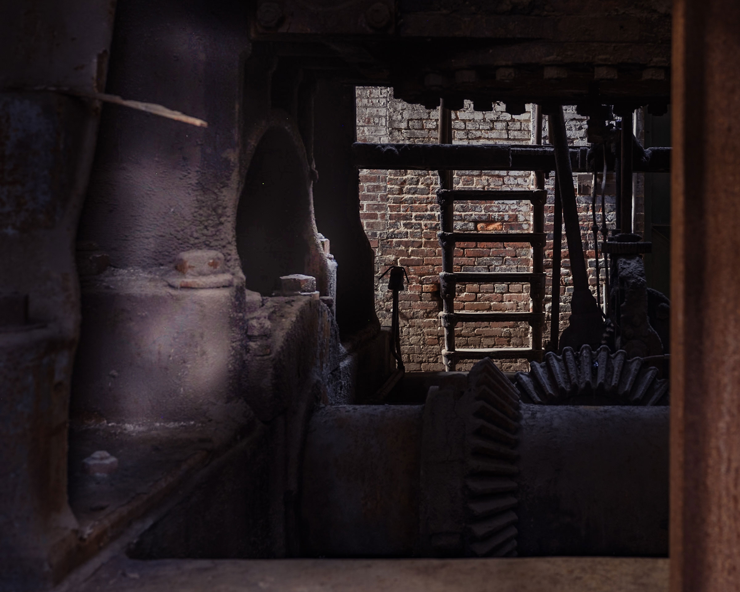
Thank you Connie. You are right about those cluttered workshops; they are fascinating but hard to capture. |
Aug 27th |
| 12 |
Aug 24 |
Reply |
Thanks Carole. Colorama has so many fun options; you could spend a long time playing with all the different options. I have both iColorama and iColorama S; as far as I can tell the former one is for the iPad and the one with the "S" is for the iPhone. |
Aug 27th |
| 12 |
Aug 24 |
Comment |
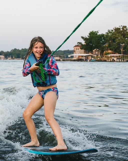
Ally, this is a wonderfully cheerful, bright image that is perfect for a kitchen. It holds lots of intriguing possibilities for any number of variations. I agree with Lisa that this version is closer to my understanding of an impressionistic as opposed to an abstract photo, but a worthwhile effort either way. |
Aug 9th |
| 12 |
Aug 24 |
Reply |
Thanks Lisa - I agree with your observation about the darker areas, those did concern me; I will play with it a bit and see what I can come up with. |
Aug 9th |
| 12 |
Aug 24 |
Reply |
Thank you Melissa. I liked the look of the workshop but I didn't think it worked particularly well in a photograph, so I was happy to find a reason to play with it. |
Aug 9th |
| 12 |
Aug 24 |
Comment |
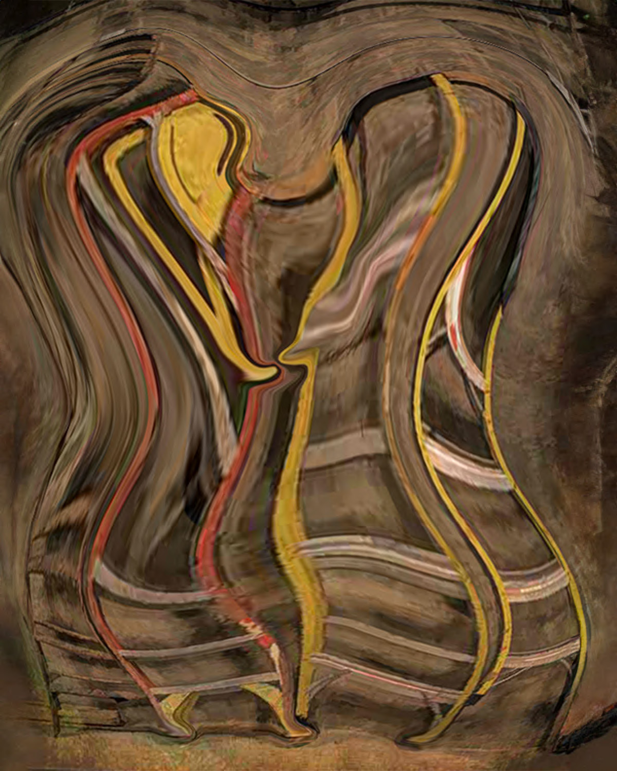
Lisa, this photo suggests lots of fun so you still have the feeling of a Merry-Go-Round although I would never have guessed what it started out as. I like both of your versions. The second version has a couple of areas that kind of look like eyes, which gives that one a bit more of a creepy feel. One thing I learned as I was fiddling with this assignment is that choosing the right image to start with is key. You chose well! |
Aug 9th |
| 12 |
Aug 24 |
Comment |
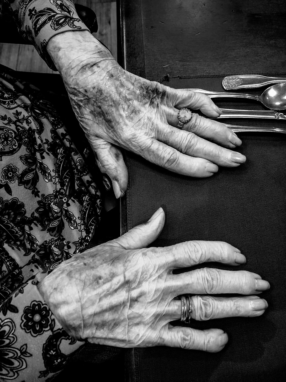
Love this Connie! It's very intriguing; the title is perfect as I see the two little short arms (or possibly just hands?) reaching towards each other in the center at about arm/hand height. The colors are subdued, which seems appropriate since the most important feeling in this image is of movement. If the colors were bolder I would expect them to detract from that wonderful feeling of motion. The feet are also wonderful. The only suggestion I would make would be to add a smidgen of background on the right so that both ladders are fully in the frame. I pulled it into Photoshop and added a little space on the left and the right. |
Aug 9th |
 |
| 12 |
Aug 24 |
Comment |
Melissa, this is an image that suggests strength to me. I like what you did with the palette knife, it definitely look like an abstract painting that was done primarily with a palette knife with bold strokes. The colors work well together and look intentional. I'm particularly drawn to that grey and white area on the right that has the sharp triangular shape pointing towards the top of the frame. I do wish I had a better idea of where the actual image boundaries are; since it is framed in black it looks like the solid black extends from edge to edge of my screen. |
Aug 9th |
| 12 |
Aug 24 |
Comment |
Carole, I really like the layers of this. I think my brain automatically looks for animals in an abstract because that's what I tend to see, but I see the colorful feathers of a tropical bird layered one on top of the other. There are so many colors, but they work well together and the texture adds more interest. The black adds to the image in my view, perhaps due to the fact that there are different gradations of black. You ended up with a great abstract image. |
Aug 9th |
5 comments - 5 replies for Group 12
|
5 comments - 5 replies Total
|