|
| Group |
Round |
C/R |
Comment |
Date |
Image |
| 12 |
Jun 24 |
Comment |
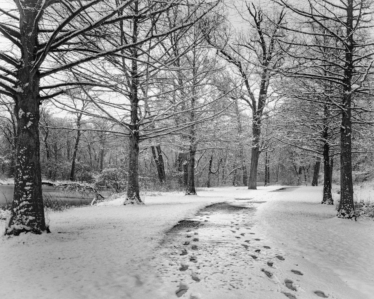
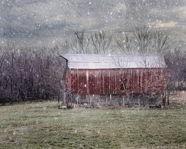
Ally, this is a great image and I agree with Melissa - it is worthy of being on a wall. I like both the color and the black and white versions; it's the composition that makes the image. If there was more color I think it would detract from the composition. The fact that the trees climb out of the frame works well, and I particularly like all that cloudiness at the base of the trees. |
Jun 16th |
| 12 |
Jun 24 |
Comment |
Ally, this is a great image and I agree with Melissa - it is worthy of being on a wall. I like both the color and the black and white versions; it's the composition that makes the image. If there was more color I think it would detract from the composition. The fact that the trees climb out of the frame works well, and I particularly like all that cloudiness at the base of the trees. |
Jun 14th |
| 12 |
Jun 24 |
Reply |
Thank you Connie - It's always nice to think that something is worth framing. |
Jun 14th |
| 12 |
Jun 24 |
Reply |
Carole - I cloned a little, but it was not easy to get it to look natural so I also darkened that whole area more and cloned some of the darker stuff at the very bottom to hopefully make that area of the photo less eye-catching. What do you think? |
Jun 14th |
 |
| 12 |
Jun 24 |
Comment |
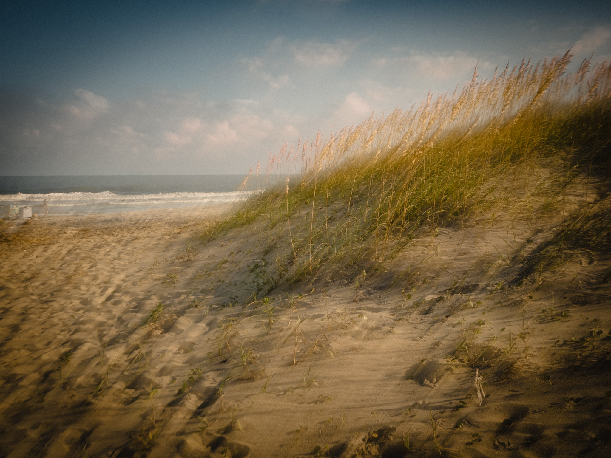
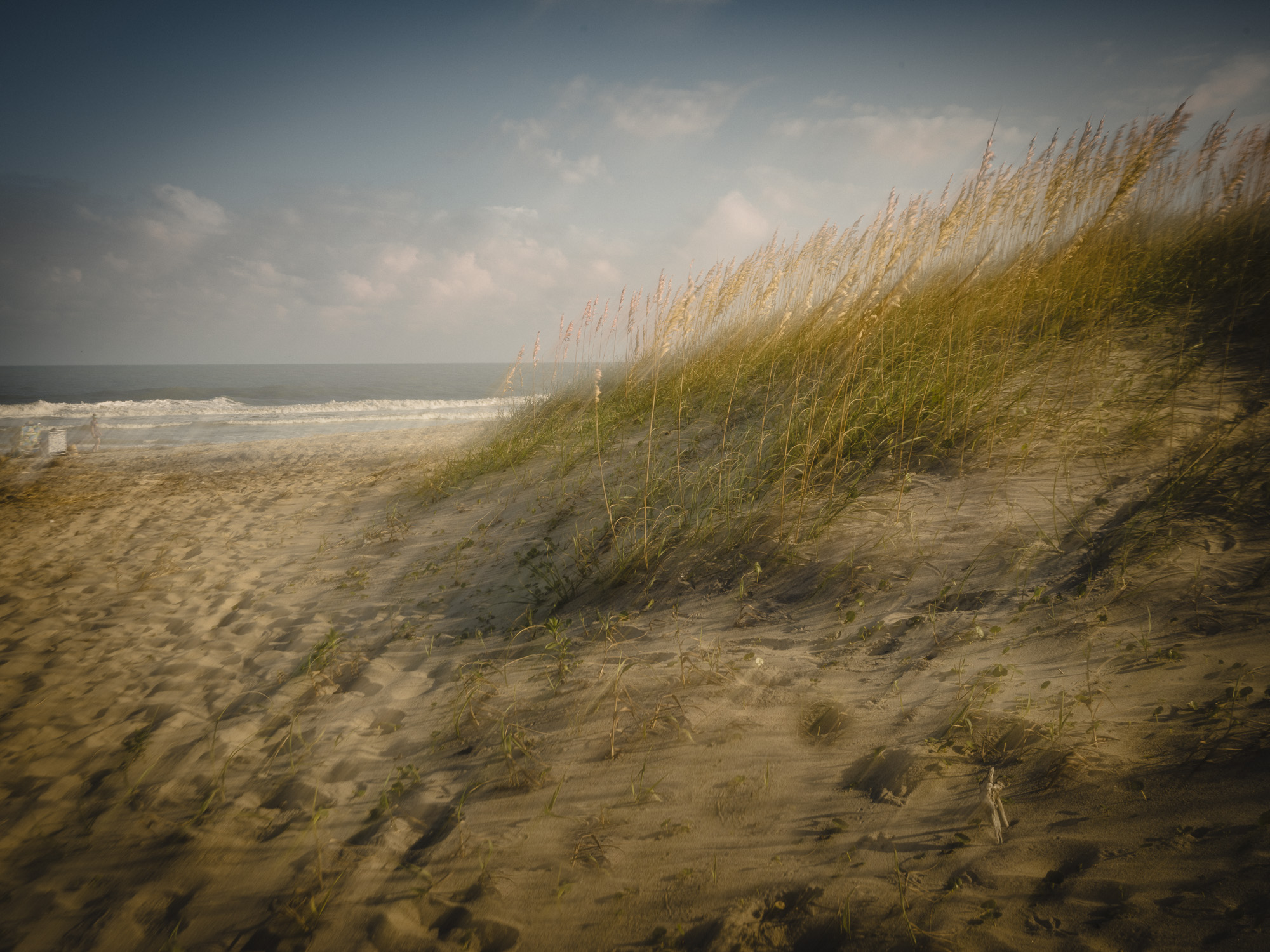
Connie, I like this image a lot! I don't mind the vignette as it is - it looks very intentional which is not a bad thing. It makes it clear where your eye needs to go, and I love the effect the camera movement created with the glass. This is a moving (pardon the pun!) image. The only suggestion I would make--and this might be hard to do--is to get that blue inside of the vignette as opposed to outside of it. I was going to suggest that you take the blue sky out altogether by desaturating, but then you would lose the whole upper part of the vignette. |
Jun 14th |
| 12 |
Jun 24 |
Comment |
Melissa, this is a soothing image so it's well titled. The feeling of a waterfall is so strong. I found it interesting that you can easily discern the objects at the base of your image, which I guess is due to the fact that you were moving your camera down as you shot as opposed to up - leading to that strong waterfall effect. I was going to suggest that you consider cropping in on the left since the lighter area could draw the viewer's eye. I tried it and (in my view) it wasn't an improvement since the lines are still vertical and they act as more of a block to keep your eye in the image as opposed to a road out. |
Jun 14th |
| 12 |
Jun 24 |
Comment |
Great work Carole, I have used the slow shutter app on my phone occasionally in the past but I always forget about it. I need to use it more often!
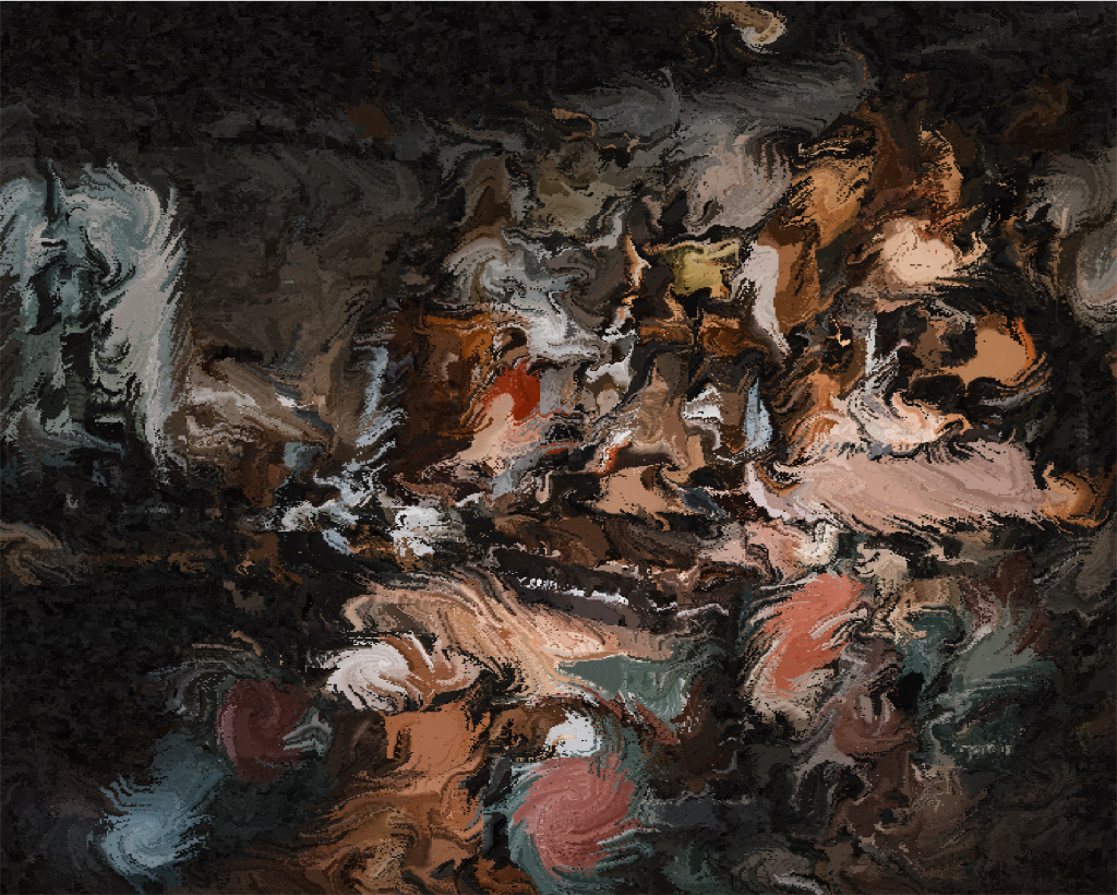
You've ended up with a lovely abstract image with colors that blend wonderfully; I think the way you chose to crop is what makes it all work. I get the suggestion of flowers but no clear image of one. And add me to the list of those that think it would make great fabric for a t-shirt or a design on one. |
Jun 14th |
| 12 |
Jun 24 |
Reply |
Thanks Carole. I will try your suggestion and post the results. I agree ICM is harder than it looks! I have tried it several times and am never that happy with the results. The ones I've seen that I'm drawn to have very little movement but in multiple directions. I'll see if I can find a good example to link to. |
Jun 6th |
5 comments - 3 replies for Group 12
|
5 comments - 3 replies Total
|


