|
| Group |
Round |
C/R |
Comment |
Date |
Image |
| 12 |
Nov 23 |
Comment |
Some additional editing based on suggestions, thank you everyone.
|
Nov 22nd |
 |
| 12 |
Nov 23 |
Comment |
Joan, congrats on being chosen for the monthly slide show! As a newbie here there are lots of ins and outs I'm not familiar with, but I know enough to understand that there are lots of photographers and photos to choose from so that is a pretty elite group.
I love that you chose a real bar for this, and one from Paris no less. I tried the search function in Lightroom Mobile and just typed in "bars' to see what it would come up with; I was thinking of the kinds of bars on a window or in a fence, and what Lightroom mostly produced was shots like yours, although nothing as interesting. Thank you for also sharing the original image, the fisheye view was also interesting. I don't have any lenses that wide.
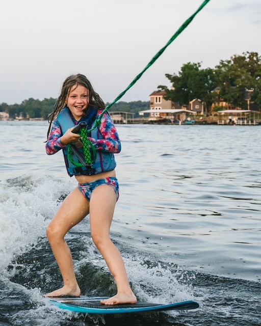
I don't have any suggestions for improvement; both LeeAnn and Carole suggested there are lots of ways this could be shot and I agree. I'm not sure about taking the lights out. They do catch your eye first but if you take them out I don't think your eye would know where to land and I might just pass the whole photo by. Once the lights pull me in I start to explore all that other stuff�� |
Nov 18th |
| 12 |
Nov 23 |
Comment |
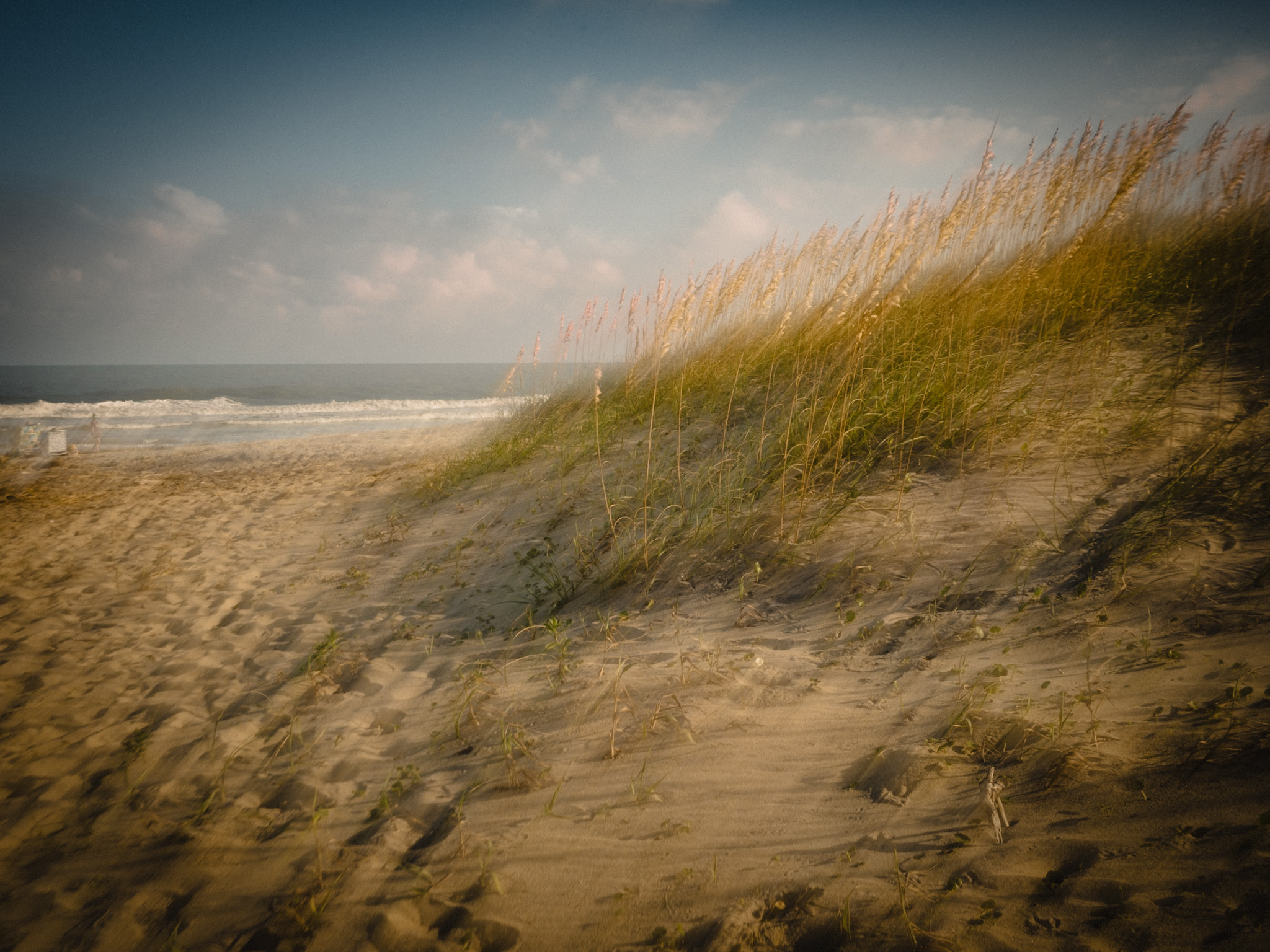
Lee Ann, the shadow bars really jump out at the viewer and turn what might have been a stock beach photo into an interesting piece of art. You mentioned in your response to Carole that you might do some additional processing; it's fine as it is but I agree that some additional work on things like color and contrast could take it to another level.
There is a lot to look at here, and I kept finding new things as I studied your image. The shadow of the wire on the right, the claw, the details of the wire, something that looks like a feather but I'm not sure what it is��nice work! My only suggestion for improvement would be to clone out those two partial leaves along the top edge, I think they could lead the viewer out of the photo. |
Nov 18th |
| 12 |
Nov 23 |
Comment |
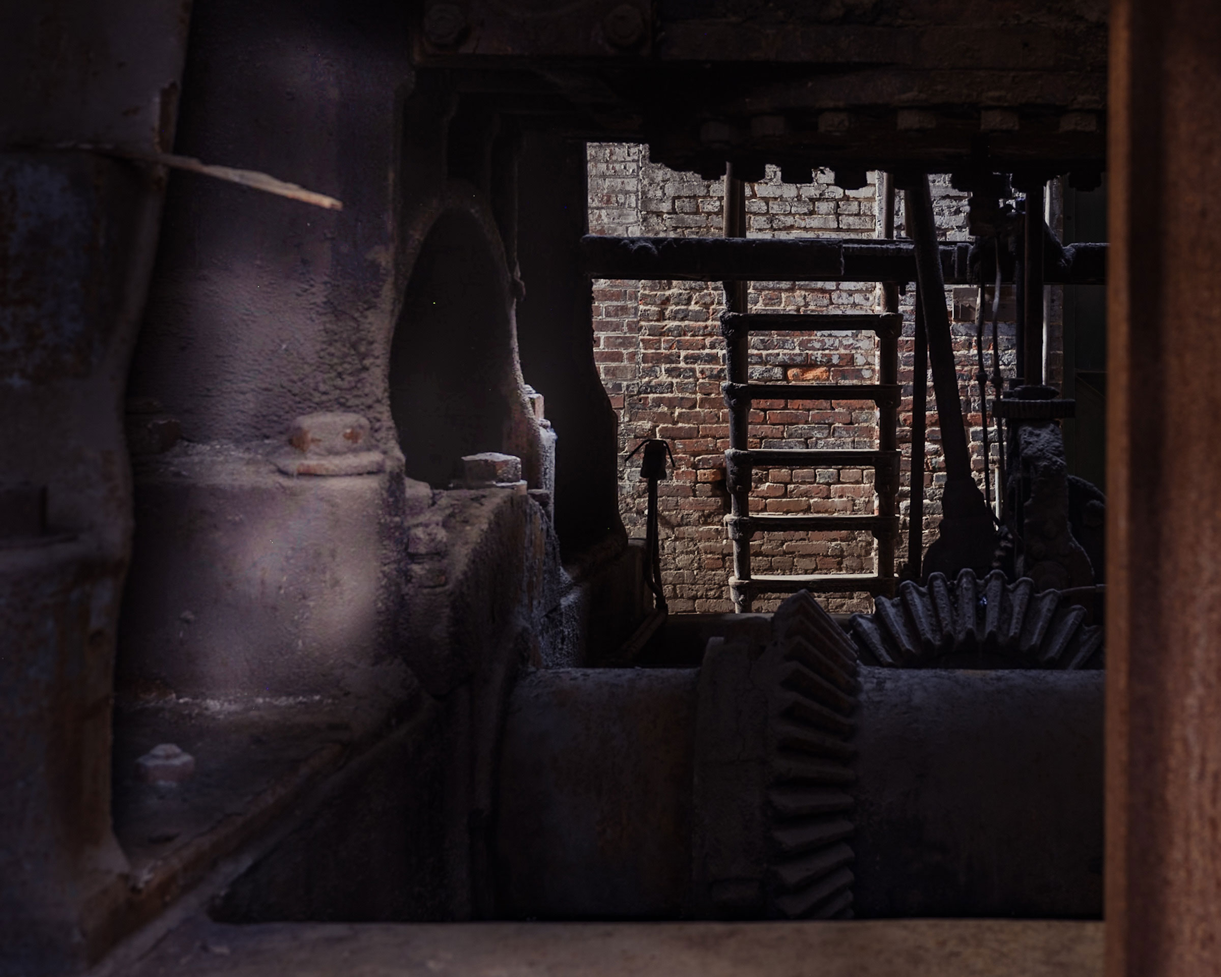
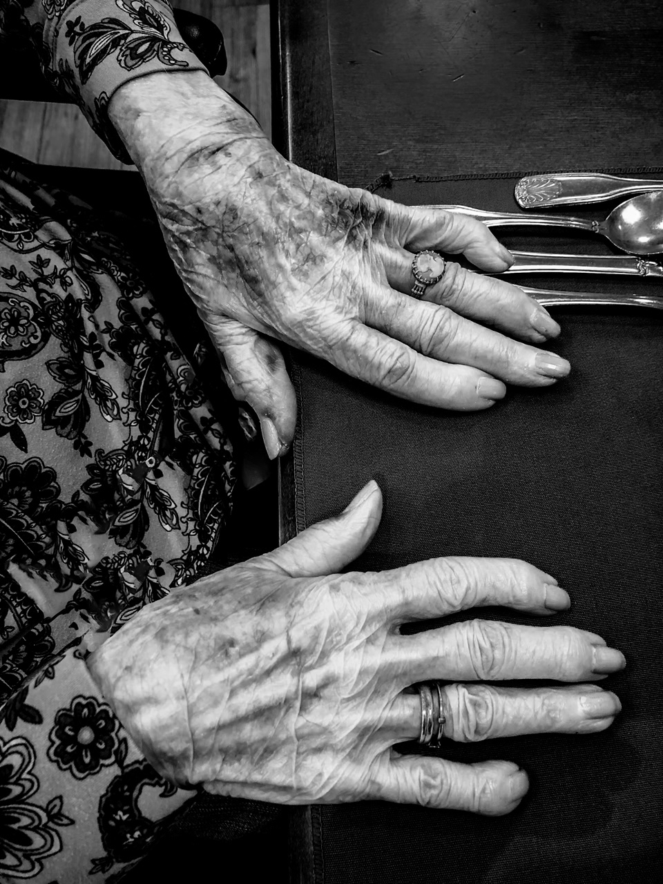
Connie, this is an nice image - and I learned several things. It draws you in if you don't quite understand what it is. And I didn't.
I particularly like your explanation of what the tools are for and all the steps you took to get a good image. It made me appreciate the kinds of things someone who does product photography would have to consider-is that something you have done? I like your angled shot and the crop, those decisions created several triangles and made a more interesting composition. |
Nov 18th |
| 12 |
Nov 23 |
Reply |
LeeAnn, I didn't realize you are in the DD&B club; I will have to look for you at the meetings. |
Nov 18th |
| 12 |
Nov 23 |
Reply |
Thank you LeeAnn, great suggestions and I plan to incorporate them into a new edit. I'm sorry that I didn't have a chance to get to know you a little better, but I understand the time constraints. It's so easy to get over committed when it comes to photography. Best of luck to you. |
Nov 18th |
| 12 |
Nov 23 |
Reply |
Thanks Carole - I like your suggestions about the light and dark areas; I'm going to work on it and repost the edited photo. |
Nov 18th |
| 12 |
Nov 23 |
Reply |
Thanks Joan. I'm happy to hear you noticed the figure in the window early; I'm going to work on the light in that area of the photo based on the feedback I've gotten, and hopefully bring more attention to that figure. Getting things to look straight in these old building photos is a challenge, I am going to work on the crop as you and LeeAnn suggested, then reassess the straightening. |
Nov 18th |
| 12 |
Nov 23 |
Comment |
Very creative- and this really nails the topic in so many ways. I like all the diagonal lines, they give the image lots of energy. Black and white was definitely the way to go. I find myself wanting a little more of the piano keys on the left and just a smidge more on the bottom so that bottom note isn't cut off. Nice image! |
Nov 9th |
5 comments - 4 replies for Group 12
|
5 comments - 4 replies Total
|