|
| Group |
Round |
C/R |
Comment |
Date |
Image |
| 29 |
Apr 26 |
Comment |
I prefer the original. The green seems more natural and there is no color cast in the water or on the pagoda. It would be nice to see the top of the pagoda, but if that was not possible I like that you cloned in some green leaves over the brown. |
Apr 18th |
| 29 |
Apr 26 |
Comment |
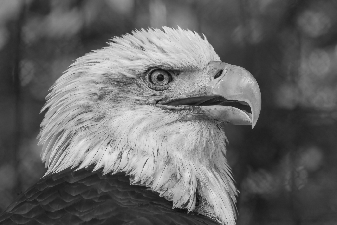
I agree with Bob that adding more to the left would give the bird a place to land. I toned down the yellow/green of the grass. Great capture! |
Apr 12th |
 |
| 29 |
Apr 26 |
Comment |
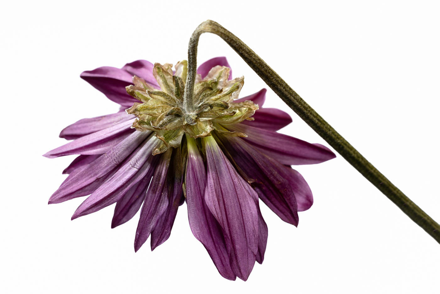
I like the soft colors. It pops against the black background. The curved stem adds interest. I wouldn't change anything. |
Apr 12th |
| 29 |
Apr 26 |
Comment |
I like the colors. Definitely tells the story of our times with everyone always on their phone! |
Apr 12th |
| 29 |
Apr 26 |
Comment |
Adding warmth or contrast changes the peaceful feel for me. I like your original processing. My eye is led to the bench. I also thought a person on the bench would be good, but I like it without too. |
Apr 12th |
| 29 |
Apr 26 |
Comment |
Welcome! I like Bob's edit, but might increase the blue in the sky. I like the reflections. |
Apr 12th |
| 29 |
Apr 26 |
Reply |
I usually take my images into Topaz AI for sharpening, but was in a hurry to get a photo ready and skipped that step. |
Apr 12th |
6 comments - 1 reply for Group 29
|
6 comments - 1 reply Total
|