|
| Group |
Round |
C/R |
Comment |
Date |
Image |
| 49 |
Feb 24 |
Comment |
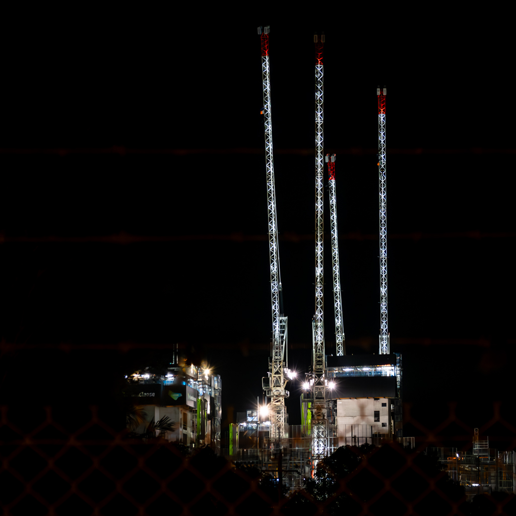
Hi David,
I just played with the image in LR and straightened it vertically. To me, it lost a lot of "energy", but it was definitely worthwhile having a look at it that way.
Yeah the starburst was a surprise to me too. It was definitely shot at 2.8 without any trick filters, I think the thing that may have helped the effect was a slight misty haze in the air that was caught by the lights. Not really sure I'm afraid. |
Feb 23rd |
| 49 |
Feb 24 |
Comment |
Hi Alan, A very nice colour palette compliments the nicely out-of-focus background and sharp details on the bird.
I think the close cropping and high ISO processing has combined to produce some very definite artifacts in and around the upper branches of the tree however. All together though a very pleasing and balanced capture.
Cheers |
Feb 14th |
| 49 |
Feb 24 |
Comment |
Hi David,
I think Craig said it best. Wow!
Loved the impact of the image straight away, it is a strong capture that you would/should be very happy with!
I do think the rainbow itself could be lightened off, and personally I would clone out that bush on the left as I think its a minor irritation.
I think the aspect and crop of the image adds to its strength. Cheers
|
Feb 14th |
| 49 |
Feb 24 |
Comment |
Hi Josh, Totally agree with the other two, I think this is a strong image with an imaginitive take on a subject that could have easily been overlooked. Well seen. And I think the composition works really well.
The only suggestion I could make is that I would probably punch the contrast a little more, but otherwise a "complete" picture .. I wish I had taken it!
Cheers
|
Feb 14th |
| 49 |
Feb 24 |
Comment |
Hi Craig, As the others have said, there is a nice little story in this image, with strong impact for the viewer.
I think the square ratio woks well here keeping the full attention on the three birds, but I wonder if the right hand side of the image feels a little tight, especially as number three is looking out of frame.
A good job on the expoure too considering the bright background. Cheers |
Feb 14th |
| 49 |
Feb 24 |
Reply |
Thanks Craig, I just felt it suited the imagry. |
Feb 14th |
| 49 |
Feb 24 |
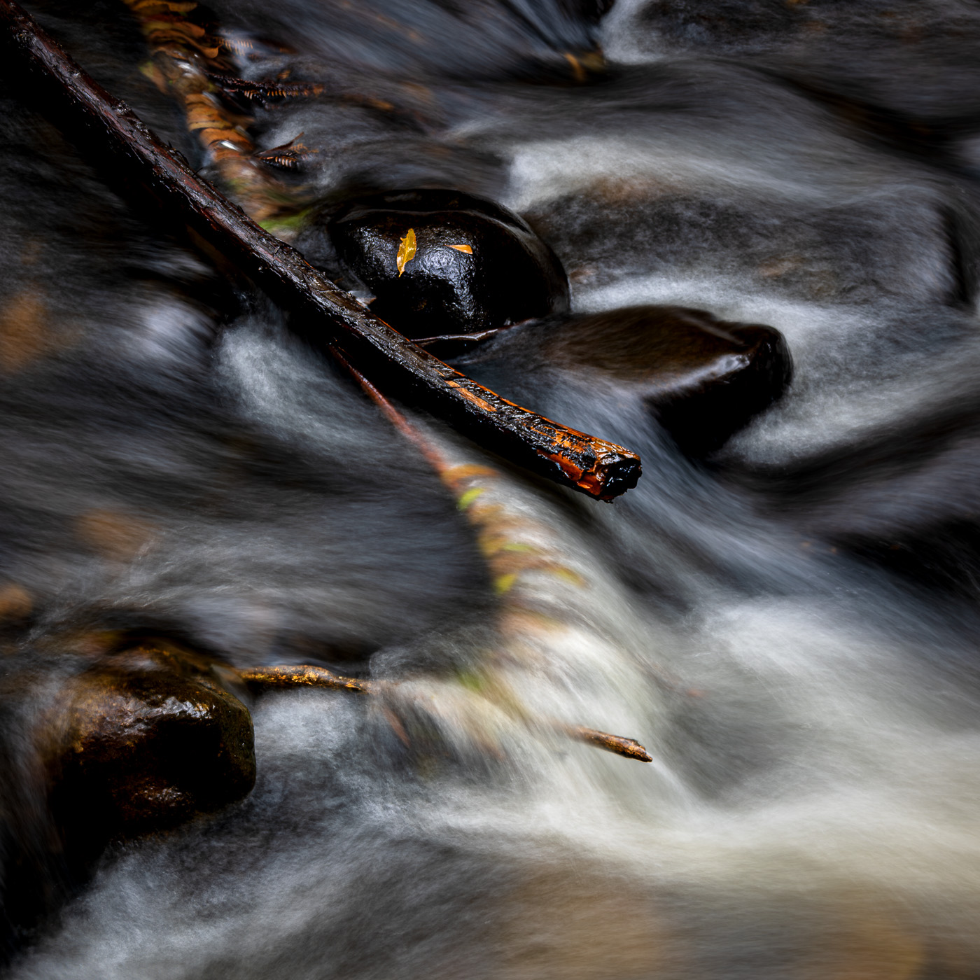
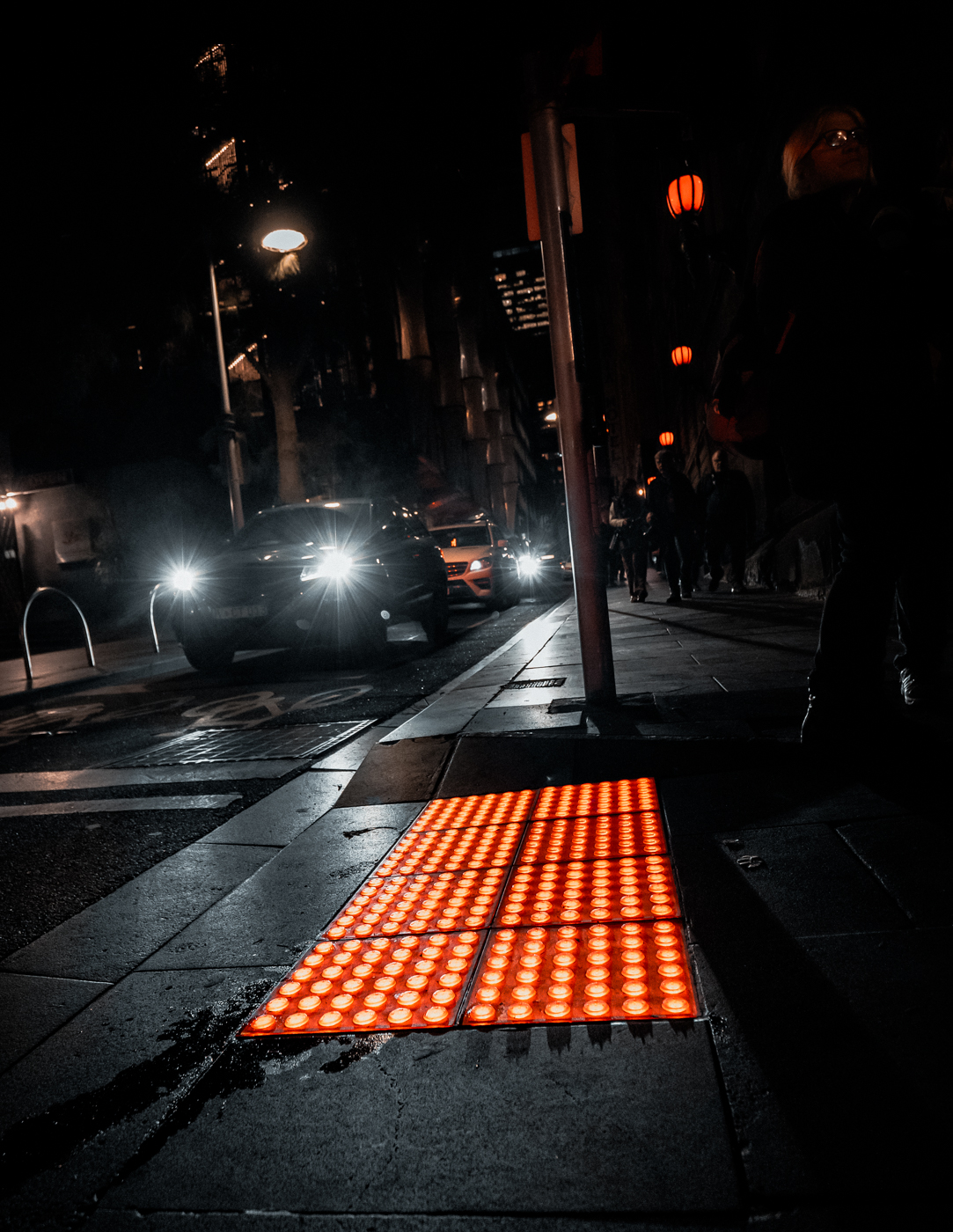
Comment |
Hi Josh, thanks for your comments !
The streetlamps that you mentioned are very similar in colour to the warning pad on the ground, I just emphasized that fact a little.
I chose the framing aspect as I just thought it added an edge to the overall feel of the image. Call it an artistic choice.
: ) |
Feb 11th |
6 comments - 1 reply for Group 49
|
6 comments - 1 reply Total
|