|
| Group |
Round |
C/R |
Comment |
Date |
Image |
| 49 |
Dec 23 |
Comment |
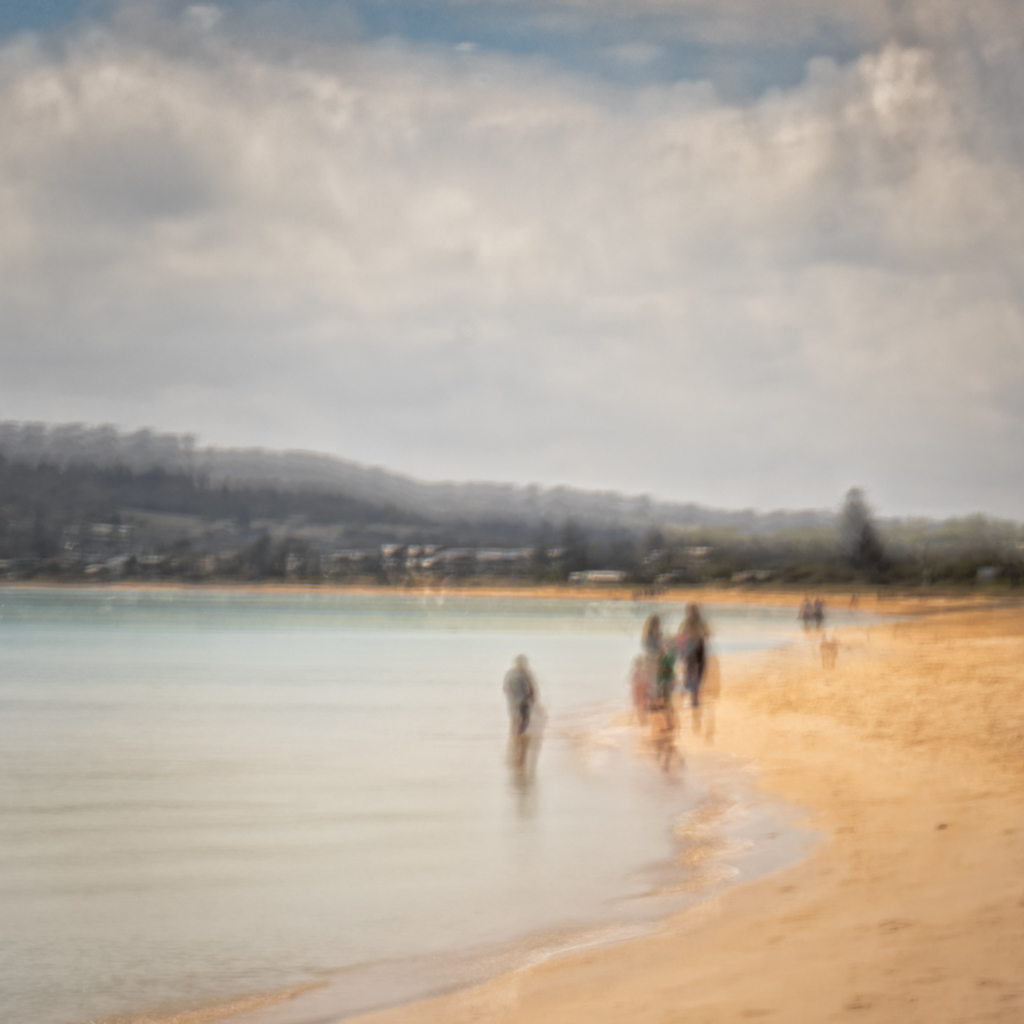
Hi Michael, thank you so very much for your kind comments.
The final version is actually a mix of processes. It starts with using Intentional Camera Movement in the original capture. I find that using a shutter speed of around 1/5th second or so, and holding the camera out at arm's length, gives a useable 'wobble' and this produces a softly blurred image. Make sure you turn Image Stabilization off before you shoot. Slower speeds seem to work too, its a matter of shoot-and-see really.
Then in Lightroom I play with the Tones and Luminance in the image until I am happy ( sorry can't really be more specific ) Importantly though, I make sure to sofeten off Texture and Clarity a bit, but then increase Sharpness. This seems to give a pleasing finish.
Hope that helps. Cheers.
|
Dec 18th |
| 49 |
Dec 23 |
Reply |
David, Many thanks for the suggestion. I have cloned out the ghosts as you described, and it is now a much cleaner, more pleasing image.
It's amazing that you can look at something and not see things that are easily appearant to others.
Thanks again! I will definitely be looking out for this sort of distraction in the future.
Cheers |
Dec 15th |
| 49 |
Dec 23 |
Reply |
Hi Alan, No worries, ICM is definitely not to everyone's taste. Many thanks for the comment.
Cheers |
Dec 14th |
| 49 |
Dec 23 |
Reply |
Thank you Craig, you have noted one of my favourite artists, so I am absolutely delighted !!! |
Dec 13th |
| 49 |
Dec 23 |
Comment |
Why don't you give it a try, just for the sake of the exercise, and post it ? See what you think.
|
Dec 10th |
| 49 |
Dec 23 |
Comment |
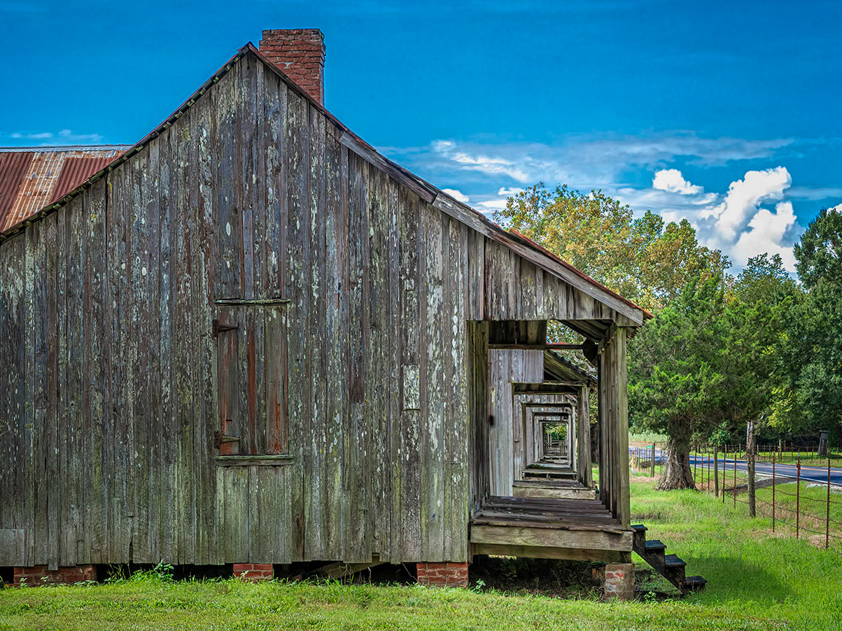
Hi Peggy,
Well done on seeing the shot, the line of porch frames is a strong element in the image and immediatey draws the eye.
As Josh has said, I think a slightly tighter crop works for this image.
In the copy below, I did make a small crop to bring the point of interest in a bit, and to lose some of the wall.
Also, I put a vignette around the porch frames and applied to the rest of the image a bit of darkening, contrast and sharpening. I think this may just help to bring out the hero of the image.
Cheers Stephen
|
Dec 10th |
 |
| 49 |
Dec 23 |
Comment |
Hi David,
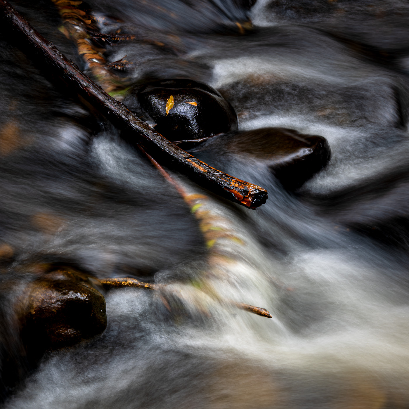
Agree that the leading lines in the foreground rocks are a strong leading line, and, point of interest in the image.
The sharpness overall is fantastic, well done on the focus stacking work !
The complimentary blues and yellow colours are very nice and add well to the the depth
I am just curious about one point however. All of the lines of different colour rock in the background mountain are well away from being level. Is that a true representation of the way the rock levels had formed over time ? ( I'm guessing it is. )
Cheers Stephen |
Dec 10th |
| 49 |
Dec 23 |
Comment |
Hi Josh, You've captured an interesting line in the shape of the waterfall, and the 0.5 second has rendered the movement of the water nicely.
Whenever I shoot moving water, I always take the same image at a number of different speeds, so I can have a choice of bluriness when I get back home in front of the PC.
I wonder if you had taken the shot slightly further to your left ( if possible ), with a tighter crop it may have more strongly empasized the break and shape of the waterfall.
Well done in the post process ideas too. |
Dec 10th |
| 49 |
Dec 23 |
Comment |
Hi Craig,
I think you did a great job with the Lumecube, the lighting of the vase and flowers is lovely. Really nice contrast and detail in the flowers and depth in the vase, and I like the soft nonde background, it takes nothing away from the main subject.
I am not sure however about the AI generated stump as it appears slightly unnatural I think. I am glad that you noted the use of Generative Fill in your description, and agree it is the BIG thing at the moment for discussion.
For my own part I don't use it, but can see where it would have useful applications.
Cheers, Stephen
|
Dec 10th |
| 49 |
Dec 23 |
Comment |
Hi Owen,
You have achieved your goal well, the viewer's eye is definitely drawn into the depth of the image along the leading line, and there is a nice "pay off" at the end with the interesting house, and there is nice sharpness throughout.
Like Josh's comment, I too would crop the bottom of the image, say to just under the base of the right hand tree. It might give a nice "pano" feel to it.
Also, maybe a tweak of contrast may help.
Nice image, thanks !
|
Dec 10th |
7 comments - 3 replies for Group 49
|
7 comments - 3 replies Total
|